Related
Add and delete vertical space in measured intervals [The Elements of Typographic Style Applied to the Web]
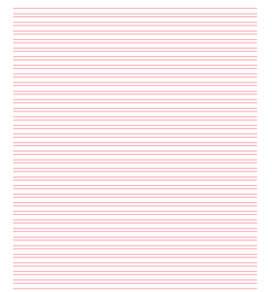
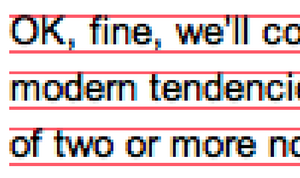
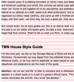
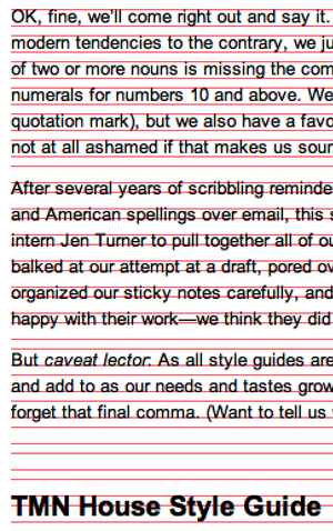
Compose to a Vertical Rhythm [24ways]: “The basic unit of vertical space is line height. Establishing a suitable line height that can be applied to all text on the page, be it heading, body copy or sidenote, is the key to a solid dependable vertical rhythm, which will engage and guide the reader down the page.”

Matt Carey
on 18 Dec 06In other words a baseline grid.
Brandon Kish
on 18 Dec 06This is especially important in newspaper design. When columns of text don’t line up vertically, there is almost a subconscious feeling of chaos that affects a reader’s feelings about the content.
Rick
on 18 Dec 06I don’t understand, don’t word processors prevent this from happening (e.g. Microsoft Word’s “Style’s & Formating” feature) making this a non-issue?
gwg
on 18 Dec 06This is even more important when you have multiple columns on your web page. Much like print design (as B. Kish mentioned), a strong baseline grid sets apart amateur looking sites, from professional looking sites.
gwg
on 18 Dec 06Rick: By default, Word is sets the leading (or line height) to a multiple of the font size (usually 1.2 if memory serves). So, when your paragraph is set at 11pt and your headers are set at 14 pt, the baseline grid is destroyed almost immediately.
Mike
on 18 Dec 06This site explores the ideas in the Elements of Typographic Style book, relating the concepts to web design. I never knew there was so much to it…
Rick
on 18 Dec 06So, when your paragraph is set at 11pt and your headers are set at 14 pt, the baseline grid is destroyed almost immediately.
@gwg
So does this imply that headers have to be set in a multiple of the paragraph text in order to keep the baseline grid.
Or is it possible to have paragraph set at 11pt and use 14pt, 15pt and 16pt (any size) headers – all of which maintain the baseline grid.
Rick
on 18 Dec 06Also, how does someone go about accomplishing this on a web site/page?
Christian Augustin
on 18 Dec 06Reducing “being in phase” to a baseline grid is not the only solution. Web pages have no back side that will shine trough, and you can construct “phases” with divisions of a basline grid (i.e. 5px as the smallest grid unit with 15px as the “standard” line spacing). Based on such a “divided grid” you are more flexible (i.e. by using 10px distance between paragraphs) but stay in phase—even with columns, because they “re-synchronize” often. You can see that distances are not choosen randomly, but paragraphs will better stay together (especially if you have to deal with highly fragmented content with short sentences and paragraphs).
Thoug the “rhythm” is slightly more complex in those cases, this is similar to the diverse rhythmical schemes in music.
Just my 2 cent :-)
Christian Augustin
on 18 Dec 06Oh, I forgot to mention: With a divided grid, you are more flexible with headlines either. With my example from above, you can use 15px/20px for a headline and stay in phase with the 5px grid.
Rick
on 18 Dec 06I’m assuming this implies you have to stay in the same font family for this to work.
Having a heading set in Times, and paragraph copy set in helvetica would seem to me that the baseline grid would break just because different fonts are used (proportions etc..)
Christian Augustin
on 18 Dec 06Rick: As far as I can see most fonts have the same baseline position when used with the same font size and line height. It works with the usual suspects (Arial, Verdana, Trebuchet, Times, Georgia), so no need to stay with one font. But if you try to stay exactly on a grid, you have to do some shifting up/down with different font sizes (i.e. using “position: relative” and “top: 1px” or the like for the headlines).
Baseline position varies with platform/browser (especially MSIE/Win …); but all fonts are affected, so again you stay in phase (but shifted 1px down).
Grant Hutchins
on 18 Dec 06Rick, it would depend on what you use to determine the grid. If the X-height is the same and the leading was adjusted as necessary, overall it might look better than if the full-height was the same.
That said, point size of a font is its full-height anyway, so switching between fonts alone shouldn’t break the grid by definition. What you might be thinking about is typographic color which is the proportion of white to black (or whichever colors) over a block of text and how it is distributed. It’s hard to make any sort of rule about color, it’s more about just looking at the text from afar and looking for inconsistencies.
Brandon Kish
on 18 Dec 06Measuring in pixels makes this discussion convienent for web designers, but will the same theories necessarily apply to em-based styles?
Simon
on 18 Dec 06Yes, as Brandon and gwg say, it’s especially important when you’ve got more than one column. You’ll notice that newspapers and magazines always make sure the lines on one column line up with the column next to it.
In Quark it’s the lock to baseline grid check box.
Meikel
on 18 Dec 06//Baseline Grids – Josef Müller-Brockmann: Grid Systems in Graphic Design/Raster Systeme Fur Die Visuele Gestaltung
Best book ever
http://www.amazon.co.uk/Systems-Graphic-Systeme-Visuele-Gestaltung/dp/3721201450/sr=1-4/qid=1166463642/ref=sr_1_4/202-8660028-6316639?ie=UTF8&s=books
Rick
on 18 Dec 06So, to make sure I understand this correctly – the following site does not conform to this rule.
http://coudal.com/
Rick
tom
on 18 Dec 06But for the web, fixed type sizes are bad (read: the devil). Is this possible with percentages? It seems not at first thought…
Thijs van der Vossen
on 18 Dec 06I used a baseline grid like this for our website. It mostly works fine even though we often ‘miss a beat’ because of line length and image size. You can find a screenshot of the website in ‘development mode’ here.
Rick
on 18 Dec 06@Thijs van der Vossen
That is NOT a grid based layout. Even look at your own screenshot.
http://stuff.vandervossen.net/temporary/fngtps_dev.png
The word “Portfolio” under Section doesn’t align on the base line. Neither does the heading “This Proxy Pattern in Ruby”.
Rick
on 18 Dec 06@Thijs van der Vossen
That is NOT a grid based layout. Even look at your own screenshot.
http://stuff.vandervossen.net/temporary/fngtps_dev.png
The word “Portfolio” under Section doesn’t align on the base line. Neither does the heading “This Proxy Pattern in Ruby”.
Richard D. Bartlett
on 19 Dec 06@tom
It’s not real hard to do with liquid layouts:
div.content{ font-size: 1em; line-height: 1.2; /* unitless multiplier */ padding: 1.2em; }
p.content{ margin-bottom: 1.2em; }
...and so on.
You just set your font-size with a relative unit, set the line-height with no unit, and use the product of the two as your baseline grid interval.
You can always break the grid, say by having a heading that is 1.5 units high, so long as you use your margin-bottom to get the subsequent content to fall back into the rhythm.
It’s all very nicely explained here.
I try to apply the same principle to the horizontal rhythm of the page, too, though that can get a little more involved.
Richard D. Bartlett
on 19 Dec 06...to extend that comment a little further:
To apply this concept to em-based layouts, start by defining your base unit: in this example, I’ve chosen 0.75em as the font size, with a line height of 1.25. Then to create headings of arbitrary size: font-size: “X”em; line-height: multiple of (global line-height divided by X); sum of vertical margins: multiple of (line-height determined by previous equation).
body{ font-size: 0.75em; line-height: 1.25; } h1{ font-size: 2em; line-height: 1.25; margin: 1.875em 0 0.625em 0; } h2{ font-size: 1.5em; line-height: 1.6667; margin: 0.8333em 0 0.8334em 0; } p{ margin-bottom: 1.25em; }I hope this is helpful
Nice Paul
on 19 Dec 06Richard Rutter explained this concept in last week’s Compose to a Vertical Rhythm.
Reis
on 19 Dec 06Amazing article, instantly improved the look of my weblog.
Great find!
This discussion is closed.