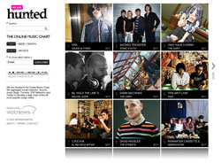
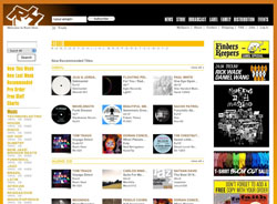
A Wired article this morning led me to We Are Hunted. It’s an awesome example of the difference UI makes. There are tons of music sites out there, but most are 90% chrome. Compare We Are Hunted to Rush Hour or Sounds of the Universe. The other sites are a lot of text and navigation with tiny postage-stamp album covers. We Are Hunted flips the formula by focusing on album art and the result is like standing in a record store. There’s art in your face everywhere. Scenes and styles and provocation and “howtf is this record going to sound?” all lurk in an album cover. Clicking a cover to play the linked track gives you the familiar feeling of taking a CD home and examining the art while the first track streams through the speakers.
Aesthetics aside, this comes back to UI design. Music sites have mostly the same elements. A cover image thumbnail, a play link, the artist name, the track name, etc. The difference comes in the triage. How do you decide what’s important? What do you focus on? What do you want your customer to see first? To see second? We Are Hunted gave album art the top slot and the result sets their site apart and gives their customers a markedly different experience.


Anonymous
on 17 Apr 09A still from Full Metal Alchemist as an album cover??
Matt Kowal
on 17 Apr 09While I agree that this setup is better than some other music stores, I cannot at all relate to “the familiar feeling of taking a CD home and examining the art while the first track streams through the speakers.” The pixelated album covers leave a lot to be desired. When clicking on the album cover streams music and leads me through the story book album jacket, then I will be impressed.
Brenton
on 17 Apr 09howTF? the TF is pretty unnecessary.
RS
on 17 Apr 09@Brenton That can depend on which cover you’re puzzling over :)
Nate
on 18 Apr 09I do like the large album covers and the simplicity really of the homepage compared to say lala.com. However, these days I’m used to visiting music sites like lala.com and thesixtynine.com and being able click on something (e.g. to read the bio of the musician, etc.) without the play stopping of what I was just listening to. Not sure what magic they use to do that, iframe nav probably?
Right now it’s kind of like bring home the CD, put it in, hit play, browse the cover booklet, wait wtf, why’d the music stop :)
Good start though, and thanks for the referral. Definitely gonna add We Are Hunted in the mix.
Sam
on 19 Apr 09The initial impression created by the big pictures is definitely cool…. until you realize that most of these images are NOT the album artwork. Not only that, many of the images don’t have anything to do with the album or artist whatsoever.
Yeah Yeah Yeahs == Ninja Gaiden?
Sunny
on 21 Apr 09Hmmm… not sure about this one. It still seems to mainly pay attention to the “big name artists” like dizzee rascal, the streets and sonic youth…so its hardly groundbreaking stuff. Much prefer http://www.aircharts.com.au which charts indie bands mp3 downloads AND record shop sales on a weekly basis..and also has radio airplay charts that lets you know what is being most played on the radio, a true indicator of what people are actually listening to. Plus its run by a not for profit music industry association that puts any revenue raised from the proceeds of its itunes referral sales links back into the indie music industry, rather than just another corporations pocket.
Timo
on 22 Apr 09I have to disagree. At least on the case of Rush Hour, where the SELECTION they sell is the main thing. Electronic music is very anonymous and the often times, the cover art reflects that. That is, the records are packed in a generic label sleeve or have no artwork at all. So – you example UI would not meet my experience goals in my usage situation.
Timo
on 22 Apr 09Whoops, have to read more carefully. Exactly your point there, the UI makes a difference but the content dictates the suitability. I stand corrected.
This discussion is closed.