Yesterday, we pushed an update to Campfire that added some new functionality to the transcripts screen. You can read the details in this post on our product blog, but I wanted to share the thought process on a small change we made as part of the update.
While working on the “Files, Transcripts and Search” tab in Campfire we noticed that the heading for each transcript day was kind of a mess. Here’s what it looked like before the update (the image has been reduced, click to see it full size):
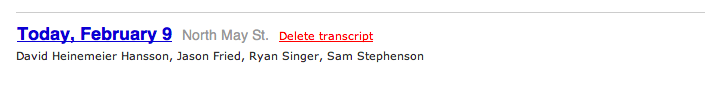
The design has essentially four elements using 3 font sizes, 4 colors, and 2 font weights. It certainly gets the job done, but it adds a lot of noise to the screen and can only make scanning the page slower than it needs to be. Contrast is essential to differentiating elements of a design, but here everything is unnecessarily different from everything else.
As we looked more critically we also felt like the link to read the transcript could be more obvious and that the link to delete a transcript was far too prominent for a feature that is rarely needed.
Here is what it looks like today:
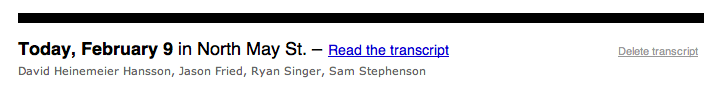
The redesigned header reduces the contrast between the date and room name to just the weight of the font — a good example of least effective difference. The link to read the transcript is now explicit, reducing confusion, and the delete transcript link it subdued. Aligning it to the right keeps it out of the way where it is less likely to be accidentally clicked. Finally, a heavy black rule decidedly separates each day while giving each entry some visual weight.
The new design retains the same four elements as the original but by reducing unnecessary contrast, and refining the arrangement makes it feel like fewer to the eye. This results in less clutter and better scanability. It’s a small change that we think makes the whole page better.
Anonymous Coward
on 09 Feb 10I think you mean by “least effective difference” the actual (and positive) term “just noticeable difference”.
Emil
on 09 Feb 10Wow. I like the update but it is almost impossible to read “Today, February 9 in…” since the black border takes all the attention. Especially if you have many transcripts listed.
Anonymous Coward
on 09 Feb 10+1, the huge, repeated back border takes all the attention and makes my eyes cry.
JF
on 09 Feb 10The majority case is that images, highlights, and files are part of the transcript browser view. So there’s a large amount of content between the thick black bars. They make a lot more sense in context. Small screenshots don’t tell the story.
afruit
on 10 Feb 10“Almost impossible to read…” ?
I hate to be a comment troll to other peoples views, but what I hate more is the ‘hyperbolized usability viewpoint’.
Edwin Vlieg
on 10 Feb 10I also find the thick black borders more distracting than useful in this situation. Maybe you should make them a little less thick or give them a less harder black color (gray)?
oh dear
on 10 Feb 10Just a thin rule would be enough! I can’t take the pain anymore so I stopped looking at the page.
Jimmy Chan
on 10 Feb 10I love that idea.
Des
on 10 Feb 10To everyone saying : It’s too thick etc
You need to see the design in context – it’s a good improvement. The screenshot has you asssessing it as an image, not as an application, so things look different.
I already posted that comment, and it somehow got lost.
Scrummy Dude
on 10 Feb 10@JF, context is a BIG part of usuability. Perhaps consider including some in your next post. As a standalone design, the rule is waaaaay too heavy.
Manuel Lemos
on 10 Feb 10Is it my impression or Google Buzz is going to kill Campfire business?
hofo
on 11 Feb 10I’d scale the weight back all around, the line is a tad too think as is the type. And the type is too thick to be next to the line that heavy IMHO.
This discussion is closed.