The archives at the Cathedral Church Of Saint Peter In Exeter have some interesting examples of layouts from centuries ago.
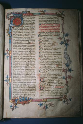
Rosa Medicinae

“A page from John de Gaddesden’s Rosa Medicinae, a 14th century work. The author is mentioned in the Prologue to Chaucer’s ‘Canterbury Tales’. This is almost certainly the earliest medical work surviving in Exeter.”
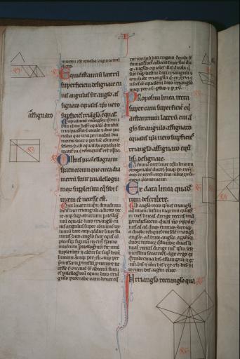
Pythagoras’ Theorem

“Proof of the Theorem of Pythagoras in Euclid’s De Arte Geometrica – late 13th century.”


Matt Turner
on 01 Feb 07Very illuminating…
Sorry, bad pun I know, I love the big wax seals dangling off the bottom of official documents such as with this land grant from the collection.
Ian
on 01 Feb 07I love those wax seals myself. Reminds me of WH40K Purity Seals (google it if you aren’t sure).
Brandon
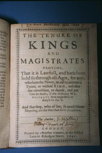
on 01 Feb 07Layouts from that time period are often stunning. Such beautiful art. Typography from the 1600’s is equally beautiful.
Its even more amazing when you consider the process to get it done. No Illustrator, no Indesign, no Wacom, heck no typewriter. Simply amazing.
Will Simons
on 01 Feb 07This site rocks!
I know you’re designers but it takes an rare breadth of imagination to blog about 14th century manuscripts when your bread and butter is project management. Or does it? After all, it took a boiled sweet for Jonathan Ive to come up with the design for the iMac – so, yes, as designers we need to be thinking with our eyes wide open, alert to even the most unlikely of sources.
You’re an inspiration, guys. Keep it up.
Dave Davis
on 01 Feb 07In high school graphics we had a couple old letter presses that required us to manually set and lead the type, so I have a tiny bit of experience in this kind of layout technique. I have to say that in many ways the technology was liberating, especially relative to the tools you mention. It wasn’t technically any more difficult, in some ways easier: Anyone with a basic mechanical understanding of the process and the ability to read could do it immediately (if not well).
On the other hand, take Guttenberg and sit him in front of a modern page layout system. The cognitive loads aren’t remotely comparable. No doubt Guttenberg could figure it out eventually, but the barriers to entry between his system and say, Adobes, are much lower on a number of levels.
Aesthetically, there are very different challenges too. Paper is atom-based, screens electron-based. Much modern print is designed purely for screens, while letter press printing and lithography are liberated from the constraints of conventional aspect ratios, and shapes, not to mention textural variation!
Very cool post guys… We can learn much from the oldest of schools! ;)
John
on 01 Feb 07I love this stuff, another cool collection, while not as old (18th and 19th century mostly), can be found here:
http://digicoll.library.wisc.edu/DLDecArts/
mimo
on 01 Feb 07The Bible printed by Mr. Gutenberg himself.
http://www.gutenbergdigital.de/
Leith
on 02 Feb 07What is it about these old manuscripts, they just take your breath away. The number of utterly dedicated people it took to write and decorate every page so lavishly, and then to preserve the book for so long… its quite breathtaking.
Jacob Nadal
on 02 Feb 07What is it about these old manuscripts
Love, patina, intention, the audacious humility of creation and communication, a human connection and hint of the divine: discovering the efforts and insights and foibles of another creature across a breadth of space and time we cannot traverse in life.
This discussion is closed.