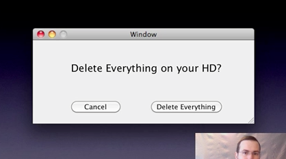
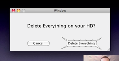
The Science of Aesthetics by Keith Lang (video) is a talk Lang gave at UXAustralia in 2009. In it, he talks about how some shapes are naturally friendly looking, like the rounded rectangle, while other shapes are harsher and more unfriendly. Here’s a cool example of how a UI could take advantage of this by using an aggressive, spiky shape:


Interesting idea. People would definitely think twice before clicking a button that looks like it’s going to carve up fingertips.

Jeffrey Tang
on 05 Apr 10Then again, could the spikiness be interpreted as friendly vampire sparkliness?
Peter J. Hart
on 05 Apr 10Awesome.
Jagath
on 05 Apr 10Great talk with good demonstrations. I loved the spiral and the squares examples very much.
On this spiky button issue, I think there is also the novelty factor. We are not used to seeing such a button, so we will pay attention to it. So, if someone overuses this shape (and creates many buttons in the UI using this shape), I would guess that the usability will suffer. The button will then no longer serve quite the same purpose.
nickd
on 05 Apr 10I’d imagine that a “spiky” button would be even more intimidating on a touch interface.
beerzie
on 05 Apr 10It’s ugly. It looks like an inept attempt at sparkliness. How about a bomb?
The Real Josh
on 05 Apr 10where in the world can I find that button, ha. I want it.
Alex Shaffer
on 05 Apr 10I like the concept but the design is ugly. We when design we use colors & symbols to accomplish the same thing. To prevent the user from making a mistake by we would design a “caution symbol” inspired button.
Keith
on 05 Apr 10This is an interesting example, because the spikes actually serve to call attention to the destructive action, rather than the safe action.
I’d gather that in this particular case, you would probably see a lot of mis-clicks (and a lot of destroyed data) as users probably tend to quickly choose the most prominent option.
That being said there is merit to this meta-perception based approach.
Anonymous Coward
on 05 Apr 10This is pretty off-topic, but I had this weird association: I was reminded of a contest by (I think) the Department of Energy to design a building-size sculpture that just looked “evil” or “bad” no matter who looked at it. A lot of those were spiky looking scary things too.
They were (are?) supposed to be used as a marker for radioactive waste sites in the Nevada desert or thereabouts. And since the waste would remain dangerous for hundreds of years in some cases, the idea was that this structure would scare off not just people who could read the written signage, but also – should civilization as we know it collapse/blow up in the meantime – the intelligent apes (or whoever) that might inhabit the world hundreds of years from now.
In any case, the point was the same: To intentionally make something that would be viscerally scary and ward people off. Admittedly the physical scale and time scale was slightly different compared to UI design, but still…
pim
on 05 Apr 10Interesting, indeed. I think to get user’s attenion we wouldn’t have to change shape so much. Changing color from standard blue (standard in Mac OS) to red should be enough.
Berserk
on 05 Apr 10Partially related: http://www.codinghorror.com/blog/2010/03/the-opposite-of-fitts-law.html
Michel
on 05 Apr 10I’m wondering. What if you really do want to delete everything. Why would a button look so aggresive and spiky if you’re trying to perform a ‘succesful’ action… ?
Johan Strandell
on 05 Apr 10The study that Anynomous Coward refers to is online here. There are images of the spiky designs there, as well.
Mark
on 05 Apr 10Quite honestly, a spiked button on a UI looks more adolescent than anything else. Even if it did work, it comes off as a “you really don’t want to do this” action moreso than a cautionary one. Hence, if an action is really going to do me that much damage, why even build that capability in to the software?
I think the more elegant approach would be to design a caution icon as part of the one button which will illicit an action you might want to think twice about—like buying any program that comes with spiky buttons.
Eric Fleming
on 06 Apr 10I wonder how long it will take for websites to start using this concept?
ex. Are you sure you want to delete this? [spiky yes]
token iPad reference: Also, when you touch on an iPad, it could vibrate a little to make you feel it. Witnessed something like this on the Scrabble game.
Nithin Bekal
on 06 Apr 10Wouldn’t people would find it much easier to understand if some sort of warning image was used instead of changing the shape of the button. I don’t think making the delete option more prominent is such a good idea.
Pies
on 06 Apr 10Or better yet, how about if we put icons at the left side of the dialog box to indicate importance of the content? Like, an information box that you can dismiss without reading would have an ‘i’ on a blue background, and a very important dialog would have a yellow exclamation mark on red background. Groundbreaking, ain’t it?
Eddy
on 06 Apr 10This is a trip but there is an unmistakable visual association to this button and the Mormon Temple architecture located here in Boise . . . no kidding. Google “mormon temple boise”
Michael S
on 06 Apr 10Ugly or not, I would pause before clicking that thing.
Dave Reynolds
on 06 Apr 10I like that…as someone who frequently has a “doh” moment after deleting stuff this is an interesting idea. Unfortunately I’m a bit OCD about the symmetry and alignment of my UIs so I’m sure having mismatched buttons would drive me crazy.
kadavy
on 06 Apr 10Wicked tattoo!
I mean. Button.
Qz
on 06 Apr 10Seems like too much focus on the buttons and less on the main problem: Modal dialog windows are %@%ing annoying, and that’s the main reason why people just click any random button, because they just the goddamn thing to go away.
If you want people to stop and think about what the buttons do, stop interrupting their damn workflow. Place the confirmation ‘dialog’ in some kind of drop down header like you get when a browser tells you it’s blocking popups on some website etc. Then people can take the time to figure out what it’s asking, because it’s no longer an intrusive UX nightmare.
Qz
on 06 Apr 10Alternatively, sticking do the idea of making the button look dangerous, why not just put a radioactive warning symbol next to the ‘delete everything’ button?
Originally I was thinking make it red and octagonal to emulate a stop sign, but there’s a problem of conflating stop with cancel, whereas the yellow/black radioactive sign doesn’t have that problem and is a pretty universally recognized sign that something is dangerous.
Marjan Venema
on 07 Apr 10@pim changing colors might be enough for you, but won’t do a thing for the color blind…
pim
on 07 Apr 10@Marjan Venema – you’re right, I didn’t think about it.
Mizanur Chowdhury
on 08 Apr 10For the spikes for a button, I see the ‘concept’ on the author’s viewpoint, however, the application on to ‘buttons’ is rather not effective in my opinion. As I see it, there is now more emphasis on a button we would like our users to avoid accidentally clicking.
Interesting post none-the-less.
This discussion is closed.