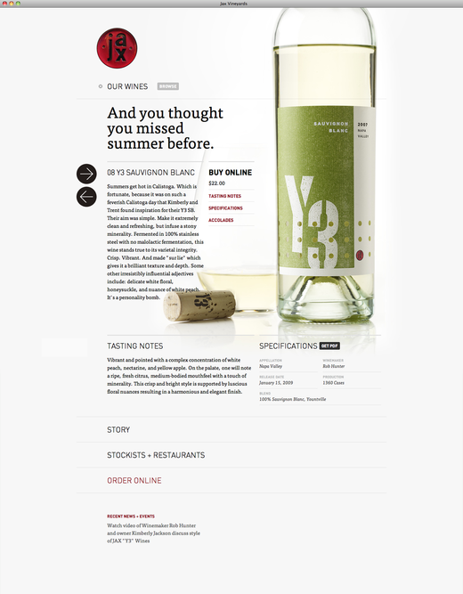
We’re digging the pretty imagery and big type at the Jax wines site. If you go to the site, click an arrow and a new wine slides in.
You’re reading Signal v. Noise, a publication about the web by Basecamp since 1999. Happy !

We’re digging the pretty imagery and big type at the Jax wines site. If you go to the site, click an arrow and a new wine slides in.
Bill Horsman
on 08 Jul 10I love the way switching wines moves left and right and going for more detail (e.g. tasting notes) moves down. Gives the impression of a big canvas that you’re moving around on.
Only comment: my instinct is that the arrows should be reversed. Clicking the left arrow move the page to the left when I would have expected it to move my view to the left. Not a big problem though: a couple of clicks and I worked it out.
peter
on 08 Jul 10nice but the order form is really bad. https://secure.hostmonster.com/~jaxviney/services/wineorder/
Mark
on 08 Jul 10Is it possible the site is done with Wordpress?
Dan Gilbert
on 08 Jul 10They made some lovely selections from Typekit.
I agree with Peter – it’s a shame the wonderful aesthetic doesn’t carry through to the order form.
Devang Kamdar
on 08 Jul 10Great Design and zippy animation of the wine display.
One Observation: I don’t know if its my browser (chrome on mac) or just me but whenever I am trying to click the “BROWSE” button/image next to first item “Our Wines”, a menu pops up making it impossible to click on “BROWSE” giving a feeling that its a bug. May be thats exactly what you are aiming for. But as a user I feel more in control if the menu would pop up if I clicked it (BROWSE) rather than just hover over the entire row. Not being able to click on BROWSE is making the whole UX feel incomplete and therefore buggy.
Tony
on 08 Jul 10I like the look but I find the typeface very difficult to read. The image is nice and big but I’m tempted to suggest it’s too big. I’m scrolling all the time, even on a widescreen monitor.
Nate Bird
on 08 Jul 10@peter I agree, the order form really isn’t up to the standard of the rest of the site.
David Kawczynski
on 08 Jul 10Love the site (save the order form) on the desktop. There is no mobile version and it doesn’t translate well.
Problem is it looks like it could almost work, maybe the thought was that the site could serve both. It can’t.
Chris Funk
on 09 Jul 10Like the look but there is so much wasted whitespace in the top half. Jacob Neilsen would not be proud :)
Jason Weathered
on 09 Jul 10A nice selection of typefaces.
Did anyone else notice the Portal reference in the page source?
cant comment
on 09 Jul 10can’t comment
cant comment
on 09 Jul 10I can’t comment on some of the other posts (like the one about :hover). Nowhere does it say posts are closed but for some reason the comment is never sent.
anyway:
Future tablets will have heat and proximity sensors so when you put your finger close to the screen but don’t touch it it will detect that your finder is “hovering” over an area of the screen and activate :hover. - former factory supervisor
Peregrine Solus
on 10 Jul 10Form at the expense of function.
Devang Kamdar
on 10 Jul 10also I should have mentioned in above comment, but for me the confusion is created because pop-up happens when mouse is hovered over entire row rather than just the “BROWSE” button. I tried in safari/chrome/firefox on mac – all giving me same behavior.
@”cant comment” – thanks for noticing … for a moment I thought everyone is ignoring the comment as if it was a noob point :)
This discussion is closed.