Here’s a quick anti-pattern (an anti-pattern is something you want to avoid) that I occasionally catch in our markup and CSS.
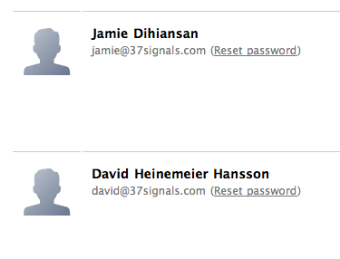
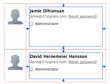
I opened some code for a new user management screen we’re working on. This excerpt of the users screen shows an avatar, the user’s name, their email address and a reset password link.
The avatar is in a container, and the user info is in a container.
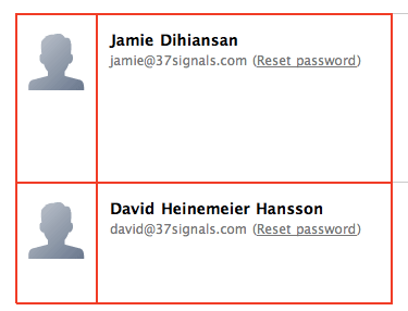
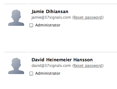
I wasn’t familiar with the code when I opened it, so I assumed the interior white space came from padding on the container. I wanted to add an “admin” checkbox below the user info on the right, and I expected it to align flush left with the name and email. But that’s not what happened.
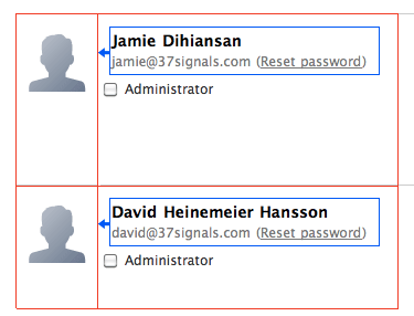
The checkbox didn’t line up with the text above it. It turned out that the container didn’t have any padding. The text was in its own nested container with a left margin.
This is one of those cases where “it worked” at the time, but as soon as the design needed to change, it broke. This kind of thing makes change painful because you can’t just pop in an element. You pop in an element, but then you have to dig around to see what the margins are supposed to be, move the margins in the right place, and shuffle styles around until the block looks how it should.
To prevent this, I advise thinking about styles as “rules” and “exceptions.” If an element inside a container has padding or margin assigned to it via a CSS selector, that implementation is telling me that the element is a special case. It’s not following the default flow. For some special reason, it needs different spacing. On the other hand, if no elements inside a container are going to look right without the spacing adjustment, that styling should be a “rule” on the container. It should be a constraint for whatever goes inside that container so the design naturally handles additions and future changes.
It also helps to think: which parts of this design are the “room” and which parts are the “furniture”? You should be able to move furniture around without worrying about the walls and volumes of the space. The CSS should be set up in such a way that your space is a constant and you can easily move elements around as you improvise and improve a design.
Back to my project, a quick refactoring moved padding to the container, and going forward this element will handle anything we put into it. Future designers won’t have to think about the containers.
Try keeping these distinctions in mind the next time you’re styling a layout so that future changes are easier to make.
Daniel Genser
on 13 Jul 10Glad to see this is a common problem others design themselves into at times. Thanks for the walk through on how you approach being proactive about the solution.
T.J.
on 13 Jul 10Depending on how your widths are defined and how exact they have to be in situ, the new solution will bring up some box-model problems. The padding on the container will make the boxes wider and taller in FF and Safari (by the amount of the padding), but stay the defined dimensions in IE.
Putting the margin on the child elements is arguably the “right” solution considering the known box-model issues, and can still be solved as a “rule” using the CSS child selector—for example, div.parent > * { margin: 5px; }
T.J.
on 13 Jul 10Actually—I take it back.
The box-model bug in IE only shows up in quirks mode, and it looks like all of your pages are triggering standards mode, so my point is moot.
Long Live the Solution.
Paul S
on 13 Jul 10I’ve run into quite a lot of these problems. In my own code and that of others. For these layout “bugs” Firebug is extremely helpful! Can’t live without it.
Michael
on 13 Jul 10Hi Ryan
Good article, but I really like your analogy with furniture. This makes it so much easier to remember.
Michael
Niero
on 13 Jul 10Remember when table cellpadding did this automatically without 300 lines of DIVs and external style files … and it worked exactly the same on every browser?
I can’t wait until CSS becomes the next Frameset
Hibiscus
on 13 Jul 10I love this post, not for the main message you wanted to get across to developers, although that is great as well, but for the diagrams that show why the code gave you the unexpected result.
I am going to bookmark this and use it to illustrate to clients who are only familiar with print design why sometimes “just moving this little thing a tiny bit over this way” is sometimes really HARD, because of how the page is coded, even though in a print design it would be trivially easy.
Thank you!
Chriztian Steinmeier
on 13 Jul 10Excellent post Ryan.
@Niero: Yeah, right – show us where “300 lines of DIVs” was necessary for that, please…
Kyle Fox
on 13 Jul 10Ah, but what happens if you want to make something span the entire width of that container?
You might not need to that in this specific case, but I’ve ran into situations where, in an effort to be clever, I’ve added consistent padding around the whole perimeter of an element. If I have to go back and make an element 100% of the width, it’s quite annoying; you need to toy with negative margins, etc.
There’s always, always a tradeoff.
Tim
on 14 Jul 10That’s exactly the problem I am running into now. I am revisiting some old code and need to change it to add additional elements to the layout. Basically, I’m throwing most of the CSS (and even a lot of the HTML) away and starting from scratch… Simply because in the beginning, I only positioned the existing elements one in relation to the others, instead of identifying general areas and creating them in code, placing the elements inside those areas. Thanks for this post, it’s nice to see that even professionals like you make these “mistakes” (or shall we say, “learning processes)”.
Todd Zaki Warfel
on 14 Jul 10Why not just place the Administrator checkbox inside the container that holds David HH and call it a day? Problem solved.
Pete Schuster
on 14 Jul 10@Kyle Fox true, but like he said, he was expecting it to be just a case of padding because that would have been the best way to initially code it. If another case were to arrive that need span past the padding, the coder would know where to look, not trying and figure out why theres a random left margin on an element.
Scott WIllman
on 14 Jul 10I always solve the problem by placing a container div inside each of those panes. That way I can set a hard dimension to those divs while placing a width:100% and padding:6px in the intermediate div.
Keeps solid size and gives consistant padding to children. Easy-Peasy.
Ryan
on 14 Jul 10@Scott I often use that same pattern (of nesting a div for padding). I think it’s a holdover from IE6-era browser testing since the combination of width and padding was unpredictable. It’s somehow easier to have width on one element and padding on the first child.
Scott Willman
on 14 Jul 10@Ryan It is. Though it does feel a little dirty to use an intermediate ‘container’ just for layout stability… ...but when it works, it works, right?
It’s nice to see you guys do posts that get into specifics every once in a while. Don’t do it too much though, you’ll just be starting debates :)
EH
on 14 Jul 10Yikes, am I the only one thinking ‘divitis?’
David Cole
on 14 Jul 10@Kyle Fox I think too many designers are afraid of negative margins when they don’t need to be. They can cause problems when used for complex layout/float arrangements, but they’re actually fairly reliable in simple cases (such as the one detailed in this post). I make frequent use of negative margins precisely because of the model outlined in this post: CSS as a set of rules. CSS handles that way of thinking pretty darn well.
Jarin Udom
on 14 Jul 10Time for some fun with `git blame` :)
Bryan Sebastian
on 14 Jul 10Ryan – I really like the room and furniture analogy as well. I had to make a note of it. That is a very practical way of thinking while developing. Thanks for the insight!
Ryan Cannon
on 14 Jul 10This is a nice concept, but I rarely find it works in practice, especially when you’re working with a designer. Usually design guides specify things that don’t work well with HTML—my personal favorite being the top of an image lining up with the visual top of the text regardless of its required line-height.
It always seems like what I consider walls and doors, designers treat as a wheeled ottoman.
Cappy
on 16 Jul 10errr…. just throw the admin checkbox into another container also left aligned and move on. While you’re farting around with that checkbox your competition is adding a FEATURE. These are tough times.
I’ve been here a while and you guys have some great stuff. I really have gotten something out of reading this blog almost every time I stop by, but I think you waste so much time on some of this nit-pickin artsy fartsy stuff that has no value to your customers, that you should be ashamed of yourselves.
If you worked for me (and you don’t – in fact you can prolly buy and sell me as sundry effects) and I heard or saw a group of you bickering over the use of the word “really” more than once in a sentence… I’d tell you to get back to work. lol :)
If you lost 1 customer over that checkbox I’d be surprised, and if you did that’s a barometer of a vastly different issue and not directly related to the checkbox.
Now you might say, well times that checkbox by 100 and if we ignored those hundred little nit-pickin artsy fartsy things it would change the flavor of what it means to be 37signals. I would answer true, but you need to figure out who made those 100 errors and fillout a Corrective and Preventative Action Report (CPAR) and start the retraining process.
This discussion is closed.