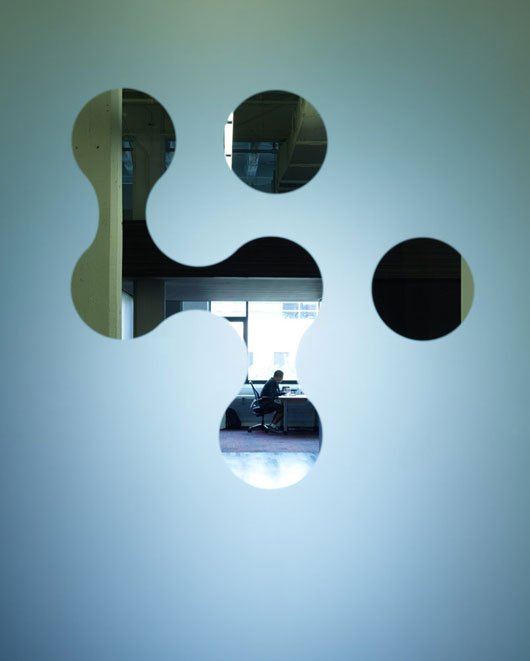
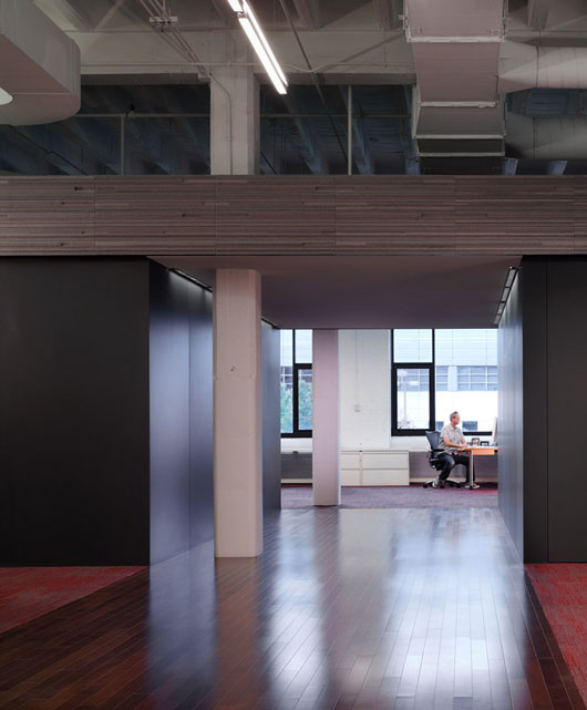
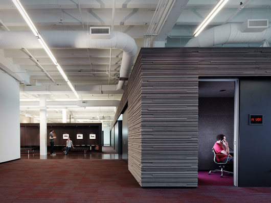
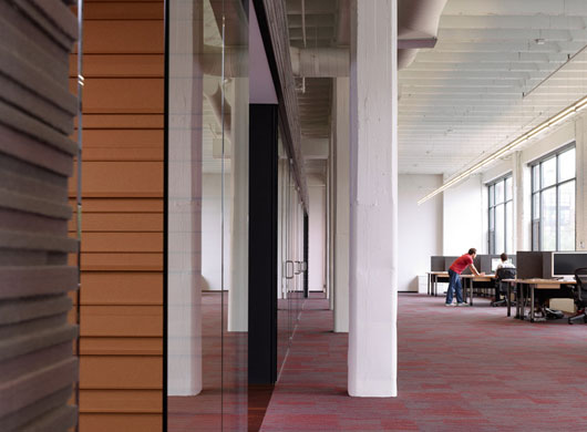
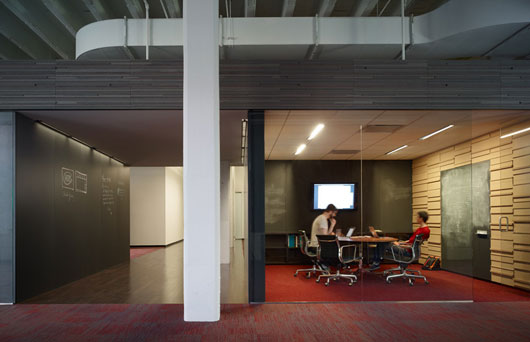
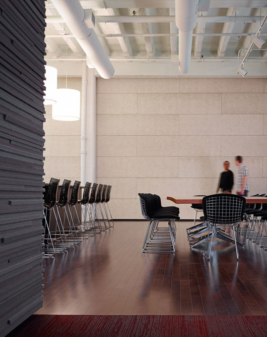
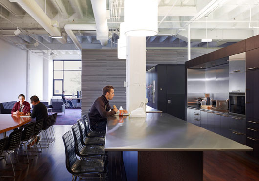
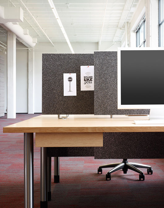
Just got the official shots of the new office back from the photographer. There are a few more coming, but we couldn’t wait to share these.
The chief architect was Brad Lynch from Brininstool, Kerwin and Lynch. The general contractor was Goldberg General Contracting. The wood millwork, cork and felt walls, desks, and blackboard walls and doors were built by hand by the incredible crew at Stay-Straight Manufacturing. The photographer was Chris Barrett. Down the road I’ll write up a more detailed post about the people who worked on this project. They were all incredible to work with.
And here’s a rough video of some moving pictures:

JBagley
on 01 Oct 10Pretty average. :)
Daniel Kjeserud
on 01 Oct 10That looks awesome! Man, I wouldn’t mind working there!
maz0
on 01 Oct 10WOW…looks nice
Rick
on 01 Oct 10Gorgeous office! Good job on it. It’s so HUGE…..who are looking to hire now? ;-)
James Deer
on 01 Oct 10Fan-bloody-tastic!
Love it.
Maximo Migliari
on 01 Oct 10Awesome work guys. The office looks amazing. Industrial look, yet cozy and warm. I loved the soundproofing. Seems like you guys spent a pretty penny getting all that in there.
Looks like a Google office, but better :)
Manuel
on 01 Oct 10Wow, very nice office! I like.
Terry Sutton
on 01 Oct 10Some great unhappyhipster moments here
At first, David felt isolated from the others. Within just a few short weeks it occurred to him that eating alone helped improve digestion and thus reduce afternoon fatigue.
Matt Kempster
on 01 Oct 10A very pleasant working environment. Lots of space, to say the least.
peter connor
on 01 Oct 10Guys,
It looks like a lonely place with a strict clean desk policy. Ok ok ok what you need is someone fun with a big voice. Mail me back flight details I’ll start packing.
Pete
JF
on 01 Oct 10Love that site, Terry.
Libo
on 01 Oct 10Does Jesus comes by sometimes in there?
Robert
on 01 Oct 10drool
Ola
on 01 Oct 10Cozy minimalism is not something you see everyday. The panelling works great especially with the room in room. Hat off to the architect.
Prescott Perez-Fox
on 01 Oct 10That’s a ton of space for such a small company. Are you sharing the floor with other companies? Or have you grown much larger than I thought.
Unixmonkey
on 01 Oct 10Interesting to see a number of new fit-outs have a kind of modern 70’s deco look with the tans and browns, stainless steel & glass.
Jamie
on 01 Oct 10Very stylish and utilitarian… like a modern university library, but without stacks of books and people.
Blain Smith
on 01 Oct 10My favorite part is the private phone rooms with the bulb hanging there. Very old school. Nice work!
Frank
on 01 Oct 10Looks awesome. Must be a good feeling to have built an office from scratch and finally work there every day.
One thing isn’t really for me though. The desk in picture 8. The colour of the wood and the pole are a little bit off in my opinion. https://37assets.37signals.com/svn/newofficeshots/_1027201931.jpg
Jeff Mackey
on 01 Oct 10Very nice. Congratulations on your success!
Christopher
on 01 Oct 10It did not escape us that you could not resist the tempation of making the pun you mad in the headline of this blog-entry.
CK
on 01 Oct 10I like those desks, can you share what make / model they are?
Jacob
on 01 Oct 10Looks cold and bleak
Davide Alábiso
on 01 Oct 10I’m speechless. Beautiful.
FredS
on 01 Oct 10Congrats guys! Looks awesome.
Danijel Šivinjski
on 01 Oct 10Very nice, I like huge workspaces.
Beth
on 01 Oct 10How sheez, how many square feet do you have? 37,000?
Doug Anderson
on 01 Oct 10Looks great. I would love to hear the thought process behind all the details of why you chose the materials and layout that you did. Fascinating!
Jeff
on 01 Oct 10Nice stuff. Does Coudal get to share your space now?
Daniel Nathan Stoddart
on 01 Oct 10“Perfection is achieved, not when there is nothing more to add, but when there is nothing left to take away.” ~ Antoine de Saint-Exupéry
Sean McCambridge
on 01 Oct 10Beautiful. I’m moving to Chicago. Y’all need a junior developer or janitor? :)
Ricardo Sanchez
on 01 Oct 10It is open, simple and gorgeous, and the best thing it does not look like “the office”.
Congrats, you guys did an awesome job with the space.
Cavica Magazine
on 01 Oct 10Absolutely amazing! What’s the cupboard with a phone in? It looks like an interrogation room? Or is it a phone room?
Nick Satkovich
on 01 Oct 10Congrats! The space looks awesome!
benoit
on 01 Oct 10Incredible ! ... [FR] Du très bon travail ! :)
Brade
on 01 Oct 10Pretty schweet space, although I’d add some art. Couldn’t help but compare and contrast with this other recent article about the new digs of Level 5, a game company in Japan: http://www.1up.com/do/blogEntry?bId=9057776
Don Schenck
on 01 Oct 10Nicely done. I have a fantastic office myself (in my house), and I appreciate the difference the right setting can make.
And @Terry Sutton: Comment OF THE YEAR!!! +Infinite!
BobbyAdamson
on 01 Oct 10I was looking for pictures of the new office a couple days ago! So sick!
Joshua Pinter
on 01 Oct 10That is incredible. I can see you’re using plenty of “white-space” to clear you minds when you work. Tons of breathing room there.
Video needs an epic soundtrack to go with the beautiful imagery.
robin
on 01 Oct 10very nice and european/nordic, but what does the company do?
Anonymous Coward
on 01 Oct 10Gorgeous, now where is the work?!?
Aaron M
on 01 Oct 10That looks very nice Jason, you guys thought this out well. Looks very spacious, like you can have good privacy while working.
ryan beale
on 01 Oct 10The new office looks great, guys! Just want to say that I love your book Rework and wish you well on continued success.
Best, @RBeale
Olivier BONNAURE
on 01 Oct 10HE HOOO … HE HOoo… he ho…oo. You don’t have echo ?
Very nice anyway ;)
AC/DC
on 01 Oct 10Luvley :) I just didn’t get what was the reason not to hide all that ugly ventilation pipes and other stuff with some plain stretch or suspended ceiling.
Joe
on 01 Oct 10Congrats guys, looks like a great space!
Tadas
on 01 Oct 10Amazing office, very elegant. What is that room for which has the sign “in use”? Is it like a phone booth or a restroom? :D
Rob Brown
on 01 Oct 10Looks nice… based on the photos, it looks like the space is “waiting” for something. Long uwa shots of the workspace contrasted by walls, carpet and light make it seem a bit cold and lifeless.
I’m not knocking the photos, they’re very nice – but I don’t know much about 37 Signals as a company – is this how things are? A handful of people in a wide open space? Might be cool but it feels a bit lonely.
Robert EVans
on 01 Oct 10Beautiful attention to detail while still keeping it simple. I love the chalkboard!
So, if I happen to be in town, any chance of being able to stop by and take a peek? :)
JF
on 01 Oct 10I like those desks, can you share what make / model they are?
They were custom made.
Absolutely amazing! What’s the cupboard with a phone in? It looks like an interrogation room? Or is it a phone room?
There are three small “phone rooms” for people to make private calls. When someone is inside the “In Use” light comes on.
Pretty schweet space, although I’d add some art.
There will be, in time. Still looking into some options. Over time the space will warm up with personalization – it takes time. I don’t believe you can start out with an exceedingly personal space – personality is layered in over time. Personality is patina.
That is incredible. I can see you’re using plenty of “white-space” to clear you minds when you work. Tons of breathing room there.
That was one of the key requirements – a lot of space for everyone to stretch out, breathe, and not feel cramped while they are working. Just about every office I’ve been in feels a bit too cramped for my taste.
teeray
on 01 Oct 10I’m curious what the “in use” sign is for too, Tadas.
Napoleon Suarez
on 01 Oct 10Has a really nice minimalism feel. Thanks for the inspiration.
Spencer Fry
on 01 Oct 10I thought our new office looked good: http://bit.ly/a0mp6S Congrats, @37signals on yours. Stunning.
jpcyr
on 01 Oct 10Very nice. I’m happy to see there are blackboard walls in conference/meeting rooms and some corridors. Blackboard walls bring the sketches at a human scale. The size of the chalk force to never go into too much details in your sketches, letting your mind only focus on the big picture to find the best possible solution for the problem/task to accomplish. The size of blackboard let also everyone participate and see. It makes also great piece of art (refreshed with new ideas are dawned onto in ;)
In my mind it is one of the best creative and communication tool that exist. I’m using it all the projects I’m working on. I wrote a post about how I conceived interactive solutions with them.
Ernest Semerda
on 01 Oct 10Both thumbs up. Definitely a great environment to stimulate the creative mind!!
Jan Willem Tulp
on 01 Oct 10Wow, very beautiful!
jonathan frei
on 01 Oct 10It looks to me like you’re going to need more employees to fill up all the space…
Nicole
on 01 Oct 10Wow, that’s a cool space. Loved the single hanging light bulb in the phone rooms. It looks good, but also strikes me as a humorous choice (in a good way) given the size of the room and resemblance to a movie-style interrogation room.
Also, props to Terry. That picture was screaming to be unhappy hipster-ized.
jake nickell
on 01 Oct 10you guys should get a soft serve ice cream machine in the kitchen!!!
Phil
on 01 Oct 10These pictures belong in Dwell magazine, and of course they should be submitted to the site UnhappyHipsters.com – as Terry says above.
Alright, I saved you the work. I just went and submitted these photos to the site.
Bill
on 01 Oct 10Holy expensive office space batman. Business is doing really well, you guys deserve it.
Jane Quigley
on 01 Oct 10I really love all of the windows and that natural light streaming in, but those lighting fixtures (in the photo where David is eating) are exquisite.
Tommy C
on 01 Oct 10Work for 37 Signals: No Equity, but a kick-ass office!
BillP
on 01 Oct 10Was fortunate enough to be there last Friday. It’s beautiful, and roomy, but it’s not outrageously big in real life – it just looks that way. Kudos to the Architects & Designers.
It’s a wonderful use of space and windows and light. I really loved the Theater & the Lunch counter area.
By the way – Michael B is a very gracious host. He gave me (and probably eveyone else too) the full guided tour.
Alfonso
on 01 Oct 10Somebody call UnhappyHipsters.com.
jtd
on 01 Oct 10Really nice place but I’m a bit baffled why you’d spend so much energy/focus/resources on building all this from the ground up, especially with all the custom work. It seems like a huge, unnecessary distraction for a company whose employees regularly telecommute and whose clients would rarely visit (as opposed to a law firm for example).
Great work though. Cheers!
JF
on 01 Oct 10jtd: It wasn’t a huge distraction, it was a joy. It was a chance to reward ourselves for 10 years of hard work.
In our work, we think the details matter. We believe in craft. So we wanted the office to reflect our love for the details, but in a physical sense. Almost all the materials were custom made or designed/assembled by hand. We wanted to be surrounded by that kind of craftsmanship. I believe more you appreciate the things around you, the more they begin to influence your own work.
We believe this office will make us a better company on a variety of levels. Time will tell, but so far it’s already had a great positive impact.
jtd
on 01 Oct 10Gotcha. Makes much more sense now after thinking about it from your perspective.
Cheers!
Felipe Cerda
on 01 Oct 10It looks really cool. Congrats for the new office!
Chris
on 01 Oct 10Woah, the architects you guys uused have a usable website—amazing and appropriate!
Also… the office looks really nice.
Andrew
on 01 Oct 10Excellent and inspired design.
thomas
on 01 Oct 10any particular reason your desks don’t allow you to both sit and stand in front of them? i am also very surprised at the chairs. they look super-uncomfortable. but the size of it all is impressive.
Stephen Jenkins
on 01 Oct 10Being a bit of an espresso nerd, I gotta ask what the coffee setup is like – machine? grinder? drip? french press pots?
Dylan
on 01 Oct 10Beautiful. I especially love the interesting textures, colour and open space. Congratulations on your success and your new office – I hope you enjoy it :)
John W
on 01 Oct 10The new office is elegant but simple, i like it. The space matches the great products being made.
Jeff T
on 01 Oct 10Jesus, I thought you had already brought enough of Denmark to the US… :)
Randall
on 01 Oct 10Since the team isn’t all in one place, and you probably left some room to expand, how full is the office usually?
Or, since that’s subjective, how many people come into the office on a typical day?
(My favorite touch is definitely the chalkboard wall.)
Scott
on 01 Oct 10Great job. Looks nice and fits your company ethos and products.
Question: In the raw footage video, what’s on the chalkboards from 1:03 – 1:09 where you’re working through “inbox”, “archive”, and “triage”? I like how you’ve crossed out thread, exchange, settled on the term “Story” because – and this is the part I like – “A story should have a happy ending.”
Merms
on 01 Oct 10When do I get to come over and do some cooking? Speaking of cooking, where is the kitchen?
Eatup Drinkup, Merms
draix
on 02 Oct 10Congrats!. Great Rockstar environment ;-)
Edmundito
on 02 Oct 10You guys are some posh mother f’ers, and I’m pretty jelaous of that.
Espree
on 02 Oct 10The new office is freakin huge. Where’s the workshop area tho…?
Lars Fischer
on 02 Oct 10Why do you build such beautiful (and expensive) offices when you don´t have many employes and almost all of them work remote :-)
El cunto
on 02 Oct 10Who’s “billy no mates” eating his lunch alone?
Alessandro
on 02 Oct 10It’s a very horrible place to work. It seems like 37S are so new in thinking about software and so old in thinking about people environment. “Peopleware”, the way to go. This seems a place where only the Owners can work not seen.
Dafydd Rees
on 02 Oct 10The office looks beautiful – but in the understated, simple way that’s become the trademark for 37signals.
Just one thing though: desks with cubicle dividers(?)
I though Jason Fried didn’t like people being distracted by interruptions. Cubicle partitions are the worst compromise: You neither have privacy nor a collaborative team environment.
I’d have predicted 37 signals would have chosen to have private offices…
I’m pretty confident 37 signals could afford private offices if they want so is there a reason why you chose cubicle dividers?
Mauro Zadunaisky
on 02 Oct 10Great place! You corious: Why did you choose a blackboard instead of a white one?
brmore
on 03 Oct 10I love the open / whitespace in here. Great feel.
DemoGeek
on 04 Oct 10I was also expecting a bunch of total private offices and a nice relaxation area with sleep pods and such. Anyways, those huge displays look cool!
Igwe
on 04 Oct 10wow. can I have a job. looks like a livable modern musuem.
Paul
on 04 Oct 10SPACE! A lot of it! Great, guys.
Jack
on 04 Oct 10Joel Spolsky must be jealous!
Mike Rohde
on 04 Oct 10I can verify that this space is very beautiful but also livable and comfortable.
I was in last week to create a chalk mural on 5 of the chalkboard panels (see the hallway in photo 2).
Flickr set: http://www.flickr.com/photos/rohdesign/sets/72157625062741838/with/5043612368/
Video: http://vimeo.com/15416098
You’d think for a large, open space it would be noisy, but it wasn’t. It was very quiet. To compensate for the hard surfaces, many of the walls are covered in cork to absorb the sound.
Natural light along the north edge of the space is pretty amazing, and that light filters into the glass doors of the meeting rooms opposite the workspaces.
Probably my biggest positive is that the space, while appearing large and spacious, feels proportional and human. Best of both worlds really, with seeming spacious to the staff while not feeling like you’re in an airplane hangar.
Tim
on 05 Oct 10Sigh. Jealous, much.
Jean-Pierre Bobbaers
on 05 Oct 10@Jason
What is the brand or link to the product you use for the walls. In your previous post (office details) you said: “They also came up with the stacked cork/felt concept which is great for acoustics and a unique look/feel”
I can’t find the material (google) even if I am an interior designer myself :-( I would like to use it in my new office/loft
Thanks
JP
Adam
on 05 Oct 10Now that’s what I call an office!! Amazing!
Phil Lindsay
on 06 Oct 10Loving this edit of the office tour by @mattjones – 237 Signals (YouTube)
This discussion is closed.