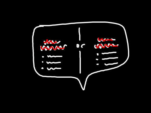
Rejected design idea. Required someone to think too far ahead. Made something simple appear complex.
You’re reading Signal v. Noise, a publication about the web by Basecamp since 1999. Happy !

Rejected design idea. Required someone to think too far ahead. Made something simple appear complex.
George P.
on 19 Jan 11Strokin’ the ego a bit much, no?
[email protected]
on 19 Jan 11I don’t get it.
Maz
on 19 Jan 11Qué ?
Makes me think of the so called “best critics” => best negative / best positive about a movie / product…
But yeah an explanation would be much welcome there !
Nate
on 19 Jan 11I don’t get it either. Could you do a blog post explaining this?
Jon
on 19 Jan 11Whoa, deja vu- that looks exactly like a design we just refined for the same reason. (selecting a member type)
George
on 19 Jan 11How do you not get it? There was some element of funneling a user through a process, and the option here was eliminated because it just added more complexity.
At least, that is what this seems like. I may be completely wrong.
MC
on 19 Jan 11I get it: Given two roughly equal options, I can’t decide which one I fuckin’ want. Since neither option rises above the level of the other, fuck ‘em both. Rejected.
EH
on 19 Jan 11This tells me maybe 37S discovered that A/B testing can’t be done just by lookin’ at ‘em.
Rodrigo
on 19 Jan 11Rejected this blog post idea. Required someone to think too far ahead. Made something simple appear complex.
John
on 19 Jan 11I think it’s a great idea! It’s so clear. Either choose the thing or the thing. It’s all there in black & white (and red). I, myself, will be acting on choice A or B immediately because it seems to be the best fit for my needs. Job well done. Communication achieved!
No wait…. I have no idea what this is about. Nevermind….
Beerzie
on 19 Jan 11?
BradM
on 19 Jan 11I guess it would depend on the ‘copy’ which is part of the design as well isn’t it?
I’m going through this EXACT same scenario right now to be honest.
Try using Dribbble for some inspiration, but really, having a User choose between 2 options (using a 960px grid wide) space seems somewhat difficult for me.
Then again, I’m not a designer. I just pretend to be.
Curious to see your final design/copy.
Olivier
on 19 Jan 11I think he meant that he rejected a design idea (maybe the one illustrated above) because the designer thought too far ahead and made a simple idea looked overly complex.
For example, you could have a simple form to reply to an email with a Save and Cancel buttons. But thinking ahead, you could add all kind of bells and whistle to format the text, to have grammar validation, to do all kind of stuff which could prevent the UI to be clean and simple …
At least, that’s my interpretation.
winston smith
on 19 Jan 11it looks like a teary-eyed alien.
Richard
on 19 Jan 11Lots of noise in this post. Little signal.
Red Feet
on 20 Jan 11I prefer this image to illustrate the need to think ahead Think Ahead
This discussion is closed.