Feedback is an essential part of software user interface design. It’s especially true when designing applications for current mobile devices. Tapping a touch screen is less precise than clicking with a mouse. Touch screens also lack the tactile and auditory feedback of a physical key or button. Slow, unreliable cellular data access adds to the confusion. A user might wonder: Is the app broken or do I have a poor connection? Was my tap registered or did my fingers miss that tiny button? Making sure users get clear feedback in response to their actions and to changes in state or conditions is key to a great software experience.
When we designed Basecamp Mobile we decided to use a variety of methods to keep people informed about the current state of the app. Different conditions can require different feedback, so we had to carefully consider multiple types of feedback. Here are some examples:
Touch
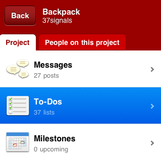
It was important for us to make taps in the app feel responsive. Even if there could be a delay before the associated action executed it was essential that the user knew the tap was successful. Anything that can be tapped in Basecamp Mobile has a selected state that highlights the item immediately when the user touches the screen. Here you can see how a selected item on the project screen:
Loading states
Basecamp Mobile is an HTML5 app that uses local storage to cache both content and the app itself. The app runs entirely in the browser, rendering HTML with Javascript and loading only your account content from the server when needed. Each screen has a number of states depending on the status of the screen’s content. A single loading indicator wouldn’t cut it—the feedback had to be appropriate to each situation. Here are some of the states we had to consider in the design:
Initial load
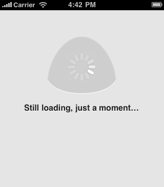
Basecamp Mobile is loading assets the first time you run it or when the local cache is empty. The large animation is the only element on the screen making it the focus. The lack of any other UI elements makes it clear that the only option here is to wait. Because people see this before they see the app, it’s even more important that we let them know what is happening.

If this initial load is taking too long we let the user know. After a short wait, the app reassures people that it’s still working.
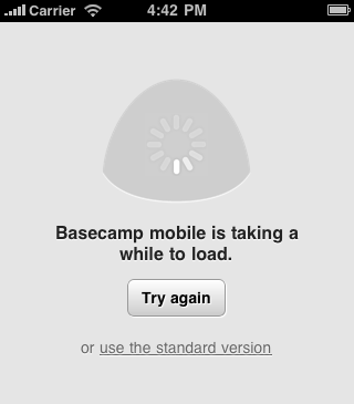
If the screen still doesn’t load after a few more seconds the app offers some other options: Refresh the browser and try again or try the standard version. The latter option is useful for users who may be attempting to load the mobile optimized version on an unsupported device and need the option to switch back to the normal version.
Loading content
In the next state, the app has loaded and the UI is now available, the app is only loading content now. The user can always cancel the action and go back to the previous screen. You’ll see this the first time you load a screen that you haven’t loaded before like a newly posted message.
Refreshing content
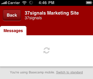
Basecamp Mobile caches screens as you visit them so going back and forth between them is nearly instant. Because the data could be old we need to check the server for changes, new items, new comments, etc. The screen might be perfectly fine, or it might need to load in changes. While this is happening we show a small, less prominent indicator. The page is fully functional but we want to let the user know that we’re talking to the server. This indicator isn’t in the user’s face or in the way of what they’re doing. It’s just a notice that the app is working and if you’re expecting something new, we’re checking. You can see the spinning icon in the upper-right of this screenshot:
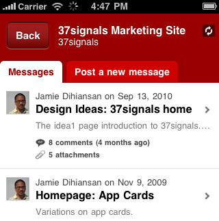
The icon actually duplicates the functionality of the browser’s own loading spinner (visible in the top toolbar in the screenshot above) but we felt like people were likely to ignore or completely miss it. The approach brings the loading indicator a little closer to the action without making it more intrusive.
Loading previews
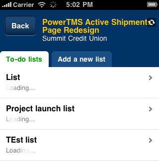
We took a similar approach with the To-do Lists screen. For each list we wanted to show the first few items on it. This makes it clear these are to-do lists and helps people identify the one they need. The previews load after the page is available because the content is helpful but not essential. A very subtle effect doesn’t distract but makes it clear something is happening. A series of spinners would have overwhelmed this screen, but the subtle gradient shine moving over the word “loading” informs without distracting.
Final thoughts
Presented like this it may appear that the app is just a series of waits, it’s not. Most of these indicators are actually on the screen for just seconds, but that is sufficient time to quiet a user’s doubts and ensure they know things are working. It feels great to click through the app and always feel like you know what’s happening, that things are working.
We use prominence of these indicators to tell people how important it is that they wait. The amount of surrounding UI is a clue about what else they can do if they don’t want to. You certainly have to wait for the app, itself, to load. But you can pass right by a To-do list that’s fetching a preview of it’s items. Just the right UI feedback makes sure users know this without having to think about it.

Ryan Swarts
on 14 Feb 11Great points. I think feedback is more important than ever with the explosion of mobile. One of my biggest complaints? Websites that don’t optimize their drop-down navigation for mobile devices. Because there is no such thing as a “hover” on a touchscreen, these extra links are totally inaccessible.
dusoft
on 14 Feb 11Ryan: turn off the Javascript support and you will get the dropdown links shown as a list (usually, for any website adhering to the web standards)
Ahmet Ardal
on 14 Feb 11Thanks in advance for useful tips.
Carl
on 14 Feb 11This design is far better than most mobile apps I work with! I would still prefer “Loading” on the first screen (the huge animation is a little disconcerting without any text whatsover). In December I blogged about the development of feedback in standard applications: http://guijournal.com/2010/12/1-2-3-help/
Pablasso
on 14 Feb 11The ToDo list is useless if you have a long list. Takes ages to load, if you’re lucky that it didn’t freeze.
JZ
on 14 Feb 11@Pablasso
I’m sorry it’s slow for you. We are working through some performance issues on accounts with lots of active projects and exceptionally long to-do lists. We’re hoping to push an update soon. Thanks for being patient.
Team Buto
on 14 Feb 11Amen – too often visual feedback is ignored, or tied to the event success. This is the kind of attention to detail that needs to be applied, yet so few do. Nice work.
Tim
on 14 Feb 11Just finished V1 of my first iPhone app. Wireframing (hat tip: Travis Isaacs and his Keynote wireframing kit) V2 now and feedback is at the forefront of design. That, and context (thanks Signals for Getting Real and Defensive Design).
Moving on to mobile web app version and this sort of stuff is of paramount importance.
Prescient timing once again.
JZ: how do you measure or decide when you’ve done enough optimisation and tweaking. Like, at some point any extra effort derives marginal utility and usefulness, keeping in mind the mobile network has latency.
In Aust, I am on Telstra which is a premium 3G network (think 7Mbps in the back blocks of regional AU), so for me, Basecamp is fast. It’s actually slower in the city where network contention is higher.
So, yep, how do you decide when enough is enough?
Joshua Pinter
on 15 Feb 11These loading and wait screens often get overlooked, along with error messages, when working in development. It’s good to see you guys did real-world testing.
I might suggest making the page loading icon (spinning arrows) more prominent. It’s easy to miss as it is.
JP
John
on 15 Feb 11Are you using web sockets or polling for data transport?
Devan
on 15 Feb 11Thank you for posting this – It’s great to see such an often overlooked part of an app being focused on in such a positive way.
We all as programmers wish/assume that our apps will load and respond in a millisecond on any processor. User responsiveness is the final 5% that will dictate whether your app will be dumped or pumped by the end user…
JZ
on 15 Feb 11@Tim – Support load is a good indicator. It gives us an idea of how many people are effected and how to prioritize them.
Eric Anderson
on 15 Feb 11I would be interested in how you approached the development of this project. It is a HTML5 app so you are using a lot of technologies you normally use. But the design is a complete change. Most of your existing apps the real work is done server-side (Rails encourages this) and client-side coding is mostly embellishments. This app flips that around. The server is a dumb data store and the real smarts are all client side.
Did Rails support this type of development well or was that a battle? Does this run as a separate app (server-side) or do you have one app that is handling both desktop and mobile?
So many other developers use the same stack and philosophy you do. It would be interesting to see how you approach the building of a mobile app.
Pavol Galovic
on 15 Feb 11Guys, do you know about UI problems on the iPad? Every time you move from one view to another, all elements on the page are blinking – looks terrible :(
Let me know if you need more feedback!
Pavol.
Guy
on 15 Feb 11Thanks for the look. One question, when you get to level 3 of the initial screen (loading icon, message, and try again button). Should I assume that Basecamp is still trying to load? The throbber is still rolling so I’m assuming yes, but wasn’t 100% sure. Just checking that if I didn’t do anything (go to standard version or click the try again button) the page would continue to try and load?
Kenn
on 15 Feb 11Always great and inspirational posts :)
JZ
on 15 Feb 11@Guy – yes, it continues to load. The feedback is just to let you know what is going on and what other options you have.
Fred Carlsen
on 16 Feb 11JZ: The ‘Try Again’ still confused me a little, leading me to believe that it has failed, even though the text says otherwise.
Angela Randall
on 16 Feb 11You said “Presented like this it may appear that the app is just a series of waits, it’s not. Most of these indicators are actually on the screen for just seconds, but that is sufficient time to quiet a user’s doubts and ensure they know things are working. It feels great to click through the app and always feel like you know what’s happening, that things are working.”
Thinking of these small details – some of which the average user might not even see – is what separates a “good enough” user experience from a thoughtful, elegant solution. It’s not enough to just create something that’s superficially user friendly; as ux designers we’re challenges to come up with an experience that degrades elegantly too.
Good job.
Matt
on 20 Feb 11Very nice work. I’ve been using this for a few days and it’s been responsive while giving a lot of nice visual feedback.
James
on 20 Feb 11It’s not working on Windows Phone 7. Was the OS overlooked for any reason?
Anonymous Coward
on 20 Feb 11It’s not working on Windows Phone 7. Was the OS overlooked for any reason?
This discussion is closed.