With the launch of Basecamp Mobile just a couple of weeks behind us, we wanted to take a look back at some of the design decisions we made along the way.
One of the first challenges was simply how to take the Basecamp design and make it work on a much smaller screen. It needed to look like Basecamp and be familiar to people who have been using the desktop version for years. We wanted it to perform like a native app but we didn’t want it to look like one, it was far more important that it looked like Basecamp. This was a big factor in the decision to avoid using one of the existing mobile Javascript UI frameworks.
Early inspiration: iOS
For the earliest mock-ups it was easy to rely on the excellent UI conventions of the iPhone; most of us are iPhone users at 37signals (as are many of our customers), we did a lot of testing on the devices, and frankly the UI is very good. It was a great place to start. That meant the first version had an iOS-like navigation bar at the top of the screen with the title of the screen in the center. A button on the left navigated up one level in the hierarchy (backward). A button on the right worked in the context of the current screen. This was pretty much stock from the iOS Human Interface Guidelines. Here is one of the very first screenshots of Basecamp Mobile:
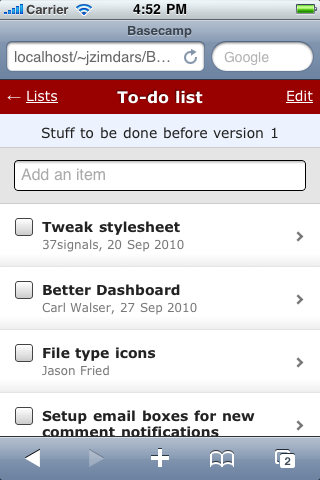
This early mock-up was just static HTML. We used the iPhone SDK simulator even at this stage to make it seem as real as possible.
Finding our own way
We continued with this design for some time but a few problems kept coming up. We’d used the item type instead of it’s title in the navigation bar because titles can be very long. So now we had two bars that both titled the screen, but in different ways. And even using all that space it still wasn’t clear where you were. Where does the back button go? Which project is this list in?
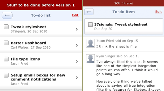
After a few more iterations we knew something wasn’t right. We were trying too hard to squeeze our app into a navigation idea that wasn’t the right fit.
Starting over
Right about this time I happened to be in Chicago so I sat down with Ryan and Jason Fried to brainstorm some new ideas. We were sure that the iOS style navigation bar wasn’t going to work. We had to be able to show a lot more information than it was capable of—especially since titles were often much longer than the available space offered (usually just a word or two). Here are the pieces that needed to be included:
- Back button
- Title of the screen or item
- Name of the project
- Context actions (Add and Edit)
- Account theme (header color)
I went immediately to work quickly sketching a single header with more dense information.
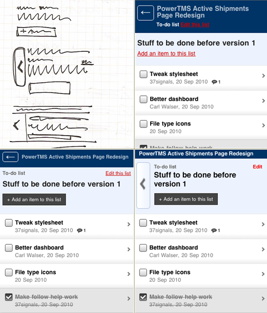
Several paper and Photoshop sketches
After we agreed on a direction from the sketches, I began impleming the new ideas into our app mock-up so we could click through it on our phones. A few iterations later we had something. The new direction was more clear and managed to look more like the desktop version of Basecamp.
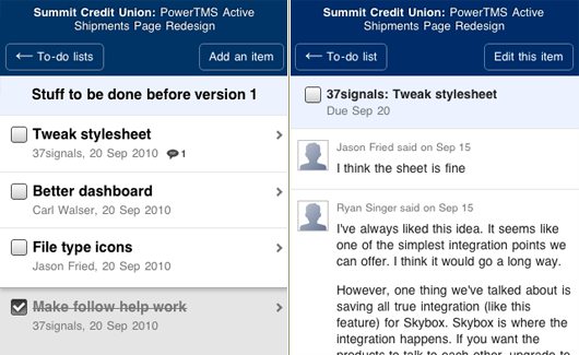
I left Chicago with a better navigation concept in place but there were several things that still bothered me. The header was different on every screen; different height, different buttons, different hierarchy, and just plain awkward looking in some cases. It took up more space. The buttons varied in size and location from screen to screen. The entire header needed to be tighter, more structured, and give us the flexibility to label the buttons as we needed without it looking bad.
Starting over again
When I got back to my home office I took another look at it. I felt like we’d found the right problem but that the solution had still eluded us. One idea was to let the header be just that, headings for the current view. We could comfortably show the project, company, and screen title without having to squeeze in buttons if we move them to their own bar.
The result was a action bar fixed at the bottom of the screen closer to where physical buttons appear on the phone hardware. The buttons loosely tied to the back, add and edit actions added some visual interest and the colors helped tie similar actions together between screens. There were some nice improvements here: The back button was always in the same place; the header was more complete and less crowded. There were also some new problems: The bottom bar was going to be difficult to implement, technically, and the colored buttons were visually overwhelming.
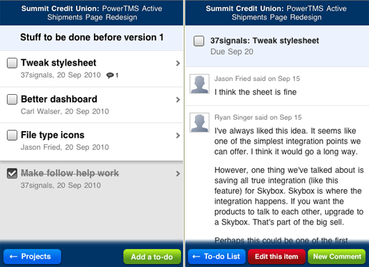
I shared this concept with the rest of the team, who confirmed what I was thinking. But I had another idea that I was working on at the same time. This idea had two major elements: a large (thumb-sized) back button that was clear and in the same place on every screen; a tab bar that split the screen between its actions.
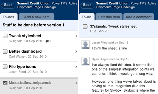
This finally felt right. It was clearer, had more visual style, and the tabs managed to unite the header and content area. Plus, they visually recalled the tabs in the desktop Basecamp design. The new design managed to break out of the iPhone mold while feeling even more like Basecamp. With a little polish we had a winner.
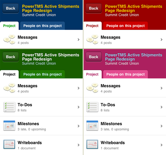
The final design in several color themes”
Final thoughts
I can’t say enough how important it is to let the process of design take your project where it will. We couldn’t have predicted how this app would look when it started. Nor would the app be as strong if we’d locked down the design after the first version. Continuing to think about your design as it gets more real helps give you clarity and lets you confirm or reject your earlier ideas. As you go from sketches to mock-ups to prototype to real data and conditions the solution solidifies naturally. Each step reveals surprises and new problems. We hope this look at the decisions we made helps you to look at your own design process with fresh eyes. We’d love to hear about your process.

Jeremy Wechsler
on 21 Feb 11Nice article. I do like the mobile design and it is very clean, but I have to turn it off about 60% of the time, as my primary use of Basecamp on the road is to respond to and post messages. Responding I can do from my email client, but the lack of ability to actually address messages to sets of respondents from the mobile interface makes the interface really only useful as a sort of read-only look at the state of a project. If there is a clean way to select thread participants, I’d love to see it :)
Frankie Roberto
on 21 Feb 11I really like the design, and the tabs definitely make sense.
I’m not sure why you removed the left-arrow from the back button though. It’s the one thing that jars with me every time I use the app.
I don’t know if it’s just conditioning from being common to so many iPhone apps, but I now just expect the back button to be top left, and be shaped like a left arrow… Anything else feels odd.
Randy Oest
on 21 Feb 11Great post! Always glad to see the thinking behind the design.
Susanna K.
on 21 Feb 11Thanks for sharing your design process. It’s not only useful for me to see how you came up with UI solutions, but it’s helpful for me to be able to show others I work with how UI design is really an iterative process, and that great solutions take time, thought, and work.
Andre
on 21 Feb 11It would be interesting to hear some of 37s’ thoughts about dodging the bullet of Apple’s subscription regime. Considering that 37signals originally planned to make a native app, I’d be curious to know if your decision to go HTML5 was influenced by the Apple tax.
JF
on 21 Feb 11Andre: We started on the HTML 5 version of Basecamp Mobile many months before any of these latest Apple announcements.
Our decision didn’t have anything to do with Apple’s 30% take on subscription fees, but part of it did have to do with being in control of our distribution and releases.
Hal
on 21 Feb 11I noticed you used Photoshop for the mockups instead of just going straight to HTML as per (http://37signals.com/svn/posts/1061-why-we-skip-photoshop). Any reason for this? Harder with mobile development?
Adam Berger
on 21 Feb 11I have to say that this by far one of the best, most thought out Basecamp apps out there. It has been a pleasure using it over the past few weeks.
Uwe
on 21 Feb 11Haven’t tried it yet, I ask myself whether the lack of a file upload ability in the browser did drive any negative reactions from the users of your app?
JZ
on 21 Feb 11@Hal – Skipping Photoshop isn’t a philosophical stance. We use the best tool for the job.
We work mostly in HTML, in the browser. This app was no different. On day one I went from my sketchbook right to HTML.
There are times when sketching in Photoshop is faster. This typically occurs when you want to try several very different directions that would require major code changes—it’s faster to paste a screenshot in Photoshop and move a few things around as you riff on the idea. Then you can choose one direction to execute in code. That’s a huge time saver.
Don’t let us or anyone else tell you how to work. Use the best tool for the job.
Pies
on 21 Feb 11I think the “Messages”, “Todos” etc. icons are too complicated, unbalanced, and don’t have a common theme. They also look blurry, but maybe that’s just the screenshot.
RebateSense
on 21 Feb 11That’s a great walk-through of the progressive evolution of the UI. The bubbled Back button would have had a nice touch as it points to the direction of going back.
Chad
on 21 Feb 11Great post. Some of the design ideas remind me of Ryan’s An Introduction to Using Patterns in Web Design article.
Thanks for sharing.
Johan Larsson
on 21 Feb 11I really like the mobile design overall but I really dislike that you don’t get an overview of your company when logged in (like the desktop browser app). It’s a real pain to dig deep into the projects in order to get the latest update for each project.
Am I using it wrong?
JH
on 21 Feb 11I have been looking at several of the mobile frameworks out there to make the UI “feel right” on the iphone. Did you guys use any type of mobile framework, or write it all in house?
JF
on 21 Feb 11I really like the mobile design overall but I really dislike that you don’t get an overview of your company when logged in (like the desktop browser app). It’s a real pain to dig deep into the projects in order to get the latest update for each project.
That is missing from this design. It didn’t make the first release. It’s likely the next major feature to make it into the mobile version.
Blake Erickson
on 22 Feb 11Wow thank you for writing this. I’ve been struggling to create a great UI for my Online Router Simulator I’m building and just seeing that if I don’t get it right the first time, I’m still okay, and that if I keep at it I’ll eventually nail it.
Kris Gosser
on 22 Feb 11Is Skybox an easter egg in those screenshots, or did I miss something in the past?
Andrew Johnson
on 22 Feb 11great post. hate how much emphasis is on the back button. not sure of a better solution for it, but it just sticks out too much to me. great job either way though jz
hfrbdx
on 22 Feb 11Am I using it wrong?
BradM
on 22 Feb 11Hey I love the design posts! I tried searching (very quickly mind you) in past threads in case this was brought up before, but I didn’t find any references.
I’m curious if the development was done using any frameworks such as JQuery Mobile, Sencha/JQTouch, etc.
I’m looking at porting an app to mobile and I’m curious as to your take on any framework options. Thanks Brad
Mark
on 22 Feb 11Any hope for a Highrise mobile UI similar to this?
Chris Shepherd
on 27 Feb 11The biggest thing for me, is the confidence and time to either start again or pick up and re-visit details because it isn’t quite ‘right’.
I love that attitude because it instantly shows care about the product and the details of the design.
This discussion is closed.