This week we updated Highrise with a revised layout for the people and company pages.
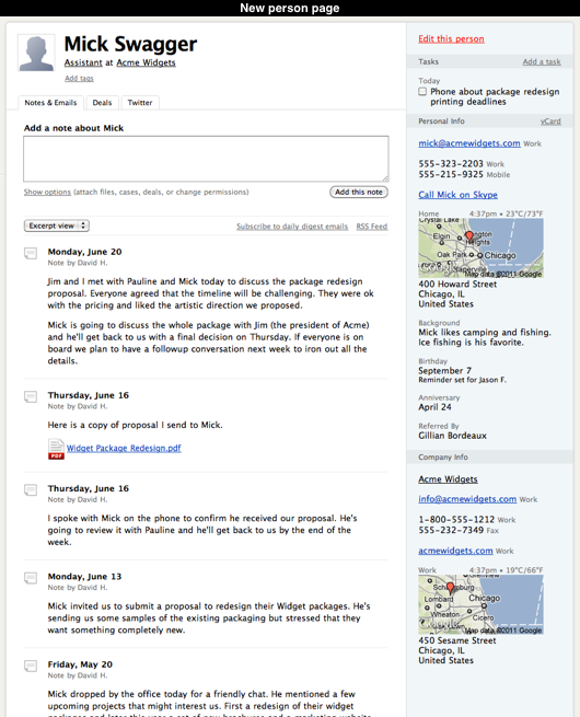
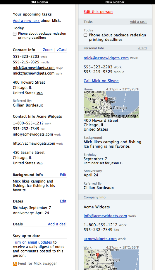
We decided to change these pages because we thought the existing sidebar had become too cluttered. The old sidebar contained tasks, contact info, custom fields, dates, deals, background info, a list of people on company pages, a twitter stream, an email notification toggle and an RSS link. It was a bit of junk drawer. Many items were constrained by the small space afforded by the narrow sidebar and it was difficult to see where one section ended and another one started.
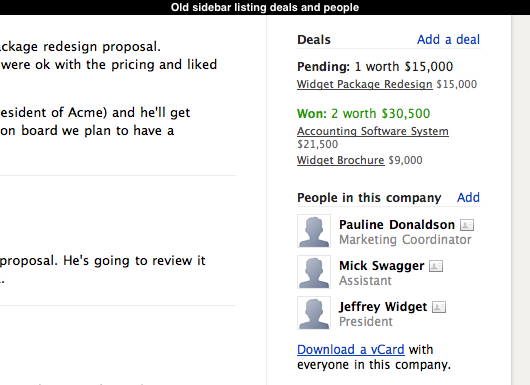
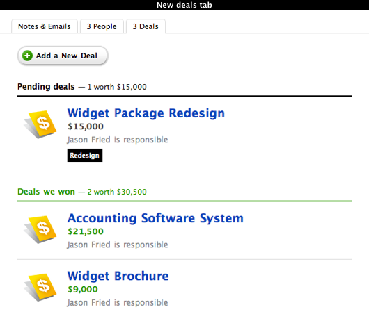
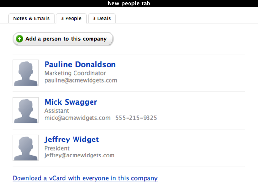
To help reduce the clutter we introduced tabbed sections for deals, the list of people in each company and the optional twitter stream. In the old sidebar the list of deals and people was often cramped and the twitter stream was limited to three entries. We wanted to give these sections dedicated spaces outside of the sidebar so that there was enough room to show more data like a person’s email address or details about each deal. We also wanted to make the appearance of deals and people consistent with other pages in Highrise.
The old sidebar had a seperate section for dates. We decided to merge these into the new Personal Info section because their presentation makes it obvious that they are dates. We also introduced a line of text that indicates which dates are configured with reminders. Previously you had to visit into the date editing pages to find out which dates had were setup with a reminder which was a bit of a hassle.

At the bottom of the old sidebar we had links to toggle daily digest emails and a link to the RSS feed. Both of these items provide a way to stay up to the date with the notes and emails that are added to a contact but their position at the bottom of the sidebar didn’t communicate that relationship very well. We moved them to the top of the stream of notes and emails to make it more obvious that these features were related.

The contact pages in Highrise have always been a challenge for us. They can contain many different combinations of data and everyone uses them in their own unique ways. We hope this round of changes makes these pages more useful and a little easier on the eyes for everyone who uses Highrise. As always, we’ll continue to review and revise as time goes on.

Ben Garvey
on 23 Jun 11We decided to change these pages because we thought the existing sidebar had become too cluttered.
Ben
on 23 Jun 11(Sorry, my previous comment was mangled somehow)
I think clutter is overrated in design, especially when dealing with “firehoses” of data that Highrise is intended to handle. The more data I can get with less clicks, the better the UI/UX is.
I draw the line when the clutter prevents me from getting the data I need (ie. there are so many deals or tasks that it takes up the whole page). The vast majority of my 9,000 contacts have no tasks, no deals. Maybe one if I’m lucky.
Where does 37signals draw the line of being too cluttered? Is it simply on looks?
Josh Martin
on 23 Jun 11Sadly this post did not address the main issues or the reason behind the updates besides “the side bar was too cluttered”. There has been an on going thread on the answers site at this link: http://answers.37signals.com/highrise/6177-37-signals-changed-the-contacts-layout that still leaves a lot of unanswered questions.
I know that we are paying users and we don’t have the authority to demand answers, but it would be nice for the concerns to get addressed. Granted the new layout is “cleaner” and has a “more polished look” but you took away key information. I believe you could simply add pending deals and recently contacted clients back on the company pages and just pending deals onto the personal page and still achieve the same streamlined look. If you felt it was to “cluttered” still you could remove the useless maps and free up a large chunk of space.
Sadly, it seems that the highrise system will not implement some of the requested changes from the users and it now is forcing its clients to either change their work flow or seek a new option. Either way, both of these options result in lost time, meetings with team members, and frustration on the users part.
JF
on 23 Jun 11Where does 37signals draw the line of being too cluttered? Is it simply on looks?
1. There is no line. 2. We don’t make design decisions purely on looks.
We’re always looking to find the right balance of clarity and information density. It’s a huge challenge with something like Highrise – a product that lets you keep track of so many things about a single person.
Cramming everything in the sidebar isn’t the solution. That doesn’t mean we’ve found the perfect solution by not cramming everything in the sidebar, however.
Design is a constant evolution. We believe this was the right step in the right direction, but it’s not the final step. Highrise will continue to evolve.
richallum
on 23 Jun 11Jason, I like some of the emphasis on the new sidebar but I still think it’s fat too cluttered. In my opinion the maps serve no useful purpose at all and simply add to the clutter. AS they are so small they simply tell you the name of the town or city with no wider geographical context – that info is shown in the address anyway so it is duplicating what you already know. Why not just have a “link” to the Google map that users can click if they want.
The email address for your contact in the example is fortunately short. Most of my contacts have longer emails that disappear off the edge. The only way I can see the full address is to edit the contact and even then I can’t see the full address some times. The zoom feature, which you focussed on with the new design, solved this issue – why take it away? It was very useful, new Highrise creates more work for me.
Ben Garvey
on 23 Jun 11I guess there is no line if it’s an evolution and of course, I shouldn’t have asked if it was simply based on looks. That was a dumb question with an easy answer.
I guess my real question was how does 37signals approach solving the problem of clarity vs information density? How do you know when it’s too cluttered?
richallum
on 23 Jun 11Just noticed that if you click into an email or note, the contact info in the right sidebar still has the zoo feature available. Is there any reason it has been removed from the main contact screen but kept in the email and note screens?
ggwicz
on 24 Jun 11Wow! Very noticeable change when compared side-by-side. The second picture down (old sidebar vs. new) is damn impressive. And Mick’s a pretty good guy, too.
bvz
on 24 Jun 11We switched our crm from Insightly to Highrise on Monday mainly because Highrise allowed us to do things in fewer clicks. Unfortunately, 1 day, in this new design has added extra clicks, which is what we were trying to reduce. It’s almost as if this simplicity was ignored at the expense of reducing the number of items in the sidebar. This is really making me rethink our decision and look for another option.
Ben
on 24 Jun 11While I think that this was a great step in the right direction, I have to agree with others above concerning the Maps thumbnail. A link to Google Maps would allow users to get directions, etc. without losing precious real estate in the (quite narrow) sidebar. As always, I’m a fan of the team’s iterative philosophy and look forward to seeing Highrise continue to evolve!
Matt
on 24 Jun 11I have been using Highrise for a month and love it. I noticed with this change that I no longer have a “Map” button next to my contact’s addresses. I also do not have a google map picture under the address as is shown in the picture of the new sidebar. Is there anything I can do to fix this?
Michael
on 24 Jun 11It’s interesting how I want the deals on the sidebar but I don’t have a good reason for it. I think I just like to admire my won deals.
Josh Martin
on 24 Jun 11Michael – to your comment having pending deals on the side bar would be a huge added feature because it would allow you to see what quick items to speak with your contact about.
Sadly, I have never talked about the weather / temperature with a client, but I do talk ALOT about pending deals and that seems to be a more important feature.
I hope that this design continues to evolve, but I am afraid that since the items were removed they might never get added back.
grimen
on 25 Jun 11@37signals Can I just add a LinkedIn-URI to Highrise to add a contact? Entering manually is overkill if most people got a LI-profile.
grimen
on 25 Jun 11^The first part of my comment “dissapeared”. What I said was something like:
Nice.
I tried to get at you on Twitter regarding the redundat way of adding companies/contacts in Highrise (basically I got asthonished that it had to be done manually still). Hope you can fix it, because current way of adding contacts is not very efficient/maintanable.
Greg Macoy
on 27 Jun 11I think you could do with having another look at the line height for a lot of the text and the spacing around the maps.
Dan
on 28 Jun 11Highrise is excellent for users who wish to step up to the level of sophistication that Highrise provides. I still think there are plenty of folks out there who need a more lightweight tool, so I decided to build a business around this as per the advice of Jason, David, Seth Godin and others.
Design is indeed an iterative process, and the great thing about software is that the kaizen principle of continuous improvement can be applied every day. As a wise general once said: “A plan violently executed today is better than a perfect plan executed tomorrow”. Applied to design, this can be interpreted as: “just launch something – even if it’s imperfect”.
Mark
on 28 Jun 11Why not keep “recently visited” deals and top-3-accessed People in the sidebar, and relegate the Map to a tab? I use deal and people info repeatedly, I need a physical Map rarely (and would not mind clicking through for a Map, based on how rarely I need or care about physical addresses). The new change is the triumph of white space over usability.
This discussion is closed.