Last week I dropped into an online auction to see what was for sale.
The auction house uses the LiveAuctioneers software/service to conduct the online auctions.
This is what I saw:
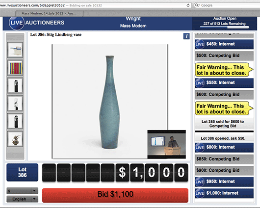
At first, it’s easy to unfairly judge this UI by its cover. There are a lot of font sizes, colors, and shapes competing for your attention. It’s also clear that this design isn’t going to win any type direction awards.
But I ripped off my designer hat, gave it five minutes, and followed along as dozens of items were auctioned off live. I even jumped in on a few and ended up winning a couple.
And I have to tell you, this is really good interface design.
You may not be able to tell from looking at the still image I posted above, but if you’re in there, watching the items go up for bid, watching the bids flow by on the right in real-time, watching the auctioneer on live video, seeing the big yellow flags pop up when an item is about to close, and having a big fat red button that you can click to instantly place your bid, it’s all very clear. There’s a lot going on, but it’s all in the right place at the right time, and it worked flawlessly. I was very impressed.
Yes, it could look better, but it works great. And the works great part is the harder part of the UI to get right. A real-time live auction is a complicated task, and LiveAuctioneers made it work well with no learning curve. I look forward to using this service again.
CRC
on 23 Jul 12Something that may have contributed to this UI’s success is the fitness for the activity/task.
Often we take a first look at something and reject it immediately because it seems too complicated. But once you get into the activity that UI is designed for, you begin to see that it is not complicated for what it is trying to achieve.
This is probably more true, the more domain or niche specific the UI/task is.
AC
on 23 Jul 12You gotta love Flash!
JF
on 23 Jul 12AC: It’s Java!
Katherine
on 23 Jul 12I love this post. I spend a lot of time on auction websites like these. Design-wise, they’re atrocious, but they get the job done. For those of us who aren’t designers or developers - and who therefore have little control over major visual elements of our websites at times - these sites are a great example of the perfect being the enemy of the good. Just get your stuff out there before worrying about everything looking beautiful. Does it work? Is it obvious which button to click? Depending on your industry, sometimes that’s good enough.
Ben Dunlap
on 23 Jul 12The converse is something like mint.com, which is kind of a usability snafu but looks sooo pretty.
Dan Bowen
on 24 Jul 12It would be interesting to do an eye-tracking study to follow the ebb and flow of the auction and how the elements attract ones vision…even more so with biometrics to measure how the heightened awareness and anxiety impacted the interaction with the site as bidding closed on items. Big, easy-to-identify elements that make bidding easy would certainly seem to be high-priority over slick and pretty for something like this.
GeeIWonder
on 24 Jul 12It looks very functional to me. And hats off for taking, er, your designer hat off.
Colin
on 24 Jul 12Always consider the audience of any application. Realise that we (reader of this kind of blog article) live in our “bubble” where design matters. For most people, good design is something totally abstract. They can tell such a thing exists, but won’t be able to put words on it. What matters is to actually achieve something.
Considering the complexity of enterprise software many people (including me) have to deal with at work (SAP, Oracle to name only two), the example above is ALREADY much better design than what we have to put on with at work.
It’s great to have companies like 37signals or balsamiq setting very high standard of design and usability. The lead the way, it’s great. But keep in mind that badly-designed-software is still a multi-billion dollar market with millions of users. The trend toward better usability is changing, but it’s very, very slow. Whether the software vendor re-engineers their products, or the customer changing them to better solution, it is slow.
Every single step toward a better user experience is good. Weather it’s primarily on the features (like above), the design, or, ideally, both.
Ryan N.
on 24 Jul 12This is a great post. It’s amazing how something can be “under designed” and still fun to use. And it’s the fun that keeps people coming back.
TJH
on 24 Jul 12That is in fact a Flash site
Anonymous Coward
on 24 Jul 12Yep, that’s flash.
Not sure why Jason thought it was Java.
j hook
on 24 Jul 12Right – just what I thought – I saw your picture – then the link to the auction house and I was hooked. Sure not great UI design but darn simple and straightforward.
Mark Wilden
on 25 Jul 12A big “Bid” button? Live video feed of the auctioneer? Notifications for upcoming events? I’m trying to think of how you could NOT design this site like that.
Josh Loewen
on 25 Jul 12I’d love to see a collection of bad designs that work well.
JF
on 25 Jul 12I’d love to see a collection of bad designs that work well.
No such thing. If it works well it’s a good design.
Junjay
on 26 Jul 12Good point, Jason. While we all would love something that looks great and works well, your experience shows that a good web experience doesn’t necessarily have to look aesthetically pleasing at first glance. Of course, looking good can’t hurt—they would probably get less people who don’t bother giving it a try if they spiffed up the site’s look.
Rick T
on 27 Jul 12@Jason
I call bullshit.
If you really believed that statement, you’d then also say that Windows XP is/was the best ever “designed” operating system ever.
Lee
on 27 Jul 12I think this is a good UX, but a bad UI.
There can be good UI’s with bad UX as well.
Michael
on 27 Jul 12Rick, Windows XP didn’t work very well. :P
This discussion is closed.