About Jason Fried
Jason co-founded Basecamp back in 1999. He also co-authored REWORK, the New York Times bestselling book on running a "right-sized" business. Co-founded, co-authored... Can he do anything on his own?
Read all of Jason Fried’s posts, and follow Jason Fried on Twitter.
Chris
on 07 Apr 07I expected some sort of video, frankly.
FredS
on 07 Apr 07Be sure to check out ‘Me and You and Everyone We Know’ if you’ve never seen it. ))<>((
Martijn
on 07 Apr 07It was posted on some other blog a few hours ago (but I can’t remember where..) and I really loved it. Shared the link with a friend an he thought it was great too. Very creative indeed!
Javan Makhmali
on 07 Apr 07My advanced apologies for this site going down. It’s currently making a strong run on reddit, deli.icio.us, and metafilter, and there’s no way our measly dreamhost account will hold!
Marc-André Cournoyer
on 07 Apr 07I first saw it on Seth Godin’s blog @ http://sethgodin.typepad.com/seths_blog/2007/04/idea_saver.html
Cameron Barrett
on 07 Apr 07Cool concept but it’s absolutely crazy to not let the Flash file scale down to 1024×768. I had to make my browser window a good deal larger than that to get the whole experience.
Anonymous Coward
on 07 Apr 07Meh.
Chris
on 07 Apr 07Duh, I didn’t see the arrows the first time I visited.
Javan
on 07 Apr 07Cameron - It’s not Flash, and there’s no 1024×768 requirement. What browser are you using?
Nick Husher
on 07 Apr 07I think I might buy her book, both for the web site and the fairly glowing quote from David Eggers.
I want her to start a weblog in the same style, though. It could even be something stupid like, “The Food On My Stove”
Simon Angling
on 07 Apr 07I thought it was terrible. I bailed out at about slide 20 knowing nothing about the book and certainly not inspired to find out more.
Brian
on 07 Apr 07The opinions seems to be very mixed. I thought it was a very creative idea, in fact almost ingenious. The author quite clearly has a sense of humor, I couldn’t resist clicking to the next page. And the book is tempting.
By the way. The guy who coded the website (so it seems) has a website here.
Rick
on 07 Apr 07Brilliant. Thanks for posting that.
schlarb
on 07 Apr 07It kind of strips the web down to the basics of story-telling:
information -> next information -> next information -> next
I read all the way through.
Jason
on 07 Apr 07A very pragmatic approach to the question of what to do with the top of the refrigerator. Absolutely brilliant.
JJMcKay
on 07 Apr 07I’ve seen a site like this before and I don’t remember thinking it was all that special back then either.
Bob Aman
on 07 Apr 07I thought it was a cool idea, but the execution was frustrating: I browse the web on a tiny laptop that can only do 1024×768 resolution, and the website doesn’t work very well at that resolution—lots of text is cut off and there’s no way to scroll down.
And of course, the site clearly isn’t very accessible, but then again, I suppose the dead-tree book won’t be much better in that regard.
Matt
on 07 Apr 07I’ve had a serious crush on Miranda since )) <> ((
Peter Cooper
on 07 Apr 07Bob: Really? I played with it and the image was exactly the size of the browser window however small or large I made it..
Cameron Barrett
on 07 Apr 07The images are scaled up beyond a 1024×768 size, which is weird. The bottom of most of the images is cut off and there is no opportunity to scroll. I have all my browser windows set to 1024×768—not expanded full-size to the monitor’s actual resolution. I’m using the Camino browser on Mac OS X.
Peter Glyman
on 07 Apr 07Love it! Especially like the (click here) circle ;-) Kept my attention the whole way. Cool.
Luke Crawford
on 07 Apr 07beautiful site. of course you’re missing the obligatory link to the wtf wooden table, web 0.1
Ramon Bispo
on 07 Apr 07Cool! :D
Dan
on 07 Apr 07Cameron Barrett 07 Apr 07:
Bob Aman 07 Apr 07:
Cameron Barrett 07 Apr 07:
Seriously, guys? ‘Cause this is all that’s really happening in the css:
There should be no scrolling necessary. Hell, even IE shouldn’t be able to eff this up.
Cameron Barrett
on 07 Apr 07Shrug. Apparently, the guy who coded the site has fixed the problem. The images load into my 1024×768 window just fine now (no clipping at the bottom). They’re a bit squished (wider) because the CSS is forcing them to the browser window’s height and width but it looks OK.
Chucky
on 08 Apr 07“Cameron – It’s not Flash, and there’s no 1024×768 requirement. What browser are you using?”
I’m attempting to view the site on my refrigerator, and I’m also having resolution problems. The mayonnaise keeps getting in the way.
Jeremy
on 08 Apr 07Miranda July is terrific. She’s been working in different mediums for years and I always find she has a way of making you stop and take notice. She gets under your skin with simple words and often the sound of her voice. That she could carry this over onto the web really isn’t a surprise given her talents—clicking through the site made me think, ‘Boy, I still think too hard about this medium.’ I could just grab a pen right there and start telling a story with pictures.
Thanks for posting the link Jason.
Gary R Boodhoo
on 08 Apr 07at one point I thought: this is awesome, but how I wish it was hyperlinked other than prev/next.
Then realized I was still reading, enjoying the narrative, interested enough to click “next” and that was enough.
Loved the “buy” link in the image map too.
Cool idea, and the kitchen is certainly cleaner than mine
harrison
on 08 Apr 07images r too big and some times he just rambles on too much so it doesn tget to actual website aspects. some what funny though
really
on 08 Apr 07http://ithinkyougotit.com/
Nick S
on 08 Apr 07It’s gorgeous. And it really brings back memories of sites built in 1996/7 or thereabouts, when people didn’t feel compelled to wireframe and user-test and alpha/beta/gamma designs to the hilt for personal sites. They just effing built them. And that makes me happy, because it’s like a nostalgia-filled antidote to all sorts of over-design.
(Another of her sites has that mid-90s purity, too.)
Raymond Brigleb
on 08 Apr 07Nice slide show.
Tanja
on 08 Apr 07It’s very lovely and übercool!
Gary G
on 08 Apr 07It was interesting, but I still do not know anything about the book. So I guess she will end up with an enourmus bandwidth bill and no books sold?
But maybe I am to “marketing” oriented.
Samuel
on 08 Apr 07Indeed. Finally, someone dares to bring back the realness and gets some legitimacy here for doing it. Her voice came through truthfully, instantly and viscerally. A fresh attitude delivered by an artist, disregarding conventions of the dominant modes of online/interactive production (however nascent they may be). Interactive marketing workers: read, click and learn.
Tim
on 08 Apr 07Was I the only person who got tired of clicking next after about the 3rd or 4th click?
Anonymous Coward
on 08 Apr 07Was I the only person who got tired of clicking next after about the 3rd or 4th click?
Sounds like you are the only person without a sense of wonder, discovery, and fun.
EelKat
on 08 Apr 07this is showing up on every blog here on WordPress… I’ve been seeing it on every blog I read, all morning today… my question is:
WTH? I sorry, but I just can’t see what this has to do with promoting a book. maybe I missed something here. Could yo please explain?
~~EK
Tom
on 08 Apr 07Creative, yes… usable, definitely not.
After about 5 pages I just started clicking through i without reading anything to see if there was something exciting at the end… there wasn’t.
JF
on 08 Apr 07Creative, yes… usable, definitely not.
I found it eminently usable. Two options: forward or backwards. It’s not about jumping ahead, it’s about someone telling you a story.
And at the end of the day, the site sets the tone. People who like the creativity of the site will probably like the book. People who pick apart the usability rather than enjoying the playfulness will probably not like the book.
Anonymous Coward
on 08 Apr 07Well it must be about telling a story, because it certainly isn’t about selling a book. Unless the book is about refrigerators.
jhns
on 08 Apr 07i guess people who like the narrative of the website will probably like the book. so i think the website says pretty much about the book, without using excerpts.
and it worked: i preordered.
carlivar
on 08 Apr 07Boring.
Darren Marshall
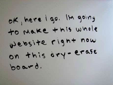
on 09 Apr 07And here I was thinking I needed to actually go and purchase a dry erase board for on the fly comps! Give props for the stove tops – I love cheap innovation.
Marcus
on 09 Apr 07All the web 2.0 crap destroyed that kind of sites. Once upon a time, websites were creatives. Now everything looks like a fucking blog.
Anindya
on 09 Apr 07It may be creative as the concept is new, but I personally don’t think people will eager to go through the site just to see the “new-concept” rather than the purpose served.
Tell me frankly, how many of this post readers have gone through all the the screens and read all the copies? I think most got bored after first 5 slides. Please share your views.
Stephen
on 09 Apr 07It would have been creative as a presentation or slide show, or even a CD-ROM. But on the web we want HTML and text, not a big bunch of images in sequential order. This is an order of magnitude more annoying than the worst Flash web sites. If it weren’t for the obvious sequential URLs that you can hack to jump ahead, I never would have reached the end.
Khawaja M.
on 09 Apr 07wow! natural and to-the-point!
Meso
on 09 Apr 07This presentation is brillant and attractive for me, i am so eager to go to another page to see what’s happened. However, if i treat it as an adverstisement or trying to sell the book. Don’t think that helps.
mandy
on 09 Apr 07Remember books? You know, physical paper objects where you read each page slowly, enjoying the words, before turning to the next? Sometimes, you felt compelled to reread a passage a few times, because it was so revealing or interesting or just plain lovely. Sometimes, getting to the end of the book, you turned back to the beginning and started reading again, loathe to let go of it just yet. It was all terribly inefficient, of course. Thank heavans we have blogs now, and usability, and standards. I feel the richer for it.
CJ Curtis
on 09 Apr 07Hey, if you need a site up in a day, and you want it to be different…she surely pulled that off.
I am neither picking apart the usability nor the playfullness of the site, since I think it satisfies both.
But in response to this being the most creative site ever devised…
Give - Me - A — Break
Scribblings on top of a refrigerator and a stove… FU**ING BRILLIANT!!!
Eloy Anzola
on 09 Apr 07Miranda July is awesome.
Christian Watson
on 09 Apr 07Interesting idea, but I wonder how well it will rank in the search engines? This is always a big problem with sites like this (and I why I would never recommend them).
Grouchy Bear
on 09 Apr 07An annoying stunt. Yawn.
Grant Hutchins
on 09 Apr 07Reminiscent of back before Web 1.0 when websites all looked different and were visually adventurous.
I’d say that by now we’ve hit the new International Style of web design with all these grids and over-engineered fonts. Not that there’s anything wrong with it, but the popularity of the new Helvetica movie is telling.
Darren
on 09 Apr 07Perceived or not, it’s hard for me at least, to consider the creativity of this site, without taking into an account that we’re talking about an author, not a web designer.
It is interesting to see how people who don’t design for the web, use what they have available and adapt it for a different audience. Only those who understand this concept will really appreciate it.
Those who rant off, likely appraise their own appropriated ideas as original, but are probably the least authentic in the room. Pity the fool.
Eric Anderson
on 09 Apr 07Maybe I’m not creative enough but it just seemed retarded to me. Plus I never even got the fact that I could actually click the “Buy” (or any other link) while viewing the site. It wasn’t until I read the comments here to see if I missed something. I guess I did but that just confirms that the site is retarded.
Anonymous Coward
on 09 Apr 07@ Darren…
Can’t speak for other “ranters” as to their creativity or anything else, but as for my own opinions…
They have nothing to do with the site in question.
They have to do with the title of this post, followed by a dozen or so gushing responses of “wonderful, ingenious, brilliant, wow,” and so forth.
Einstein was brilliant. We web designers and marketers, on the other hand, simply try and do things differently in order to get noticed.
Is the site creative? Yes.
Is it original? No.
Is it brilliant? No.
CJ Curtis
on 09 Apr 07sorry…forgot to claim my last…
Evan
on 09 Apr 07Off topic, but related to previous posts – PowerPoint is Bad for Brains – http://infosthetics.com/archives/2007/04/powerpoint_bad_for_brains.html
indi
on 09 Apr 07I liked it. Read it through all the way. It did interest me in the book. I would not have bothered if the writing and setup weren’t playful and clever.
john
on 09 Apr 07All the web 2.0 crap destroyed that kind of sites. Once upon a time, websites were creatives. Now everything looks like a fucking blog.
Amen to that brother!
BillyWarhol
on 10 Apr 07http://www.WeFeelFine.org is thee coolest site i’ve seen by a country mile
Go Long + Go Deep!!
;))
Peace
Sebhelyesfarku
on 10 Apr 07Useless gimmick and not accessible.
Eric Mill
on 10 Apr 07She’ll be in Portland on May 18th, right during RailsConf. I’ll probably swing by!
Anonymous Coward
on 10 Apr 07I have a crush the size of Greenland on Miranda July.
john manoogian III
on 11 Apr 07@Sebhelyesfarku: so’s your mom.
David
on 11 Apr 07I saw something along these lines, but actually useful, in a hospital emergency room—the staff had a whiteboard on which they listed room assignments, patient status, and so forth, and they had a closed-circuit camera pointed at the whiteboard, with the video sent to a couple TVs around the ER working area. Seemed a nice way to have a distributed, low-tech(ish), quick-to-update status display.
--Josh
on 13 Apr 07Along the same lines, I’ve always been very impressed with Jeff Bridges’ site (http://www.jeffbridges.com). It’s entirely done “by hand” – not the coding, but the actual writing and drawing. He’s had the same site since at least 2000, and it just keeps getting better.
beth
on 13 Apr 07Frankly, Miranda July is one of the most creative and thought provoking people out there right now. Check out some of her other projects like learningtoloveyoumore, Are You the Favorite Person of Anybody, and the Swan Tool. She’s also easily the most talented performance artist of our generation. And I’d hardly call this a stunt, I read elsewhere (can’t remember where to cite, check Google) her website has a sort of natural selection. If you can’t get through it you probably aren’t the kind of person who’d be buying her book anyway.
This discussion is closed.