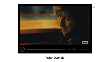
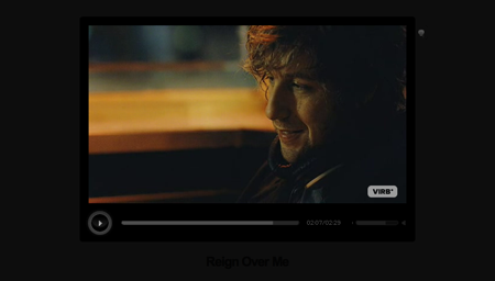
Neat feature at Virb.com: Click the lightbulb at a video screen and the “lights” go off. The screen fades to black and leaves just a trace of the text that was there before.
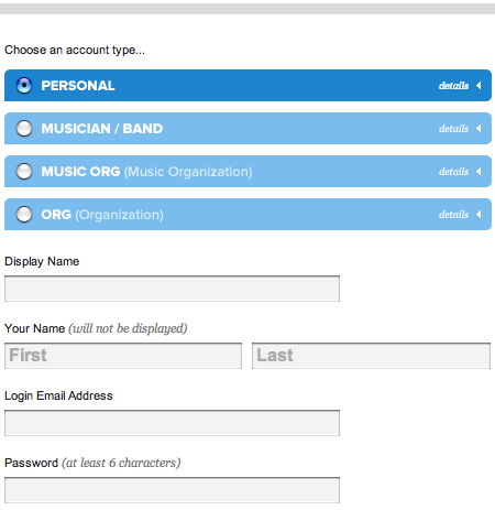
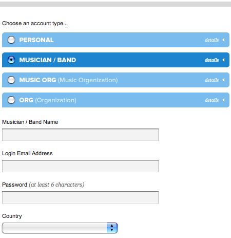
The signup page also has a cool UI feature: Click the whole bar to select a radio button and and the form underneath changes to match that item.
While there’s lots of nice design stuff going on at Virb, the copywriting leaves a bit to be desired. Specifically: Good luck trying to figure out what the site does if you’re a newbie.
The intro copy at the home page, which changes randomly, doesn’t reveal much:
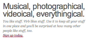
Finally, a site for people who like stuff! I like stuff, don’t you? Vague intro sentences followed by a plea to “Sign up today” are the online equivalent of a clumsy high schooler who moves in for a kiss too soon.
Well, surely the “Virb is” link at the top of the page will clear up the confusion. Not so much…
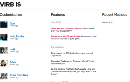
(You can keep digging but The FAQ page has no “What is it?” question and the About page only offers another generic description.)
I know minimal text is cool but more (or maybe just better) explanatory text here would really help grease the wheels. Mashable offers this succint summary:
In short, Virb is what MySpace would be like if it actually worked: a nice design, simple and intuitive navigation and just as much (perhaps even more) customization…There’s photo sharing too, of course, plus video-sharing, tagging, groups, comments, messaging and all the other standard features. Coming from the makers of PureVolume, there’s also a strong musical element: a download called Virbtunes works like MOG or Last.fm, tracking the music you listen to in iTunes and making recommendations. And just like on MySpace, bands also have special pages from which you can grab tracks to populate a player on your own profile.
Someone shouldn’t have to go to another site to figure this out though.

Robert
on 17 Apr 07And I thought I was the only one who didn’t get that site…
Daniel
on 17 Apr 07Yeah…they have some stuff to work out still. They’re pretty new, though, and I’m happy to see that they’re getting some more attention.
The problem is, I can’t seem to convince my friends to ditch MySpace or Facebook in favor of this.
The unfortunate reality seems to be that pretty design is nice, but not that important to most folks. They just want to go where all their friends are, or stick with what they already know.
I suppose Virb will attract more folks from the design/tech set, but social networking sites aren’t quite as useful or interesting when you don’t know too many people on there.
And for crying out loud – they just need to make blog/rss import a higher priority – there’s no way I’m writing for two sites. :-)
Dan Boland
on 17 Apr 07You basically took the words out of my mouth regarding the copywriting. I couldn’t figure out what the hell Virb was until about the third time I visited the site. “Oh, it’s like a prettier MySpace…”
Also, a point about the signup page UI—I actually think it doesn’t do what it looks like it will do. My expectation would be that those details would be directly below the corresponding bar, not below all of the bars. It’s not confusing to me, but it’s more confusing than it needs to be.
That all said, Virb is a gorgeous site.
Terry Sutton
on 17 Apr 07Blast. I love Virb, and was hoping you’d explain what it was all about. I have NO idea – though i do enjoy poking around.
Chris
on 17 Apr 07StumbleUpons video interface is very nice. They have a similar fade capability that auto runs after about 3 seconds of viewing.
Adam Michela
on 17 Apr 07Virb is a fun site. I’ve been using it for some time now, I work with and I’m friends with people from Virb. That said, I still don’t understand 90% of the site.
It’s definately not of the “don’t make me think” school of design.
The navigation, the copy, it’s all mighty confusing.
That said, having built large scale social networking apps myself, I know how difficult it is to get something like this perfect on the first, second, or even third go around.
Virb is a GRAND site in scale, functionality, and beauty. Virb is built by some of the most talented people I know, and they continue hiring people who are even better.
By most measures, Virb is a success. They’ve a passionate user base, and it’s large. Sure, it’s no MySpace or Facebook, but it’s big nonetheless.
I’m confident that the supremely talented crew will, over time, knock it out of the ballpark in response to positive feedback from those who are actually using the site for what it’s worth. They’re off to a mighty fine start afterall.
Lee
on 17 Apr 07I might be wrong, but I assumed they made it intentionally hard to fathom. They seem to have a pretty cool publicity campaign where they attract the ‘elite’ of certain cliques, and throw them awesome parties. The theory is, by attracting these people, the average joe will soon need to figure it out to remain “with it” and will take the time and effort to figure it out. In this way they attract the entire bell curve.
I am miles from the action though, and I could be way off the mark.
Jeff Portier
on 17 Apr 07Can someone please explain to me how the light on the videos work? It’s really cool..
Seth Aldridge
on 17 Apr 07I like the site but every time I’ve tried to use it, it breaks. When I’m uploading images it times out, when I first signed up it kept taking me to blank pages…this is just a few small issues, but to have any chance of claiming the MySpace or Facebook crowd they need to get these issues worked out…that being said I am a fan. I have talked to my friends about joining, but they don’t or don’t want to.
I suggested they develop a tool that will let you put in your myspace/facebook username and password and it would invite all your friends to virb and take them to a special page that shows how you do things in virb that you normally would do in MySpace or Facebook…play on that card because a lot of people are sick of MySpace banning stuff and making it harder to use.
I still think there is room for improvement, but they did a great job for the first time out of the gate.
Ben
on 17 Apr 07I can see the points that some have made about the slightly “mysterious” aspects of Virb. But I think some of that actually makes it appealing for certain types. It certainly isn’t as friendly to the “masses” as MySpace, but I think that’s intentional.
I know personally of one very good copywriter that just got hired there, so I’m sure things will be improving in that department soon.
I think your criticism about their supposed lack of “description” is a definitely off base. Here it is, pretty plainly: http://www.virb.com/about And right on the homepage it says:
I don’t find either of those cryptic.
Frankly, Virb is what I’ve been looking for for a long time. It’s a solid, amazingly customizable, viable alternative to the drivel that is MySpace. (And the customization is clean, organized, and almost completely CSS-driven). And no, I don’t work for them. :-)
Karl N
on 17 Apr 07The lightbulb is great! Makes for better viewing of the clip, and very intuitive.
Brad
on 17 Apr 07Matt-
I hear you man. While we don’t feel we are that far off, a current push for VIRB (now that we are in public beta) is improved communication. I don’t want to hand hold every single citizen of Virbland, but will admit we have some copy holes to fill and could offer a better road map of what lies ahead.
Hell, the last thing I want to look like is a clumsy high schooler who goes in for a kiss way to soon. I have enough problems simply dealing with clumsy adulthood.
Peter Cooper
on 17 Apr 07Design wise, I think it’s great. They clearly put in a LOT of work and came up with some neat touches, but…
I don’t see it as a MySpace killer. One of the things I LIKE about MySpace is its scrappiness. It’s like the difference between some stinky back-alley record store with stained carpets, and going into the sterile environment of a major chain. Virb is really sterile for a supposedly organic social network, where MySpace is crammed full of both pages that are are works of art, but also many that are dank, nasty cesspits. This contrast makes MySpace constantly interesting, even if large sections of it suck. It is not, however, a Gap-esque sterile environment for the psuedo-trendy.
Ruben
on 17 Apr 07I gave VIRB a shot for about 3 weeks. Loved the customization, loved the iTunes plugin, loved the subtle design whizbangs like the lightbulb.
Still, it wasn’t enough. After I customize it, now what? Linkspam my profile? How are people supposed to find the interesting ones?
And how do I subscribe? Content was hidden behind clicks. At least MySpace offers some RSS feeds.
And finally, in a genuine act of senility, I lost interest following the hipster party scene. I have a wife, kid, work in a startup, and go to school part-time. The vicarious bit got old real quick.
Yesterday I blasted the account, with not one twinge of regret. I wasn’t willing to stick around and see where it went. In any case I wish them success.
Rob
on 17 Apr 07I would in no way describe VIRB as “Gap-esque” or “sterile.” When you walk into the Apple store do you get a sterile feeling? I certainly don’t. There is beauty, organization and comfort with the minimal, simple approach VIRB has taken. I for one absolutely loathe MySpace and avoid it whenever possible. I don’t want to walk into a dark back-alley to go to a record store with stained carpets and photos of half-naked 13 year old girls on the wall sceaming, “THANKS FOR THE ADD!”. How is that in any way attractive? You obviously can’t deny the power and reach it has but I think had VIRB been on the scene first, this would be a very different conversation.
Kelly Smith
on 17 Apr 07I love how the keep all their header graphics in one big fat gif file rather than making 30 different images for each page:
http://www.virb.com/_graphics/_frontend/keypage_titles.gif
One update to one file and you’ve got your site wide header update.
Chris Griffin
on 17 Apr 07I think it’s safe to say that anybody that doesn’t get Virb probably doesn’t get social networking period. So anybody who doesn’t “get” Virb probably doesn’t have a MySpace account and think that this whole “social networking” thing is silly anyway (I say this because I see that a few commenters say derogatory things when it’s obvious they just don’t understand social networking, much less Virb).
Virb should focus on the MySpace defectors and people who are fed up with MySpace all together. 170 million people are on MySpace not because of the great copy (copy? where?) but because of hear-say through their friends. So how much does copy really matter in this case?
Luke Seeley
on 17 Apr 07The fact that you can’t set your profiles music player to auto-play gives it the edge over MySpace.
Also, being able to remove a user’s profile customization really shows how these designers paid attention to the countless flaws in MySpace.
Mrad
on 17 Apr 07Yeah, I’m a little puzzled about this site too. There’s a bit too much – it’s kinda like the uber social/media site.
Still, it’s very pretty. Ryan Simms is a bad man.
Mrad
on 17 Apr 07Oops – make that Sims. Fingers get a bit jumpy after a Starbucks Doubleshot.
chad
on 17 Apr 07Like others, I am a bit confused what they do. As for the light bulb it is a cool effect but it made the navigation invisible. Overall though really nice design, just needs someone to help with copy and usability.
Chad www.wtfShouldIDo.com
Justin Reese
on 17 Apr 07@chad: That’s intentional. It provides a “distraction-free” viewing experience. I’m just glad they didn’t go the “extra mile” and throw your browser into kiosk mode.
Virb is pretty, so I have one. MySpace is ugly, so I don’t.
I don’t think I’m narcissistic enough to make use of either, though.
Jon Nichols
on 17 Apr 07“I think it’s safe to say that anybody that doesn’t get Virb probably doesn’t get social networking period…So how much does copy really matter in this case?”
At the very least, you had better figure out how to convince people who are in the social networking world why they would bother with another site. Plus, I’d have to consider myself social-networking-lite (no MySpace or Facebook), but I might consider joining a site if the right one came along.
steph
on 17 Apr 07I don’t know if it’s virb’s case, but a lot of marketing – not just for websites – tries to avoid explaining exactly what their product is. They probably think it’s more attractive than going to the point. Think about when you have a crush on someone you just met: in many cases, if you knew how the person really was, you wouldn’t be interested. It’s no big news that most advertising and marketing use hypocrisy as their main tool (although lately there is a trend for transparency). Anyway, if the marketing is avoiding to get to the point, and if I’m curious, I usually find answers at wikipedia.
Alex Bunardzic
on 17 Apr 07Peter Cooper wrote:
“One of the things I LIKE about MySpace is its scrappiness. It’s like the difference between some stinky back-alley record store with stained carpets, and going into the sterile environment of a major chain. Virb is really sterile for a supposedly organic social network, where MySpace is crammed full of both pages that are are works of art, but also many that are dank, nasty cesspits. This contrast makes MySpace constantly interesting, even if large sections of it suck. It is not, however, a Gap-esque sterile environment for the psuedo-trendy.”
This is a very good observation. Right now, it looks like the big businesses are beginning to eye the world of social networking, and so the sterile, faceless Gap-esque (to use your turn of phrase) sites are starting to pop up. I think you make a valid point that the careful airbrushing of the creative fingerprints left by the community at large is what’s going to ensure that these corporate takeovers sink sooner than they’ve even had a chance to see if they have a fighting chance.
Adam Michela
on 18 Apr 07@Kelly – Nice catch! Interesting approach.
Rob
on 18 Apr 07And PS, don’t even allude to VIRB being faceless, you couldn’t be further from the truth.
Chris Fizik
on 18 Apr 07The lightbulb is genius. Discovered it this past weekend and blew me away. Simple. Intuitive. Very effective too.
UI feature of the month for me.
David
on 18 Apr 07I don’t think the login UI feature is as good as is said. It looks to me like if you were to click one of the blue bars, a new panel would open up right below it (above the next bar). This is possibly because the lower-left corner of the bars is straight, while the others are rounded. This leaves the impression that something rectangular will attach itself to the bottom of it. Also possibly because of the arrow on the right, as if this is the minimized version and when clicked it will maximize and the arrow will turn to point downwards.
This is obviously a correct impression since clicking “details” will do all this (except for the arrow-turning). It is wrong however in that they combined both and made clicking the bar select the option (only).
Two ways to make it more intuitive: the bar should contrast less with the background, and should only have straight corners. Or, clicking the bar and/or selecting an option would expand the details and collapse all others, and select the option.
Steve
on 18 Apr 07My main problem with Virb is simply that everyone I know uses either Facebook or MySpace. The only person I know on Virb is a hip-to-the-inter-social-blogger-starbucks-has-a-mac guy. It certainly has that elite feeling to it that was mentioned in a previous comment, but a social networking tool is only as good as its network. No? What are Virb doing to build that network? Clean design and whizzbang features certainly rock, but if that was all that was necessary, why do people still join MySpace: The Eyesore Network?
Perhaps taking a page from Mugshot’s book and integrating the other social networks’ features into Virb might help boost things? What I mean by this is having a portal feature that allows you to interface with your Facebook, MySpace, Twitter, etc… accounts from within Virb. Just a thought…
Alex Bunardzic
on 18 Apr 07Rob wrote:
“For one, can you provide examples of some “sterile” corporate social networking sites popping up?”
Here you go:
http://community.microsoftdynamicslive.com/default.aspx
“And secondly I don’t think it’s fair, or relevant, to draw comparisons between these corporate social sites, whatever they may be, and VIRB . VIRB is, even in public Beta, far and away one the most amazing apps I’ve seen. Time was clearly spent on attention to detail and it shows in every way.
And PS, don’t even allude to VIRB being faceless, you couldn’t be further from the truth.”
I’m sure that Microsoft fanboys are saying the same thing about the Microsoft Dynamics Live social network. It’s a matter of personal taste, I guess.
This discussion is closed.