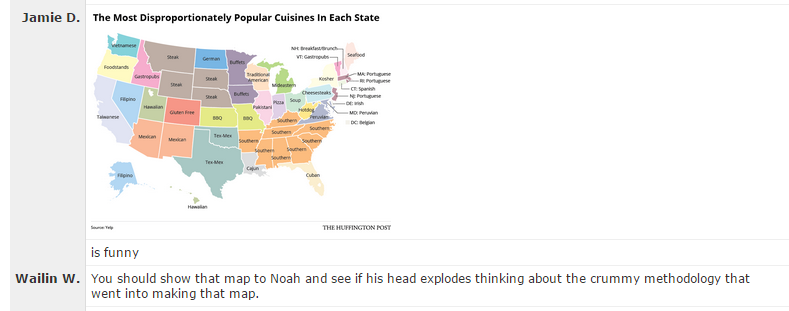
My wonderful coworkers here at Basecamp have discovered a surefire way to make my head explode. All you have to do is post a link in Campfire to a piece of flimsily sourced “data journalism” that’s hard to believe (like the notion that the top decile of American drinkers consume a mean of 10 drinks per day, every single day of the year).

Bonus points are earned for things that have ridiculous infographics and/or provide absolutely no source or methodology. Since I started my career by analyzing Census data, things about demographics are extra special catnip.
This is a fun game to play, but it’s actually a real problem. The bar for what passes as credible when it comes to data journalism is incredibly low. There are some shining examples of quality — FiveThirtyEight releases much of the data that goes with their stories, and some are advocating for even greater transparency — but the overall level of quality is depressingly low. It’s just too easy to make an infographic based on shoddy original data or poor methodology and publish it, and there’s little to no repercussions if it isn’t actually accurate.
Academia has been battling this issue for years under the banner of “reproducible research”. Peer review has been a hallmark of academic publishing since at least 1665, but it hasn’t solved the problem. Still, there’s awareness of the issue, and some efforts to improve it: training, policies requiring data release in order to be published, etc.
It’s easy to take shots at data journalists and academics for shoddy methodologies or insufficiently reproducible research because their work is public, but the truth is that those of us in industry are just as susceptible to the same flaws, and it’s even easier to get away with. Most analysis done for private companies isn’t peer reviewed, and it certainly doesn’t have the wide audience and potential for fact checking that journalism or academic publishing has.
I’m as guilty as anyone else in industry when it comes to being less than perfectly transparent about methodology and data sources. I’ve even published plenty of tantalizing charts and facts and figures here on SvN that don’t meet the standards I’d like to see others held to. Mea culpa.
I’m trying to do better though, particularly with what I share internally at Basecamp. I’m footnoting data sources and methodologies more extensively, doing more work in Tableau workbooks that show methodology transparently, including my analysis scripts in writeups, and trying to get more peer review of assumptions that I make. I’m fortunate that the Basecamp team trusts my work for the most part, but I shouldn’t need to rely on their trust — my job is to bring impact to the business through responsible use of data, and part of being a responsible data analyst is being transparent and reproducible.
It’s not the easiest path to work transparently or to ensure reproducibility. It takes extra time to explain yourself, to clean up scripts, and so on, but it’s the right path to take, both for yourself and for your audience, whoever they may be.

Jan
on 06 Mar 15Well said!
JW
on 09 Mar 15I’m curious now, what is the problem with the article on the top decile of drinkers? It links to its source and seems to present the data well (e.g. not giving a mean but showing the actual distribution).
This discussion is closed.