You’re reading Signal v. Noise, a publication about the web by Basecamp since 1999. Happy !

Noah

About Noah

Noah Lorang is the data analyst for Basecamp. He writes about instrumentation, business intelligence, A/B testing, and more.

How we lost (and found) millions by not A/B testing

Noah
Noah wrote this on 8 comments

We’ve always felt strongly that we should share our lessons in business and technology with the world, and that includes both our successes and our failures. We’ve written about some great successes: how we’ve improved support response time, sped up applications, and improved reliability. Today I want to share an experience that wasn’t a success.

This is the story of how we made a change to the Basecamp.com site that ended up costing us millions of dollars, how we found our way back from that, and what we learned in the process.

Continued…

Go at Basecamp

Noah
Noah wrote this on 8 comments

Basecamp is a Ruby company. All of our customer facing applications are written with Ruby on Rails, we use Ruby for our systems automation via Chef, we deploy via Ruby through Capistrano, and underneath most rocks you’ll find a Ruby script that accomplishes some task.

Increasingly, however, Go has found its way into our backend services and infrastructure in a variety of ways:

  • Our timeseries data acquisition and storage daemon was rewritten from Ruby to Go in January 2013.
  • Our Ruby build scripts build new Ruby packages for our servers via Docker.
  • Our log parsing and storage pipeline writes to Kafka, HDFS, and HBase via an assemblage of Go programs.
  • We backup our DNS records from Dynect with a tool written in Go.
  • We run a multi-master Nagios installation via a Go-based passive check bridge and multi-host notifier.
  • We keep our GitHub post-commit hooks in shape using a Go program.
  • The server side of our real user monitoring and pageview tracking systems are entirely written in Go.
  • We regularly download, decrypt, and test the integrity of our offsite database backups with a Go program.

There are also numerous experiments in Go that haven’t made it into production: keeping multiple memcached instances in sync from packet captures, serving Campfire over websockets, packaging our Rails apps into Docker containers, and more. We’re also heavy users of some third party Go applications (etcd and sentinel) which power our failover process between datacenters.

Our use of Go is entirely organic. We never sat down one day and decided to start using it; people just started writing new things in Go.

Personally, I like Go because the semantics of channels and goroutines are a great fit for building data pipelines, and the innate performance of Go programs means I don’t have to think as much about the load that a parser might be adding to a server. As a language, it’s a pleasure to write in—simple syntax, great standard library, easy to refactor. I asked a few other people why they enjoy working in Go:
Will: “Go feels perfect for Ops work. The error handling seems to fit so naturally into the way I want to write systems software, and on top of that it’s good (and getting better) at using multiple cores effectively. Deployment is really simple too, where I’d have to think about how to package up deps and configure Ruby versions I can now just push an updated binary.”


Taylor: “When you are learning a new programming language sometimes you reach a point where trying to solve a real problem furthers your understanding of the language and it’s strengths. Go’s fantastic documentation, ease of testing and deployment (compile once and run anywhere via a single binary) are enough to help even a novice write a performant and reliable program from the start. Where you might spend hours debugging a threading bug in your Ruby program you can spend minutes implementing go channels that seem to just work. For even the basic script that needs high concurrency this is a huge win.”


It’s unlikely that you’ll ever see a fully Go-powered version of Basecamp, but Go has certainly found its way deep into our infrastructure and isn’t likely to go anywhere soon. If you’ve never tried it out, give it a shot today!

Gopher drawings by Renee French and licensed under the Creative Commons 3.0 Attributions license.

A chart a day keeps the data in play

Noah
Noah wrote this on 1 comment

Every working day for the last month or so I’ve posted a single “chart of the day” to our Basecamp account. They’re posted internally without much commentary—just enough to explain what the chart is about. The topics are wide ranging: in the last month, we’ve covered browser uptake, search terms, The Distance, database performance, phone support, Nagios alert trends, demographics, classes, timezones, and even home energy usage and BMW torque curves.

The charts don’t fit into a big picture narrative, and there’s no agenda behind them: I simply take one chart from something I’m currently working on, have worked on recently, or someone has been curious about. Most are literally pulled from an open workbook or browser tab, so it’s not a big time investment. The chart of the day takes about a minute to post when it’s pulled from something I’m already working on, or up to fifteen minutes on the rare occasions that I create something completely from scratch for one. Sometimes they’re great visualizations; sometimes they’re not the most stunning displays of data. The key thing is that there’s a new one every day.

Why am I doing this? In part for fun and as a personal challenge: it takes a certain amount of thought and a different approach to making a chart that can tell a story on its own.

The bigger and more strategic reason for posting a chart a day is that I want to make data easier for people to digest and make a part of their daily work. I’m guilty of occasionally dropping 5,000 word reports with a couple dozen figures included into a Basecamp project when writing up a topic. I’ve gradually moved more and more content into appendices, methodological supplements, or self-service Tableau workbooks, but a full in-depth analysis of a topic is still long. I understand that it’s a real commitment of time and attention to read something of that length and digest it fully.

One chart a day, on the other hand, is easy — it’s not a big commitment to look at one chart and a couple sentences of context on a different topic each day. I don’t track readership of either longer reports or charts-of-the-day religiously, but based on general feedback, I think it’s fair to say more people are reading – and benefiting from – the daily charts.

I’ve talked to people in other organizations who do similar things, whether it’s a weekly internal blog post or data show-and-tell at a meeting, and the reaction has been uniformly positive: more people engaging with more data and having a bigger impact on organizations. If you do something like this, I’d love to hear about what you do and the impact that it has. If you don’t, maybe it’s time to give it a try.

A mountain of salt for the Apple Watch satisfaction numbers

Noah
Noah wrote this on 1 comment

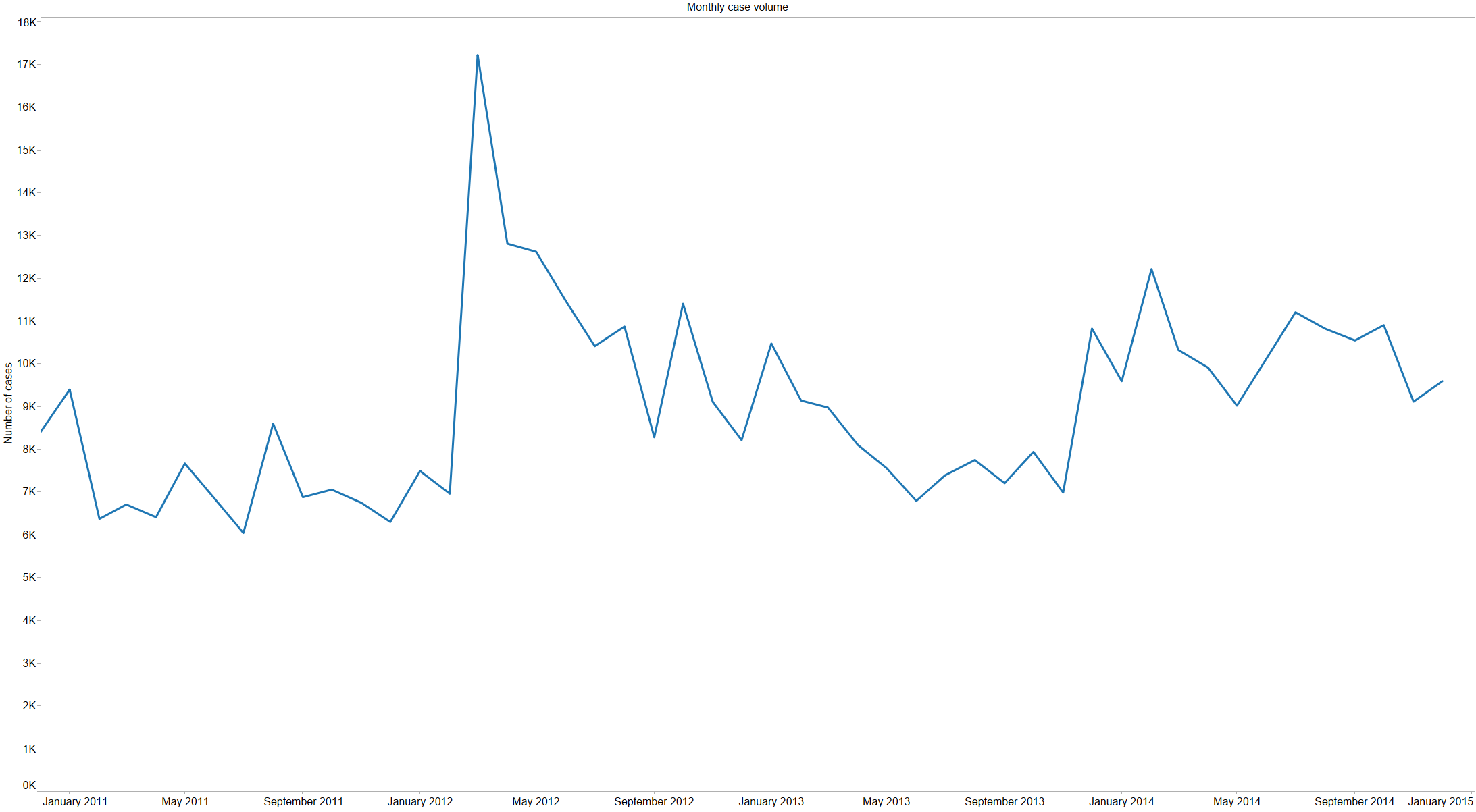
We’ve talked a lot about the Apple Watch internally, and even thought a bit about how Basecamp might work on it. A number of Basecampers have gotten Apple Watches, and reviews have been mixed; some people returned their watch, others wear it every single day. Our unscientific, non-representative sentiment runs probably 50/50 satisfied/dissatisfied with the watch.

A study reporting high levels of customer satisfaction with the Apple Watch made the round of news sites last week, from the New York Times to Fortune to re/code. The same study was also mentioned by Tim Cook on the most recent Apple earnings call. The study was conducted by Creative Strategies, Inc for Wristly, and you can read the whole report on their website.

I’ve never touched an Apple Watch, and I personally don’t spend a lot of time thinking about it. Even so, when I see a study like this, especially one that receives so much press attention and that runs contradictory to other data points (such as the reactions from my colleagues), my attention turns to understanding more about the details of how they conducted the study and drew their conclusions. Examining this study in more detail, I find four major reasons to be skeptical of the results that received such media interest.

Are these apples and oranges?

One of the most talked about conclusions from this study was that the Apple Watch had a higher satisfaction level than the iPhone and iPad had following their introduction in the market. This conclusion is drawn by comparing the “top two box” score from Wristly’s survey (the portion of consumers reporting they were “very satisfied/delighted” or “somewhat satisfied” with their watch) against satisfaction scores from surveys conducted by ChangeWave Research in 2007 and 2010.

Without going into the quality of those original surveys, there are two clear differences between the Apple Watch research and the iPad and iPhone surveys that make this sort of comparison specious:

  1. Different panels: in order for this sort of comparison to be useful, you’d need to ensure that the panels of consumers in each case of roughly equivalent – similar demographics, tech familiarity, etc. There isn’t really sufficient information available to conclude how different the panels are, but the chances that three very small panels of consumers gathered over an eight year span are at all similar is exceedingly low. A longitudinal survey of consumers that regularly looked at adoption and satisfaction with new devices would be fascinating, and you could draw some comparisons about relative satisfaction from that, but that isn’t what was published here.
  2. Different questions: the Apple Watch survey asked a fundamentally different question than the earlier work. In Wristly’s survey, they appear to have measured satisfaction using a five point Likert-type scale: they had two positive and two negative rankings surrounding a fifth neutral ranking. By way of contrast, the ChangeWave research for both the iPhone and iPad used a four-point Likert scale (two positive and two negative ratings with no neutral ground) with a fifth “don’t know” option. The question of whether a four or five point scale is a better choice isn’t necessarily settled in the literature, but it’s obvious that the top-two-box results from the two aren’t directly comparable.

Who are you asking?

The conclusions of a survey are only as good as the data you’re able to gather, and the fundamental input to the process is the panel of consumers who you are surveying. You want a panel that’s representative of the population you’re trying to draw conclusions from; if you’re trying to understand behavior among people in California, it does you no good to survey those in New York.

There are a lot of techniques to gather survey panel members, and there are many companies dedicated to doing just that. You can offer incentives for answering a specific survey, enter people into a contest to win something, or just try talking to people as they enter the grocery store. Panel recruitment is hard and expensive, and most surveys end up screening out a large portion of generic survey panels in order to find those that are actually in their target population, but if you want good results, this is the work that’s required.

Wristly’s panel is an entirely opt-in affair that focuses only on Apple Watch research. The only compensation or incentive to panel members is that those who participate in the panel will be the first to receive results from the research.

It’s not hard to imagine that this sort of panel composition will be heavily biased towards those that are enthusiastic about the watch. If you bought an Apple Watch and hated it, would you choose to opt-in to answer questions about it on a weekly basis? I wouldn’t. (Credit to Mashable for noting this self-selection effect).

To Wristly’s credit, they do attempt to normalize for the background of their panel members by splitting out ‘Tech insiders’ from ‘Non-tech users’ from ‘App builders’ from ‘Media/investors’, which is a good start at trying to control for a panel that might skew differently from the general population. Even this breakdown of the data misses the fundamental problem with an opt-in panel like this: the massive self-selection of Apple Watch enthusiasts.

What’s the alternative? Survey a large number of consumers (likely tens of thousands) from a representative, recruited panel; then, screen for only those who have or had an Apple Watch, and ask those folks your satisfaction questions. This is expensive and still imperfect — recruited research panels aren’t a perfect representation of the underlying population — but it’s a lot closer to reality than a completely self-selected panel.

Where are the statistics?

The survey report from Wristly uses language like “We are able to state, with a high degree of confidence, that the Apple Watch is doing extremely well on the key metric of customer satisfaction” and “But when we look specifically at the “Very Satisfied” category, the differences are staggering – 73% of ‘Non Tech Users’ are delighted vs 63% for ‘Tech Insiders’, and only 43% for the ‘App Builders’”.

Phrases like “high degree of confidence” and “differences are staggering” are provocative, but it’s hard to assess the veracity of those assessments without any information about whether the data presented has any statistical significance. As we enter another presidential election season in the United States, political polls are everywhere and all report some “margin of error”, but no such information is provided here.

The fundamental question that any survey should be evaluated against is: given the panel size and methodology, how confident are you really that if you repeated the study again you’d get similar results? Their results might be completely repeatable, but as a reader of the study, I have no information to come to that conclusion.

What are the incentives of those involved?

You always have to consider the source of any poll or survey, whether it’s in market research or politics. A poll conducted by an organization with an agenda to push is generally less reliable than one that doesn’t have a horse in the race. In politics, many pollsters aren’t considered reliable; their job isn’t to find true results, it’s to push a narrative for the media or supporters.

I have no reason to believe that Wristly or Creative Strategies aren’t playing the data straight here—I don’t know anyone at either company, nor had I heard of either company before I saw this report. I give them the benefit of the doubt that they’re seeking accurate results, but I think it’s fair to have a dose of skepticism nonetheless. Wristly calls itself the “largest independent Apple Watch research platform” and describes its vision as “contribut[ing] to the Apple Watch success by delivering innovative tools and services to developers and marketers of the platform”. It’s certainly in their own self-interest for the Apple Watch to be viewed as a success.

So what if it’s not great research?

There’s a ton of bad research out there, so what makes this one different? For the most part, nothing — I happened to see this one, so I took a closer look. The authors of this study were very good at getting media attention, which is a credit to them — everyone conducting research should try hard to get it out there. That said, it’s disappointing to see that the media continues to unquestioningly report results like this. Essentially none of the media outlets that I saw reporting on these results expressed even the slightest trace of skepticism that the results might not be all they appear on first glance.

Behind the scenes: our staff performance widget

Noah
Noah wrote this on 6 comments

Behind the Scenes posts take you inside Basecamp for a look at an aspect of how our products are built and run.

In our quest to make Basecamp as fast as possible for users all around the world, we recently decided to elevate awareness of page load performance for staff users. We wanted speed to be something we always think about, so for the last couple of months Basecamp staff have been seeing a little something extra when they’re logged in to Basecamp: “Oracle”, our performance widget.

Oracle uses the Navigation Timing and Resource Timing APIs that are implemented in most browsers to track how many requests are made in the course of loading a page, how long the page takes to load, how much time was spent waiting for the first byte of content to be received vs. parsing and loading scripts and styles, and how much time was actually spent processing the request within Rails itself. On browsers that don’t support those APIs, we degrade gracefully to present as much information as possible.

Mobile staff users don’t miss out on the fun—we include a stripped down version of the widget at the bottom of every page:

If you need Oracle out of the way you can drag it wherever you want, or just minimize it into a little logo in the bottom corner of the page:

This data for staff users is sent up to our internal dashboard, which enables us to diagnose slow page loads in more detail. When staff click on the toolbar after a slow page load, they load a page in our dashboard that looks like this:

This page shows the full request/response waterfall, including DNS resolution, TCP connection, SSL negotiation, request and server runtime, downloading, and DOM processing. It also shows timing for the additional assets or ancillary requests that were loaded.

One of the most useful features of Oracle is having instant access to all of the logs for a request. Clicking on the request ID under “Initial request” will load the Rails, load balancer, and any other logs for the first request of the page load.

In addition to presenting the raw Rails logs for the request, we also try to do a little bit of helpful work for you—we identify duplicated queries, possible N+1 queries, cache hit rates, etc. In most cases, timing details and logs are available in the dashboard within two seconds of the page load completing.

Oracle is just one of the tools we put to work to try to make Basecamp fast for all users. Read more about other things we do to keep Basecamp fast and available for you.

Reproducible research isn't just for academia

Noah
Noah wrote this on 2 comments

My wonderful coworkers here at Basecamp have discovered a surefire way to make my head explode. All you have to do is post a link in Campfire to a piece of flimsily sourced “data journalism” that’s hard to believe (like the notion that the top decile of American drinkers consume a mean of 10 drinks per day, every single day of the year).

Bonus points are earned for things that have ridiculous infographics and/or provide absolutely no source or methodology. Since I started my career by analyzing Census data, things about demographics are extra special catnip.

This is a fun game to play, but it’s actually a real problem. The bar for what passes as credible when it comes to data journalism is incredibly low. There are some shining examples of quality — FiveThirtyEight releases much of the data that goes with their stories, and some are advocating for even greater transparency — but the overall level of quality is depressingly low. It’s just too easy to make an infographic based on shoddy original data or poor methodology and publish it, and there’s little to no repercussions if it isn’t actually accurate.

Academia has been battling this issue for years under the banner of “reproducible research”. Peer review has been a hallmark of academic publishing since at least 1665, but it hasn’t solved the problem. Still, there’s awareness of the issue, and some efforts to improve it: training, policies requiring data release in order to be published, etc.

It’s easy to take shots at data journalists and academics for shoddy methodologies or insufficiently reproducible research because their work is public, but the truth is that those of us in industry are just as susceptible to the same flaws, and it’s even easier to get away with. Most analysis done for private companies isn’t peer reviewed, and it certainly doesn’t have the wide audience and potential for fact checking that journalism or academic publishing has.

I’m as guilty as anyone else in industry when it comes to being less than perfectly transparent about methodology and data sources. I’ve even published plenty of tantalizing charts and facts and figures here on SvN that don’t meet the standards I’d like to see others held to. Mea culpa.

I’m trying to do better though, particularly with what I share internally at Basecamp. I’m footnoting data sources and methodologies more extensively, doing more work in Tableau workbooks that show methodology transparently, including my analysis scripts in writeups, and trying to get more peer review of assumptions that I make. I’m fortunate that the Basecamp team trusts my work for the most part, but I shouldn’t need to rely on their trust — my job is to bring impact to the business through responsible use of data, and part of being a responsible data analyst is being transparent and reproducible.

It’s not the easiest path to work transparently or to ensure reproducibility. It takes extra time to explain yourself, to clean up scripts, and so on, but it’s the right path to take, both for yourself and for your audience, whoever they may be.

Sometimes there really is an easy button

Noah
Noah wrote this on 4 comments

For a long time, I was frankly somewhat dogmatic about the tools I used to analyze data: Give me a SQL connection, R, and my trusty calculator and that’s all I need. If I need to make a report, I’ll just use Rails and HTML. Open source or bust.

For most of my four years here at Basecamp, that was mostly how I worked, and it was fine. I think I was reasonably productive (or at least productive enough to stay gainfully employed). I built a lot of tooling and reporting for the rest of the company, and I did some analyses that I’m proud of. These tools were all I needed, but it turns out they weren’t all that I wanted.

As we’ve grown as a company both in headcount and analytical appetite, I found that I was spending a lot of time working on reporting—dashboards, one-offs, random questions asked in Campfire, etc. This kind of thing is important and vital to a successful company, but it frankly isn’t that much fun to do. Fiddling with the position of charts in an HTML dashboard or typing long incantations to generate a simple histogram just aren’t how I want to spend my day, and I don’t think that’s the most value Basecamp can get from my time either.

So I went shopping, and I bought a license to Tableau. I used it to prepare for a big internal presentation, and then I got the server version to use for all future reporting on features, usage, our support team, even some of our application health and performance work. I’ve used Tableau at least a little every day since then — when talking about mobile OS fragmentation in Campfire, when reviewing the year our support team had, and as a replacement for parts of our Rails-based internal dashboard app.

There’s absolutely nothing that Tableau can do that I couldn’t do before, but that’s exactly the point: it lets me do the exact same stuff much faster, cutting down on the parts of my job that aren’t the most exciting and leaving more time for more valuable work. So far, the things I use Tableau for take less than half as long as doing them with my more familiar toolset, and I end up with the same results.

I still use R, SQL consoles, and my HP-12C every single day, and I commit to our Rails dashboard app almost every day. If you’d polled Basecamp six months ago and asked who was the most likely to be using Windows and endorsing the use of expensive enterprise software, I’m pretty sure I would have been the last person mentioned, but here I am.

Admitting that my dogma was wrong and spending a relatively small amount of money on a great tool means that I get to use those other tools that I know and love on more interesting problems, and ultimately to have more of an impact for Basecamp and our customers.

Forecasting support response times with the Support Simulator 4000

Noah
Noah wrote this on 1 comment

Kristin wrote about our efforts to achieve 24/7 support, and it reminded me of a project I worked on last year. When we started talking about expanding the support team to improve our coverage outside of US business hours, David asked me to take a look at what we’d need to do to achieve a response time of under four hours for every case that came in, and related to that, what response time we could expect with each hire.

Framing the problem

When we talk about “response time”, we’re really talking about about one specific measure—the time from when we receive an email until we send an initial personalized response back (we stopped using autoresponders over a year ago, so every response we send is personalized). That encompasses exactly what we can control — how long we let a case sit in the queue and how long it takes us to answer. We exclude emails that don’t result in a reply (vacation messages sent to us in reply to invoices, spam, etc.), but otherwise include every single email in measuring our response time.

When we look at response time, we usually look at it one of two ways:

  • Median, 95th percentile, and max response time: the point at which half, 95%, and all cases are answered by, respectively.
  • Service level: the portion of cases that we reply to within a given time period.

So the goal that David was asking about can alternately be framed as a max response time of 4 hours or a 100% service level at 4 hours—they’re interchangeable.

There’s a really simple mathematical answer to “what do we need to do to ensure a max response time of no more than 4 hours”: at a minimum, you can’t have any gaps in scheduling that are greater than four hours. In reality you need a slightly smaller gap to actually achieve that service level, because after any gap in coverage you’ll come back to find a queue of cases, but at a minimum, there’s no way you can do a four hour max response time if you have a gap in coverage of more than four hours.

That’s a pretty easy and straightforward answer, and gives you a pretty clear idea of how you need to grow the team: hire such that you can make a reasonable schedule for everyone that doesn’t leave any gaps of more than four hours.

That didn’t answer the question of what we should expect in terms of response time as we grew the team over the course of many months, so for that, we moved to a simulation.

Simulating our support workload

Continued…

2014 was a good year for Basecamp support

Noah
Noah wrote this on 8 comments

2014 was a big year for Basecamp’s support team—we expanded our coverage hours dramatically and added phone support for the first time. Below is the summary of the year from a quantitative perspective that I shared with the team this week, reproduced here in its entirety.

Email case volume grew in 2014

We closed the book on 2014 with 123,350 cases, a 24% increase over last year (and just shy of the record setting 127k cases post-BCX* launch in 2012). Monthly case volume was pretty steady over the course of the year, with less of a summer/fall dropoff than we’ve seen the last few years:


Wednesday remains our biggest day for cases by a tiny bit, but we also saw a relative increase in Sunday cases this year.


U.S. mornings (up to about 2 p.m. UTC) continue to be our busiest time by far, and we actually saw a relative increase in mornings this year, with comparatively fewer cases coming in the afternoon.


Response time improved dramatically

In 2012 we had coverage during US business hours, roughly 7 a.m. – 6 p.m. CST five days a week; in 2013 we were doing a little better, with coverage 7 a.m. – 9 p.m. CST five days a week. This year we reached 24/7 coverage (with the occasional vacation).

The 2014 Basecamp support team

Thanks largely to that investment in getting to 24/7 coverage, we continued to make a dent in response times this year, with the median time to response across the entire year falling slightly to 3 minutes. For comparison, back in 2011 and 2012 our median response time for email cases was over 2 hours. Even more significant is what happened to the tail—95th percentile response time fell from 16 to 2 hours.

Response time took an especially noticeable drop downwards in April when we started to add 24/7 support in earnest:


Not surprisingly, the biggest impact on response time was seen on the weekends, where we cut median response time from about 8 hours to 6 minutes. We made a dent on weekdays too, with median response time falling from ~10 minutes to ~3 minutes.


Those overall weekday response time improvements came largely from the addition of full overnight coverage, which has brought the wee hours response time to about the same as daytime:


Case types: more BCX, constant on-call load

The absolute number of on call cases (including both level 2 and on-call programmer cases) rose slightly this year to 5,805 (or about 22 per day, from 19/day in 2013), but relative to our overall increase in case volume on-call load fell by about 5% this year, thanks largely to improved tooling & root cause fixes.


BCX unsurprisingly makes up the biggest chunk of our cases, and that increased this year as Classic, Campfire, and Backpack cases each fell by about half in absolute terms. Absolute Highrise case volume remained almost exactly constant over the last year.

Accounting / billing issues are the single biggest category of cases that we receive, and increased the most dramatically vs. last year. We also saw a modest increase in the number of access trouble cases, while recording decreases in broken things/bugs and sales related inquiries.

Phone support

This was the year we added phone support, and we closed out the year at just under 3,000 phone support requests from customers. The median call waited just 39 seconds (and 5.5 minutes at the 95th percentile) for us to call them back, a wait time that many inbound call centers would envy, not to mention the fact that we’re doing callbacks! Calls clocked in with a median duration of 2.5 minutes, and a 95th percentile duration of about 10.5 minutes.

We saw pretty steady phone support volume over the course of the year, with changes as we changed the various places you could get access to the callback option.


Phone call requests almost exclusively come on weekdays from US & European customers, despite the fact that we offer it for parts of the weekend and overnights. Calls skew a little later in the day than cases do.


Other support projects this year

This was our third year of offering Twitter support, and we saw a modest decline in the number of tweets we sent out (to about 30/day, from 34/day). Tweeting is also a mostly weekday activity, and also skewed a little later in the day than do email cases:


This was also our third year offering webinar classes, and we clocked in at 102 classes offered in 2014, continuing our steady increases year over year:


Finally, we continued our steady march of making customers happier. 93.32% of Smiley responses in 2014 were of the “great” variety, a slight increase from last year:


All in all, a great year! We handled more cases while improving response time dramatically and holding the line on customer happiness and on call volume—a job well done!

* I refer to the new Basecamp launched in March 2012 as “BCX” throughout this post.