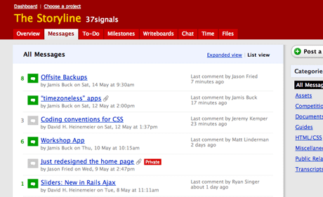
This weekend we pushed a new view in Basecamp called the List view. You’ll find this new view in the messages section.

List view makes scanning multiple message titles a lot easier (one of the top requests we’ve had). It also does a great job of showing you which messages are seeing a lot of comment activity (another top request).
- New messages or messages with new comments are marked green.
- Messages/comments you’ve already viewed are marked grey.
- The number of comments per message are listed at the front of each row.
- The last commenter (if any) is listed in the right column.
- Messages with file attachments have a paperclip icon after the subject.
- Private messages are marked with the red private flag.
The Standard view, which was the only view until we released List view, remains the default. You can toggle between the views at will. Basecamp will remember which view you last looked at and keep you in that view until you switch to the other view. This is a per-user setting.
We hope you like it as much as we do!

Steve T
on 21 May 07Did you run out of space to put the Category name next to the message title, poster’s name or date? I blame the long name “David H Heinemeier” for you not being able to fit the Category on the concepts and then cutting this feature!?
Benjamin Reece
on 21 May 07Great! This is awesome! I just wanted to say that our organization appreciates the continued effort into this product, as our needs are always evolving.
This is why we purchased a hosted product!
Thanks!
Des Traynor
on 21 May 07Just saw this a second ago, excellent work.
Long Time Listener - Repeat Caller
on 21 May 07Looks great. Could use category mentioning, though. Maybe cut down the verbage for the comment section on the right and put the category on the top line? I dunno… Just a though.
B
on 21 May 07Category doesn’t really matter in this context. This context is about activity, not which slot a message falls into. If you need to see all the messages in a specific category just click the name of the category in the sidebar.
George Morris
on 21 May 07Excellent, this makes locating messages much easier. It keeps it uncluttered and easy to scan.
Yan
on 21 May 07Very nice! Looks like it takes some flavor from beast/37 signals forums :-) Wish I could set it as global default, though…
Yaml
on 21 May 07Sliders new in Rails Ajax? Sounds inneresting, any more information about that?
Long Time Listener - Repeat Caller
on 21 May 07B – You like contradicting my comments, don’t you?
Ben Delaney
on 21 May 07Nice! Very thoughtful and something I had often wished was there. Thanks for the improvement!
Alexandre Simard
on 22 May 07Doesn’t this post belong in the new Product Blog? Love the feature, though.
Alexandre Simard
on 22 May 07Actually, it’s there. I haven’t subscribed to the Product blog yet, sorry about that. Then my question is: will cross-posting between the 2 blogs be frequent?
Nick
on 22 May 07That’s wonderful! Can we have the ability to delete people from the comment notification list?
JF
on 22 May 07Then my question is: will cross-posting between the 2 blogs be frequent?
From the post announcing the product blog: “We’ll still post occasional product news here at Signal vs. Noise like we always have…”
Alexandre Simard
on 23 May 07I missed that. Thanks, Jason.
This discussion is closed.