I’m working on a new Permissions screen for Basecamp. All the hard stuff is done. The layout, the reorganizing of actions and flows, the templates, and most of the Rails side of things. With 90% of the work done, the last 10% is where I pull out the magnifier and tweezers to finesse the details, check my assumptions, gild the lillies and ready the “DONE” stamp.
You’re definitely in the 10% when you keep flip-flopping designs. I went back and forth on this one three times before moving on:
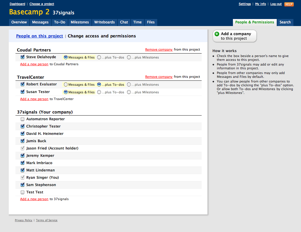
On this screen, companies appear with people whose access can be toggled (“candidates”) underneath. My first inclination was to cycle the shading on candidate TRs to make it easy to know who’s permissions you are affecting. But two things bothered me about this design.
The first factor is noise. I found a black border was necessary beneath the company headline in order to overpower the candidate rows and group them. The combination of black border and shading all over is just a bit much for me.
The second factor is conceptual. It’s important for people to understand that you add and remove companies from this screen in order to give or modify access for people in those companies. You can’t just add one person without regard for the company they belong in. I won’t get into the legacy and practical reasons behind this, we’ll just accept it as Fact for now. This noisey design doesn’t emphasize the company groups enough, and puts more weight on candidate tables.
Those factors in mind, here’s the subtle redesign:

Now the emphasis is on the companies. The border is removed and the page feels less noisey without the row shading. The redesign feels smarter, cleaner, and more modular. So after three rounds of flipflop, I’ll give it the champion belt.
James Finley
on 01 Aug 07Any hint as to when Basecamp 2 is coming out? Or is that top secret? I have worked a bit with the new Backpack, and love it.
Josh Walsh
on 01 Aug 07I love these posts, keep ‘em coming.
The left side looks great, but the right side troubles me. Your “How It Works” seems quite wordy.
Great work as always.
Luke
on 01 Aug 07A) It looks great B) I love the insight into the mind of a good designer
Tim
on 01 Aug 07Who’s Christopher Tester?
Is Chris the contract employee Jason mentioned about a few weeks ago?
http://www.37signals.com/svn/posts/509-what-do-you-want-to-know
Michael
on 01 Aug 07It’s fascinating how you see things differently, depending on how long you’ve been looking at them.
My initial impression is that Design #1 without the candidate TR shading meets your redesign goals, even more effectively than Design #2. I think the solid line delivers a cleaner transition between the company name and links (on the right), and the candidate rows, and better separation between companies.
Nick Toye
on 01 Aug 07Correct me if I’m wrong but are we not working with Basecamp 2 and have been for a while now?
RS
on 01 Aug 07James/Nick: Basecamp 2 was our internal name for an update that was rolled out months ago. My development version of Basecamp uses an old snapshot of the database, which is why I’m inside that project.
Nick Toye
on 01 Aug 07Ok, that’s what I thought.
So does that mean Basecamp 3 is in the wings. ;)
Jason
on 01 Aug 07What made y’all decide more permissions in Basecamp were a good thing? People and ideas can change, but it wasn’t that long ago that Jason wrote that if you had it all to do over again, there’d be fewer permissions in it. The visual decisions are interesting, but the features decisions are good to hear about, too.
RS
on 01 Aug 07The permission options are the same as the existing version. People either have access or they don’t, and clients can optionally add to-dos or milestones. If you look at the current version of Basecamp you’ll see this is the same.
The aim of this redesign is to clarify the existing rules and remove some stumbling blocks we have become aware of over time.
Des
on 01 Aug 07Just a quick note to say thanks Ryan, I love these posts, and thanks for writing one.
Craig Anderson
on 01 Aug 07I think it would be helpful to allow people that are not in the main company to add time entries. I allow several freelance employees to access Basecamp for projects, but they are unable to make time entries unless they are added within my company. However, if they are added within my company – they can see all the private message and the like.
Anyway, just a thought. Not sure if I was able to explain that point coherently enough.
Jeremy
on 02 Aug 07Why the ‘Ryan Singer (you)’?
Why do you think it’s important to for the system to tell people who they are?
jitesh patil
on 02 Aug 07Ryan, Like always I found the blog post very interesting.
Though I like the entire design, what I like most about the screen is the “How it works” section on the right hand side.
RS
on 02 Aug 07The “(You)” and “(Account holder)” labels explain why the checkbox is disabled. I also like the personal touch.
Thomas
on 02 Aug 07Great post, it is a good example of how small changes can make huge differences.
victor
on 02 Aug 07i was wondering: if it is
[ ] Client ( ) Messages and files ( )...plus To-dos ( )...plus Milestones
since it is a ‘plus’ decision, meaning it is what you chose before (Messages and files) + what you’re choosing right now (To-dos)
shouldn’t it be a checkbox? radio buttons read as exclusive selections, and semantically they are about it, whether checkbox are inclusive choices. it gives you the advantage of just browsing and seeing which client has the most privileges (the more checked boxes)
JF
on 02 Aug 07shouldn’t it be a checkbox
Yes, but unfortunately for legacy reasons we’re stuck with radio buttons for now.
Mike Gowen
on 02 Aug 07I second Jason’s idea about exposing the reasoning for feature selection. I’d love a regular Feature Decisions series where you map out the logic for why an idea you (or a user had) didn’t make the cut.
Terry Bleizeffer
on 02 Aug 07The right side says that “People from 37signals may add or edit any information in this project”.
If this is true, what is point of the checkboxes next to the names in the 37signals section? I assumed it meant removing their authority for this project, but the help text suggests otherwise.
Also, are all members of a company added to the list when the company is added? If so, it seems odd that you would provide a way to add members to a company from this panel – it seems out of synch with the purpose of the panel. On the other hand, if what the “Add a new person” link does is add an existing member of a company to the list so that you can assign permissions for the project to them, then you aren’t adding a person “to” the company, you are adding a person “from” the company to the project.
I’m not a Basecamp user, so this might be self-evident to anyone else.
This discussion is closed.