Vikas Sabnani writes:
Since launching [our website] in private beta 8 days back, we have seen more than 100 [accounts] created but less than 5 have actually done anything after creating an account.
Since you offer a free basic version as well, I suspect you see the “Blank Page” problem as well. My question is – what is the best way to encourage / prod your customers to try the product out?
This reminds me of the old “hosting a party” metaphor for web apps. Just because you’ve invited someone over to your house/app, doesn’t mean your hosting duties are over. You still need to welcome your guests, show them around, offer some introductions, and make sure they get into the flow.
That’s why the blank slate, the first screen people see, is so key. If it’s unwelcoming, people may not stick around.
It’s easy to overlook the blank slate too. When you’re building an app, it’s natural to get hung up developing the best experience for power users. But for most people, getting started is the biggest obstacle. So step back every once in a while. Put yourself in the shoes of newbies and figure out the best way to welcome them into the fold.
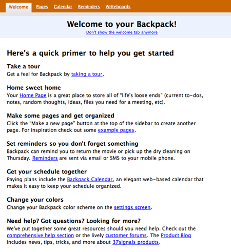
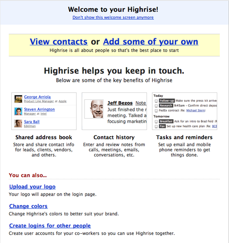
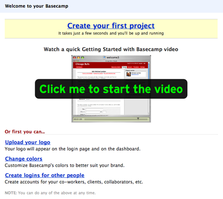
37signals blank slates
We’ve begun using welcome tabs as a variation on the blank slate. These let people keep intro information nearby for quick reference or get rid of it when they’re ready. This tab also serves as a crude site map of admin features, help links, preferences, and more.
Our newest product, Highrise, has a bunch of different blank slate states, one for almost ever major feature and some special “almost-blank slates” for screen with just a little bit of data. Some blank slates go away instantly while others go away after you’ve done something three times.
Basecamp’s welcome screen offers a “Getting Started with Basecamp” video. The video demos how the Chicago Bulls might set up an account and walks you through it step by step. It’s time consuming to create videos like these, but they really do a great job guiding customers.
Blank slates in Getting Real
Getting Real has a chapter on blank slates that offers some good advice too.
Use it as an opportunity to insert quick tutorials and help blurbs.
Give a sample screenshot of the page populated with data so people know what to expect (and why they should stick around).
Explain how to get started, what the screen will eventually look like, etc.
Answer key questions that first-time viewers will ask: What is this page? What do I do now? How will this screen look once it’s full?
Set expectations and help reduce frustration, intimidation, and overall confusion.
Related SvN posts
A couple of previous posts discuss using email to reach new or inactive customers: Waking up the sleepers talks about “poking” dormant accounts. People don’t scroll…emails offers advice on welcome emails.
Got a question for us? Send it to svn [at] 37signals [dot] com and make sure the subject line reads “Ask 37signals.”


Eric
on 25 Oct 07I just want to give you a testimonial of sorts of the simplicity of Backpack. We have been using it in our church office and has really revolutionized how I, as the boss can keep up with everyone’s project, volunteers and staff. Well, I took it home and showed my wife and she has now implemented her Backpack for running the hole house hold, including home schooling one of the kids, chores lists and essentially managing the home. The reason why this is noteworthy, is that I have what is know as the “Darlene” test. If Darlene can work it, then it is simple.
Tim
on 25 Oct 07The post ID wiggs me out.
Matt Brown
on 25 Oct 07I saw that too and laughed.
Craig
on 25 Oct 07I think you are missing an important point. Don’t get me wrong—the blank slate is great for somone who actually wants to use the product. But I think that the majority of these silent sign up never wanted the product in the first place. They are trying you product just out of curiosity, and because it’s so easy. Just accept this as a reality. By all means try to get their permission to stay in touch. E.g. send a “may we offer assitance” email a couple of weeks later. Or a survey to understand why they are not using.
Tony Wright
on 26 Oct 07Another really important response here…
Blank slate aside, how is your usability? I can’t count the number of times I’ve seen web geeks build a great app that falls VERY flat with non-geeky users. Make sure that your UX isn’t confusing or frustrating.
Great question and great response, though.
As a data point, we’re going through a closed beta (VERY close to an open beta) and about 70% of our users have done something (with most of them still active)... Which would lend me to disagree with @Craig (above).
I’d love to get a sense from 37s what kind of attrition they see in their users… Sites ALWAYS boast of accounts, but NEVER mention active accounts.
Vikas
on 26 Oct 07Thanks all – Great insights. We have experimenting with a few things – such as seeding with default content, which we hope will provide both an example of what the page looks like when complete and also makes it easier to get started; and providing a form to fill up the blank slate.
Co-incidentally, we decided to go with a primer instead of a “Welcome” page. The reasoning was that a primer provides more contextual help at exactly the point where its needed – whereas a Welcome page would be too overwhelming. We’ll see how it goes, though!
@Craig – i partially disagree. I don’t think the remaining 70% of users do not want the product, its just that their need is not strong enough to try and cross the initial hurdle. We, either need to figure out a way to make the perceived need higher, or reduce the hurdle.
Julia
on 26 Oct 07I am using Backpack since a few weeks, and I think it’s a great product.
I believe a short online survey would be great to get feedback from users, and understand their needs in order to convert them to loyal customers.
Great job!
Dan Evans
on 29 Oct 07A feature that I really like that got me to use a product I signed up for is the percent indicator in LinkedIn. It tells you how complete your profile is and gives you an example action that you can take to increase the completeness by a given percent. This makes filling out forms almost like playing a game. Also the fact that I can do a little now and a little later is nice.
This discussion is closed.