Actionhead Studios
Actionhead Studios is a nice little web studio site.

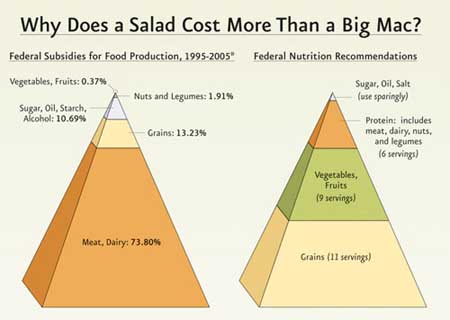
Salad vs. Big Mac
This graphic on food subsidies packs a punch. (source)

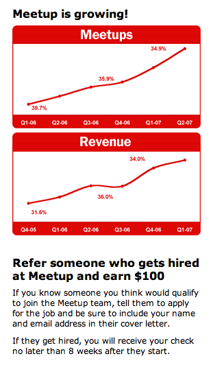
Meetup
Meetup.com’s job section offers this sidebar graphic which quickly shows potential applicants the company’s tide is rising.

Have an interesting link, story, or screenshot for Signal vs. Noise? Contact svn [at] 37signals [dot] com.

Charlie Park
on 03 Dec 07Maybe it’s just because the Meetup graphs have been decontextualized, but they don’t make sense. The percentages in the first one are decreasing, although the graph is going up. (Furthermore, 35.9% of what?) The second one is goofy, too.
Graphs are powerful animals. If they’re not using them right, maybe they shouldn’t be using them at all.
rb
on 03 Dec 07It’s too bad that the cleverness of the farm subsidies graphic requires it to use a misleading 2-d pyramid representation… while the height of the “Meat Dairy” section is 73.8% of the total height, the total orange area is far higher (around 90%). I think I measured it right. Forgive me for channeling Tufte, but their data is good enough that they didn’t need to exaggerate it.
Kerry Buckley
on 03 Dec 07@rb: It’s worse than that, because the graph gives the impression of being three-dimensional, so the apparent volume of the meat & dairy section is around 98% of the total.
Michael Zuschlag
on 03 Dec 07Re: Meetup. Also, there’s no scale on the y-axis, but it’s apparent that the bottom is not at 0%. It’s only 5% change of whatever is changing (I guess).
The artists of both of these graphs are hearby sentenced to be pelted with hardback copies of Tufte and Huff.
Nathaniel
on 03 Dec 07A different take on Salad vs. Big Mac by Chris Rice, my favorite contemporary Christian song writer.
I dig ActionHead Studios.
Peter Cooper
on 03 Dec 07@rb: And it’s not just the height.. since it’s being shown as a pyramid, it’s in three dimensions, and the volume of each of those sections is majorly out of whack with the numbers. In terms of volume, meat / dairy is probably 95% or more in that graphic.
Peter Cooper
on 03 Dec 07Can’t believe someone else wrote almost the same thing in the same format in the 20 seconds between me loading the page and writing that comment. The world is a small place.. :)
Charley
on 03 Dec 07Clarity of graphs aside, I enjoy how the Meetup charts resemble the “Hello, my name is . . .” stickers.
Mads Buch Stage
on 04 Dec 07I actually measured the pyramid to 239 pixels height and the Meat portion to 177 pixels, which equals roughly 74%, so except for the mass-thing, the graph is okay :-)
Morley
on 05 Dec 07Did anyone look at that Big Mac graph and expect a side view of a hamburger, with the ingredient heights inflated and shrunk to express the volume of subsidies? Informative and delicious.
This discussion is closed.