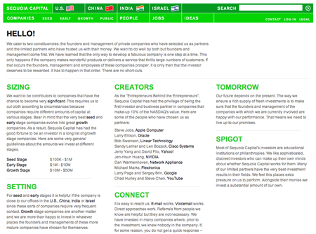
Sequoia
Sequoia, the guys who funded Apple, Google, and YouTube, have a no-frills site. It stands out from the typical flashy, fancy, or salesy VC firm site.
1-800-GOT-JUNK
Vincent Hubert writes:
Have a look at the bottom of the page here: 1-800-GOT-JUNK
You want to have a clue on how much clutter you have? Just click on the truck ratio, and you will see the amount of junk it represents.
Blockbuster
It’s always a challenge to deliver bad news to customers. Don Wilson spotted this Blockbuster account change email and sent it in. The compay is downgrading customers on this plan from unlimited in-store exchanges to 3 free exchanges per month. The note is a little long winded — the main point: You no longer get unlimited in-store exchanges — but at least it clearly explains what’s going on and shows all the options available to customers.
Have an interesting link, story, or screenshot for Signal vs. Noise? Contact svn [at] 37signals [dot] com.


GeeIWonder
on 13 Dec 07This seems like no-frills to you?
Ok then.
Tom
on 13 Dec 07I recently used 1-800-Got-Junk for the first time, not only is their site great, but their service was awesome as well. Not sure I would have actually used them if the site hadn’t made it so easy to understand exactly how the service works.
--Josh
on 13 Dec 07That Blockbuster email is interesting in that they sent me one saying that while they were restructuring their plans I was grandfathered in as long as I stuck with my current plan. Odd that they didn’t do that for everyone.
Luke
on 13 Dec 07@GeelWonder
You disagree?
Well I would disagree with you. Find me a single superfluous graphic, gradient, or piece of gloss.
Even the home page you linked to has nothing superfluous on it—there isn’t a single piece of frill to be seen. When you accuse it of being the opposite, I assume you’re pointing to the image grid, which isn’t frivolous in the least. The only “decoration” used here is the padding between images, which is a moot point.
GeeIWonder
on 13 Dec 07Hey Luke. Who are you quoting when you say ‘decoration’?
‘Accuse’ is a loaded word, but ok let’s look at their site. First the page I linked to is their landing page, not an about page (compare that, for instance with Mozilla’s, . Since the post said ‘site’, it’s disingenous to link to a page you have to navigate to without talking about the pages you’re navigating through. Which is the second point.
Now, let’s look at the landing page itself. I think a landing page with 72 110×110 images is inherently fancy, frilly and with the javascript, flashy, but that’s just me.
It’s got not one, but two images for each grid element. They’re all jpgs too (high color depth, even for the greyscaley elements), and apparently loaded sequentially rather than front first. Which is a misnomer, because they’re actually loaded as backgrounds. It doesn’t scale well to lower resolutions in e.g. Firefox or Opera. And the whole thing would be essentially unnecessary, and probably more indexable to begin with if with judicious use of the img alt were used.
Now, look at the nav on top: 5 identical pages with completely separate links.
I’m not saying it’s a bad site, but if I was saying it stood out, I wouldn’t pick lack of frill as the reason why.
Kevin Milden
on 13 Dec 07I found Sequoia a while back and I was impressed.
Rimantas
on 13 Dec 07No frills? Sure: http://www.berkshirehathaway.com/
John
on 13 Dec 07Rimantas: upping the ante somewhat is http://www.something.com/
(Which is, incidentally, my most favouritist website of all time)
GeelWonder: I think you missed the point. Stepping back for a second from how the site was built (I know it’s hard when that’s what you do for a living), the site is dead simple. It communicates without superfluity. That is the point.
Also, the copy is so, so spot on… if I wanted funding, they’re the first people I’d gravitate to. They speak in plain English and seemingly open up the game to all comers. Whether that happens in practice or not is another matter, but it surely gives one confidence to have a shot at it anyway.
GeeIWonder
on 13 Dec 07THe landing page is loaded with unnecessary images trying to do something that would not only be faster and more indexable, but just plain better as text. Javascript hover, alt, whatever. That’s superfluity.
Sometimes when a selected section is shown in the navigation, it’s darkened. Sometimes it’s highlighted. Sometimes it’s underlined. Sometimes a similar color suggests a sub-section. Sometimes it doesn’t. Sometimes there are not one, not two, but three nav bars (all of different colors) taking the top 100 px of the screen. Maybe there’s many more nav bars to be found… I don’t know.
That’s not simple.
The copy is good. The company is good, I’m sure. But that’s not what the original point was at all, I dare say.
Tor Løvskogen
on 13 Dec 07The green colors are hurting my eyes.
Mike
on 13 Dec 07I like that Blockbuster offers “Cancel Now” as an option. It seems like more and more companies (37signals included) are realizing that it’s good business to make it easy to cancel your service. My experiences with several companies (AOL, Discover, many long distance companies) which virtually refused to allow me to cancel MY account, have led me to a) vow never to do business with them again, even if they seemed to be offering an ideal service and b) always look for the “cancel” button when signing up for a new service.
I sincerely hope that the “once we have your credit card number we’re going to charge you $19.95 a month until the day you die, come hell or highwater” business model goes the way of the dodo.
J
on 13 Dec 07Re: Sequoia Capital site:
I applaud their attempt to avoid being flashy and fancy, but this site is, in my opinion, not appealing at all.
It does stand out, but for all the wrong reasons. If their reputation and names did not save the day, they’d be in trouble.
And those wavy flags?? Really? Might as well be animated GIFs.
Andre
on 15 Dec 07The Sequoia site is the kind of thing you don’t often see. For the nature of the enterprise it fits very well.
In just a few seconds of scanning the front page you: 1) learn what they do 2) can sense how they do business 3) know where to go to get more information
Good communication in my books.
Kenan Banks
on 17 Dec 07Just thanking you for posting this. I stumbled upon this redesign a couple months ago (I think) and for the life of me couldn’t remember what it was when I randomly thought of the design again.
Seeing this was as satisfying as having your ears finally pop a day after getting off the plane.
Mark Dempster
on 19 Dec 07Matt’s interpretation is precisely what we were trying to achieve. The comments are very helpful. Positive or negative, keep them coming so we can improve and make the site more useful to entrepreneurs.
This discussion is closed.