I love this guy’s message, work ethic, and results. Fascinating epiphany too – equating the circus with… Well, I don’t want to ruin it. Just watch it.
Is there a better way for you to price your product?
Alex Bogusky thinks scrappy small-agency entrepreneurs will lead us from recession. In the piece, he mentions Big Agency Defectors (or BAD), an agency that aims to develop big ad ideas quickly and efficiently without the baggage involved with big traditional agencies.
They have a simple fee structure called “20:20:20” that’s pretty neat:
Our fee structure is simple and transparent. We call it 20:20:20. There are three phases of creative development, each with a bite-sized fee attached. $20k for creative initial concepts. $20k for developing each into a full campaign. And a 20% commission on production costs to produce them…If you don’t want to move forward from one phase to the next, that’s no problem. At the very least you’ll have some fresh thinking about your brand. But we think you’ll like what you see and want to go further. Our fee structure rewards us for getting the ideas into production. This means doing great work right from the start.
I sent an email to BAD’s Mark Simmons asking why they chose this pricing route. His response:
The traditional route is opaque. It takes so much time working out a fee arrangement between agency and client. We’re trying to cut through the bullshit and say up front exactly how much we charge so nothing is hidden. Our system means a marketer pays a reasonable amount at each stage and we’re incentivized to create work that actually sees the light of day.
Pricing can be usable too
We tend to think that only products can be more usable. But pricing can be usable too. Any time you can take something that’s normally complex for customers and make it a no-brainer, you’re closer to closing the deal.
Reminds me of when we did client work and launched 37express (1 page redesigned in 1 week for $2,500). It was our way of getting work done quickly while being as upfront as possible about pricing and deliverables. We eliminate the typical proposal documentation BS. We didn’t need a lengthy back and forth to get started. It was just “Here’s what we do and how much we do it for.” It wasn’t for everyone but some customers really loved the idea of getting down to business right away.
Years ago, Saturn turned the typical car dealer pricing model on end and made it “what’s on the sticker is the actual price.” The reason according to “Saturn: Secrets of the ‘no-haggle’ price”: Few people like the process of haggling for the best price on a new car. In fact, almost two-thirds of car shoppers in a survey said they would prefer to pay a single, set price. It’s no wonder then that people who buy Saturns generally love the no-haggle price.
Pricing is an easy place to fall into the “it’s always been done that way” trap. Next time you’re trying to make it easier for people to use your product or service, look at the way you price it and ask yourself if there’s a better (or easier or faster) way than the status quo.
Related: The early days: How 37signals built buzz out of the gate [SvN]
Get Satisfaction, Or Else...
Get Satisfaction, a third-party customer service app/community, allows customers to offer feedback, make suggestions, get their questions answered, and generally get help with a product or service.
A good idea
Building support/community infrastructure is a pain point for a lot of companies. The help section, forums, FAQs, and whatever else you have to build to offer comprehensive customer support is a big undertaking. It’s often the last thing you want to do after you’ve just worked for months on a product or service.
So for those companies that would prefer to outsource this infrastructure to a third party, or use an alternative sanctioned support outlet in addition to their own, Get Satisfaction is a handy service.
But…
But if you prefer to provide great support on your own site with your own forums and your own help section and your own feedback mechanisms and your own FAQs, well, Get Satisfaction doesn’t play fair.
If you fail to subscribe to Get Satisfaction’s way of doing things, Get Satisfaction suggests to your customers that you’re “not yet committed to an open conversation.” That’s unfair and unreasonable. Just because we don’t team up with Get Satisfaction it doesn’t mean we’re not committed to an open conversation.
They make something look official that is not official
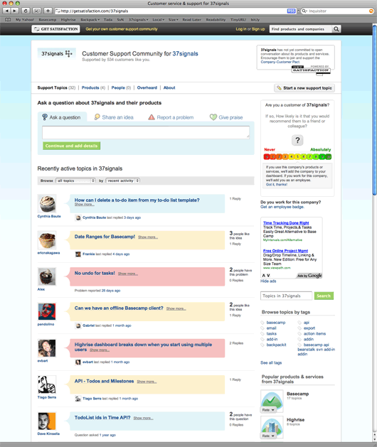
A screenshot of the 37signals Get Satisfaction page…which we have nothing to do with.
That’s not the only shady area for Get Satisfaction. The site also hosts, without permission, company support pages for over 14,000 companies. They’ll use your logo, title the page “Customer service & support for [COMPANY NAME HERE]” and generally make it feel like an officially sanctioned place to get official support from the company in question. The problem: It’s not official at all. That’s misleading.
The heavy handed tactics used by Get Satisfaction seem to indicate that their long term plan is to own every company’s customer support experience – whether it has your permission or not. Google searches for “[COMPANY NAME] support” will end up linking people to a Get Satisfaction page. If that’s not the offical support home for that company, who winds up winning? It’s not the company. It’s not the customer. It’s really only in the best interest of Get Satisfaction.
They also have a certificate-like customer-company pact agreement that they’d like you to sign. And if you don’t, they’ll make an outlandish claim about your lack of commitment to your customers. Here’s an image they put on our company page on the Get Satisfaction site:
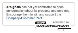
Can you believe that language? “37signals has not yet committed to open conversations about its products or services.” WHAT?! We haven’t committed to open conversations about our products or services because we haven’t signed Get Satisfaction’s pact on Get Satisfaction’s site which generates Get Satisfaction’s income? That’s awfully close to blackmail (or a shakedown or a mafioso protection scheme).
Continued…The evolution of the 37signals home page



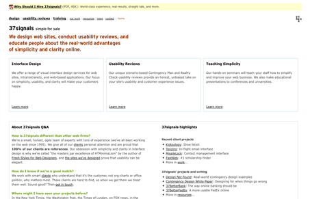

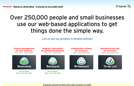

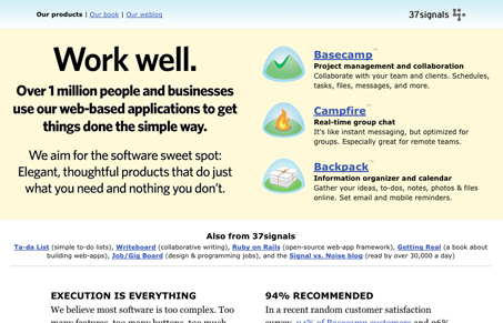

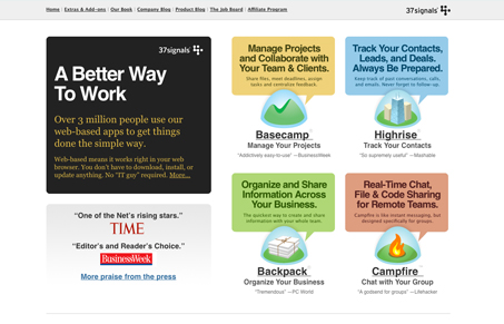
View the original version (the 37signals manifesto).
View the current version.
Unmatchedstyle.com takes a look at the evolution.
The Real World: A video of David's talk at FOWA Dublin
Other talks from the Future of Web Apps Dublin 2009.
Designers: Make it Memorable
Last year Jason Fried made a rather bold statement declaring the Drudge Report as one of the best designed sites on the web. I had recently been hired as a Designer, and I didn’t quite know what to think of this post. My boss explained to me (and 85,000+ people) that he thought the Drudge Report was one of the best designed sites on the web, and I disagreed with the statement.
It was only after launching the design for the 37signals site that I started to reflect back on the original sentiments of that Drudge Report post. Jason explained that the Drudge Report stands apart from the “news” pack. It is unique in its design—albeit plain—compared to the CSS mastery of other news sites. This simple and plain uniqueness actually makes it memorable.
It looks good, but what did it say?
We went through hundreds of designs for the Highrise, Basecamp, and 37signals marketing sites. I thought many of these designs were visually successful. Ultimately most were rejected on the basis of clarity. Each time Jason and I would have a design review he would inevitably ask, “What is this trying to say? Why is this important?” Then he would follow-up with the statement “Clarity above all else!” This would often result in making the font bigger, removing an illustration I spent hours on, or Jason rewriting complete pages of text.
It was during this time that I’d think about the sites that I appreciated from a design standpoint. Many of them are personal blogs or cool brochure sites. I began to realize that these sites displayed information well, but I could not exactly remember what they were about. They sure were pretty with fantastic CSS, but I can’t really remember what what the site said. Did it say anything?
I started to recall those amazing Flash Sites of the Day. You know those sites that get passed around via IM in your office on a slow day? Simply amazing design and programming. Problem is: I can’t for the life of me remember what those URLs were–much less the company/product that was being featured! Isn’t that the point with those sites? That the impact should be profound so that you remember Product or Company X?
And so it was in revisiting Jason’s Drudge-Report-Loving-Post that I finally began to understand: It doesn’t matter how awesome or slick the CSS or ActionScript on your site is. You have to make your site memorable. Your site has to speak clearly. Otherwise it may just end up as a web monument awaiting for another beautiful site to take its place.
I learned back in the days when I was consulting that they give you more information than you could possibly read. So you needed to quickly step back and say, “What are the two or three things that really matter?” And I find in the world that people don’t really do that often.
Music collaboration via git?
I was digging through some old backups this week, and I stumbled upon a bunch of music that I had written twelve and thirteen years ago. No, I will not inflict it on you. Much of it is so embarrassingly bad I can only laugh, but there are a few pieces I thought would be worth archiving (for my own personal history’s sake). So I downloaded LilyPond and began transcribing them.
LilyPond is free, but it is not a graphical music notation editor. I’m not into music composition enough these days to desire to spend any money on it, so “free” is about all I’ll budget for it. What LilyPond does is take text files containing (essentially) gibberish, and emit a PDF with beautifully laid out music. It’s easy! All you have to do is learn to convert your music into gibberish.
The interesting thing about this, though, is that it essentially lets you convert music into source code. Once it is in a text format, you can treat it just like any other text file, including hosting it on GitHub (or similar). So I wondered: are there any projects out there, where people have worked on a musical composition as a community, using something like git or subversion to collaborate?
I’m sure I can’t be the first that this has occurred to. And while my own musical chops aren’t up to participating in a songwriting project, I would love to follow along, all from the comfort of my command-line!
The Mystery of the Snowglobe

What a pleasant surprise to find on my desk today! Thanks to the amazing snowglobe creator, Herb Rabbin, for sending this to us. And a thousand times thank you to whoever commissioned the work, since there was no note enclosed. Who could have sent us such an awesome gift? If it was you, please get in touch with [email protected]!
37signals Live in just a little bit!
Ask 37signals questions and we’ll answer live on video. Featuring Jason Fried and David Heinemeier Hansson.
Thursday, March 26
11 am Central (17:00 GMT)
at live.37signals.com
Tune in at your local time:
San Francisco, 09:00
New York, 12:00
London, 17:00
New Delhi, 22:30
Tokyo, Friday, 02:00
Sydney, Friday, 04:00
(See what time 11am CST is in your timezone with Permatime.)
Join Jason Fried and David Heinemeier Hansson as they recap what’s been happening at 37signals. Jason and David will also take questions from viewers and answer them live.


