You’re reading Signal v. Noise, a publication about the web by Basecamp since 1999. Happy !

Signature designer?

Basecamp
Basecamp wrote this on 27 comments

A conversation about signatures (real ones, not digital) from our room in Campfire:

Jason F.: Don’t you think that would be a really cool niche side job for a designer? Custom designed signatures? The client would have to learn it, but I bet there’d be a decent market for a really cool signature.

Jamie D.: That is interesting, and actually w/ all the digital stuff you probably don’t even need to really sign it

Jason F.: Either way, I think it would be really cool to have a beautifully designed signature. One carefully considered, unique, and interesting.

Jason Z.: It’s actually surprising that never happened when calligraphy was in it’s hey-day. Surely everyone didn’t have a knack for graceful flourishes.

Matt L.: love the idea of a signature designer. wouldn’t even have to invoice you. he can just sign the check himself.

Great proportions melt away impurities in a design. So if you have buttons and there’s too much space between them, the space between them is another element that you have to comprehend.

So if you have two buttons, you now have three objects. You’ve got the button, the button, the space. But if things are the right proportions, you just have two items, the two buttons.

And I think over a big screen, if you get the proportions right, you could be eliminating 10 or 20 different extra negative space things and things that you just have to comprehend. So it’s very soothing.


Jason during the 37signals podcast Design roundtable – Part 2 (transcript).
Basecamp on Aug 24 2010 2 comments

Nice post-order communication from Bobybuilding.com

Matt Linderman
Matt Linderman wrote this on 19 comments

Ian Hall writes in:

Just ordered from Bodybuilding.com and got this follow-up and thought it was an interesting way of doing some post-order marketing and outreach to build community. Take a product and talk about it, direct people to more information, and recommend additional things they could use to see better results. Dunno if it’s terribly innovative but I thought it was neat, clean, to the point, and, at least in my case, communicated genuine interest and care.

letter

Grant Achatz and Craig Schoettler experiment with the idea of bubble tea. Gin and tonic made with junipero, yellow chartreuse and cucumber alginate encapsulation. (via Chicagoist)

What to do if your iPhone falls in water: 1) Do not turn it on. 2) Remove the sim card. 3) Use a blow dryer on it. 4) Put it in a bag of rice. Full details.

Matt Linderman on Aug 23 2010 14 comments

This week in Twitter

Basecamp
Basecamp wrote this on 1 comment

A few of this week’s 37signals staff posts at Twitter.

uptonic@uptonic: “XML is like violence – if it doesn’t solve your problems, you are not using enough of it.” –Nokogiri.org


Ryan Singer@rjs: A programmer at 37 just surprised us with one of the freshest UIs I’ve seen in a long while.


Jamis Buck@jamis: Called the Apple Store. “Sure we have that battery!” Walked 1 mile to Apple Store. “Battery? What?” And then it rained.


Jason Zimdars@JZ: Neat idea: dingbat fonts for web icons using font-embedding techniques. http://pictos.drewwilson.com/


Kiran Max Weber@kiranmaxweber: As expected, the @goincase Slider Case for iPhone 4 is perfect. Highly recommended. http://bit.ly/bHhm51


Matt Linderman@mattlinderman: Some cool vaseline-on-the-lens shots at “Four Fun and Easy Ways to Make Your Photos Look Vintage” http://bit.ly/auQ5Jj


Ryan Singer@rjs: Summertime tip: Two shots from the Nespresso machine, sugar, ice, martini shaker, and a lowball glass. Perfect.


Sam Stephenson@sstephenson: AmEx’s customer service is worth the cost of admission. Just called about a fraudulent charge from July; they’re overnighting me a new card.


Jamis Buck@jamis: Does Rite-Aid’s “with us, it’s personal” slogan strike anyone else as vaguely sinister?


Jason Fried@jasonfried: Audi’s Haptics Team focuses on sensory experiences: http://audiworld.com/news/10/sensory


Jason Fried@jasonfried: BusinessWeek 2001: “Sorry Steve, Here’s why Apple Stores Won’t Work”: http://bit.ly/Z2uNK


How branding and transparency help charity: water stand out

Matt Linderman
Matt Linderman wrote this on 17 comments

The final guest speaker at our recent 37signals HQ meeting was Scott Harrison from charity: water.

harrison

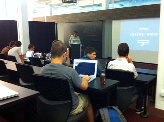
charity: water is a non-profit organization bringing clean and safe drinking water to people in developing nations. Harrison’s personal journey is compelling and it was interesting to hear how CW’s unorthodox approach, especially when it comes to branding and transparency, has helped it stand out from other charities.

Branding
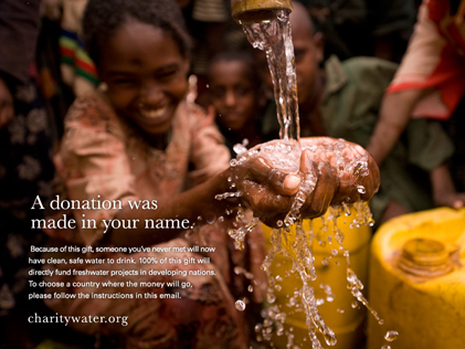
CW’s messaging emphasizes cool visuals, striking videos, and from-the-field reportage. It’s more like what you’d expect from a business or publication than a charity.

For example, the image of the yellow jerrycan — often used to carry water in third world countries — has become an iconic symbol used in CW’s advertising and videos.

This image of a baby bottle filled with dirty water is also used frequently by CW:

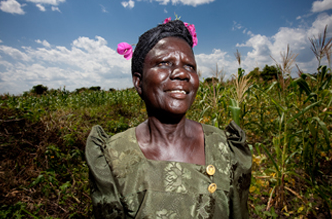
Below, a couple examples of the stunning field photography used by CW. Looks more National Geographic than NGO.

photog

hands

CW’s videos are sharp too. Hotel Rwanda Director Terry George directed this PSA starring Jennifer Connelly.

Transparency
Another key to CW’s success is that 100% of donations are used for direct water project costs. (A group of private donors, foundations and sponsors help pay for the everyday costs of running the organization.) CW even pays for the paypal and credit card transaction fees when people donate online so each penny goes straight to actually building a well.

Harrison chose this route because he felt many donors had lost faith in charities due to outsized admistrative costs. Many CW donors decide to give because they know for sure where their money goes. (It’s worth noting this policy presents a big challenge since it makes fundraising for operational costs difficult to scale.)

CW also works hard to document the results of donations. One way this is done: GPS and photos of completed projects.

google map

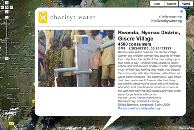
When donors see photos and videos of the communities they’ve helped, they’re a lot more likely to continue giving.

It’s a great story and it’s neat to see this kind of approach brought to the charity world. Thanks for stopping by, Scott.


Learn more about charity: water or donate.

Experiment: Customer training

Sarah
Sarah wrote this on 48 comments

UPDATE: Thanks everyone! We’ve got all the responses we need for now.

Now that we’ve moved into our new office space, we’d like to experiment with some ideas for training customers in person.

Are you a paying 37signals customer who’d like to have a personalized one-hour training session for you and/or your co-workers? Our learning theater at the new 37signals office in Chicago is now operational and soon we’d like to start bringing in customers to show them the ins and outs of our products.

If you’re interested, please email sarah [at] 37signals [dot] com for more information.

David Thorne's "Missing Missy"

Matt Linderman
Matt Linderman wrote this on 12 comments

Seems this Missing Missy exchange has made the rounds already but I just discovered it and genuinely LOL’d (GLOL’d?) so figured I’d share. Will prob hit even harder if you’re a designer who’s ever been asked to craft a “quick” design for a co-worker.

Shannon: “I opened the screen door yesterday and my cat got out and has been missing since then so I was wondering if you are not to busy you could make a poster for me.”

David: “Although I have two clients expecting completed work this afternoon, I will, of course, drop everything and do whatever it takes to facilitate the speedy return of Missy.”

missy

Shannon: “yeah thats not what I was looking for at all. it looks like a movie and how come the photo of Missy is so small?”

David: “It’s a design thing. The cat is lost in the negative space.”

Gets stranger/funnier from there.