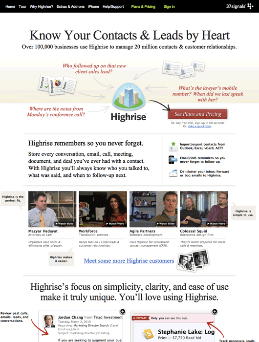
I was an A/B test skeptic. Maybe we don’t want to be second-guessed. Maybe we don’t want to cater to the lowest common denominator. Designers are taught—explicitly and implicitly—to follow certain visual rules and the final design will work great. The whole A/B testing concept probably came from from “strategy analysts” or “MBAsses”. Anyway, now I’m a believer in A/B testing.
How I Learned to Stop Worrying and Love the Bomb
Designers, you’ve been in critiques where Clients, Art Directors, Creative Directors, Project Managers, Copywriters, Executive Assistants, and other Designers have picked apart your work. You listened with agony when they questioned your choice of this shade of red or this typeface. You winced when they said that photograph wasn’t “right”. Your vision is already changing based on a series of opinions!
Next time say, “I hear your concern about the shade of red. Why don’t we test that? I feel strongly about the color red, but it sounds like you need to be convinced it won’t affect X.”
Increasing our Signups through A/B Testing
A few weeks ago Noah and I talked about the testing we’ve been doing with the Highrise marketing site. Here’s a summary of the findings we posted:
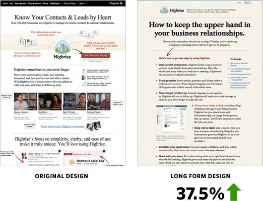
37.5% more people signed up for Highrise with the Long Form design.
Jason Fried’s mantra while testing was: We need to test radically different things. We don’t know what works. Destroy all assumptions. We need to find what works and keep iterating—keep learning. (I’m paraphrasing here…) We tried out a radically different design with these results:
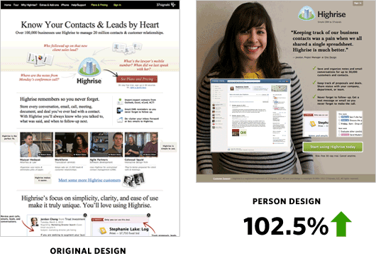
The Person Page was far shorter. There was less information about Highrise. However it had a 47% percent increase in paid signups than the Long Form design. Why exactly was the Person Page working? What might happen if we added more information to the bottom?
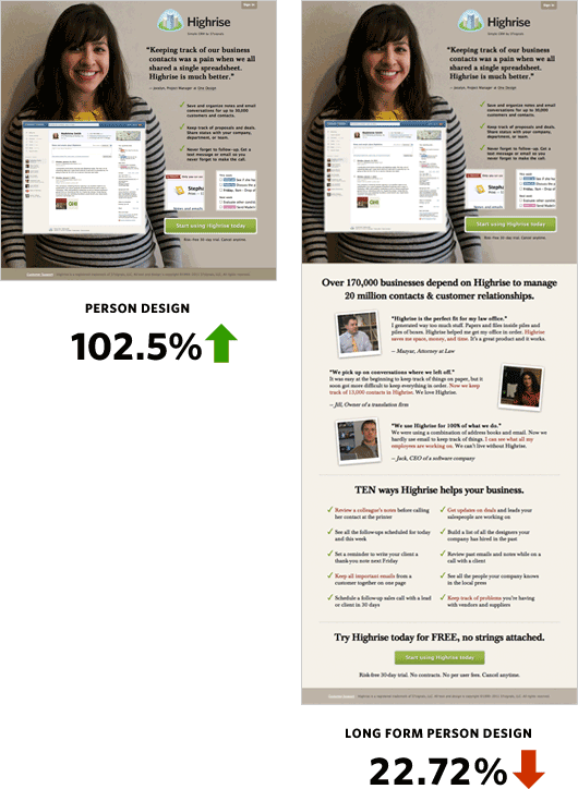
The crazy thing was when we added more information to the bottom of the Person Page it performed over 22% worse than the original design!
Changing People
Jocelyn from One Design—a Chicago design company—could also be the secret sauce to the effectiveness of the design. Her quote is direct and simple. She looks friendly and very non-techie and approachable.
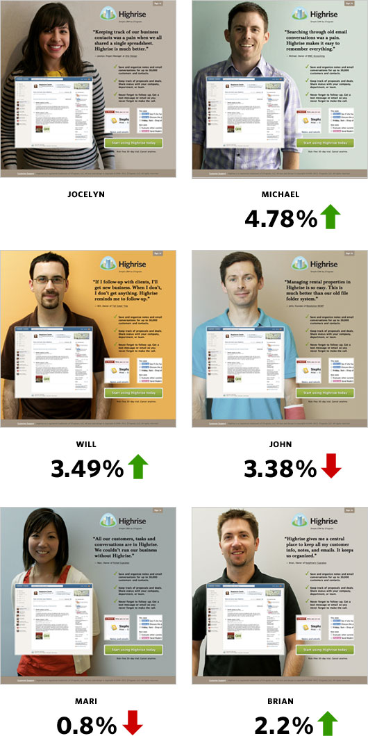
I got in touch with more of our wonderful Highrise customers to see if some would be interested in posing for our homepage. Michael, an accountant at MWC Accounting; Will, a programmer at Tall Green Tree; John, founder of Revolution Management; Mari, owner of Foiled Cupcakes; and Brian, owner of Nutphree’s were gracious enough to have me interview them for the site.
I was curious to see if Jocelyn was the key to the winning design. Here’s how she fared:
Conclusions
- Big photos of smiling customers work
- A specific person didn’t quite matter among the set of people we tested
I hope you gained some insight from our series of behind the scenes articles. Please try to roll in A/B testing into your schedule! If you work in an internal Design Department then this is a no brainer. It’d be interesting to see Interactive Agencies add testing to the design process.
We’re still testing too. You may not notice such drastic changes to the Highrise site anymore, but trust me we’re tweaking and measuring behind the scenes. We’ll also be applying some of these findings to future marketing efforts. However, as Jason says, we will always test, improve, and learn. I want to be the first to come up with a design that beats our Person Page. Thanks for reading!
Please note: What works for us may not work for you. Please do your own testing. Your conversion rates may suffer if you copy us.

