You’re reading Signal v. Noise, a publication about the web by Basecamp since 1999. Happy !

Jason Fried

About Jason Fried

Jason co-founded Basecamp back in 1999. He also co-authored REWORK, the New York Times bestselling book on running a "right-sized" business. Co-founded, co-authored... Can he do anything on his own?

Join our customer service and support team

Jason Fried
Jason Fried wrote this on 6 comments

We’re looking for a fourth person to join our customer service team. You’ll join Sarah, Michael, and Jason in making our customers as happy as possible. Sarah, Michael, and Jason are great at what they do — you’ll be joining a top shelf team.

You’ll provide “it was so good they couldn’t stop talking about it” customer service via email for Basecamp, Highrise, Backpack, and Campfire. You’ll also be responsible for chiming in on 37signals Answers and updating and improving the articles in our help section. We’ll also be exploring phone support and in-person training shortly, so that should be something you’d like to do as well.

You’ll be expected to answer about 75 emails per day once you’re fully up to speed (2-3 months on-ramp). This is a significant volume, so be sure that you’re ready and able to deal with that kind of load day after day.

We’re looking for someone who loves to help others, someone who can keep smiling even when dealing with tough customers (empathy is important), and someone who has a passion for our products and company. You should enjoy the process of making an anxious customer a happy customer.

In addition, you have to be an excellent writer who enjoys writing. Our customers love when we get back to them within 10 minutes with a clear, concise, and friendly answer. Great writing is key.

How to apply

Please submit a cover letter explaining:

  1. Why you want to work in customer support.
  2. Why you want to work at 37signals and not somewhere else.
  3. A description of a great customer service/support experience you had recently, and what made it great.

Also, attach the following writing samples:

  1. Explain in 3 paragraphs or less why a customer would pick Basecamp vs Highrise.
  2. Respond to a customer asking for Gantt charts in Basecamp that it’s not something we offer, but suggest using the Milestone section instead.
  3. A company using our job board failed to find to find a suitable candidate and wants a refund. Respond that we don’t offer refunds for job postings.

We offer health-care coverage, a 401K with a generous match, a Flexible Spending Account, plus a progressive work environment. We’d prefer someone in Chicago, but we’re open to hiring the best person no matter where they live.

Email everything to [email protected]. Include “Customer Support” in the subject line. If you’re attaching a resume, please send it as a PDF. Note: We look favorably on people who get creative with their applications.

We look forward to hearing from you.

Redesigned: The new 37signals.com

Jason Fried
Jason Fried wrote this on 102 comments

This weekend we launched a redesign of 37signals.com.

We try to redesign 37signals.com at least once or twice a year. It’s not a stated goal, but it’s something we just like to do to keep things fresh — especially since our designs are often copied pretty quickly after we launch anything new.

This time around we wanted to go back to our roots. Our roots included simple, sparse, mostly text-based black and white designs. Our original site, which is now the 37signals Manifesto is the best example of this style. This design from 2002 is another example. Strong opinionated writing was also part of these early designs. It was time to return to that era.

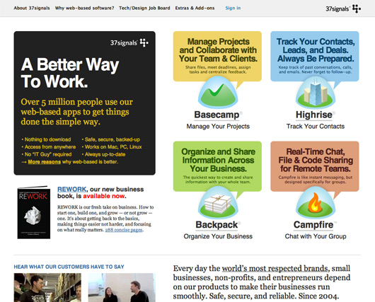
Our previous home page design looked like this:

It was a bold departure from our earlier designs. Full of color, shapes, and pretty dense newspaper-like columns of text. I still like the design, and it served us quite well, but in some ways just didn’t feel like 37signals.

The goal for this redesign was to get back to being absolutely clear about what we do, what we offer, and what we believe in. A big part of that would be the straightforward presentation. Black, white, red, centered, big text, great writing, color for naturally colorful things like product icons instead of color for shape.

We also wanted to bring a bit of the manifesto back to the 37signals home page. Our strong opinions and vision for software and business are a key part of our company. We wanted to make sure some of these ideas were front and center.

A couple of weeks ago we began exploring some new designs for 37signals.com. We’ll share those iterations in a future post. We’ll also be sharing some of the copywriting process for the headlines and paragraphs that ended up on the home page.

The new design

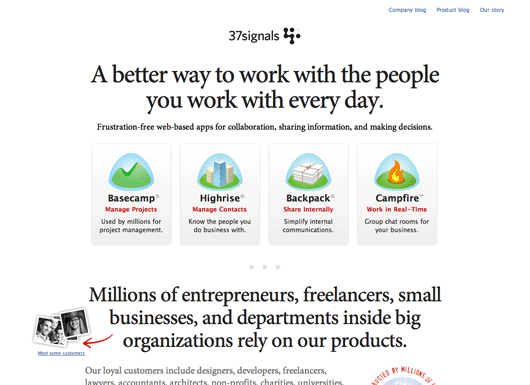
The final design we came up with was a simple, straightforward approach. Big centered headlines, clear blocked sections (one for the products, one for our customers, one for our ideas, one for REWORK, etc). Tight copy, clear lists, and a few small visual flares to highlight key points we want to make. We used color to make a point, not to make a statement.

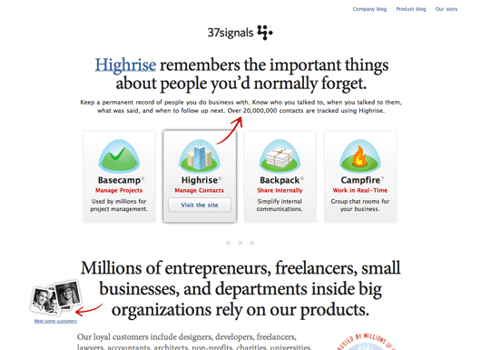
The only thing that’s a bit fancy on the page is revealing a more detailed description of a product when you hover over the product’s icon. On hover we switch out the main headline on the page with the product-specific headline. We also add a red arrow to make sure the connection between new headline and product is absolutely clear.

The whole new design is live at 37signals.com. The new design also introduces our new customer page with faces, locations, and stories from some of our customers around the world.

We hope you like the new design. Thanks for listening.

Official pictures of our new office

Jason Fried
Jason Fried wrote this on 97 comments

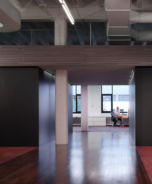
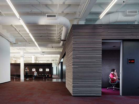
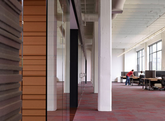
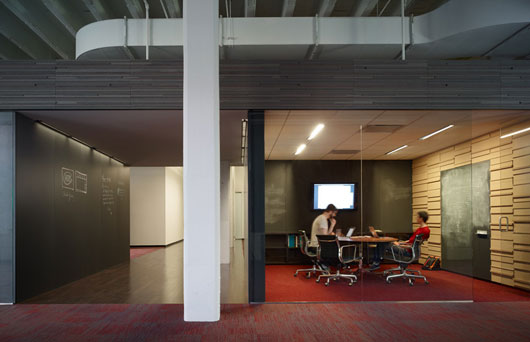
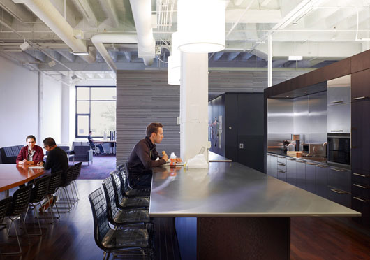
Just got the official shots of the new office back from the photographer. There are a few more coming, but we couldn’t wait to share these.

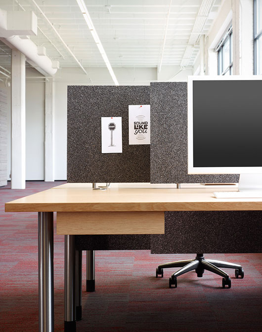
The chief architect was Brad Lynch from Brininstool, Kerwin and Lynch. The general contractor was Goldberg General Contracting. The wood millwork, cork and felt walls, desks, and blackboard walls and doors were built by hand by the incredible crew at Stay-Straight Manufacturing. The photographer was Chris Barrett. Down the road I’ll write up a more detailed post about the people who worked on this project. They were all incredible to work with.

And here’s a rough video of some moving pictures:

What happens when it's all glass?

Jason Fried
Jason Fried wrote this on 49 comments

Apple’s design dominance over the past decade has been due to industrial design first, software design second. Their hardware designs have inspired a generation. Over those last 10 years their software has gotten better and better too (it’s really damn good now), but it’s been their industrial design that has made the first impression on the market.

However, I wonder if Apple will soon lose their perceived industrial design edge. It’s not that they aren’t incredibly good at it — they are the best in the business — it’s that industrial design is trending towards transparency. It’s all going glass. Everything is turning into a screen, from edge to edge. Once it’s all about glass, it’s all about software.

Luckily for Apple their software is outstanding. But, I think over time great software is less of a competitive advantage than killer hardware only because software, across the board, is getting better quickly. This is especially true in mobile, where the glass revolution is in full swing. Android is solid, WebOS is solid, and Blackberry’s new OS/UI looks great too. Nothing I’ve played with is better than Apple’s iOS, but a lot of the alternatives are approaching “plenty damn good” status.

Apple does the small things better than anyone else. Their choice of materials, finishes, and fittings are top notch. Their tolerances are tight. Their assembly techniques make their products feel like one solid whole. They are damn good at this. But, while these details matter to those who notice them, I wonder how much they are noticed by the public. The difference in build quality, materials, and tolerances between a MacBook Pro and a Lenovo are still obvious, but as things go all glass, will the build quality between an iPad and a Blackberry Playbook be as noticeable?

Time will tell, I’m just curious about the answer. Apple has a way of making the future. Maybe Apple’s tight integration between products is more important than the first visual impressions. Or maybe Apple’s purchase of LiquidMetal may pave the way for stronger, smaller, thinner, lighter things that other companies just can’t match. Or maybe my imagination isn’t big enough to see what innovative differentiators are coming next. But what about all that glass?

Want to be on our customer wall?

Jason Fried
Jason Fried wrote this on 10 comments

We’re going to be dedicating a wall in our office to customer pictures and stories. We’re also going to be putting these pictures and stories on a special page at 37signals.com.

If you’re a 37signals customer, and you’d like to be featured on our customer wall and web page, here’s what we need from you:

  • A photo of you (or your team – it’s up to you). It can be any picture you’d like, it doesn’t have to be “business formal”.
  • Your name, your title, and the name of company or organization you work for.
  • A brief two or three sentence description of what you do.
  • The city (and state or country) where you work. If you’d like to include your full address that’s fine too, but city is enough.
  • A list of the 37signals products you use (Basecamp, Highrise, Backpack or Campfire).

Please email [email protected] with all the stuff above. Be sure to include “Customer Wall” (quotes aren’t necessary) in the subject so we don’t miss the email.

Thanks so much! We’re really looking forward to getting this stuff up on the wall and the web.

Why non-profit pricing?

Jason Fried
Jason Fried wrote this on 107 comments

When you’re in the software business you’ll inevitably be asked if your company offers special pricing for non-profits. I wanted to share my thoughts on the topic for a while now, so here’s a blog post.

What’s the difference?

Over the past six years we’ve had hundreds of requests for non-profit discounts. They come from non-profits of all sizes. Some are huge multinational charities, some are small local volunteer organizations, others are somewhere in the middle. Just like there are small businesses, medium sized businesses, and large businesses, there are small, medium, and large non-profits.

The fundamental difference between a for-profit business and a non-profit business is the profit. For-profits are allowed to realize a profit, non-profits aren’t. Non-profits can generate a profit – called a surplus – but they have to reinvest it back into the organization. For-profits can take the profit and distribute it to their shareholders, owners, or anyone else they’d like. That’s the key difference.

There are some other differences too. Some might say that non-profits do good, while for-profits do business, but I don’t believe that 1. matters, or 2. suggests that for-profits don’t do good.

Another difference might be staffing. Many non-profits are staffed by volunteers. But many aren’t. In fact, according to the BLS, non-profits employ 8.7 million people (6% of all workers in the US). Overall, average hourly earnings of full-time workers at non-profits and for-profits are about the same. So both non-profits and for-profits have a lot of paychecks to write.

Yet another difference could be revenue from customers vs. fundraising from donors or funding through grants. But wherever it comes from, it’s still money in the door to sustain operations.

Adding this all up, I’ve never understood how these differences relate to pricing. Why should a non-profit organization pay less for software (or supplies or food or rent or…) than a for-profit company? How is an automatic discount for a non-profit fair to a full-price paying for-profit? They both have employees, budgets, goals, financial pressures, etc. If you don’t look at the tax code or the sign on the door, they are the same.

Who decides who really needs a discount?

Many of the non-profits that have contacted us asking for discounts have operating budgets far north of many of our for-profit customers’ annual revenues. Many of our small business customers are individual entrepreneurs barely making enough to pay themselves. Some of our small business customers are still in the red – making them “non-profits”, literally.

To be clear: We don’t have anything against non-profits. Over the years we’ve donated our products to select causes, schools, teachers, relief efforts, and organizations — some of which have been non-profits. Where appropriate, we try to help when we feel we can. There are plenty of non-profits doing incredibly important work around the world. And many of these organizations are staffed by devoted volunteers who generously give their time for their cause. We respect these organizations and these people.

However, we believe everyone who pays us for our products should pay the same price. We’ve worked hard to keep our prices reasonable. We haven’t increased our prices in years. From the small guy just getting started in his spare time on the weekends, to an established small business, to organizations assembled for a cause, to small groups inside some of the world’s largest corporations, our published prices are the same no matter who you are or what you do. We think that’s the only fair way.

I recognize some companies use discounted software for non-profits as a way to sneak into the for-profit companies some of the people work for at their day jobs. While it may work, it feels like a slimy motivation.

We believe prices should be fair, public, and consistent

We don’t want to be one of those companies that has a “who you are determines how much we can charge you” pricing model. We find those models unfair, dishonest, and flat out unappealing. The best pricing is clear, fair, public, consistent, and predictable.

When you buy from 37signals you should know we aren’t charging you more than someone else just because we can. You aren’t paying a higher or lower price based on your negotiation skills. That doesn’t mean an exception here and there for a rare special case can’t be made — it means that when someone sees a published price on our site they can be confident that that’s the price 99.9% of their fellow customers are paying.

The Soda Pop Stop. A celebration of a small niche business led by a guy who really loves sugar and carbonation.

Jason Fried on Sep 10 2010 18 comments

Smiley: An app in 24 hours

Jason Fried
Jason Fried wrote this on 83 comments

Late Monday afternoon David, Kiran, and I were discussing how we could begin to measure how our customers felt about our customer service. We’re already measuring things like response time, average tickets per day per person, average tickets in a thread, etc. Those stats are helpful for measuring internal efficiency and speed, but they don’t measure quality from a customer’s perspective.

The idea

We talked about it for a bit and came up with this basic goal: Let’s make it really easy for our customers to quickly rate our customer service every time we talk to them. It’s not rocket science, and it’s not a breakthrough idea, but it wasn’t something we were doing. It was time we experimented with the concept. We’d write some software and try it out. We’d call the app Smiley.

The key

The whole feedback process had to be easy, it had to be fast, and it couldn’t be a burden on our customers. We didn’t want to put people in front of some long-winded complicated survey — no one likes filling those out. We just wanted to ask them one quick question and that was it. The whole thing should take about five seconds and it should be entirely optional. We’d start there and see how it went.

Linked from the email signature

We decided we would add a short link to each support person’s email signature. The link would encode the support person’s ID along with the ticket number for the support request. When someone clicked the link they’d go to our site where they’d be asked to answer one question about the customer service experience they just had. That’s all.

Starting on the design

The next morning I went off and started designing some screens. After a few minutes I had the basic structure. There were five screens total: Three customer facing (and two of those were optional), two internally facing.

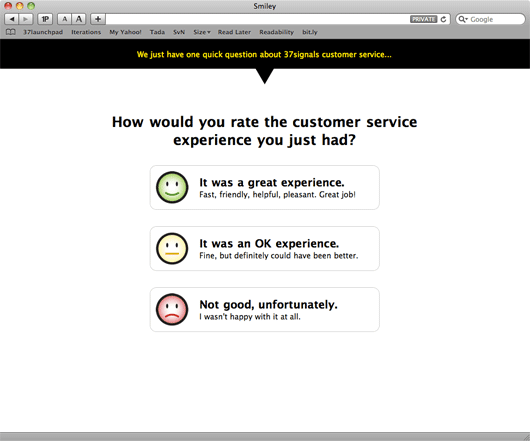
  1. (Customer facing) One screen which asked a customer a single question with three possible answers.
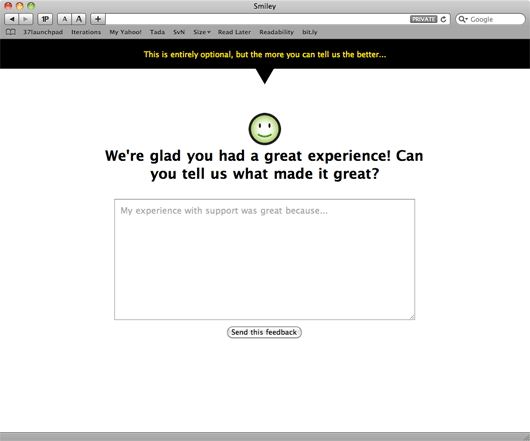
  2. (Customer facing – optional) One screen with a single text field where someone could choose to elaborate on their answer. This was entirely optional.
  3. (Customer facing – only seen if someone provides freeform text feedback) One thank you screen someone would see after they submitted their feedback.
  4. (Internal) One screen that showed all our customer service people along with their most recent ratings, their overall average rating, and a link to see all their ratings and feedback.
  5. (Internal) One screen that showed all of someone’s ratings along with any feedback a customer left on a particular rating.

About an hour or so later I had the customer facing screens done. We went back and forth on a few iterations, and experimented with two options (“great” and “not great”) vs. three options (“great”, “fine”, and “not very good” – we picked this version), but overall the design was settled in about an hour. Originally I used some stock photo smiley faces for the mockup, but I asked Jamie to design some custom smileys for the design (you’ll see these below).


The screen the customer sees after clicking a link in the email signature.


The optional screen a customer sees if they answer the first question.

Hooking it up

Next David took the UI and began writing the Rails back-end to make it all work. While David was working on this, I started working on the internal facing admin screens. I spent a few hours messing around with some ideas, but eventually settled on the simplest version:

Continued…