You’re reading Signal v. Noise, a publication about the web by Basecamp since 1999. Happy !

Jason Fried

About Jason Fried

Jason co-founded Basecamp back in 1999. He also co-authored REWORK, the New York Times bestselling book on running a "right-sized" business. Co-founded, co-authored... Can he do anything on his own?

Get Satisfaction, Or Else...

Jason Fried
Jason Fried wrote this on 272 comments

Get Satisfaction, a third-party customer service app/community, allows customers to offer feedback, make suggestions, get their questions answered, and generally get help with a product or service.

A good idea

Building support/community infrastructure is a pain point for a lot of companies. The help section, forums, FAQs, and whatever else you have to build to offer comprehensive customer support is a big undertaking. It’s often the last thing you want to do after you’ve just worked for months on a product or service.

So for those companies that would prefer to outsource this infrastructure to a third party, or use an alternative sanctioned support outlet in addition to their own, Get Satisfaction is a handy service.

But…

But if you prefer to provide great support on your own site with your own forums and your own help section and your own feedback mechanisms and your own FAQs, well, Get Satisfaction doesn’t play fair.

If you fail to subscribe to Get Satisfaction’s way of doing things, Get Satisfaction suggests to your customers that you’re “not yet committed to an open conversation.” That’s unfair and unreasonable. Just because we don’t team up with Get Satisfaction it doesn’t mean we’re not committed to an open conversation.

They make something look official that is not official


A screenshot of the 37signals Get Satisfaction page…which we have nothing to do with.

That’s not the only shady area for Get Satisfaction. The site also hosts, without permission, company support pages for over 14,000 companies. They’ll use your logo, title the page “Customer service & support for [COMPANY NAME HERE]” and generally make it feel like an officially sanctioned place to get official support from the company in question. The problem: It’s not official at all. That’s misleading.

The heavy handed tactics used by Get Satisfaction seem to indicate that their long term plan is to own every company’s customer support experience – whether it has your permission or not. Google searches for “[COMPANY NAME] support” will end up linking people to a Get Satisfaction page. If that’s not the offical support home for that company, who winds up winning? It’s not the company. It’s not the customer. It’s really only in the best interest of Get Satisfaction.

They also have a certificate-like customer-company pact agreement that they’d like you to sign. And if you don’t, they’ll make an outlandish claim about your lack of commitment to your customers. Here’s an image they put on our company page on the Get Satisfaction site:
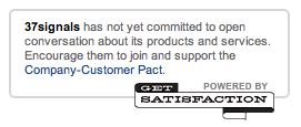
Can you believe that language? “37signals has not yet committed to open conversations about its products or services.” WHAT?! We haven’t committed to open conversations about our products or services because we haven’t signed Get Satisfaction’s pact on Get Satisfaction’s site which generates Get Satisfaction’s income? That’s awfully close to blackmail (or a shakedown or a mafioso protection scheme).

Continued…

Writing Decisions: Related to Milestone

Jason Fried
Jason Fried wrote this on 32 comments

Last week David and Ryan were working together on a new Basecamp feature that provides a link to a milestone on a to-do list if that list had a related milestone. We’ve always displayed a link to the list on the milestones screen, but we didn’t display a link to the milestone on the to-do list.

After David and Ryan made it work, Ryan wanted to run the implementation by me for a visual review. We ended up making some minor changes to the implementation based on this review and we wanted to share the quick iterative process we used to get there. Ryan and I often work this way either via IM or Campfire.

While the position of the implementation changed, the biggest change was the wording. I think this is a great example of how words can make or break a feature.

Here is the relevant part of the chat transcript with inline images from that conversation (some parts were removed since they weren’t relevant to this post). You’ll see we spent just under an hour on this:


(14:35:37) Ryan Singer:

Continued…

Highrise turns two

Jason Fried
Jason Fried wrote this on 18 comments

Last Friday (March 20) Highrise turned two. We couldn’t be more proud of how much it’s grown since it popped out of our dev servers and onto the internet. Here’s the original post that launched Highrise back in 2007.

For the past year or so, Highrise has been our fastest growing product on a month-to-month revenue growth basis. And lately it’s really taken off. We see Basecamp-like growth patterns which has us very excited.

For fun we’ve posted some growth charts below. We love the slow and steady curves. No sharp bull or bear markets — just steady predictable growth.

BTW: Highrise Deals were launched last October so the chart is shorter and steeper. We expect this to take on a more steady form as time goes on.

To everyone who uses Highrise: Thanks so much! We really hope you’re finding it useful. To those who don’t, how about giving it a try? It’s the best way we know to keep track of who you talk to, what was said, and what you need to do next. It helps you prepare for that next call, that next meeting, that next conversation. You’ll be amazed at how amazed other people are when you’re better prepared.

Failure is overrated, a redux

Jason Fried
Jason Fried wrote this on 41 comments

Last month I suggested that learning from failure was overrated. My point was that learning from failure may tell you what not to do the next time, but that doesn’t tell you what to do next time. I believe paying more attention to your successes leads to better outcomes.

A couple of days ago the New York Times ran a piece called Try, Try Again, or Maybe Not. It refers to a recent Harvard Business School study that found that when it comes to venture-backed entrepreneurship, the only experience that counts is success:

Already-successful entrepreneurs were far more likely to succeed again: their success rate for later venture-backed companies was 34 percent. But entrepreneurs whose companies had been liquidated or gone bankrupt had almost the same follow-on success rate as the first-timers: 23 percent.

I was thrilled to see this. I’ve never understood Silicon Valley’s obsession with failure. Many investors and entrepreneurs out there believe that you should fail a few times before you succeed. That the people worth funding are the people who’ve failed a few times. I’ve heard from a few VC who won’t fund an entrepreneur until they’ve failed at least once. I don’t get that.

Mark Pincus, founder and chief executive of Zynga Inc., (and Tribe.net before that) says “As an entrepreneur, you have to get used to failure. It is just part of the path to success.”

What? Failure is part of the path to success? This industry’s obsession with failure has got to stop. I don’t know when it became cool or useful, but the industry has been steeping in it for so long that it’s become normal to assume failure comes before success.

Don’t be influenced by this. If you’re starting something new go into it believing it’s going to work. You don’t have to assume you’re doomed from the start. You shouldn’t believe your first idea won’t be your best one. And you definitely shouldn’t treat your first venture as a stepping stone towards something else. What you do now, what you do first, can be the thing you do well for as long as you want to.

Also, don’t let the old “9 out of 10 new businesses fail” cloud your vision. It has nothing to do with you. If other people can’t market their product that has nothing to do with you. If other people can’t build a team that has nothing to do with you. If other people can’t price their services properly that has nothing to do with you. If other people can’t earn more than they spend that has nothing to do with you.

Yes, starting a business is hard. And you certainly could fail. I’m not suggesting failure isn’t an option. I’m only suggesting that it shouldn’t be the assumed or default outcome. It doesn’t need to be. Have confidence in your ideas, in your vision, and in your business. Assume success, not failure.

Oh, and one more thing… While I liked the article, this part of the study made me gag:

Success was defined as going public or filing to go public; Professor Gompers says the results were similar when using other measures, like acquisition or merger.

Going public, being acquired, or merging with another company is a skewed measure of success. It’s easy to measure for a study, but it’s barely what really defines success for most entrepreneurs. How about sustainable profits, loving your work, and making a dent in your universe?

Speaking to a recruiter friend of mine recently, I mentioned that job titles in the “experience” field have always been hard to understand. What’s the difference between all of these?

  1. user experience designer
  2. user experience analyst
  3. interaction designer
  4. user interaction designer
  5. visual designer
  6. information architect
  7. usability specialist
Jason Fried on Mar 12 2009 21 comments
37s-preview.jpg

Preview of the new 37signals.com launching soon.
Blue Sharpie on inkjet paper.

Jason Fried on Mar 12 2009 25 comments

Harney & Sons Guide to Tea

Jason Fried
Jason Fried wrote this on 29 comments

I love good tea. You should too.

Tea is full of history, flavor, and mood. It’s a fascinating beverage. There are hundreds of variations, but all white, green, black, oolong, and pu-erh come from a single tree: The camellia sinensis.

Then you can get into the science of it. All the different flavors and aromas (around 600 have been identified) come from a mashup of six chemical compounds: color pigments, amino acids, fatty acids, sugars, caffeine, and polyphenols. Different combinations, different flavors. How cool is that?

Through the cultivated combination of climate, sunlight (full or shaded), time, damage (oxidation), and fixing technique (steam, dry heat, etc), you end up with an incredible world of choice, style, flavor, and color.

Even the brewing water temperature has a huge impact on flavor. Getting the water temperature right has more to do with enjoying tea than almost anything else. It’s why most people don’t like green tea — too-hot water scalds the tea and turns it bitter.

If you’re interested in reading more about the history, the science, the flavor profiles of popular variations, and the tasting notes of one of the true experts of tea, check out The Harney & Sons Guide to Tea book. The hardcover is beautiful, but it also comes on the Kindle.

It’s the best balanced book I’ve found on the subject. I hope it helps you appreciate tea in a whole new way.

Design in Progress: Product bubbles

Jason Fried
Jason Fried wrote this on 15 comments

A few weeks ago Jamie posted a screenshot of a concept we were exploring to help someone choose the right 37signals product. It looked like this:

The idea was a series of tightly arranged conversation bubbles pointing to one of four different product icons (one for Basecamp, Highrise, Backpack, and Campfire). Each bubble would contain a use case. “Keep track of all the hours spent during the project” would point to Basecamp, for example.

It wasn’t a final design, it was just an exploration. We liked the spirit and friendliness and essence of it, but the execution was messy. We learned that we liked the bubbles. That’s what quick explorations are for.

v2

Last week we wrapped up another exploration using the bubbles. We’re not going with this direction, but we thought it would be interesting to share the progress. Here’s what we came up with.

Instead of random bubbles tightly packed, we went with a major bubble per product and then 2 secondary bubbles on either side. The major bubble was the big picture idea of the product and the secondary bubbles were key uses or features we wanted to communicate. Note: This is not final copy — it’s good enough copy for the exploration.

We liked this, but we still felt it was a little messy and lacked focus. A lot of imagery and shapes to communicate a few things per product.

But, this design lead us to what we think is the right design. We’re keeping the bubbles but reworking them again. We hope to have the new 37signals home page redesign live within a week.

Thanks for everyone’s feedback thus far. We hope you like the behind the scenes “Design in Progress” posts.