You’re reading Signal v. Noise, a publication about the web by Basecamp since 1999. Happy !

Jason Fried

About Jason Fried

Jason co-founded Basecamp back in 1999. He also co-authored REWORK, the New York Times bestselling book on running a "right-sized" business. Co-founded, co-authored... Can he do anything on his own?

The newest Signal: Jason Zimdars, designer

Jason Fried
Jason Fried wrote this on 54 comments

Today we announce the latest addition to the 37signals team: Jason Zimdars (“JZ”). Jason is a designer who lives in Oklahoma. You can find out more about him on his site.

JZ is going to be working closely with Ryan and me on app UI design while Jamie continues to kick ass on the marketing/public side of things. Mysteriously, Jason is the 7th person at 37signals to have a name that starts with J.

We’ve been talking to JZ on and off for the past year (here’s his original pitch). We considered hiring him before, but the timing and fit just wasn’t right. Now it is.

Why do we need another designer?

Even though we’re a design driven company, designers at 37signals are outnumbered about 2 to 1. Since we design interface first, this presents a problem.

There are often changes and improvements we want to make, but we don’t have enough slack on the design side to jump in and design the UI. This slows us down and makes it harder for the programmers to implement the features.

Having JZ on board will allow us to focus on improving our UIs, adding new features, polishing up existing features, and exploring new product concepts.

Why did we hire JZ?

Whenever we announce we’re hiring for a designer position, we get hundreds of responses and resumes. After evaluating people’s basic taste and skill level, we turn to other things. How do they think? What do they think about? How do they approach problems? Can they write? Do they enjoy writing? Can they express themselves concisely? How do they work when they aren’t given direction? Stuff like that.

We liked what we saw, heard, and read from JZ so we asked him to do a few paid contract projects for us. One was a quick one week exploration of variations on the Highrise Contacts screen. We gave him a week, barely any direction, and let him run with it. Jason had a full time job, so he had to squeeze in time after work. Here’s what he came up with. All things considered, we were very happy with the explorations, how he explained himself (although he’s a bit verbose — something he’ll have to work on), and the decisions he made.

After that we flew him into Chicago to meet with us for a day. We described another product we were thinking of building and asked him to mock up the UI for it based on a series of very rough sketches. Over the past few weeks he’s been working on that — also in his spare time. It was a challenging project that required a lot of problem solving. We were thrilled with what we saw. And if we decide to do this product in the next few months, you’ll see his fingerprints all over it.

So the skills were there, the thinking was there, the writing was there, the self-driven motivation was there. And to top it off, he’s a fine person and all around good guy. Character means a lot to us and it certainly helped JZ get this job.

JZ is coming to a 37signals app near you

Jason is starting in a few weeks. We have a really cool first 8 weeks for him. He’ll be exploring a variety of interface elements and screens in our existing apps in the style of the old 37express projects. Redesign one screen in one week (much like he did with the Highrise exploration). We plan on sharing many of these explorations right here on Signal vs. Noise. And hopefully we’ll be working his work into our products soon after.

So please welcome Jason Zimdars to our team! We’re pumped to have him.

Two great lessons from Jeffrey at BIGOmaha

Jason Fried
Jason Fried wrote this on 14 comments

BIGOmaha was great. Definitely one of the best produced, one-day conferences I’ve been to in a while. Great venue, wonderful people, perfect lineup of speakers, and generous, accommodating hosts. Well done all around.

There were a lot of takeaways from the conference, but here are two that hit me in the gut. Both of these came from Jeffrey Kalmikoff’s presentation.

1. The goal is to apologize sincerely and be taken seriously

This was such a strong point. For all the talk about transparency and authenticity, what it really means is this: Can your company mess up bad, apologize sincerely, and be taken seriously?

Can your customers trust your apology like you’d trust a friend’s apology if they just smashed your car? Your friend would be pissed, but they’d understand and get over it. Can you say the same for your customers if you really messed up bad? Would they understand and have your back through the tough times? Would they empathize?

I thought that was a great analogy. And I think it’s such an interesting way to look at what the fancy terms like transparency and authenticity and all that really mean. Bottom line: Can someone trust your apology?

2. Accessibility means pinging back

When Jeffrey talks about accessibility he’s not talking about Section 508, he’s talking about being available to your customers, co-workers, etc.

It’s not enough to spread your email address, twitter name, IM handle, or phone number far and wide if you’re not going to respond to emails, tweets, IMs, or phone calls. Being accessible doesn’t just mean taking it all in, it means giving it all back.

There’s a lot of social broadcast going on. But it doesn’t mean as much if you’re a black hole. If you give someone a way to contact you, you need to close the loop by contacting them back. You aren’t accessible if you only receive.

Design Decisions: The New Backpack Marketing Site

Jason Fried
Jason Fried wrote this on 27 comments

A few weeks ago we launched the new Backpack marketing site. This completes the redesigns of our four top product sites (Basecamp, Highrise, Backpack, and Campfire) as well as the 37signals site. More on the 37signals.com redesign in another post.

I wanted to share the thought process and some of the design decisions we made while redesigning the Backpack site. Even though the Backpack site feels part of the Basecamp, Highrise, and Campfire design family, it’s the most unique of the four.

Before

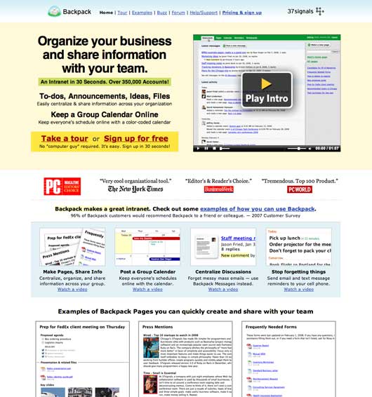
Old Backpack home page

This was the old Backpack marketing site. It had been this way for a couple of years. It served the product well, but not well enough. The main weakness was a lack of focus.

Backpack is a swiss army-like product. It actually does a lot of things. You can use it to take notes, create to-dos, share files, share photos, create pages, set SMS reminders, collaborate on mini projects, keep track of who’s working on what, and view and share calendars and schedules. While all of this has been a strength, how we attempted to explain it was a weakness.

The old home page tried to expose it all. We wanted to flash the world with Backpack’s entire body. So we talked about notes and lists and calendars and reminders and pages, etc. It all made for an unfocused message.

Starting over

So instead of just taking the old content and repurposing it in a new design, we tossed it all out and started over. We asked ourselves: What is Backpack really about? What’s the core? What does it do better than anything else it does? What would it miss the most if it was gone?

Continued…

Seen any great ads lately? Video, still, paper, whatever. Post ‘em if you got ‘em.

Jason Fried on Apr 17 2009 33 answers

Santa Monica BMW's Checkmate

Jason Fried
Jason Fried wrote this on 104 comments

Brilliant move by a local BMW dealer in responding to a national Audi ad. Audi’s 2009 A4 ad on the left side of the street says “Your move, BMW.” Santa Monica BMW comes back with an M3 ad across the street that says “Checkmate.” Now that’s advertising.

What do you do if you’re Audi?

Patterns is now a book

Jason Fried
Jason Fried wrote this on 8 comments

A few months ago I posted about Patterns. Patterns is a great example of smart self promotion by R.BIRD, a package design agency out of New York.

They recently stepped it up a notch by turning their free Patterns reports into a book. You can now buy a 220-page full-color paperback or a PDF on their site. You can also purchase individual reports too.

I just got my copy and the book is really beautiful. Well done, R.BIRD.

Turning 35

Jason Fried
Jason Fried wrote this on 61 comments

Today is my 35th birthday. I’m not one for personal ceremony or predicting turning points. But I do believe in trying to be a better person every year. And I’ve found that making public promises helps me keep them.

So I’d like to promise myself three things this year.

  1. I will be a more reliable friend (I don’t always do what I say I’m going to do and that’s just not cool).
  2. I will be more social (I tend to be a homebody too much of the time).
  3. I will smile more (for a variety of reasons).

So if you see me around, keep me honest and remind me. Thanks!

Coming soon: 37signals University

Jason Fried
Jason Fried wrote this on 79 comments

Later this year we’re planning on launching 37signals University – a series of regularly scheduled one-day workshops on topics ranging from UI design to copywriting to Rails to product management to infrastructure to entrepreneurship to Getting Real, among others. We want to teach the things that really matter. Insights that make the difference. No theory, just practice.

We’re still working on the details, schedules, materials, costs, etc, but we want to start measuring interest. What sort of topics would you be interested in? What topics do you find under-represented when you attend industry conferences?

We’ll be posting updates here on SvN, but we’ll also be making official announcements on our mailing list. Join our mailing list and stay up to date on the 37signals University announcements as well as product updates, tips & tricks, case studies, and other 37signals-related news.

We hope to see you soon.

Follow-up on "Get Satisfaction, Or Else..."

Jason Fried
Jason Fried wrote this on 95 comments

On Tuesday I posted Get Satisfaction, Or Else. The post detailed how we felt Get Satisfaction misled our customers into thinking the Get Satisfaction site was an official place to get 37signals customer service and support. The post brought out passionate responses on both sides of the issue.

First, credit is due to Get Satisfaction (“GS” from now on) for taking this situation seriously. They’ve quickly acknowledged some of the issues that we brought up, and they’ve begun to make some changes.

Some of the changes they’ve made are detailed in their two subsequent blog posts (“kissing and making up” and “an open letter to Jason Fried”). We appreciate those efforts. Just a reminder though… This isn’t about me or 37signals – it’s about our customers and every company’s customers that are confused by an unofficial Get Satisfaction page.

We hope more changes are on the way. Deeper, comprehensive changes that go beyond a few adjustments on the surface. We understand deeper changes take time. Their early response give us hope that they’ll continue to make the changes necessary to remove all potential customer confusion.

Why we care about the customer experience

I thought I would use this opportunity to talk about what customer experience means to us and why we’re upset about this GS situation.

A customer experience is the sum total of a bunch of small experiences. Logos, words, brand names, copywriting, interface design, functionality, trust, expectations, suggestions, follow-throughs. All of these things point somewhere. In the case of the GS pages, they point to an official place to get answers, report problems, share ideas, and get “Customer Service & Support” from the company in question.

The problem is that GS pages look, act, read, and feel official. And for some companies they are. GS is a useful tool for companies that choose to use it. But check out the difference between a page for a company that chooses to use GS and a page for a company that has no idea what GS is. Tiny tiny differences I bet 9 out of 10 of people hitting that page would never notice.

A small disclaimer in 9px text in the top right, and a single mention of “Unofficial” near the top of the page don’t go nearly far enough to make this absolutely, without-a-doubt-clear that this is not a company-supported or official place to get help. You should be smacked in the head with either “This is official!” or “This is not official. The real official place is over here…” Big, bold, colorful, impossible to miss. It should be the clearest thing on the page, and people should be reminded of it often (like right after they post a question).

Is Get Satisfaction a slogan? A company?

Remember that most people who hit a GS page don’t know who GS is. They didn’t search for Get Satisfaction, they searched for a company or product name to get customer service or support. A customer recognizes our company name on the page, but they don’t know who GS is. Is GS even a company? Or is it a tag line? “37signals: Get Satisfaction” on a support page seems like a reasonable interpretation. If GS is going to host pages for 14,000+ companies, the burden of absolute clarity is on them.

So when GS puts up a page unknown to us that uses our logos, our brand, and our product names, and then combines it with phrases such as “Customer Service” and “Customer Support”, I get upset. And when I see customers who’ve been misled to think this is an official place to get support (because of the names and logos and wording), I get upset. And when I see our customers that have asked questions with the clear expectation of getting an official answer, I get really upset. None of our customers should be confused by a third-party using our names, brands, etc. Period.

How our customers could be confused

Let’s look at this from a customer’s perspective. Let’s assume they hit the 37signals Get Satisfaction page from a Google search. Different combinations of searches for “37signals” and “customer service” or “support” bring Get Satisfaction’s page as high as #3.

Continued…