You’re reading Signal v. Noise, a publication about the web by Basecamp since 1999. Happy !

Noah

About Noah

Noah Lorang is the data analyst for Basecamp. He writes about instrumentation, business intelligence, A/B testing, and more.

The three secrets of business analytics (no rocket science here)

Noah
Noah wrote this on 16 comments

I’m going to give away all of my secret sauce, and tell you the three things that are required to be successful at business analytics (or data science, or whatever you want to call it):

1) Know at least a little bit about what you’re talking about.

At its foundation, business analytics is about converting a rather broad question (like “why do people cancel?”) into a set of specific questions that you can answer with data. This takes a bit of knowledge of what you’re talking about—you need the ability to construct hypotheses (e.g., people might cancel because they left the company, or because their corporate IT department rejected it, or…), and you need to know where you can get the answers. The best statistician in the world will be useless if they don’t get the context of the business.

A theoretician might call this “domain knowledge”, but all this is is the ability to know what you’re looking for and where to find it. There are no real shortcuts here – it takes exposure to your content matter to pick this up. Just open up the firehose—read as much as you can about your business and industry, stay involved in every conversation that’s even tangentially related, and be patient. Domain expertise will follow.

2) Make it easy.

There’s actually very little about data science that’s technically or intellectually challenging – it’s mostly about execution. Sure, machine learning uses advanced concepts that are worth understanding before you build a predictive model, and a passing understanding of statistics is a big deal, but most business questions can be answered with little more than simple arithmetic—what portion of customers do X? How long does it take people to do Y?

What then differentiates good data analysts from the rest? The ability to do this simple analysis quickly and easily, with minimal “friction”, so you can do more analysis faster. A few things help with this:

  • Set up “one click” access to data. Shell scripts to drop you directly as a read-only user in your database, libraries to get your data from your database into a clean format in your prefered analysis environment, robots, and data exploration / dashboard type tools all help with this. These aren’t rocket science, but being able to get to your data in under ten seconds means you’ll be able to do it more.
  • Have common definitions. Know what “active” means for each of users, accounts, etc. Try to pick consistent time periods for how far back you look at data. If you can skip the figuring out what someone means, data analysis becomes easier.
  • Keep a calculator handy. Seriously, the friction difference between a calculator that you’re familiar with at arms reach and having to find one in a drawer, or opening Calculator.app, makes an impact in how easily you can do the simple arithmetic.
  • Memorize your database schema. This isn’t a joke. You’ll know what you’re able to be able to find from a database alone and you’ll save a ton of time by not doing SHOW TABLES and DESCRIBE TABLE X all the time. At the very least, know what tables are named and generally what the relationship between them is. I’d hazard a guess that if you surveyed the business analytics people at a handful of brand-name internet companies, they could all write out the schemas for their main databases by memory.

3) Look at lots of data.

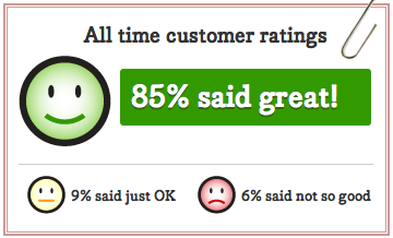
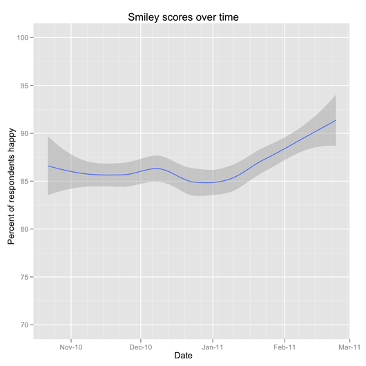
The only way to know what “normal” is when it comes to your data is to look at it, a lot. Look at graphs of different things over different time periods, review log files, read customer emails—be the most voracious consumer of new information and data that you can. Keep finding that next source of information.

Try to spend an hour a day consuming new data – just reading it in, absorbing it, maybe making some notes. It doesn’t need to be for any specific investigation of the moment, but it will pay dividends down the line. This is very similar to the “Rule of 10,000 hours” and other notions of “Just do, a lot”.

Behind the scenes: A/B testing part 2: How we test

Noah
Noah wrote this on 19 comments

A few weeks ago, we shared some of what we’ve been testing with the Highrise marketing page. We’ve continued to test different concepts for that page and we’ll be sharing some of the results from those tests in the next few weeks, but before we do that, I wanted to share some of how we approach and implement A/B tests like this.

Deciding what to test

Our ideas for what to test come from everywhere: from reading industry blogs (some examples: Visual Website Optimizer, ABtests.com), a landing page someone saw, an ad in the newspaper (our long form experiments were inspired in part by the classic “Amish heater” ads you frequency see in the newspaper), etc. Everyone brings ideas to the table, and we have a rough running list of ideas – big and small – to test.

My general goal is to have at least one, and preferably several A/B tests running at any given time across one or more of our marketing sites. There’s no “perfect” when it comes to marketing sites, and the only way you learn about what works and doesn’t work is to continuously test.

We might be simultaneously testing a different landing page, the order of plans on the plan selection page, and wording on a signup form simultaneously. These tests aren’t always big changes, and may only be exposed to a small portion of traffic, but any time you aren’t testing is an opportunity you’re wasting. People have been testing multiple ‘layers’ in their sites and applications like this for a long time, but Google has really popularized this lately (some great reading on their infrastructure is available here).

Implementing the tests

We primarily use two services and some homegrown glue to run our A/B tests. Essentially, our “tech stack” for running A/B tests goes like this:

  1. We set up the test using Optimizely, which makes it incredibly easy for anyone to set up tests – it doesn’t take any knowledge of HTML or CSS to change the headline on a page, for example. At the same time, it’s powerful enough for almost anything you could want to do (it’s using jQuery underneath, so you’re only limited by the power of the selector), and for wholesale rewrites of a page we can deploy an alternate version and redirect to that page. There are plenty of alternatives to Optimizely as well – Visual Website Optimizer, Google Website Optimizer, etc. – but we’ve been quite happy with Optimizely.
  2. We add to the stock Optimizely setup a Javascript snippet that is inserted on all pages (experimental and original) that identifies the test and variation to Clicky, which we use for tracking behavior on the marketing sites. Optimizely’s tracking is quite good (and has improved drastically over the last few months), but we still primarily use Clicky for this tracking since it’s already nicely setup for our conversion “funnel” and offers API access.
  3. We also add to Optimizely another piece of Javascript to rewrite all the URLs on the marketing pages to “tag” each visitor that’s part of an experiment with the experimental group. When a visitor completes signup, Queenbee – our admin and billing system – stores that tag in a database. This lets us easily track plan mix, retention, etc. across experimental groups (and we’re able to continue to do this far into the future).
  4. Finally, we do set up some click and conversion goals in Optimizely itself. This primarily serves as a validation—visitor tracking is not an exact science, and so I like to verify that the results we tabulate from our Clicky tracking are at least similar to what Optimizely measures directly.

Evaluating the results

Once we start a test, our Campfire bot ‘tally’ takes center stage to help us evaluate the test.

We’ve set up tally to respond to a phrase like “tally abtest highrise landing page round 5” with two sets of information:

  1. The “conversion funnel” for each variation—what portion of visitors reached the plan selection page, reached the signup form, and completed signup. For each variation, we compare these metrics to the original for statistical significance. In addition, tally estimates the required sample size to detect a 10% difference in performance, and we let the experiment run to that point (for a nice explanation of why you should let tests run based on a sample size as opposed to stopping when you think you’ve hit a significant result, see here).
  2. The profile of each variation’s “cohort” that has completed signup. This includes the portion of signups that were for paying plans, the average price of those plans, and the net monthly value of a visitor to any given variation’s landing page (we also have a web-based interface to let us dig deeper into these cohorts’ retention and usage profiles). These numbers are important—we’d rather have lower overall signups if it means we’re getting a higher value signup.

Tally sits in a few of our Campfire rooms, and anyone at 37signals can check on the results of any test that’s going on or recently finished anytime in just a few seconds.

Once a test has finished, we don’t just sit back and bask in our higher conversion rates or increased average signup value—we try to infer what worked and what didn’t work, design a new test, and get back to experimenting and learning.

Behind the scenes: Tally, our Campfire statistics robot

Noah
Noah wrote this on 11 comments

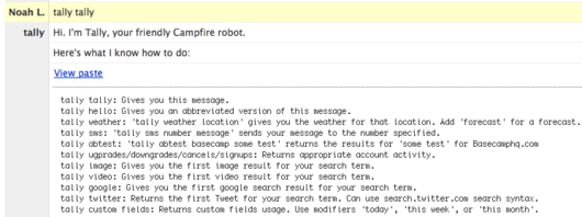
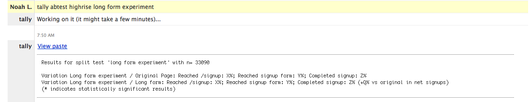
We use Campfire a lot – it’s our main way of communicating as a team that’s more than half remote. We’ve shared what happens inside our Campfire rooms before, and today I’ll share a peek at how we use our statistics robot, “Tally”, in Campfire.

Tally sits in a few of our Campfire rooms all day and answers questions people have, whether it’s about how signups for a product us doing, how a feature is being used, what the latest results for an A/B test are, or what the weather in Chicago is. Tally also sends SMS messages, searches the internet and more:

Tally grew from a couple of desires:

  1. I wanted an easier way to answer easy questions that come up frequently – how is this A/B test going? How many people have used custom fields since we launched them? None of these are hard questions to answer, but Tally makes these simple questions completely self-serve.
  2. I wanted to explore our API more. In the course of doing analyses at 37signals I end up interacting with a lot of different APIs, and have seen some great ones and some terrible ones. I wanted to see how ours stacked up, and also have a chance to write and test some new wrappers for other APIs as well.
  3. I wanted to add some fun features to our Campfire room. Tally knows how to tell a joke and has some funny images at the ready. These don’t add any practical value, but are occasionally good for a laugh.

One of the most common uses of Tally has been to check A/B test results. We use and are big fans of Optimizely to run A/B tests, but also use Clicky to measure the results. Tally makes finding the overall results a one-line affair:

Tally was inspired in part by Github’s Hubot. For the technically curious, Tally is implemented in R using the Campfire streaming API.

Have an idea for something we should teach Tally to do? Are you doing something interesting with the Campfire API? Tell us about it in the comments!

A look at Smiley by the numbers

Noah
Noah wrote this on 16 comments

Since we launched a public window on Smiley a few weeks ago, over 20,000 people have visited it to see how we’re doing against our goal of making customers happy, not just satisfied.

I recently took a look at responses to Smiley since we started using it last fall. The whole point of exposing Smiley publicly was to encourage transparency, and I’d like to continue that by sharing the same results I shared with everyone here. I’ll give the results first; for those of you interested in the “how”, I’ll share details at the end.

What we’re learning from Smiley

About 30% of people who write to support end up rating our response. We’re very happy with 30% – that’s quite high for a completely optional survey.

Across all of those responses, our report card looks like this: 85% said great, 9% said just ok, 6% said not so good

In my mind, the key metric is really the portion that said their interaction was great. If someone said it was just ok or if they said not so good, those both indicate something we could be doing differently.

I dug a little deeper to understand how happiness varies:

  • More people rated their interaction as “great” in 2011 than 2010 (87% vs 83%). This has been climbing over the last two months as well.
  • People whose tickets are fully resolved within a day of submitting them are more likely to be happy than those that took longer (87% vs. 81%; in the last six months, we’ve resolved 84% of our tickets within a day of submission, including weekends).
  • Happiness is pretty consistent across products – ranging from a low of 83% saying great to a high of 86%
  • Happiness doesn’t vary much by the specific plan someone is on. Elite Suite customers are just as happy as customers using a free version.

Aside from rating the experience great, ok, or not so good, we allow people to leave open ended comments. 59% of people have ended up leaving comments so far. I decided to take a look at what people are saying:

The average comment is 12 words. The most common words people used in their responses were: quick, thanks, answer, fast, friendly, problem, question, reply, time, great, clear, helpful, issue, support, service, prompt, good, solution, feature, solved, and timely.

I also took a special look at the written comments of people who weren’t happy with their support interaction. More of these people wrote comments (63%) and their comments were twice as long as average. Their comments connect well with what we suspected – people appreciate getting clear answers right away, and when we aren’t able to make someone happy, it’s often because of a feature request that we aren’t able to commit to immediately.

We’re happy to see happiness increasing over time, and have a bunch of ideas in the works to keep boosting this. I hope you keep watching with us at the 37signals Customer Support Happiness Report.

If you’re curious how I did this analysis, read on…

Continued…

What I do with data at 37signals

Noah
Noah wrote this on 24 comments

I’ve been at 37signals for a couple of months now, and I thought I’d introduce myself and share the answers to a few questions I’ve been asked. I’m our “business analyst”, “data guy” or “stats guy”, but those all leave some explanation lacking of who I am and what I do.

Who are you?

I’m a mechanical engineer by training, but I spent the last couple of years working at McKinsey & Company, a consulting firm. I did a range of different things, but spent most of my time focusing on understanding and predicting individuals’ behavior as it relates to the healthcare system – how people use physicians, hospitals, and their health insurance policy. I live and work just outside of Pittsburgh, PA.

What would you say you do here?

I tend to think that there are three things that I’m trying to do.

  1. Look at data to try to improve our products- understanding how people interact with and use our products helps us make better decisions about how to improve them. Sometimes this is about new features; other times, it’s about the smaller details – where does a pagination break make sense based on how many projects people have?


    We’re planning to share some specific examples of how we’re using data to inform design decisions over the next few months.

  2. Use data to help grow – Too much of using data to “help businesses grow” is about predicting (guessing) revenue or profit in five years. This is kind of fun intellectually (and there are cleverly named tools like “Crystal Ball” to do this), but it’s less useful than finding real things that we can do today or in the near future that will meaningfully impact the business. This means focusing on why people cancel, how they interact with signup pages, etc.

  3. Answer those “I wonder” questions- one of my favorite parts of working at 37signals is watching products develop every day in Campfire and on Basecamp. While doing that, people occasionally start a sentence with “I wonder…”. I get to move from wondering to knowing, and that’s loads of fun to do.

How do you do what you do?

There’s nothing magical here – most of the challenge is just about knowing the right questions to ask and understanding the relationships between data. The actual tools matter a lot less.

We have a few reporting tools that we’ve built, and use a few commercial tools (Google Analytics, Clicky), but most analysis gets done from raw data. I do virtually all of my work within a statistical programming language called R (with a couple of custom functions to interface to our databases and APIs for Clicky, etc.) and with simple unix tools like awk/sed. This combination is incredibly simple, powerful, and adaptable, and R has a great community behind it. I use a couple of different tools to produce graphics (mostly ggplot2 in R and OmniGraphSketcher), and I’m experimenting with narrated screencasts, etc. to share results as well. Of course, my trusty HP-12C never leaves my desk.

Have any other questions? I’ll try to answer any below or in a future post or podcast.