Today I started the UI for a new 37signals internal tool called ‘Champagne.’ It’s a central app for announcing changes to our apps so improvements to our products can be displayed in many places: inside the apps, on our marketing sites, and so forth. The epicenter of Champagne is actually on the consuming end, when the changelog data gets displayed within the app at certain times. That’s already designed. Today I started on the second-most-important screen, the “new entry” screen. Here’s a look at the process from sketch to markup to final design. The whole thing took about thirty minutes.
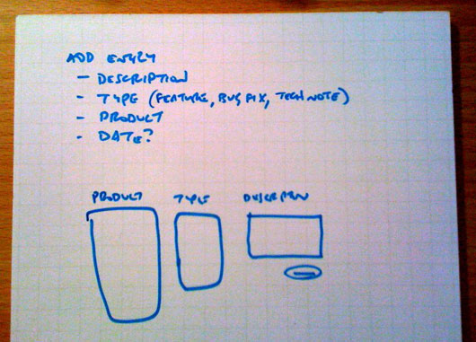
First I sketched a short list of the elements and sketched a layout. There was more detail in my head, but this little sketch was enough to concretize the main idea.

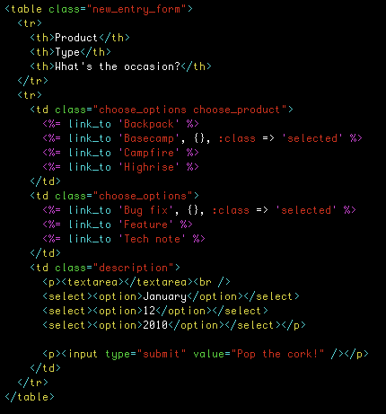
After sketching, I always jump straight to markup.

Here’s how the design looks without any styles:

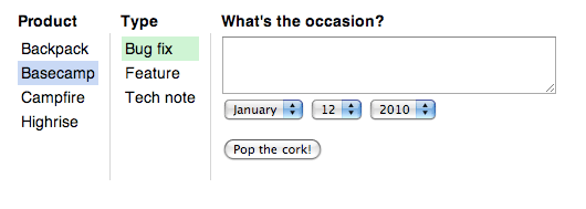
And a little CSS closes the gap to finish the design:

Small projects are so much fun because you can experience all sides of the design process in a very short time. That’s the beauty of microdomains. We’re looking forward to plugging some code into the Champagne screens so we can better share progress on our apps with our customers.

Tim
on 17 Aug 09I love it.
Only thing I would change is have both:
- a date on when the announcement should be displayed/seen
- a date on when the announcement should not longer displayed/seen.
RS
on 17 Aug 09Champagne itself is only concerned with holding a time-stamped list of improvements by product. The consuming apps can then decide which date ranges, products, and types they care about.
Kevin
on 17 Aug 09I would have had the same feedback, but that’s a valid point. It seems that the intended users of Champagne are developers, so if anything, it’s more of a changelog application than an actual CMS.
DL
on 17 Aug 09Why are you using link_to for the options lists when there is nowhere to go? Is it for UI purposes only or am I missing something do to my Rails noobness? It just seems to me that there should be some other Rails or HTML element that would be better suited for the purpose at hand.
DL
on 17 Aug 09BTW, thanks for the insight into the process that you go through when whipping up a new feature. It’s helpful to see how others do it.
Michael Aleo
on 17 Aug 09Love the process posts like this one. Well done.
However, tables for layout? I’m surprised.
RS
on 17 Aug 09I’m in the habit of using link_to instead of anchors. There’s no special meaning there. It’s just two ways to reach the same end.
Table cells have a property that divs don’t: they can shrink-wrap to their contents. That made them the fastest and most practical way to reach the final design without manually setting widths or even thinking about widths at all. This is one of those cases where tables are entirely appropriate in my view.
Anton Andreasson
on 17 Aug 09I can see the use of tables here (tabular data in some way), I think the lack of radio buttons were more peculiar, what’s your opinion here?
Tony
on 17 Aug 09I agree with Anton: the choice of links instead of radio buttons or a select box is a little anti-semantic, no?
Rob Brackett
on 17 Aug 09Given that it’s an internal tool and one would assume that the 37signals team uses more modern web browsers, why not use display:table with divs in CSS?
(I know it’s still less direct than a table and that there probably aren’t any blind 37signals employees so there’s no practical difference, but it’s the principle of the thing!)
RS
on 17 Aug 09It’s a matter of least effective difference. Here’s how the UI looks with radio buttons:
And here it is without radio buttons:
The second version is more elegant.
Would I use this UI for an app with a wide customer base? Probably not. It’s not obvious enough that the options are clickable. But for internal use? Hell yeah. Our team members won’t have any trouble seeing the affordance and they’ll appreciate the minimalist touch.
RS
on 17 Aug 09My big principle is “get it done” and second to that is “make it maintainable.”
“Make it politically correct” isn’t even on the list! ;)
Sean
on 17 Aug 09But using radios is semantic, the selection and submission is done for you by the browser, and its easy-peasy to hide the radio input, and just leave the surrounding label.
RS
on 17 Aug 09What does that mean?
You could implement this design with radio buttons, hide the radio buttons and lean on the labels to indicate the current choice. But isn’t it odd to put a control into a template that is almost always rendered only to hide it? That feels like a hack instead of a good thing. I would rather put elements in the template that I intend to display and give them the behavior I intend for them to have.
Sean
on 17 Aug 09rvr
on 17 Aug 09thanks for sharing your process, and nice job on the tool. also, good job taking the nitpicks. sorry to add mine, but… i hear you on the “get it done”, but calling semantic markup “politically correct”? ouch. obviously, you can use whatever markup you want, and some reasons to use semantic markup aren’t even considerations for this, but it’s still a valid point that was made. personally, i find working with tables takes more effort, even when i have to consider widths, etc. and even on a small project like this i’ll feel better about what i’ve left behind if i put in the effort to make it semantic.
@anton: this isn’t even tabular data. it has columns, but no rows, and isn’t normalized in any way. the only reason to use a table here is if you feel like it, but it’s not semantic.
Gabe Hollombe
on 18 Aug 09On the whole link vs radio button inputs subject:
It does seem to me that using links instead of radio buttons does create more work for you. With links, you’ve got to manually manage the click event for the option and store the selected value somewhere for the final form post. With radio buttons, you don’t have to manage anything about form behaviour or data posting.
Am I missing something here?
Nate Klaiber
on 18 Aug 09Looks good. I would probably go the radio button route, simply because it would be much easier from a processing perspective, with a large or smaller user based. It takes minimal time to hide and make clickable. With each click, the radio button is selected – meaning I can easily just pass in params, versus adding in extra JavaScript to get the links to process through to a form.
Either way works, and pragmatism wins. Thanks for the insight.
RS
on 18 Aug 09I’m sure both options could be built already in the time it takes to argue all the merits and demerits! From the standpoint of mocking screens, using links was the fastest way to render the end result I wanted. When it comes time to implement, it’s an open question whether it’s better to use hidden radio buttons or write some short Javascript functions. But whatever the choice, it should be rooted in pragmatism instead of dogma.
Floyd
on 18 Aug 09Ryan, your last comment clarifies something that many, including myself, missed on the initial read of this article. The fact that this is purely a mockup definitely changes the way that the HTML is examined. It’s obvious now the code is written purely to achieve the desired look and not necessarily for functionality’s sake. Heck, you can’t actually change date and there’s not even a form tag!
Gabe Hollombe
on 18 Aug 09@Floyd: that’s a very good point you make about reminding us that it’s purely a mockup and not meant to be a functional prototype. With that in mind, I can totally see why Ryan used links instead of radio buttons; it’s definitely less work from a mockup styling perspective. My bad.
Nic
on 18 Aug 09Stef
on 18 Aug 09I prefer the version w/o radio buttons. Looks much nicer and those radios aren’t providing any more information or such than just the highlighted text – so why use them?
Nice to see how you work on UI stuff. Thanks for sharing.
Mart
on 18 Aug 09Does that mean that tied up with this work there will be a way of a Basecamp admin Usr being able to message all their projects at the same time (as you guys do when you make announcements of BC features/service changes). That would be fantastic and answer many requests over the years for this ability. After all its a measure of the popularity of the program in our usage that this is the best way of talking/informing our clients in one hit. Thanks for sharing.
Keir
on 18 Aug 09From a UI point view – I’d say the radios add a lot of value. They indicate to a user the intented action required – ie select an option.. the links provide no indication that they are even clickable – let alone that selecting an option is required…
Am I the only one who thinks “what was the point in that post?”... UI design = draw it … mark it up? Wow no way!
I still heart you guys … but c’mon…
Eric Anderson
on 18 Aug 09Actually, I wouldn’t use radio buttons but checkboxes (at least for the checkboxes). That way an announcement can apply to multiple products. For example if you are going to have an outage that would affect multiple products.
Jeff Hartman
on 18 Aug 09I’m with Kier that adding radios make the actions more clear…
But as a whole, who really cares? This is an SIMPLE internal app used by a handful of people. If it gets the job done for them does it really matter about tables vs. divs or anything else? I say no.
Anonymous Coward
on 18 Aug 09But as a whole, who really cares? This is an SIMPLE internal app used by a handful of people. If it gets the job done for them does it really matter about tables vs. divs or anything else? I say no.
Thank you.
Tim
on 18 Aug 09Looks like 37signals is once again responding to customers comments via the Anonymous Coward function
Zach
on 19 Aug 09I like this posts a lot, but this one is a bit different because there was basicly just one iteration. Basicly the point of this is that for an internal app you’ve got less to worry about, and you can jump straight in and do it in a case like theirs.
Grant Bissett
on 19 Aug 09Where’s the haml?
It’s perfect for concretizing microdomains!
AC
on 19 Aug 09@Rob: “why not use display:table with divs in CSS ?”
What would be the semantic difference between a table and a div with display: table? Is a non-meaningful (per definition) div less anti-semantic than a meaningful table? (Especially in a case with headers and rows.
clothing shopping online
on 19 Aug 09when you make announcements of BC features/service changes). That would be fantastic and answer many requests over the years for this ability. After all its a measure of the popularity
Alex
on 19 Aug 09Celebrating often rules
Gabriel
on 19 Aug 09Wow, so is really true. People do care more about what’s not important, no mather where they are (I’m from Brazil and this is a major problem down here).
This UI design method is the one that should be used more often: it’s called “solve this problem and the job is done” (a simplification of GTD, agile or whatever).
There was a problem, a skilled person to solve it and a toolset available to do it. So what? Job done.
Congrats.
Alex
on 19 Aug 09Tables, for layout? Really? I stopped reading when I saw
Lauren
on 19 Aug 09Ugh, don’t even get me started on “Get it Done” vs “Make it Maintainable” discussion.
I can’t seem to make much headway in that area. I say, I can upload this (with totally messed up code) in 30 minutes but every time we change it, it will take another 30 minutes. OR I can spend two hours coding properly and then every time we change it, it will take 14 seconds. So if we change it five times, we have payback. Response: just do it the first way. (FYI, we will change it 65 times …) Not sure where my persuasive skills fall short, but ... .
RS
on 19 Aug 09Thanks for the comment Lauren. There’s probably a lot of middle ground between “totally messed up” and “proper” code. I often find that my markup doesn’t change much, but the styles and classes do. The main difference is my early draft has lots of inline styles.
Like v1 is:
<div>Here’s where the notice will go<div>
v2 is:
<div style=”color: green; padding: 10px; border: 1px solid green; font-size: 12px;”> Here’s where the notice will go </div>
and v3 is:
<div class=”notice”>Here’s where the notice will go</div>
There are also lots of different ways something can be “easy to change.” Should the colors be easy to change? The layout? The number of elements? The height here, or the width there? Often you can isolate the variable elements against a backbone of fixed elements to reduce your uncertainty.
Dave
on 20 Aug 09Enjoyed the post, thanks.
Erik
on 20 Aug 09Wow, I feel like someone put this post up to see what the reactions are from a UI process standpoint. Is this a test?
I have to say I am surprised by the lack of user-centered effort here. For simplicity-sake, radio buttons should be there (provided the user can only select one product) and not be hidden. At a glance the user knows how the selection works – period.
You lost me at ”...sketch to markup to final design … took about 30 minutes.”
andrea
on 20 Aug 09Ryan, this is an elegant solution to the problem on the front end. You know the audience you are designing for well – you spend 8 hours a day with them, after all – and you know that this will work for them. They will probably make the same connection I did – “highlighted = selected! Let me select something else now!” and not have problem one.
This is what UI is about – not about always having radio buttons, but designing for your audience.
If I were going to implement this idea for a less web-savvy population, I would go with the radio buttons. Or checkboxes, depending on the requirements.
No comments on the tables – I’d like to see how it’s used in context first.
Tim Moore
on 22 Aug 09I don’t know if anyone will even see this days later, but my advice to Lauren is not to give them that choice—just do the right thing.
Nobody else is going to ensure the quality of your work but you. Given the choice of having something now and having what seems to them to be the same thing later, why wouldn’t they want it now? Especially if they don’t have to suffer the consequences themselves?
So the right thing to do when they ask how long a task will take is to consider how long it will take you to do it the best way you know how and give an honest estimate: it will take two hours. You can’t do it in thirty minutes, because you can’t do it well in thirty minutes and you have professional integrity.
Your honesty and integrity will pay off in the long run, if not at this job, then at a future one that understands and respects your values.
And the best part is, the more practice you have doing your job the right way, the faster you’ll get at it! On the other hand, the more you feel forced to do your job in a way you know is wrong, the more it will sap your motivation and make you slower.
This discussion is closed.