This is a guest post by Mike Rohde. We hired Mike to illustrate original art for REWORK. Each one of the 90 essays in REWORK is accompanied by an illustration that captures the key message of the essay. We asked Mike to share the illustration process with you here on Signal vs. Noise. This post is part 2 of a 2-part series.
In part 1 of 2 of Illustrating REWORK, I wrote about the start of the project, generating concepts and capturing them as pencil sketches for review and approval. In part 2 of 2, I’ll go into depth on the process of converting those pencil concept sketches into final production art for the book.
Inking
Using batches of approved pencil sketches, I began inking illustrations for the book. Batching was important for inking the illustrations, as I could get into a groove and knock out multiple pieces at a time. It also provided a consistency of style, important with such a large group of closely related illustrations.
When I live-sketchnote an event, I listen to a speaker and capture ideas in real-time, using only a gel pen and a Moleskine pocket sketchbook. On the REWORK project I had the luxury and flexibility of taking a more methodical approach to the final illustrations for the book.
Chances were high that I’d see late, last-minute changes in the publishing process and I wanted the ability to make those changes quickly. Rather than inking each illustration as a complete unit, I inked multiple elements separately which were scanned and stitched together in a layered Photoshop document.
First, I created a variety of separate elements on a single spread for multiple illustrations, then used the elements which worked best after scanning the entire page into Photoshop. –Photo by Brian Artka.
Here’s a photo of the final illustration, printed in REWORK. This photo shows how various elements were scanned and stitched together in Photoshop to create a single, unified illustration. –Photo by Brian Artka.
Near the end of the project, I had to make changes to a few of the illustrations. Being able to quickly sketch a few elements, scan and drop them into the Photoshop master file made updates much easier.
Approval and Delivery
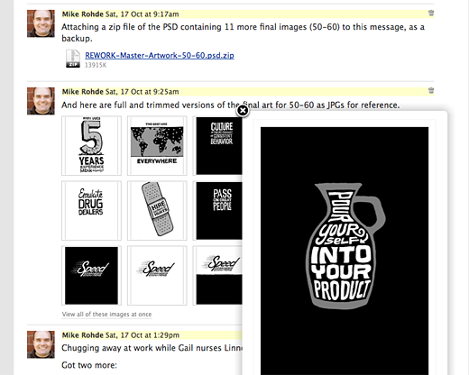
Once a batch of inked illustrations were completed in Photoshop, I would export lower-res versions of the pieces as JPG files, and post them to the Basecamp project for Jason’s review. Basecamp’s handy ‘View all of these images at once” feature allowed Jason to scan an entire batch and approve or suggest tweaks.

Here’s a sample batch of illustrations posted to Basecamp for review and approval. Note the PSD file attached to the comments above for backup. Jason was able to click individual illustrations in the grid or select “View all of these images at once” below the images for detailed review.
Final Production
Revised illustrations were modified, exported and posted in comments on the message containing the original batch of illustrations, so that Jason could compare the new piece to the original piece. Once every illustration in a batch of multiple pieces were approved, I would make any final production tweaks and finalize the Photoshop PSD file.
Dropbox, an online storage service, was used to host final files and became a key part of the process. I created a private folder for Crown and 37signals to access final PSD files, which created copies on my local drive, as well as on Crown’s and 37signals’ machines connected to the Dropbox.
Once a final PSD file was dropped in the Dropbox, I would attach a copy of the PSD, the final exported JPG files and notes about them to a new message in the Basecamp project. This served as an alert to Jason and Crown, and provided redundant backup for the final illustration files.
Once the Crown team had my master Photoshop files, they exported high resolution TIFF files for production, making any needed adjustments for printing.
A Joyful Challenge
In the middle of illustrating the book — October 15th, 2009, my second child, Linnea Rohde was born. It was a joyful and challenging time!

Linnea Grace Rohde, born right in the middle of the illustration project.
What seemed like an impossible situation turned out to be a blessing in more ways than one. I had lots of available downtime while awaiting Linnea’s delivery and after her birth. I used times when mom and baby were sleeping to keep inking, scanning and building illustrations in Photoshop.
Even with the arrival of my daughter during the project, I was able to produce over 80 illustrations before the galley proof deadline in late October.
While we awaited the galley proof, I completed the final batch of illustrations with Jason, following our normal pencil to ink process.
Galley Proof Changes and Final Art
We received the galley proofs (softcover digital printed and bound proofs of the entire book for review) and they looked good. There were changes from all parties involved, so Jason and I worked through the tweaks and I made any needed changes to the artwork.
I also felt that two of the pieces, “Outside Money is Plan Z” and “Decisions are Temporary” were not working well. I didn’t like how they felt prior to the galley proof deadline, but with limited time I let them go, with plans to revise them for the final version of the book.
I went back to the pencil stage, sketched out two new ideas for Jason, which he liked and approved. Then I produced new inks, scanned them and built new Photoshop files to accompany the other small galley proof changes.

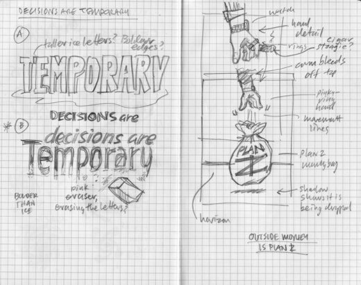
Here are my revised pencil concepts for “Decisions are Temporary” and “Outside money is plan Z” which I felt needed improvement.

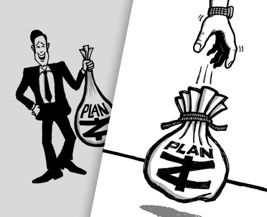
Here are the original and revised inks for the “Outside money is plan Z” piece. The second and final version has much better visual impact.
Chapter Break Illustrations
I had one last task to complete before my work was done — 10 chapter breaks in hand-drawn, sketchnote-style lettering. Initially, I thought I might hand-draw each one of these. But after some thought, I felt it would be more practical to create a hand-drawn font for consistency and other uses down the road.
I took out my Moleskine, used pencil lines for guides and drew out a simple alphabet. This was scanned at a high resolution and then processed with VectorMagic, a high-end vectorizing application. The final result was a fully vectorized version of my sketchnote lettering, ready to use in Adobe Illustrator.
The hand-drawn sketchnote font used for the chapter breaks in REWORK.

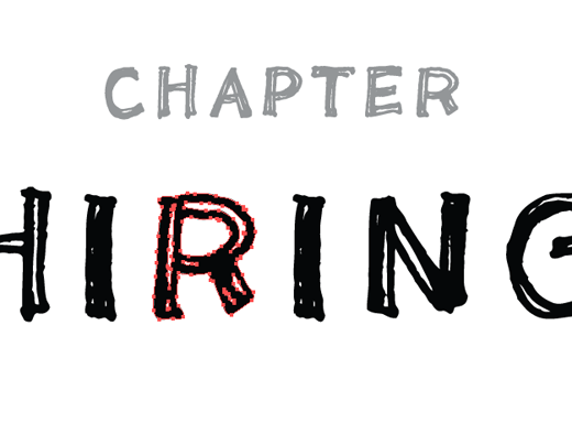
Screenshot of the hand-drawn sketchnote font traced as vectors using VectorMagic. This font was used to create the chapter breaks in REWORK.
Next, I created a master Illustrator template file with layers for each of the 10 chapters. On each layer, I built out lettering for all 10 chapter breaks. Each individual layer was exported to PDF for Jason and Crown’s review.
Upon approval, the vectorized Illustrator file was posted to the Dropbox folder and Basecamp for use in final production.
Conclusion
Illustrating REWORK was a fun, interesting and challenging project from start to finish. It’s amazing what we were able to produce in just 16 weeks, all while I worked nights and weekends and had a baby in the middle of the project. Our constant communications and use of Basecamp really made the difference.
It’s exciting to hear feedback from REWORK readers who say the illustrations help amplify the essays in REWORK which was my main goal throughout the process. My hope is that these visual anchors will make the ideas behind each essay more vivid and memorable.
I’m honored to be part of the REWORK team with Jason, David, 37signals and Crown. I’ve enjoyed writing about my illustration process on REWORK and I hope it provides helpful insight into one aspect of this book’s creation.
One more thing…
As a bonus, we’ve made all the illustrations in REWORK available as a Flickr set. Shortly we’ll be picking a few and creating full-size desktop backgrounds and iPhone/Android wallpapers. Stay tuned.

JD
on 24 Mar 10Mike, very cool to see your process. And congrats to you and your wife for Linnea!
Scott
on 24 Mar 10Mike, thanks for sharing. Great job on the illustrations.
Terry Sutton
on 24 Mar 10Awesome. I love seeing how this stuff is done behind the scenes. VectorMagic is that much better than Illustrator’s live trace?
Amber
on 24 Mar 10Nice behind-the-scenes look. I’m thinking of doing custom illustrations for a web projects and it just feels daunting. It feels much more personal than a web design or copywriting type of gig. I wonder if Mike or the 37signals folks have any wise words about selecting or working with an illustrator?
Congrats on the beautiful baby! There is a surprisingly large amount of downtime with a new baby (particular for papa) so long as you can fit it into 45 minute segments!
Anonymous Coward
on 24 Mar 10So funny to hear you say “I worked nights and weekends…” on Rework. = )
Juan Pablo
on 24 Mar 10Cant wait to have the book in my hands, and also to have one of those wallpapers in my pc. Great post
Andreas Dantz
on 24 Mar 10I’d love to get some of the illustrations printed for my office walls. Are there any plans?
Scott
on 24 Mar 10I second Andreas. Some of these should be offered as prints.
Mike Rohde
on 24 Mar 10@JD @Scott @Juan Thanks for the kind words. It’s great to share the process and hear you’ve enjoyed it.
@Terry Yep, VectorMagic is much more capable than Live Trace. It can do complex color images with lots of granular control. There’s a web-based and desktop version (though the desktop version is pretty much a front-end to the web back-end). VectorMagic could seriously use some UI help from someone but the core product really rocks. Check it out (I believe they may offer a few free traces for testing).
@Amber Thanks for the kind words on the work and on Linnea. She’s much chubbier these days. :-)
Working with illustrators is kind of like anything else, first find the style of work you like and then see how the illustrator works (if they share process that’s a great sign), read their writing and how they respond to your inquiries.
Lots of illustrators are on Flickr and I suspect there must be other venues where you can review work. I know there are great, friendly helpful illustrators out there. The best are everywhere!
@Andreas Thanks for your feedback about REWORK posters. They may be a natural and interesting by-product of the book. I’ve heard other people request them too, so we’re definitely aware of the interest in REWORK posters.
Mark Host
on 24 Mar 10Love the series of posts depicting and describing your process. This really made me appreciate the work that much more.
And yes, the illustrations amplified the essays. The anticipation of the essay summarized in one image combined with the clear voice in Rework made for excellent reading.
Alejandro Moreno
on 24 Mar 10That’s awesome. I would buy your hand-written font, too.
AC
on 24 Mar 10What kind of gel pen?
Bryan Sebastian
on 24 Mar 10Mike, thanks for the write up. It is fascinating to learn how you completed the project. I appreciate the insight. The illustrations make an already exceptional book even better.
Reinier Meenhorst
on 24 Mar 10I really like these behind the scenes posts Mike, I really like these illustrations. And while I was reading this post my Amazon order with REWORK arrived, so now I’ll be experiencing them in full context. Yay.
jonstovall
on 24 Mar 10WIN. Thanks for sharing, Mike. This is a great reminder to artists of any concentration of how important process is.
Amber Weinberg
on 24 Mar 10Those illustrations are awesome! I’ve had the book sitting on my nightstand for a couple of weeks now (waiting to finish Linchpin and AdvancED CSS) I can’t wait to start it :D I haven’t even opened it yet (didn’t want to spoil the surprises) so I didn’t even know there was illustration in it :)
Mike Rohde
on 25 Mar 10@Mark Thanks! I’ve found that “Emulating Chefs” by sharing my process is very attractive for designers who may have a similar process but also for those who may have no idea what goes into a project like this.
I also appreciate the feedback on the art amplifying the essays in REWORK. I’m hearing from lots of different people that the blend of tightly edited and distilled essays, combined with striking black & white images is working really well. It’s like a mental 1-2 punch.
@Alejandro A font for sale is in the works for late 2010. :-)
@AC For these pieces I used a Pilot G2 0.7mm gel pen, though Uniball and Bic pens also work great for me.
@Bryan Thanks man, great to hear the illustrations added to your experience.
@Reiner Happy to share the back story and pleased to hear you can now have more context as you experience the book in your very own hands!
@jonstovall Thanks! One of the reasons I like sharing my process is to encourage other artists to see similarities and maybe new ideas for solving challenges. Great to hear that was helpful and interesting.
@Amber Enjoy the surprise! :-)
Michal
on 25 Mar 10Great stuff, can’t wait until I get my copy!
This discussion is closed.