Designers sometimes use the word “refactor” in a loose way. I think they overhear the word from programmers without getting the precise meaning. This article will introduce the term to designers so they can gain the same advantages that programmers have from a clear understanding.
How do designers loosely understand refactoring? Many take it to mean “rearranging” a design or “adjusting without completely rethinking” it. Refactoring actually means something else. It means changing the way a design is built without changing the way it looks from the outside.
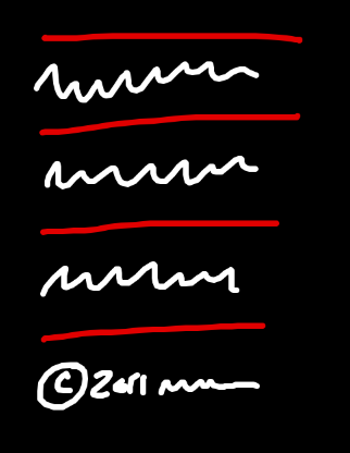
Here’s an example of a refactoring. Let’s say there is a list of elements on a page and we want a dividing line above and below each element. Below the list there is a copyright footer.
We could implement this design with the following HTML and CSS:
<div class="items">
<div class="item">
The text of the first item
</div>
<div class="item">
The text of the second item
</div>
<div class="item">
The text of the third item
</div>
</div>
<div class="footer">
© 2011 Design by Me.
</div>div.items { border-top: 1px solid red; }
div.items div.item { border-bottom: 1px solid red; }This CSS renders a border on the bottom of every item. A top border is rendered on the container so that every element has a border above and below it.
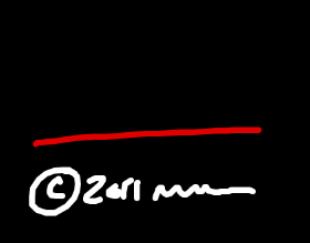
All is well. Now suppose we start working on other pages in our project and we realize we want the copyright footer on every page with a border above it. We add a selector in our CSS that renders a border above the footer.
<div class="footer">
© 2011 Designed by Me.
</div>div.footer { border-top: 1px solid red; }The footer looks good by itself. But when we return to the page with our list of elements, we now have a double border.
One way to fix the problem is to special case the global footer on just this page. Here’s what that looks like:
<body class="list_of_elements">
  <div class="items">
     . . .
  </div>
  <div class="footer">
    . . .
  </div>
</body>
body.list_of_elements div.footer { border-top: none; }
That special case for the footer fixes the problem, but I don’t love the code. The footer is a global element. It makes more sense to change the list of elements that only appears once than to change the global footer that appears everywhere.
So even though the design looks right, I’m going to change the code behind it. I’m going to “refactor” the styles so the borders on the list don’t interfere with the border on the global footer.
Here’s the refactoring:
Before
div.items { border-top: 1px solid red; }
div.item { border-bottom: 1px solid red; }
div.footer { border-top: 1px solid red; }
After
div.items { }
div.item { border-top: 1px solid red; }
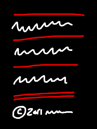
div.footer { border-top: 1px solid red; }The result looks like this:
It looks exactly the same as before. But the code is different. That’s a refactoring.
Here’s a real example from our products. Each of our products has an Account tab with a block that displays your current plan and an arrow pointing to a recommended upgrade plan.

The grey container was originally a fixed width. While we were designing the 37signals Suite, we decided it would be better if this block could stretch horizontally. We wanted the card and arrow elements to remain at their fixed widths but appear centered inside the grey container regardless of the container’s width. Here’s what happened when we stretched the container horizontally:

Oops. The arrow didn’t come along for the ride. What’s going on here?
Have a look at the structure of the design.
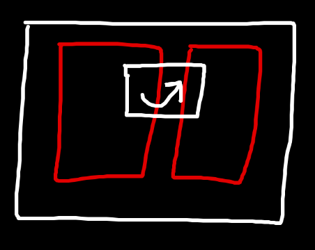
There is an outer container called .cards with two cards rendered inside (embedded Ruby does the rendering) and an arrow between them.
      <div class="cards">
          <%= render :partial => 'account_card', :locals => {:plan => @account.subscription} %>
          <span class="arrow">
              <%= image_tag('upgrade_arrow.png') %>
          </span>
          <div class="upgraded_card">
            <%= render :partial => 'account_card', :locals => {:plan => @account.recommended_upgrade_subscription} %>
          </div>
      </div>
div.cards { position: relative; background: grey; etc… }
div.cards span.arrow {
position: absolute;
top: 78px;
left: 249px;
}When I inspected the CSS, it turned out the arrow was being absolutely positioned relative to the top-left corner of div.cards. That was fine when div.cards was a fixed width. But when div.cards comes wider, and the cards move to a new center point, the arrow doesn’t move with them. It’s fixed to the top-left of the container regardless of the container’s width.
The solution is to position the arrow differently. We want to position the arrow relative to the cards instead of the container so it will always be in the right place, even if the container changes.
Before I started changing the code, I reverted back to the original fixed-width design. I want to change only one thing at a time. Otherwise when the design breaks it’s hard to know which change did the breaking. Reverting to the fixed-width design also makes the change a true refactoring. The design should look the same before and after the change on the outside.
Here’s the new code (slightly paraphrased for this example):
      <div class="cards_background">
        <div class="cards">
          <%= render :partial => 'account_card', :locals => {:plan => @account.subscription} %>
          <span class="arrow">
              <%= image_tag('upgrade_arrow.png') %>
          </span>
          <div class="upgraded_card">
            <%= render :partial => 'account_card', :locals => {:plan => @account.recommended_upgrade_subscription} %>
          </div>
        </div>
      </div>
div.cards_background { background: grey; etc... }
div.cards {
position: relative;
margin: 0 auto;
width: 590px;
}
div.cards span.arrow {
position: absolute;
top: 78px;
left: 233px;
}I renamed div.cards to div.cards_background and wrapped the cards and arrow with a new div.cards. The new div.cards has a fixed width equal to the width of both cards and the gap between them. The arrow is positioned absolutely to the top-left edge of this new div.cards. Now the arrow will go wherever the cards go.
When I reloaded the browser, the screen looked exactly the same as before.
That’s a refactoring. The difference is that now when I stretch .cards_background out, the arrow will move along with the cards as intended.
Refactoring is a good tool to have in your belt. It helps to consciously decide as you code whether you are changing the implementation of a design or the outward appearance of the design. I hope these examples give you a precise definition of what refactoring means.
Ben Atkin
on 12 Jan 11Wow. Great explanation! After seeing those two examples I’m hungry for more.
Justin Jackson
on 12 Jan 11I’ve always wondered what “refactoring” was. This was really well presented. Thanks!
Berserk
on 12 Jan 11I would add that that example is a tiny tiny refactoring, if that. It has more the feeling of naturally evolving code while developing. Just because code has changed does not mean refactoring took place.
To me, refactoring implies major code changes. Say a css file with a few hundred lines, coupled with its site, that suffers from classitis. A refactoring could mean curing the design from that disease, leading to changes to a large part of the selectors in the css file.
(I realize that this is just an example, though.)
If you don’t have it, you’re like a carpenter without a hammer.
Jason Klug
on 12 Jan 11I’m sure there will be a lot of different definitions of “refactoring” put forward in the comments.
Personally, I’ve always thought of it as taking an element that happens to repeat itself as a project develops (footer markup on each page, for instance) and making it into its own element. Instead of having a separate instance of the footer element on each of, say, 12 pages, you make that element once, and call it 12 times (leaving a single point of update instead of 12).
I think of refactoring as taking an object-oriented approach to development, vs writing long independent scripts.
Regardless of the definition, this write-up was a good thought exercise for designers, as it comes up often!
Jussi Pasanen
on 12 Jan 11Spot on, and this definition works for the traditional refactoring of software code, too.
Great write-up Ryan!
Anonymous Coward
on 12 Jan 11Does anyone else find that the color of the arrow being the same as the: signup button, heading and text to make it visually distracting.
Seems that it would be a lot more effective if the signup button was a contrasting color
Anonymous Coward
on 12 Jan 11The first series of examples should use a [ol] or [ul] element
Santiago Valdarrama
on 12 Jan 11Berserk, regarding your comments:
refactoring implies major code changes
That’s not true. Refactoring implies changing your code without affecting the external behavior (in this case, the presentation). It could be a tiny small change, or a huge one.
Here you can see the refactoring definition: http://www.refactoring.com/
And a full catalog of refactorings for programmers. Note there are simple refactorings, and complex ones: http://www.refactoring.com/catalog/index.html.
ZJR
on 13 Jan 11My take on the subject is that refactoring is meant to change the behaviour of the application WHEN IT GOES UNDER HEAVY STRESS. (that kind of change you can summarise as “working” against “NOT working”)
Anonymous Coward
on 13 Jan 11Though it is true that small code changes are probably, by definition, refactoring, I think that in general usage the term implies more of an overhaul.
Similarly, it is probably true that changing the kitchen faucet is technically a home renovation, though few of us would call it that.
JasonB
on 13 Jan 11Talking about refactoring, has anyone noticed that literally everything that DHH codes ends up getting completely rewritten (re-factored)?
Just to list a few things:
- Basecamp
- Highrise
- Ruby on Rails
And I don’t mean the small code changes, literally entirely re-written. Basecamp a few years back was scrapped to only be re-written by Jamis.
Then Rails was re-written by the Merb crew once DHH claimed (indirectly & quietly) defeat that Rails was far inferior to Merb. So the Merb guys took over Rails and have been spending a hard 1.5 cleaning up the Rails mess.
Then Highrise just recently was entirely re-written internally by I think Jamis again and a bunch of other people.
I would link to all of the facts for this but I learned of all of it while listening to about 20 different 37signals Podcasts
Joshua Pinter
on 13 Jan 11@Jasonb
Everything I write that has any longevity usually gets refactored to the point of being almost completely rewritten. That’s a good thing. Get it out fast. Get an audience and then refactor and enhance.
DHH is a busy guy. He’s probably occupied building the business and with high-level ideas. If he wasn’t he’d be doing the rewrites instead of Jamie and others.
Merb is great and Rails is great but if Rails was so inferior why would they keep the Rails name in the merge/collaboration?
Anonymous Coward
on 13 Jan 11If you’re talking about refactoring, you’d probably want to be a bit more semantic in your HTML by using < ul> and < li>... It doesn’t change how it’s displayed but that’s pretty basic.
Brian Pan
on 13 Jan 11Designers aren’t the only ones that use the word loosely. I’ve heard plenty of coders (and probably myself on occasion) use it loosely to mean a general rewrite/cleanup.
Jamis
on 13 Jan 11@JasonB, neither Basecamp nor Highrise have ever been rewritten. :) Both have seen significant changes at various points, but never anything even remotely resembling a rewrite.
Tara
on 13 Jan 11@Jamis
Are you sure?
Because this blog post from May of 2006 says quick the opposite, just to quote:
That sounds like a complete rewrite to me.
Jamis
on 13 Jan 11@Tara, keep in mind that the post you point at was written before the work had really begun. In the end, although we did make some significant, sweeping changes to how the users experienced Basecamp, the changes under the hood were not, in general, quite so large (although some were). Some features may have been rewritten (I can’t remember specifics now), but I can state with confidence that line-for-line, a significant portion of Basecamp remained untouched.
dan
on 13 Jan 11It wasn’t easy, but eventually we looked back at what we had created and admitted, “This is just way too much. It doesn’t make sense. It’s not simple. It’s not clear.” So we scrapped it and started over.
Emily
on 13 Jan 11Ryan, thanks for giving a damn. Thanks for caring enough to care and caring to do things right AND for sharing it with all of us.
David Andersen
on 13 Jan 11This is 37s gold and one of the reasons I come here.
dusoft
on 13 Jan 11Naturaly, CSS 2 selector :last-child should be used in the fotter vs. list case, which is just one line and no problem. I don’t understand why would you add other unnecessary code. http://www.quirksmode.org/css/firstchild.html
dusoft
on 13 Jan 11And more over, semantically list is a list (UL/OL + LI), not a bunch of DIVs.
Wilman
on 13 Jan 11I liked the explanation a lot. I am a programmer so I know from our world what “refactoring” means, however I love reading Ryan articles because they are very educational and clear.
Justin Russell
on 13 Jan 11@dusoft: I agree with the point about UL (in this case, at least), but :last-child isn’t so great if you want to support IE 7&8. It’s one of those things that would be perfect if universally supported, but I’d take a little extra markup over separate stylesheets or compatibility CSS.
Hope you keep posting peeks into the code, guys. It’s great to see how you think about what you code.
Benjamin
on 13 Jan 11Very informative. I find that most buzzwords are misused which is one reason I avoid using buzzwords in the first place. There are more descriptive common words that can be used to accurately describe just about anything.
Jakub Linowski
on 13 Jan 11I like to think that that code isn’t the only thing that can be refactored for the sake of improvement, simplification or greater manageability. Coming from an interface design side, the front end can also be cleaned up from time to time as it diverges or fragments. In that case, the scenario or the goal of the way the task is handled remains fixed, but visual changes can still be done. If we think that only code can be improved (and not what the user sees), we might might be missing out on creating better products. I think the great opportunity here is to extend the definition of refactoring beyond it’s traditional development roots.
George
on 13 Jan 11If you wanted to get really semantic, you could use < article> or < section>
Bryan Sebastian
on 13 Jan 11In my experience it is important to keep refactoring separate from additional enhancements. Large refactoring projects tend to induce scope creep. I worked on large refactoring project to convert a .NET website to Rails. A few days in and the client wanted page changes and design tweaks. Being a typical developer, I was like “sure” and started making these changes. After a few weeks of refactoring code AND changing the design, it was hard to track what was legacy versus enhancements and regression testing became a nightmare. Ryan’s point about keeping the refactoring aspect separate is important. In my case it was better to complete the refactoring first, test the site, get everything approved and then implement the presentation changes. This is also when I learned to say “no”.
Andreas
on 13 Jan 11Yeah what kind of refactoring is it to keep someone’s ugly div-mania?
Ryan
on 13 Jan 11I would add that in object-oriented programming, refactoring often takes the form of adjusting the division of responsibilities among objects to keep things clear and well encapsulated as functionality evolves.
This is in effect what your example shows: it’s a change in which DOM objects are responsible for drawing which borders.
I too would like to hear more about what “refactoring” could mean for a designer.
Sherwood
on 14 Jan 11Switching an animation from Flash to HTML5, while retaining its appearance and interactions, would be another example of refactoring.
Vlad
on 14 Jan 11It feels revealing to see this article’s title and then find that this is in fact code refactoring, and then this brings to a more global aspect: we’re all developers, regardless of what we develop, and this is why refactoring equally applies to all of us. Nice!
Glenbot
on 14 Jan 11Grooveshark.com is a great example of this. They completely redid the code to support HTML 5 and nobody ever knew the difference. Interface wise it all worked the same, just better and faster.
Nathan Ostgard
on 14 Jan 11Refactoring is modifying existing technology to solve the same problems in a more efficient or reusable way.
Drew Stauffer
on 14 Jan 11Hey, I’m refactoring a whole page at this very moment. Refactoring will sound a lot better on my time sheet.
This discussion is closed.