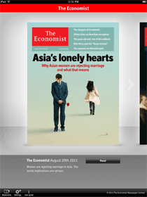
I was just reading the Economist on my iPad at lunch, and I’ll be damned if that’s not one of the best-executed apps on the platform. I’m impressed over and over by how simple and perfect it is.
The experience is massively superior to print. No issues piling up, no guilt when you only read half an issue, nothing extra to stuff in your bag, new issues available to download the second they are released, and so on.
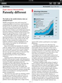
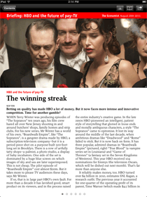
And the app doesn’t have any of the downsides of other magazine apps. The typography and layout and illustrations look beautiful and they exactly match the print magazine. It feels 100% like the real Economist, not a digital imitation. The app is lightning fast and just the tiniest amount of chrome frames the page for navigating.
I don’t get to say this often: it’s a perfect execution.
Link: The Economist on the App Store.


Ian Silber
on 25 Aug 11no guilt when you only read half an issue
Jon Allured
on 25 Aug 11Hey Ryan, are the pages real text that you can interact with (copy to clipboard) or are they really just .PNGs or something? This has always really bugged me about the iPad magazine apps I’ve tried, but I don’t read The Economist, so I haven’t tried that one.
Bryan
on 25 Aug 11Pretty cool. I love the design and UI…. Your link to the app store is broken btw.
Rebecca
on 25 Aug 11Is it missing landscape mode? Or is that just not pictured? Apps that don’t accommodate both views are lazy.
RS
on 25 Aug 11Jon: You can’t copy text to the clipboard, but I don’t care about that. I just want to read it.
Thanks Bryan. Fixed the link.
Rebecca: It also works in landscape mode. The layout intelligently reflows and some of the feature covers have special landscape displays.
Walker Hamilton
on 25 Aug 11I second Rebecca’s sentiment, if not her tone. I prefer to use my iPad in landscape mode.
Tony
on 25 Aug 11How large are the issue downloads? I get GQ and Wired and, although they look fine and have some nice interaction not available in the print edition, the downloads are huge.
For a magazine like the Economist, particularly, I can imagine wanting to be able to select text to do things like look up definitions or copy a name or other phrase to Google.
Roy Kaller
on 25 Aug 11Also available on the iPad from the Economist, in the same brilliant formatting plus embedded multimedia, is the art and lifestyle magazine “Intelligent Life.” By the way, is there any way to turn-off the print edition? I now read Economist on my iPhone and iPad the paper stacks-up.
Raphael
on 25 Aug 11Can you bookmark what page your on? One reason I still read the print edition is just because I can keep the page I was reading on.
Thijs
on 25 Aug 11Jon, Ryan: On the iPhone, the app displays real text, and you can select and copy it. Due to being real text, the magazine also loads much faster, in my experience, than any Condé Nast magazines—apart from the audio files for the Economist’s read-aloud feature (which is really nice). I tend to think it’s the same case on the iPad, but I’ve to try that this weekend.
Steve R.
on 26 Aug 11The Econonomist costs >$100 per year to subscribe. It is worth every penny. They ‘get it’. I”m a proud subscriber since 1991, and have never been disappointed in them. They know more than I do, and are smarter, on the whole, than I am, so I am getting a bargain. I find their ‘ego free’ editorial policies refreshing as well.
Marcos Wright-Kuhns
on 26 Aug 11Looks a lot like reading magazines in Zinio. While it doesn’t have the cool-looking bubbles for pages in a particular article like the Economist, it’s another true-to-print digital magazine presentation and with a single tap you can get to zero-chrome reading. It also has a great set of features like working links to jump to website & between articles, the ability to add multiple bookmarks, and the ability to switch to “Text” mode on nearly any page where you can copy text at will.
Eliot
on 26 Aug 11Tony – the issues are fairly small. I can download it over 3G in less than a minute. Nothing like Wired or PopSci!!
Chris
on 26 Aug 11You listed several reasons why this app is superior and they’re valid, but the reasons you listed could have applied to any print to digital conversion.
Did the Economist miss an opportunity to improve their product offering when they committed to “a perfect execution”?
Matt Henderson
on 26 Aug 11Ryan, I completely agree with you. And to think that on top of a great app implementation, we get great content — sharp, objective and with a touch of the deviously witty.
I’d suggest also taking a look at BloombergBusinessweek for the iPad. It’s not The Economist in execution, but it’s a solid second.
Every week, I eagerly look forward to both arriving. That’s a great sign.
At the other end of the spectrum, before deleting the WIRED app from my iPad, I decided to open it this morning. The latest edition has a cover that says, “Touch the light bulb to see it turn on.” What interactivity! Sigh…
Espen
on 26 Aug 11I’m not surprised. The Economist is one of the most perfectly designed paper magazines I know too.
Anees Uddin
on 26 Aug 11Can I ask potentially stupid question, why is having an ipad application that is just like the magazine layout, given that the platform offers so much more than that?
Deltaplan
on 26 Aug 11You forget to mention one thing : how many MB does each issue occupy in the iPad’s storage ?
It’s generally the main drawback with digital magazines : they’re huge. Some of them take as much as 150MB per issue…
Felix
on 26 Aug 11As an @Instapaper addict, I hate using media apps which don’t support it.
Having said that, I’m a fan of The Economist and will check it out.
Matt Henderson
on 26 Aug 11@Anees
What did you feel like you were missing last time you were reading the magazine?
For me, I’m glad that I can have close to the same experience of reading the magazine on the device that’s almost always with me, and delivered without having to travel to the newsstand. And I have my entire archive of issues without having to store paper.
And it does improve on the experience, though. It remembers where you left off last time you were reading, allows you to bookmark across issues, allows convenient section-wide and issue-wide navigation, allows you to share content socially if you like, and even includes supplemental audio.
WIRED is an example of an iPad magazine that tries to exploit every technological possibility offered by the iPad, and the result is a train wreck.
idont
on 26 Aug 11It will really be perfect when the iPad will have the Retina Screen. Looking forward to buy an iPad… 3?
peter
on 26 Aug 11Don’t forget you can download the full audio in app. Really useful when you want to get on with something else (like cooking) at the same time.
Thijs
on 26 Aug 11Jon, Ryan: For some reason, the iPad does not allow selecting and copying of text, but the iPhone does.
Lyle Mullican
on 26 Aug 11I couldn’t agree more. The Economist exemplifies thoughtful reporting that’s nuanced and opinionated without being melodramatic. And in addition to excellent writing, their information graphics are top-notch, frequently plotting multiple variables together in a very small space (and remaining free of chartjunk).
Paolo T.
on 27 Aug 11I also suggest a look at Le Monde’s app, another very well executed project.
Dmitry
on 27 Aug 11Looks good. Thanks for sharing! I was always wondering if there are any good applications of magazines on iPad.
Here in Finland, companies have chosen a cheap way. They buy a standardized solution from a provider and just load scanned versions of papers to their applications.
The size of each page is around 1MB, so you can imagine how terribly expensive it is to read it, not to mention how inconvenient it is.
We have actually recently made a short overview of the main problems of apps of popular magazines for iPad and put in our blog. The main problem is that magazines and papers mostly put paper versions on mobile instead of creating mobile versions.
Mike Krus
on 29 Aug 11agreed, very nicely done app.
One thing I HATE about it though is that it doesn’t preserve reading location. Everytime the app gets killed you need to navigate from the top to the article you were reading… really annoying…
Mike
Greg
on 29 Aug 11Hi all… really glad the overall sentiment is positive on the app – I played a part in the UX. I’m the design & ui/ux director at TigerSpike’s London office who built the app for The Economist. Simplicity was the overall goal – and yes – it’s often harder than one thinks… flowing the text across colums and dynamically changing some of the layouts across portrait and landscape took some tweaking to get right. The download is kept to a minimal size – there’s certainly no ‘PDF/ PNG reader’ here!
MattM
on 29 Aug 11@Anees I agree,
While I don’t dislike this app, I am also not impressed by it. Keeping it simple is one thing, but not taking advantage of some of the key features the iPad offers is less impressive. From simple transitions like turning the page over, to more advanced like letting me click into charts to get more detailed views, this app offers none of this. I’d prefer deeper richer interactions on a product like the iPad.
Charlie Blake Thomas
on 30 Aug 11Hi everyone. These are great comments. I work for TigerSpike who designed and developed the Economist iPad application.
We’ve also just launched the Android version. Everyone here is reading these comments and taking stuff on board. The main driver for the design of this application is the Economist reader themselves. In all of the research done, the readers wanted something that mirrored as closely as possible the actual magazine.
You’re right that the hardware/software itself can do a lot more but often less is more :-)
Keep an eye out for the next version of the app.
Keep the comments coming. Some of our other apps include the Telegraph (UK), Sport (UK), France TV (France), Woolworths (Australia).
tyiyfgwq
on 31 Aug 11That I recommend to see here! http://go.uc7758.com/84741
guido
on 31 Aug 11I love the Economist since 2 decades and as an early innovator I agree and hope publishers will take up the chances they have again now. Personally I think the App is well done, but a “perfect” execution looks different to me, that’s when I am expecting more relevant features + services than a reading app. I would say that’s a good standard magazine app, quality/ UX above average. But “perfect” would need to be top of the pops for me.
This discussion is closed.