
The last few years have seen an explosion in new ways of visualizing data. There are new classes, consultants, startups, and competitions. Some of these new and more “daring” visualizations are great. Some are not so great – many “infographics” are more like infauxgraphics.
In everyday business intelligence (the “real world”), the focus isn’t on visualizing information, it’s on solving problems, and I’ve found that upwards of 95% of problems can be addressed using one of three visualizations:
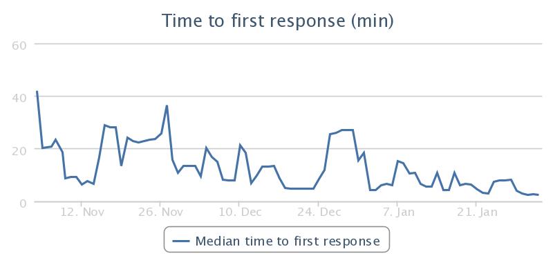
- When you want to show how something has changed over time, use a line chart.
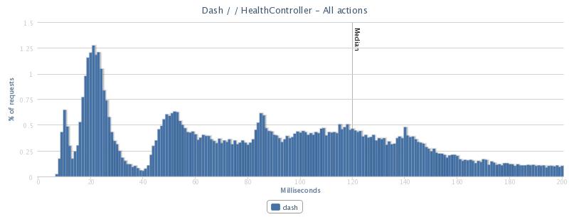
- When you want to show how something is distributed, use a histogram.
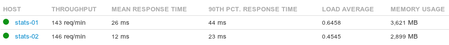
- When you want to display summary information, use a table.
These are all relatively “safe” displays of information, and some will criticize me as resistant to change and fearful of experimentation. It’s not fear that keeps me coming back to these charts time and time again: it’s for three very real and practical reasons.
1. Spend your energy on selling the message, not the medium
One of the primary points of a visualization, as opposed to dumping raw data, is to distill a message for an audience that’s less familiar with both the content and the methodology involved. People have a limited ability to ingest information in a given window of time – would you rather they focus on the story you’re trying to tell with the visualization, or the substance of the visualization itself?
Most people intuitively understand line charts and tables – you can safely put a well-constructed (with legends, labels, etc) timeseries or summary table in front of most people and not have to worry too much about whether or not they understand the medium.
Many people are familiar with the notion of a histogram as well, but sometimes more explanation is required. It gets a little complicated, because a histogram becomes much more powerful when you pair it with an understanding of normal distributions, standard deviation, etc. Still, it’s not a hugely complex thing to tackle – you can explain the visualization and the underlying concepts to a layperson in five or ten minutes.
Almost anything more complicated than these three takes some explanation. If it’s a really great chart, it should take less explanation and be worth it; my experience, however, is that in the vast majority of cases it’s not worth the mental “tax” of new visualizations.
2. Your job is to solve a problem, not make a picture
The job of the New York Times graphics department is to tell a story using graphics, and they turn out some great work in pursuit of that goal. On the other hand, the job of an analyst for a business is to solve a problem and move on to the next one.
You can spend days, weeks, or even months working on visualizations of data, but does that benefit the business most? In most cases, a simple visualization will get the job done and free you up to solve the next most pressing problem that the business has.
3. Safe doesn’t mean boring
Just because these tools are well-worn doesn’t make them boring – you can do incredibly innovative things just with line charts and histograms.
One of my favorite charts that has been published here on Signal vs. Noise was a set of histograms comparing the time of git commits across the various people at 37signals (The rhythms of 37signals). This is nothing more than a stack of identically structured histograms, and it didn’t take a long time to make or require much explanation.
What three charts would you take with you on a desert island?
Mark Sonnabaum
on 01 Feb 13The only chart I’d add is a boxplot. I find them easier to read than stacked histograms if the x-axis is a factor.
Michael
on 01 Feb 13I would add a pie chart as a subset of histograms.
Josh Ferguson
on 01 Feb 13Don’t forget about comparing groups. Minimal bar charts still make sense sometimes!
Tamal White
on 01 Feb 13One test I use when confirming my choice of visualization is: “Can I discover something about this data I wouldn’t otherwise see?”
For example, your histogram chart has a peak then valley, before a relatively flat section then tail. We’ve discovered something about the data that wouldn’t be apparent in a table or aggregate. What’s the story here? Is the peak static content that doesn’t have to be preprocessed before being served? Is the valley where static content falls off and dynamic content starts being served?
The discoveries drive questions and direct us to the answers.
Andre
on 01 Feb 13Off topic, but I wanted to say thanks to Mig for switching the text layout on the SVN’s new design back to block paragraph format. Indented paragraphs without whitespace makes sense for books (more content per fixed-area page), but are much harder to read on a monitor. Even since the redesign I’ve had to either read new posts directly in Google Reader or use Evernote Clearly.
Aditya Rustgi
on 01 Feb 13Here is actually a good chart that i found online that is a thought starter for determining what the best chart is to communicate a given point. Choosing a good chart from the website Extreme Presentation.
I have found it quite useful to structure my thought process for data presentation.
Chris
on 01 Feb 13When analyzing data for yourself, these charts generally suffice. However, if you are attempting to sell an idea, project, or viewpoint, you are telling a story, no different than the New York Times. In these instances, the basic charts may suffice, but there are cases where ‘visualization’ depictions can help sell both the ‘hard’ data as well as the ‘soft’ impressions that sways arguments.
Anonymous Coward
on 01 Feb 13Please add full urls for the images in the RSS feed, so they will show in my RSS-reader. Thanks! (Normally I would communicate this message in an infogram, but your post convinced me: if the eye candy gets in the way of the message, please: do shoot the messenger)
Dan
on 01 Feb 13So using your three chart-templates above, how would you go about representing this kind of dataset:
http://www.edwardtufte.com/bboard/images/0003VL-9150.jpeg
tufte
on 01 Feb 13This mindset only works at the gigabyte scale. You don’t need powerful technologies to deal with child-size problems
Denis Somar
on 02 Feb 13Amen to this!
I had this epiphany myself recently when redesigning a dashboard for an app. I absolutely did NOT espouse the usual adoption of red light, green light BS and even some forms of line charts as they didn’t reinforce anything. Last months numbers were less than this month’s – that’s good, but does a bar chart really tell you that. Doesn’t 60,000 vs 100,000 say that more precisely?
I thought this very same thought when dribbbling a little drool:
Alain
on 03 Feb 13Michael: I hope this is a joke! Pie Chart are the WORST way to present data. The only case in which they are useful is when you want to confuse the audience. Why? As soon as you have more than 2 values, depending on the position of the pie segments, you can make one section looks bigger smaller than another one regardless of the “real” value.
The capacity of pie chart to confuse is the main reason why it is so loved by management!
Sarvesh
on 03 Feb 13Noah, can you recommend any good open source charting library?
YinkaBrand
on 04 Feb 13Nice. http://www.yinkabrand.com
Glenn
on 04 Feb 13I second Andre. THANK YOU for getting rid of the indents. It’s a small thing that makes this blog more enjoyable, and isn’t that the message that you are trying to convey?
Paul Oprea
on 05 Feb 13Generally true, but let me give you an example. There are situations where 60.000 or 100.000 need be the same thing and 59.999 is not – that’s why thresholds exist (f.e. exam passed or not… or even more dramatic, patient has clinical AIDS or not – it’s a scoring system). There are cases when all you need upfront is just the basics, then only fancy details (how strongly is it in that state).
RxT
on 06 Feb 13A good friend of mine says he would take four: these three and a scatterplot!
Billy
on 07 Feb 13Ok… but why scatterplots? I really need to know of a good reason for scatterplots on a screen. How are people using them, interacting with them?
This discussion is closed.