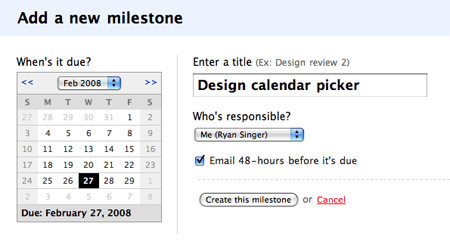
Let’s take a look at the design process. We had the idea to replace the pulldowns with a calendar picker because we did exactly that in Basecamp a few months ago. Here’s the calendar picker on Basecamp’s New Milestone screen:
First Sam converted Basecamp’s calendar picker into a Rails plugin so we could use it in Backpack without duplicating our efforts. After he inserted the calendar picker into Backpack, it looked like this:
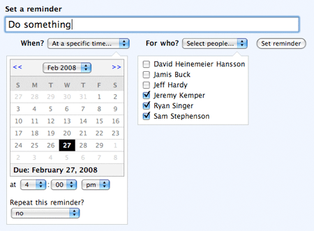
It was good to see the picker in place, but it didn’t look right. There are too many borders and shades of grey. It looked fine on the Milestone form because the calendar is surrounded by white space. Reminders are a different story. The Reminders form is already shaded blue and contained in a box, and the calendar picker appears in a smaller white box that appears and disappears based on the pulldown above. Our challenge was to simplify the calendar design to make it fit more seamlessly into the busier Reminders form.
Step 1: Critique the original
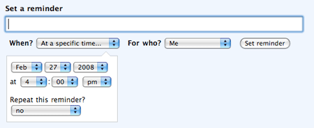
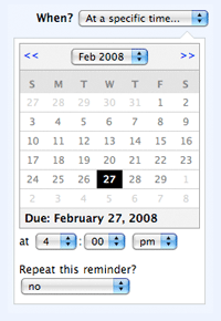
Here’s the original design. Right away a few things hit me. There are too many boxes. The calendar border makes it a box within a box. The header is a box, the weekday titles (S M T..) are a box. The “Due:” line is a box. It’s too much noise.
The grouping is also wrong. The time and “repeat” option are oddly grouped together because they share a white background below the grey footer of the calendar.
Step 2: Broad strokes
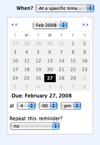
I dropped a screenshot into Photoshop and started re-coloring the sections. My main goal was to turn the calendar inside out. Instead of grey on top and bottom, I made the days grey and the header/footer white. Now they blend into the surface of the white container. In the absence of a bottom border and shading, the “Due:” date groups with the time pulldowns and anchors them. The time and “repeat” options are no longer grouped separately from the due date. Your eyes are also drawn to the center of the calendar now that the days are shaded instead of the top and bottom of the calendar.
Pleased with the mockup, I reflected the changes in my CSS. Now the grey center block was bothering me. Every month looks the same, and the difference between days inside the current month versus days of adjacent months is too subtle. It’s time for some refinement.
Step 3: Refinement
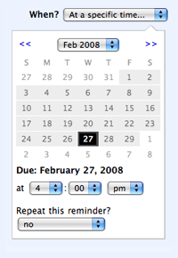
This step shows how small tweaks make a big difference. I removed the grey shading from the “off-month” days. This had a few benefits. First it allowed me to use the same color for the weekdays (S M T..) as the off-month days. The “least effective difference” bells were ringing. The shading also gave each month its own shape. That means you advance to the next month, your eyes immediately register the change without scrutinizing the month name. Lastly I removed the border between the the month pulldown and the weekdays header. That allowed the whitespace to flow from the top of the white container all the way through the calendar to the bottom. All the calendar elements are united with the white surface behind and around them.
Step 4: A splash of color
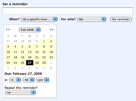
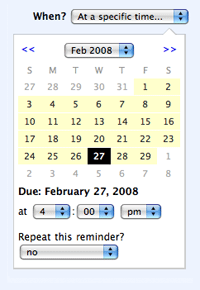
The last thing this redesign needed was some personality. Swapping the grey day cells with yellow made them pop and brought the calendar to life. The yellow had the added benefit of drawing attention to the calendar. The calendar only appears when you indicate you wish to set a specific date and time rather than a pre-set option like “Tomorrow morning.” Now when the calendar appears, it comes on the scene with a flash of color and grabs your attention.
This redesign was an exercise in making differences count. The main function of our eyes and brains is detecting differences in color, in shading, in weight, in grouping. Therefore we make it easy on the eyes and brains of our customers when we consider every line, shade, and color. Clarity and simplicity come from questioning each pixel to ask if it’s doing work. Try paying more attention to differences on your next design and kick out those lazy pixels.


Anonymous Coward
on 28 Feb 08I actually like the gray one and not the yellow one. I think it popping into place is plenty, you don’t need extra color, but I could be wrong. Either way it’s great to have :)
StevenRay
on 28 Feb 08Nice post. As simple as it seems it’s interesting to see the process you went thru. Thanks.
Eli Van Zoeren
on 28 Feb 08Any chance that you will be releasing that calendar plugin? I spent a day or two a while back looking for a rails calendar, and couldn’t find one that I liked.
Jeff Mackey
on 28 Feb 08I love these types of posts. Thanks for sharing!
Matthew Amster-Burton
on 28 Feb 08Big improvement! But I feel like there’s a way to do the time part better, too. What I’d like to see is a drop-down like:
Early morning Mid-morning Noon Early afternoon etc
With the last option as “at a specific time”, which would then offer you a text box to type the time into. What I’m getting at is that choosing an hour, minute, and am/pm is a mild, persistent annoyance—to me, it feels kind of like setting an alarm clock where you have to hold the fast-forward key down.
Sorry if this sounds ungrateful—the calendar picker rocks.
tritowntim
on 28 Feb 08Entering time is such a pain in the arse. I’ve never seen it done well. Did y’all consider just giving them a single text box and having a smart parser for entries like “4pm” or “4:00”?
Neil Kelty
on 28 Feb 08@tritowntim -
30boxes does an excellent job.
Anonymous Coward
on 28 Feb 08@tritowntim – check out Datejs (http://www.datejs.com/)
Anil
on 28 Feb 08This is great. However, I was more excited by your the people picker you showed. How would that scale if i had 300 people in the list. How about 3000? How would you design it?
Frank
on 28 Feb 08Any pointers from you programmers around here on storing a repeat date? I’m always wondering how you store that in a database in the best way and then have it show up on the right day. I was actually thinking of having all different fields on day, month and year, and make a function that looks it up every day if they would match. But do you have another way?
Richard Allum
on 28 Feb 08Big improvement. Thanks. Couple of suggestions if you look at it again: (a) it would be nice not to have to choose a time, often I select a particular date in the future and the time is irrelevant. I would rather have the ability to select time than not but maybe default it to 0800? (b) please add month selector < and > function to Highrise!
James
on 28 Feb 08Nice work!
Carlos
on 28 Feb 08Will you public release this Calendar plugin? Would be great :D Thanks!
Jose Espinal
on 28 Feb 08Me wants that calendar too! :P
Great job!
Ben
on 28 Feb 08Any chance we could get this feature on the calendar event reminders instead of “Email/SMS me 30 minutes before”?
Benjy
on 28 Feb 08I’m not sure whether this is much of an issue within these applications, but one thing that bothers me about calendar pickers in their most common application - travel sites - is the time/# of clicks to get to the month one wants. I’d love to see a more elegant way to get 6 or 8 months out, which is common for people planning a vacation. As I am trying to plan my honeymoon, I feel like I’m constantly having to click a bunch of times to select July dates for flights, hotels, etc.
Keith
on 28 Feb 08Looks great. Thanks for the addition!
Martin
on 28 Feb 08AOL on the input field for the time.
Dmitry
on 28 Feb 08Benjy: that’s true, however the amount of times when you do need to see many months ahead is not nearly as often as you just need the current month, which is why it’s necessary to hide the rest (gives it focus and cuts down on the noise).
However, it’s a valid point and one unobtrusive way to do this may be an “expand” button which would expand the picker to show more months (using some AJAX goodness of course). I’m not nearly experienced to code this however, so just an idea :)
MiSc
on 28 Feb 08@Benjy: I am just working on something like the date slider (http://ajaxorized.com/dateslider/slider.html) for a travel site. would you find sth like the slider be helpful for the date picking task?
Travis Schmeisser
on 28 Feb 08I was so excited when this calendar update came to Basecamp and I’m stoked to see it in Backpack as well. I hated needing to check a separate calendar to get the exact day. Great update!
Please keep doing these – great series!
Brian Molstad
on 28 Feb 08I second Richard Allum’s comment!
It would be great if you could add this same calendar interface to Highrise. It would significantly reduce the number of necessary clicks for tasks management. These really add up over time.
Also, having to select a time for a task that is far into the future doesn’t make sense. You are far more likely to have a specific time in mind for a task that’s due tomorrow than one that’s three months out, yet you don’t have to select a time for tomorrow. Separating date from time and making the time setting optional would be greatly appreciated.
John
on 28 Feb 08I certainly hope this same type of functionality is being considered for basecamp to-do lists.
Dmitry
on 28 Feb 08I’d like to join those asking for the plugin to be released—it looks really good and I’m sure many, including myself, would find it very useful.
Benjy
on 28 Feb 08Actually, when logging into backpack (I’m not an active user) to check out the new calendar, I realized the month is a drop-down that I seemed to have overlooked when viewing the mock-ups above. This works pretty well to jump multiple months ahead—much better than clicking the right arrow 5 times that most sites require.
@MiSc: I took a look at your slider… I like these types of sliders in certain situations, ie. stock chart ranges. But from taking a look at yours it’s not apparent how this work simplify selecting travel dates. The lack of ability to see days of the weeks is an issue, since it’s typically an important consideration for travel planning, ie. people want to plan a trip that’s Sat-Sat.
john
on 28 Feb 08How about fixing the bad grammar (“for who?” where you surely mean: “for whom?”)?
RS
on 28 Feb 08We did debate that and decided “for who?” is less stuffy.
max ivory
on 28 Feb 08I enjoyed this article a lot, but its left me rather queasy at the end, a bit like when youve eaten too much chocolate cake! Does anyone know what I mean?
I think its because we all go through these mental processes when we are designing, but its just a bit “wrong” to see them all laid out methodically. In reality this is not the way people design (linearly) – its more chaotic, like you just play around with it and experiment, and eventually after looking at the problem from every angle, you settle on the right solution. I think the sense of improvising in design is important – so in that way maybe this article just feels a bit too methodical (though of course I understand its written as a tutorial, not as documentary ;-)
Anway, the calendar rocks!
Yossef
on 29 Feb 08I’ve never been a fan of multiple dropdowns for entering dates, and the extra ones required for time just make it worse. I second tritowntim. Did you consider using something like Chronic?
This discussion is closed.