You’re reading Signal v. Noise, a publication about the web by Basecamp since 1999. Happy !

Work on your best idea

David
David wrote this on 50 comments

Turning ambition into success is hard enough as it is. Whether you’re taking time to work on a project on the side or you’re launching a full-time business, it’s going to require peak personal investment. Not in terms of working crazy hours, but of dedication and perseverance.

Why would you want to pour so much of yourself into anything less than your best idea? Other ideas might seem more achievable or convenient, but if your heart and mind is elsewhere it’s all for naught.

Whatever excuse you can come up with for why you’re settling for less is probably not good enough. It’s intensely draining to give up on your dreams and you’ll not look kindly back at yourself for treading water.

Are you working on your best idea right now?

Launch: Highrise for iPhone

Basecamp
Basecamp wrote this on 166 comments

Last year we decided to embark on designing our own iPhone app for Highrise. We picked Highrise because there were already some good options for Basecamp, and Campfire was well represented by the wonderful Ember. We thought about Backpack and Highrise and decided to go with Highrise.

Our Highrise customers have been letting us know they weren’t satisfied with the existing iPhone apps for Highrise. We agreed. We wanted the Highrise experience to be great on the desktop and the iPhone.

We dialed up our friends at Overcommitted — the people behind Ember — and asked them if they’d develop a Highrise app for us. It would be an official 37signals product. They said yes. They set up a Basecamp project, invited us in, and we got started.

Which features?

We decided to keep version 1.0 as simple as possible. We focused on contacts and tasks. We left deals and cases out of version 1.0. Those will come later.

We went through a bunch of iterations, UI ideas, layout experimentations, and functionality explorations. We hope to share some of these in a future post. There are some good lessons in there.

Fundamentally we wanted 1.0 to be solid, simple, and searchable. A tool to quickly access your business contacts, leads, tasks, and conversations wherever you are. We also wanted it to be fast so we decided to download all your contacts, tasks, and recent notes/emails to your phone so you had a local database. This way we could reduce network usage and make everything pretty snappy.

Making setup satisfying

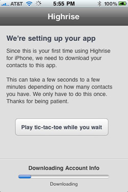
When you launch Highrise for iPhone for the first time it will download all your contacts and tasks to your phone. It doesn’t replace your iPhone address book – it just pulls the contacts down into the Highrise database so everything is local and fast.

One of the downsides to the initial download is that it can take some time depending on your connection and the number of contacts you have. Waiting for anything sucks, but what sucks more is being bored while waiting.

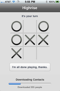
So we decided to give you something to do while the initial download is in progress. You can play tic-tac-toe while you wait. Just tap the button and the screen flips to a tic-tac-toe board. The download progress bar remains at the bottom so you see where you are while you tap away your time trying to beat the computer.
Contact search everywhere

This is a quick one, but we wanted to make sure that you could get to any contact from just about every screen in the Highrise iPhone app. So you’ll find a search contacts field at the top of all major screens. Sometimes we hide it to maximize screen space, but just scroll up and you’ll find it.

Color schemes

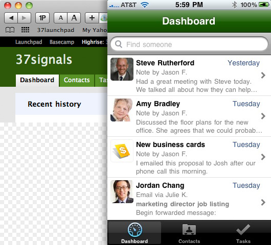
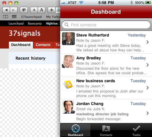
There are obviously more important features than this one, but we thought it would be fun to point it out. Highrise lets you pick from a variety of color schemes. We wanted to bring that color into Highrise for iPhone. So every time you launch Highrise for iPhone we pick the color from your Highrise account and color the main bar at the top of Highrise for iPhone. Below you’ll find an example in green and one in red. The image on the left is Highrise the web app, the image on the right is the iPhone app.
Voice notes

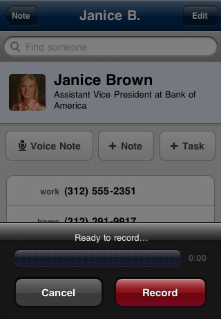
Since we’re talking about an app for a phone, we might as well take advantage of voice. Highrise for iPhone lets you record voice notes for any of your contacts. Voice notes are uploaded to your Highrise account and playable with an embedded audio player in the Highrise web app. Transcription may be an option down the road.
File attachments

Lastly, Highrise for iPhone lets you view any file types that the iPhone natively supports. This means you can view PDF, DOC, XLS, and other file types that are attached to notes or emails right from the app.

We hope you love it

We’re thrilled to finally release version 1.0 of the Highrise iPhone app. We hope you love it. Thanks again for using Highrise.

Not for sale

David
David wrote this on 91 comments

You can’t say your company is not for sale these days without incredulous stares and doubtful gasps. The big flip has become the holy grail. Worshipped to the point where non-believers are chastised, straight-faced, for refusing to give up their life’s work.

See, the new world of “sell it and do it again” belongs to the serial entrepreneur. The too-cool-to-stick-around nouveau rich of the 21st century. Staying for the long term is now seen as old-fashioned and uncool, a handknit sweater from your grandfather’s closet.

Fuck that.

Do you think Steve Jobs wants to be a serial entrepreneur? Bill Gates? Warren Buffet? Larry Ellison? All these guys put big stakes in their life’s work. Companies that they built from scratch, that they’ll champion until they can champion them no more. Sure, they may have hobby companies on the side, but for each of them, there’s one defining business, one spectacular legacy to leave behind when they’re gone.

These are my business heroes. People so dedicated to their company and its impact on society that you couldn’t pay them any amount of riches to leave. People willing to build for decades.

But, aside from the ideology behind it — the pride and satisfaction of building a company of real value to the world — there’s the financial side too. Why would you want to take a 10 times multiple of today’s earnings, if you believe you can still grow your business and you’re committed to sticking around to do it?

Why do you think you’d do a worse job than a prospective buyer of running your own business? Selling your company only makes sense if you think they can do a better job than you can. Or when you think they’re overvaluing the prospects of your company. That’s either the talk of the meek or a con man (“let’s get these suckers to overpay for this company of questionable value…”).

Flipping is a servant’s game. As the Chris Rock joke goes, Shaq is rich, the man who signs his check is wealthy. Be the man who signs the check, not the baller who takes it.

Illustrating REWORK (Part 2 of 2)

Basecamp
Basecamp wrote this on 18 comments

This is a guest post by Mike Rohde. We hired Mike to illustrate original art for REWORK. Each one of the 90 essays in REWORK is accompanied by an illustration that captures the key message of the essay. We asked Mike to share the illustration process with you here on Signal vs. Noise. This post is part 2 of a 2-part series.


In part 1 of 2 of Illustrating REWORK, I wrote about the start of the project, generating concepts and capturing them as pencil sketches for review and approval. In part 2 of 2, I’ll go into depth on the process of converting those pencil concept sketches into final production art for the book.

Inking

Using batches of approved pencil sketches, I began inking illustrations for the book. Batching was important for inking the illustrations, as I could get into a groove and knock out multiple pieces at a time. It also provided a consistency of style, important with such a large group of closely related illustrations.

When I live-sketchnote an event, I listen to a speaker and capture ideas in real-time, using only a gel pen and a Moleskine pocket sketchbook. On the REWORK project I had the luxury and flexibility of taking a more methodical approach to the final illustrations for the book.

Chances were high that I’d see late, last-minute changes in the publishing process and I wanted the ability to make those changes quickly. Rather than inking each illustration as a complete unit, I inked multiple elements separately which were scanned and stitched together in a layered Photoshop document.


First, I created a variety of separate elements on a single spread for multiple illustrations, then used the elements which worked best after scanning the entire page into Photoshop. –Photo by Brian Artka.


Here’s a photo of the final illustration, printed in REWORK. This photo shows how various elements were scanned and stitched together in Photoshop to create a single, unified illustration. –Photo by Brian Artka.

Near the end of the project, I had to make changes to a few of the illustrations. Being able to quickly sketch a few elements, scan and drop them into the Photoshop master file made updates much easier.

Approval and Delivery

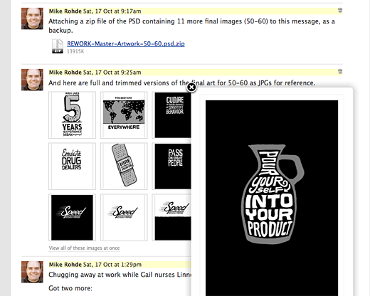
Once a batch of inked illustrations were completed in Photoshop, I would export lower-res versions of the pieces as JPG files, and post them to the Basecamp project for Jason’s review. Basecamp’s handy ‘View all of these images at once” feature allowed Jason to scan an entire batch and approve or suggest tweaks.


Here’s a sample batch of illustrations posted to Basecamp for review and approval. Note the PSD file attached to the comments above for backup. Jason was able to click individual illustrations in the grid or select “View all of these images at once” below the images for detailed review.

Continued…

Behind the scenes: Basecamp to-do email design

Jamie
Jamie wrote this on 21 comments

I’d like to share the design process that went on behind the scenes for the recent Basecamp email redesign. In this case we started at one point and wound up with a very different design in the end.

All of the conversations happened with me, Jason Fried, and Ryan Singer in our Campfire chat room. I would upload a design to the room and Jason and Ryan would give feedback. This process lasted for 1 day — start to finish.

I created many different iterations during this process. Here I’m showing the main shifts, so you’ll see “Version 2” followed by “Version 6”. You’re not missing anything.

Original plain text
We still send this out if you don’t want to get HTML.

Version 1
Here I tried to emulate the actual to-do page in Basecamp.

Version 2
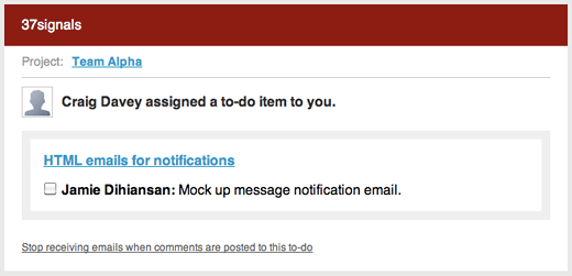
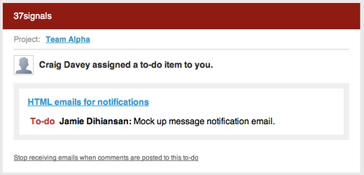
Jason thought the checkbox in the email was confusing. If you finished the to-do would you click this checkbox? The checkbox wasn’t actually functioning too. It was fake. Let’s get rid of it.

Continued…

New jobs on the Job Board and web design firms on Sortfolio

Basecamp
Basecamp wrote this on 3 comments

View all of the jobs and internships at the 37signals Job Board.

Design Jobs

Facebook is looking for a Communication Design Manager in Palo Alto, CA.

OkCupid.com is looking for a Web Developer & User Experience Specialist in New York, NY.

Amazon is looking for a Senior User Experience Designer, RCX in Seattle, WA.

FOLIOfn is looking for a Design Lead in McLean, VA.

View all Design Job listings.

Programming Jobs

Barnes&Noble.com is looking for a Front End JavaScript Developer/Ninja in New York City, NY.

Yammer is looking for a Software Engineer – Sr. Web Application Developer in San Francisco, CA.

JibJab Media is looking for a Software Engineer in Venice, CA.

University of Colorado Denver is looking for a Web Developer (Client-Side) in Denver, CO.

View all Programmer Job listings.

Sortfolio Web Designers

Creative Media Alliance is headquartered in Seattle and has a typical project budget of $25,000-$50,000.

COPIOUS is headquartered in Portland and has a typical project budget of $25,000-$50,000.

Blueprint Design Studio is headquartered in Chicago and has a typical project budget of $3,000-$10,000.

Bit Zesty is headquartered in London and has a typical project budget of $10,000-$25,000.

View all Sortfolio listings.

Two-faced shoe design

Jason Fried
Jason Fried wrote this on 30 comments

Shoe designs have been straying away from simple for quite a while now, so I was pleasantly surprised when I found the Nike Free 5.0 V4 on Zappos. Ignore the name of the shoe for a moment (5.0 V4 ??).

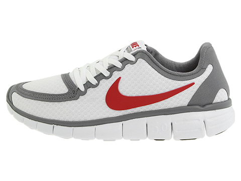
Here’s the outside profile shot:

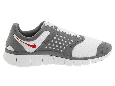
Not much fuss, nice and straightforward. I had a Nike Free shoe before and I really liked it. Ready to buy. Then I switch to the inside profile shot:

Dammit. Same colors and materials, but the design language feels different. 25 dot cutouts, saddle-shoe like styling, capped toe, wedged-in Nike logo. I recognize some of this design is functional, but it still hit me as a two-face shoe design. One side’s great, the other not so much.

Thought I had one.