Hypercard.
You’re reading Signal v. Noise, a publication about the web by Basecamp since 1999. Happy !
Jason co-founded Basecamp back in 1999. He also co-authored REWORK, the New York Times bestselling book on running a "right-sized" business. Co-founded, co-authored... Can he do anything on his own?
Hypercard.
Sometimes when I’m giving feedback on a UI, and I’m pointing out a spacing detail, I upload a little screenshot to Basecamp or Campfire to help make sure the feedback is clear.
I wanted to share a little tweak to the feedback which I think is ultimately more useful. In this example I’m pointing out that the space above and below an element is not equal (and I think it should be).
I used to do it like this:
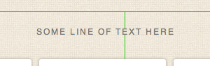
Two lines. One line above the element (text, in this case) extending to the next element above it, and one line below the element extending to the next element below it. The length of the lines shows the different spacing. That works, but the difference – especially when we’re talking about small units of pixels – isn’t as clear as it could be.
Then I switched to doing it like this:
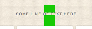
Blocks like this are easier to see than thin one pixels lines. This is an improvement. But it’s still not as clear as it could be because it’s not as easy to judge the comparative volume of a rectangle as it is a square. So…
This is how I do it now:
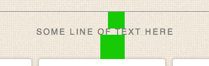
The same vertical distance is covered, but now, since both blocks are perfect squares, we have related horizontal distance which helps you see how much bigger the difference is.
Why not just say 24px vs 35px? Because I want to point out the physical difference, not the exact number of pixels. If we’re just talking numbers then it’s easy to assume 24px or 35px is right. But maybe the final size is 27px or 31px. I don’t want to get stuck on numbers when I provide feedback like this. The final number isn’t important as long as it’s the same (and it looks right).
I hope this was helpful.
You break expectations by changing what someone’s already used to. You change expectations by giving them something new. Understanding the difference is key to product design.
Last week our whole company got together. We try to do this a few times a year. We fly everyone in and all spend a few days together in Chicago. We share what we’re working on, we talk, we debate, we review, we get some work done, and we have some fun.
Usually we reserve one of the nights to all go out to dinner together, but this time we decided to host some of our Chicago-based customers at a party at our office instead. We invited about 50 customers – some new, some old – and all hung out for a few hours. We met, exchanged ideas, fielded feature requests, and just got to know each other. Everyone had a great time. Thanks to everyone who came.
We put together a little video to share.
Special thanks to Steve Dale from Gyro, Jimmy Spencer Jr. from Love Without Agenda, Ray Hightower from Wisdom Group, Ben Greiner from Forget Computers, and Michael Carney from MWC Accounting for taking some extra time to be interviewed on camera.
And just as Steve loved ideas, and loved making stuff, he treated the process of creativity with a rare and a wonderful reverence. You see, I think he better than anyone understood that while ideas ultimately can be so powerful, they begin as fragile, barely formed thoughts, so easily missed, so easily compromised, so easily just squished.
Some designs are evil – you know they’re bad right away. Others are like love at first sight. And some you just need to live with for a while before making up your mind.
I’ve been thinking more about how I review a design – both my own and someone else’s. So over the past couple days I’ve been writing down every question I’ve been asking when I look at a design-in-progress. Some of these I say out loud, some just go through my head, some are in person, others are posted to Basecamp or Campfire.
These are in no particular order, and I don’t ask all of them every time.
He changed computers.
He changed software.
He changed design.
He changed publishing.
He changed film.
He changed music.
He changed advertising.
He changed retail.
He changed business.
He changed beige.
He changed expectations.
He changed our minds.
He changed them.
He changed us.
He changed you.
“Don’t be sad because it’s over. Smile because it happened.” – Dr. Seuss
Now what are you going to change?
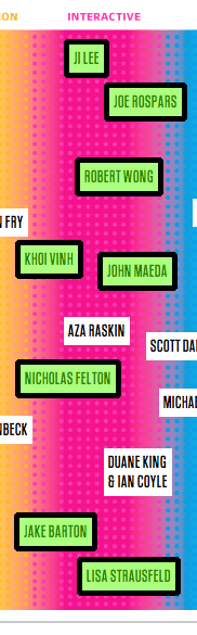
Fast Company just put out a list of the 50 most influential designers in America. The eight-category list includes interactive, fashion, architecture, etc.
10 of the 50 are in the interactive category. Out of Fast Company’s 10 most influential interactive designers in the world, eight of them are on the east coast, and seven of them are based in New York.
Fast Company is based in New York. This east-coast bias feels a little echo chamber-y and lazy. There are influential designers all over the country.
I used to think time was the most limited resource. It’s so limited that you can’t even save it for later. Every day you spend more time, and tomorrow you have less than you had yesterday. You can’t make more, and you can’t really buy more, so it’s limited and fleeting and those are the rules.
But there’s something even more limited than time. It’s your attention. Attention is a subset of time, therefore it’s more limited. How you spend your attention is more important than how you spend your time.
Attention is about focus and careful, thoughtful consideration. Unlike time – which can be broken into convenient chunks of 15 minutes – attention doesn’t divide quite so neatly or easily.
You hear a lot about “quality time” being valuable, but I think quality attention is invaluable. Giving someone your attention is giving more than just giving your time.
The greatest things you make and do are the ones that get your full attention. It’s helpful to take an inventory of what you’re doing and then ask yourself where you’re spending your best attention. You can fill your time, but you have to spend your attention. How you spend it is probably a better measure of priority than anything else.
Next time you say yes to something, ask yourself if yes means “yes, I can do that” or “yes, I can spend my attention on that.” If you’re not willing to spend your attention on it, is it worth doing? Maybe, maybe not, but it’s a good thing to think about the next time you take something on.