As the new designer at 37signals, I am working on a series of short-term projects, much like the old 37express projects and my recent Highrise contact screen exploration. The idea is to work through some long-standing areas of the apps with a fresh eye and an outsider’s perspective. It also allows us to revisit some areas that we know can be better, but for various reasons haven’t had the time to rework.
So the goal is for me to tackle one of these design challenges a week for the next 8 weeks or so. We may get sidetracked like we did on this first one, but that’s the plan for now. I’ll be looking at solutions that we can implement immediately, but also digging in to see where else the process might take us. I’ll also be documenting these explorations for all to see.
Redesigning the Basecamp Account Chart
The first exploration was of the “Account (Upgrade/Billing)” tab in Basecamp and my write-up of the process is live. Not only that, but we went ahead and implemented the final design into Basecamp. It was pretty cool to get in here, get to work, and have my design live all in the first 10 days or so as a signal.

See the Basecamp Account Chart design exploration.
For my first project since joining 37signals I’ve been working on an update to the venerable Account (Upgrade/Billing) screen in Basecamp. We’ll post more about that update and the process to get there soon, but I wanted to share an experience I had as part of this design.
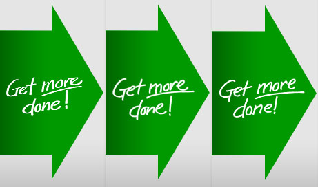
We had decided to include a few short handwritten phrases as graphic elements. Sometimes in the perfect world of web design, elements that have an organic, handmade look can soften the message and draw the eye. These phrases enhance the message but don’t convey any hard data that is intrinsic to the upgrade decision. That makes them a good place to have a little fun and lighten things up.

So, I wanted to make them look as if they’d been casually written directly on the page. They needed to look casual and authentic so no fonts. It can be tempting to use a script or handwriting font for an application like this, but they never fool the eye. I learned a long time ago that you can’t fake it — if you want something to look handmade, make it by hand.
But what I found is that this task was a lot tougher than it sounds. I must have written and re-written some of these phrases more than 50 times trying to get just the right flow, the perfect amount of flair, and a cohesiveness with the other phrases. But “perfect” was exactly the wrong approach here. Handwriting isn’t perfect and the irregularity is where the character and charm I was going for would come from. So I settled for “good enough”, which turned out to be ideal.
So instead of carefully drawing each letter and placing them together, I practiced a few times and just wrote each one out as quickly and naturally as if I was writing in my notebook.
My fingerprints — almost literally — are going to start showing up in 37signals products in the coming weeks. I’ll be sharing more of the process as we go.


