You’re reading Signal v. Noise, a publication about the web by Basecamp since 1999. Happy !

Jason Z.

About Jason Z.

Jason Zimdars joined Basecamp in 2009 as a UI designer. Most recently he worked on Basecamp for iPhone and iPad. He thinks about Basecamp constantly.

Using CSS sprites with Rails helper methods

Jason Z.
Jason Z. wrote this on 19 comments

We are constantly looking for ways to make our products faster so recently we spent some time optimizing UI graphics in Basecamp. With better support for CSS3 properties in the latest browsers and solid techniques for progressive enhancement, we began by eliminating some graphics altogether. We found that subtle gradients and drop shadows can be completely rendered with CSS properties and many times aren’t missed when viewed with a browser that doesn’t support them — the very definition of progressive enhancement. Using CSS instead of these graphics results in fewer HTTP requests to our servers plus browsers draw native CSS elements much faster than images.

Another approach we’ve used is CSS sprites, a method for combining many graphics into a single image which is then displayed via CSS. For us this technique reduced dozens of HTTP requests into one — a single, cache-friendly image file. For those new to the technique, the stylesheet references the coordinates of the desired graphic inside the image file. But keeping track of coordinates and creating new CSS styles everytime we wanted to use a graphic would have added a lot of code and made maintenance a chore.

We wanted to keep the code as easy to write as the Rails image_tag method that we used previously. So this:

<%= image_tag ("email.gif"), :class => "email" %>

…became this:

<%= image_sprite :email, :class => "email", :title => "Email" %>

The image_sprite helper method contains the dimensions and coordinates for each and renders the HTML. Here’s a shortened look at the method:

def image_sprite(image, options = {})
    sprites = {
      :add_icon           => {:w => 16,   :h => 16,   :x => 0,    :y => 0},
      :email              => {:w => 26,   :h => 16,   :x => 41,   :y => 0},
      :print              => {:w => 25,   :h => 17,   :x => 68,   :y => 0},
      :trash              => {:w => 10,   :h => 11,   :x => 94,   :y => 0},
      :comments           => {:w => 13,   :h => 13,   :x => 105,  :y => 0},
      :comments_read      => {:w => 13,   :h => 13,   :x => 120,  :y => 0},
      :comments_unread    => {:w => 13,   :h => 13,   :x => 135,  :y => 0},
      :rss                => {:w => 14,   :h => 14,   :x => 150,  :y => 0},
      :ical               => {:w => 14,   :h => 16,   :x => 166,  :y => 0},
      :drag               => {:w => 11,   :h => 11,   :x => 360,  :y => 0},
      :timeclock          => {:w => 17,   :h => 17,   :x => 375,  :y => 0},
      :timeclock_off      => {:w => 17,   :h => 17,   :x => 392,  :y => 0}
    }
    %(<span class="sprite #{options[:class]}" style="background: url(#{path_to_image('/images/basecamp_sprites.png')}) no-repeat -#{sprites[image][:x]}px -#{sprites[image][:y]}px; width: #{sprites[image][:w]}px; padding-top: #{sprites[image][:h]}px; #{options[:style]}" title="#{options[:title]}">#{options[:title]}</span>)
  end

Keeping the image details in a helper method made it easy to convert the existing images to sprites, easy to re-use the sprited images throughout the app, and will really pay off anytime there are changes to the images. Update the sprite image, update the helper, and the change is done everywhere. This improvement has already been rolled out for Basecamp and we hope to streamline our other products using these techniques soon.

Fresh wounds lead to speedy bandages

Jason Z.
Jason Z. wrote this on 11 comments

Since January, we have been experimenting with a new way of working. Two programmers and one designer form a team and take on projects in short, mostly two week, iterations. It’s been a great success so far and has resulted in a huge list of new features across all 37signals products. But after two full terms of new features, one of our teams decided to start the third term with a little spring cleaning.

The three of us had something different to bring to this term — each of us had been focusing mostly on customer support recently. Jamis and Jeff were fresh off terms in our support programmer role and I had spent the last few months working daily to help customers on our Answers forum. That gave us a unique perspective on our products. We came together having each experienced all of the little things that can be big headaches for our customers. So we spent the past two weeks fixing, polishing, re-writing, and improving the places that we’d seen the most confusion from customers first hand.

Here is some of what we were able to accomplish:

Sign up/Sign in:
  • Re-wrote and re-designed the sign in error states so that we could explain in context why someone’s login may not be working.
  • Improved the sign in link to make it more visible when creating new product accounts.
  • Added better detection and prevention of duplicate signups.
  • Cleaned up and fixed various display issues with 37signals ID email notifications.
  • Modernized the sign in screens using CSS instead of transparent PNG images.
Basecamp:
  • When inviting new users, detect duplicates. This warns admins that they may be trying to invite someone who is already on their account avoiding multiple sign in confusion.
  • Stop trying to automatically create users on an integrated Campfire account and simplify the process—members enter chats as themselves, non-members enter as guests.
  • Fixed that the responsible party pulldown for to-dos shouldn’t include people who can’t see private items
  • Fixed a longstanding issue with reordering of To-do templates.
  • Corrected the decimal precision of the total number of hours displayed on time pages.
  • Resolved various display issues, from text formatting to icon alignment.
Highrise:
  • Updated monospaced font styles to render more consistently and attractively across browsers and platforms.
  • Updated and improved iCal and API authentication copy.
Backpack:
  • Exposed better invoice options, such as the email address and ‘Bill to’ field on the Account tab.
  • Introduced per-user iCal feed to fix a recurring time bug whenever DST changes.
  • Fixed an annoying issue with editing multi-day events that could result in the start date being incorrectly set to next year.

Improving our products isn’t just about new features. Polishing, re-writing, fixing, and improving existing features can do just as much to make them better and more enjoyable to use. Many of these fixes were directly related to repeated questions or suggestions from our customers so we’ll be keeping an eye on support to measure their impact.

If you’re interested in keeping up with changes to our products as they happen, you can see them all on our 37signals change history page or follow @37changes for our Twitter feed of product updates.

twitterific_fix2.PNG

While editing a reply to Kiran’s tweet, I accidentally backspaced right into his Twitter handle. Twitterrific for iPad smartly noticed this and offered to restore the @reply. Nice!

Jason Z. on Apr 9 2010 13 comments

Design Decisions: Campfire transcript headings

Jason Z.
Jason Z. wrote this on 12 comments

Yesterday, we pushed an update to Campfire that added some new functionality to the transcripts screen. You can read the details in this post on our product blog, but I wanted to share the thought process on a small change we made as part of the update.

While working on the “Files, Transcripts and Search” tab in Campfire we noticed that the heading for each transcript day was kind of a mess. Here’s what it looked like before the update (the image has been reduced, click to see it full size):

Original transcript design

The design has essentially four elements using 3 font sizes, 4 colors, and 2 font weights. It certainly gets the job done, but it adds a lot of noise to the screen and can only make scanning the page slower than it needs to be. Contrast is essential to differentiating elements of a design, but here everything is unnecessarily different from everything else.

As we looked more critically we also felt like the link to read the transcript could be more obvious and that the link to delete a transcript was far too prominent for a feature that is rarely needed.

Here is what it looks like today:

New transcript design

The redesigned header reduces the contrast between the date and room name to just the weight of the font — a good example of least effective difference. The link to read the transcript is now explicit, reducing confusion, and the delete transcript link it subdued. Aligning it to the right keeps it out of the way where it is less likely to be accidentally clicked. Finally, a heavy black rule decidedly separates each day while giving each entry some visual weight.

The new design retains the same four elements as the original but by reducing unnecessary contrast, and refining the arrangement makes it feel like fewer to the eye. This results in less clutter and better scanability. It’s a small change that we think makes the whole page better.

Work in Photoshop, don't save in Photoshop

Jason Z.
Jason Z. wrote this on 47 comments

I’ve noticed a pretty big change in how I’m using Photoshop lately. Much of my work consists of iteration through various solutions as I explore user interface for new and existing pieces of our apps. It is common for me to jump from working directly in HTML and CSS to Photoshop and back again. Working in code lets me immediately see my designs in context, in the browser, and often in the way it will behave when interacted with. It’s the most real way to work. But sometimes I want to quickly try an alternate direction or see a change that would be faster to mock-up as an image. That’s where Photoshop is most useful to me.

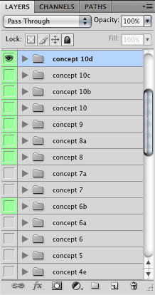
Photoshop layers Maybe I’m just drinking the Kool-Aid, but I’ve noticed that when I do use Photoshop I rarely save the PSD file anymore. It used to be that for every project I’d have one or more PSDs with tons of layer groups preserving each attempted direction. Those files became archives of my process that I kept, but never used again.

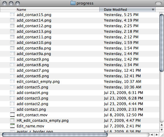
Now when I fire-up Photoshop, it is so that I can pull in a screen grab of the piece I’m working on so I can mock-up what I’m thinking. I’ll clone browser widgets, add some text here and there, try a different layout, etc. I don’t worry about naming layers or grouping concepts, but I do make screenshots. I’ll save a new image anytime I have something I might want to come back to later or that I want to get some feedback on. And those images I do keep. They become a sort of visual blog of my process. They make it easy to go back to an earlier idea and are handy to have available when we decide an exploration is worth talking about in more detail. The series of images shows where I went during the process and what I thought was notable. With a layered Photoshop file it was less clear what was what, what order it came in, and why it mattered.

Comp thumbnails

Now, when I reach the end of a project I don’t save the PSD, I throw it away. Like cleaning up your workshop after a woodworking project, you sweep up the sawdust and throw away the scrap wood. Photoshop files are scraps and pieces that I don’t need anymore.

Stop following directions and start designing

Jason Z.
Jason Z. wrote this on 23 comments

It’s easy to fall into this trap. You know the scenario… you’re knee-deep in a design and engaged in the back and forth of feedback and revisions. You are carefully revising your design, following the directions to the letter. Somewhere along the way, you’ve turned off your brain and stopped designing.

When you’re getting direction from a client, manager, art director, etc., it is easy to fall into the mode of just following instructions. You get so caught up in getting it right that you forget to keep thinking about the problem. In an effort to please, you take feedback as solutions instead of suggestions.

Of course it is totally understandable to take the ideas of those that pay our bills as gospel. But we should also be reminded that those same people hired us for our expertise. If they just wanted someone to follow orders, they’d probably have hired someone else.

Instead, feedback should be taken for what it is: suggestions, ideas, impressions, or reactions. In fact, feedback can be and should be a great springboard for new ideas. Let it be a new constraint that drives your design in new directions.

Sure, there are always situations where we need to compromise or ultimately let the decision-maker make the call. But I’d still rather respond to feedback with the revision that the client asked for plus a couple of ideas that take it a step or two further. I just need to remind myself to keep from falling into the trap.

Working at 37signals

Jason Z.
Jason Z. wrote this on 25 comments

It’s been several weeks since I was hired here at 37signals so I thought it might be interesting to share some of my experiences so far.

Ready, set, go!

One of the best things has been how quickly I’ve been able to jump in and start contributing. The very first project I worked on was a refresh of the Account screen in Basecamp. What started as an exercise quickly escalated to a new design that we wanted to actually put into the app. So it wasn’t long before I moved from Photoshop right into the app code to integrate the new design. This required me to build on my limited experience with Ruby on Rails, setup my computer for development, learn enough Git to be dangerous, and get a feel for application structure and conventions. None of this could have happened without the patience of my co-workers and the solid development structure/process that is in place here. Here are a few general observations:

  • The 37signals community is huge! Every change is noticed — sometimes within minutes of being launched. Receiving instant feedback to your work is great (at least so far :)
  • Git has been a surprisingly nice addition to my workflow. The ability to quickly switch branches and compare my version to the original has saved me countless hours
  • There are new things being added to the apps constantly. It’s exciting to see all of the new features and improvements every day. It can be hard to appreciate all of this activity from outside the company, but we’re working on that
  • No longer supporting Internet Explorer 6 is liberating!

In the first ten days or so I was able to design and implement a single screen redesign, get it deployed and write it all up at Signal vs. Noise. It’s pretty great to feel like you’re contributing and making a meaningful impact so quickly.

Working remotely

One of the biggest changes for me when joining the company was working 100% remotely. 37signals is based in Chicago, but half the team works outside the office — even the Chicago crew isn’t in the office every day. So it has been great to join a company that knows how to work with a widely distributed team. As you might assume, communication is the key to making the team effective and productive. Here are a few ways we stay connected:

Campfire

I have to admit that I didn’t get Campfire before I started working here. I’d been a long time user of Basecamp and Backpack, but Campfire never clicked for me despite a couple of attempts to bring it into a team workflow. What I was surprised to see is that Campfire might be the most important app that we use.

Our “All Talk” Campfire room is where the entire team gathers each day — we all stay logged-in anytime we are “at work”. Throughout the day we post questions, share screenshots, get feedback, collaborate on copy, and troubleshoot code. Campfire also talks to our apps so we get notifications when they are updated as we develop. It also serves as a way to quickly note to the team that you’re heading to lunch or will be away from the computer for a short time. But it’s not all business. We also find time to talk about the latest gadget/news/link/app/controversy and generally have a good time. Campfire is where all the typical conversations that happen in a physical office occur, but the difference here is that everyone can hear them, anyone can pay attention to what they want to, and it’s all archived so we can search through it later.

Campfire is also used along with instant messaging for the one-on-one and sidebar conversations when we want to chat, but stay out of the noise of the All Talk room. Jumping into our Small Talk room to work through a bit of code lets me work directly with a co-worker AND allows me to save a link to that conversation for future reference. This has been immeasurably helpful for me as I dig more into the tech side of our apps. Screen sharing via iChat is another great way a couple of us can quickly work together on a tricky bit of code.

In/out

Another key part of knowing and sharing what is going on with the comapny is with Backpack’s Journal screen. The journal lets everyone on the team set their current status (e.g., “Reviewing design comps”, or “Out to lunch”) and log the last few things that they have recently completed. There is no forced structure to it, we typically just update it a couple times a day as necessary. It’s a great way to get a quick snapshot of what is going on, who is working right now, and what they’re working on.

Of course we also follow project updates in Basecamp and keep an eye on external communications by checking into our Highrise account. Everything is out there for us to keep up with as we need to or want to.

Perfect balance

At 37signals I really feel more connected and current with what is going on than in any physical workplace I’ve been a part of. It is effortless to keep up with what my co-workers are doing and how what I’m doing contributes to the whole. I’m free to keep up with projects and learn new skills as they fit my interests. We collaborate how and when it makes sense, and stay away from each other when that’s the best way to work. That makes for a really effective working environment.

Design Decisions: Redesigning Basecamp's global milestone view

Jason Z.
Jason Z. wrote this on 39 comments

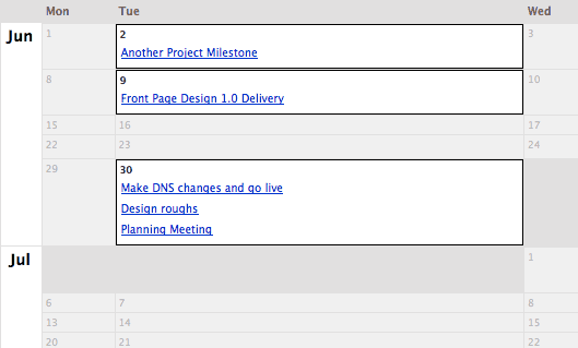
Yesterday we pushed an update to the Basecamp global milestone view. This is the calendar-style view of all milestones on all projects over the next 3 months. The goal was to make this screen cleaner and more useful.

The old milestone calendar looked like this:

Original milestones calendar

It did a great job of effectively using the space with empty days that collapsed to a very small size. This made it easy to get a good quick view of the whole picture. But it was hard to dig-in further. You couldn’t tell which project each milestone belonged to or who was responsible for completing it. The pull-down at the top right did filter by person assigned, but even in that view it was hard to see which project the milestones applied to.

So, one of the first things we knew we wanted was to add the project name and person responsible for each milestone. Each milestone now shows both without adding a lot of visual clutter. We think this instantly makes this screen more useful, but wanted to explore more ways to make it better.

New milestones view 1

When we thought about how people use this screen it became clear that the empty days could be just as important as the days that have milestones. One reason to check this global view was to find the holes — the places where new milestones could fit.

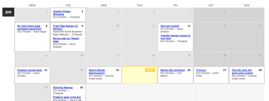
So we explored sizing each calendar day to an equal width — much like a more traditional calendar. This had the added benefit of making the whole screen more understandable simply because it looks like a traditional calendar. It is more clear what you’re looking at and what you can do here. This is the revised look with equally-sized days and some small visual tweaks:

New full month view

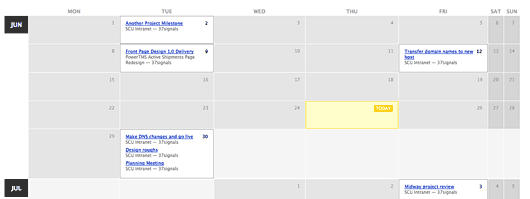
We added a subtle visual style for the days that fall on weekends to differentiate from weekdays. It then occurred to us that some businesses operate almost exclusively on a regular Monday–Friday schedule. For them it was a waste to have almost 30% of the available space each week used to show empty weekend days. So we brought back some of the table collapsing for weekends. If there are no milestones on any weekend day in the current view they simply shrink to a minimal width, allowing more space for the weekdays. However, if any weekend day has a milestone, then weekends become full-fledged citizens again. Here’s what it looks like when weekends aren’t being used:

Collapsed weekends

One more thing…

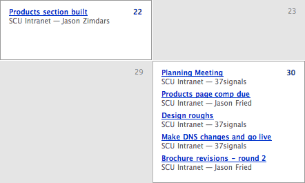
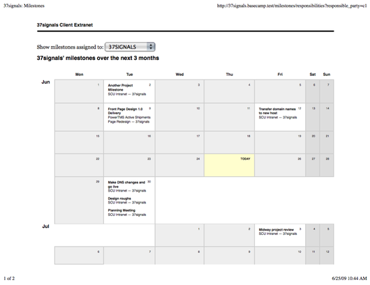
While re-working the CSS for this particular screen, we noticed that we hadn’t defined any print styles. So we spent a little time adding some CSS to our print stylesheets for the global milestones calendar. Now when you print it will look something like this:

printer view