You’re reading Signal v. Noise, a publication about the web by Basecamp since 1999. Happy !

Ryan

About Ryan

Ryan's been getting to the bottom of things at Basecamp since 2003.

Tablets are waiting for their Movable Type

Ryan
Ryan wrote this on 20 comments

Remember the web before Movable Type? If you wanted a blog you had to program one. You had to know databases and webhosts and PHP or Perl. If you were “just” a web designer, or a writer with ideas, you had to hire an in-demand web programmer to make it happen. Publishing was expensive and hard.

Apps like Marco Arment’s The Magazine give me flashbacks to that time. Wouldn’t it be awesome to publish my own magazine on the iOS Newsstand? People could read my articles on their iPad Mini, pay without typing in a credit card, and automatically receive new issues as they come.

Sounds great. But here’s the thing. To be on the Newsstand you have to program an iOS app. The tech hurdle is high, and hiring isn’t cheap. iOS programmers are in extremely high demand.

Now is a great time for another Movable Type. Writers would love a way to push serialized content straight to tablets, and the experience would be a boon to readers. Tablets are the best way to read, and Newsstand is the equivalent of RSS for non-geeks. Hopefully apps like The Magazine inspire somebody to make this happen.

(Inspired by Craig Mod’s Subcompact Publishing.)

Learn essentials of product development with Ryan in Chicago

Ryan
Ryan wrote this on 7 comments

Come out to WindyCityRails in Chicago on September 6 to see me talk about “Essentials of Product Development.”

A lot of us here on SvN are product people. We know it’s not just the UI, engineering, or business idea that make a product. It’s how you bring them all together to make the world better than it was before.

I’ll share lessons from years of experience designing and building products at 37signals in the talk. Actually the things I’m most proud of aren’t even our official products. They’re the things I made on the side. It’s incredible what you can do with those few hours on nights and weekends when you have a strong hold of product development.

Many of us have deep questions that go beyond making a better product. We want to know how to make more progress on our product. Getting there requires you to bring the talents you have together at the right time, in the right order, with the right people, on the right things.

That’s the fundamental challenge, and I’ll be sharing techniques I’ve learned over the years to cut through it and make more progress on your product.

WindyCityRails is a great conference. I hope you’ll come out and see the other speakers too.

I’m speaking on September 6th at 2:15pm. You can register here before August 8th and save $150.

Offical abstract:

It takes more than talent to make a great product. You also have to focus on the right things, in the right order, with the right people at hand. Ryan will explain key points for successfully developing product so you can make the most progress on your big idea. The talk will cover common pitfalls, techniques for seeing the bigger picture, and advice on how to bring the different roles together.

See you there! Thanks to Ray for inviting me again this year.

"Sign up in seconds" ... and then what?

Ryan
Ryan wrote this on 34 comments

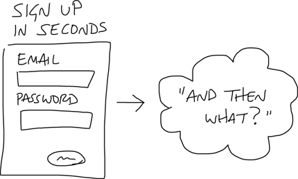
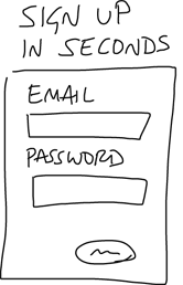
Today I saw a familiar pattern on a website for an analytics product. The home page pitched the product, and then above the signup form there was a headline: “Sign up in seconds.”

I see this all the time on signup forms and it makes me wonder: why did the designer put that there? My best guess is that they were trying to relieve some anxiety the customer might have. Like, “don’t worry, it’ll be over soon!”

I’ll bet that the time-to-signup isn’t an important anxiety factor. When’s the last time you shopped for a software product under intense time pressure, where every second counts?

When I evaluate web products I often feel uncertain about what will happen after the quick signup. Sure it takes seconds to create an account, but then what?

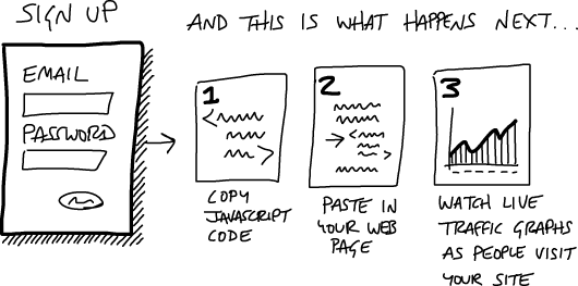
I had an idea to address this uncertainty. You could preview the workflow steps that come after the signup so it’s clear how much of a gap there is between signing up and getting value out of the product.

Check out this sketch. It shows “what happens” after you signup. Once you sign up, you get a Javascript code, paste it into your website, and then you can watch real live graphics of traffic come to your website. Sounds pretty easy right? Why not try it?

I haven’t tested this approach on any sites. Intuitively I like how it integrates the call to action with the sales pitch in a single flow. What do you think?

If something is going to be better, it is new, and if it’s new you are confronting problems and challenges you don’t have references for. To solve and address those requires a remarkable focus. There’s a sense of being inquisitive and optimistic, and you don’t see those in combination very often.

The Documentation Dilemma

Ryan
Ryan wrote this on 34 comments

Back when 37signals was consulting, we gradually weaned ourselves off of documentation. It’s normal practice in the design world to produce lots of artifacts. You see IA diagrams, flow charts, OmniGraffles, and all kinds of illustrations of what the final product will be. In the early 2000s we noticed that our clients only cared about the deliverable, so we dropped nearly all of the paperwork.

Since then we’ve often advised other companies to spend less time on paperwork artifacts and more time on real prototypes. But just saying that isn’t enough. How does a team that is accustomed to a heavy paper flow wean themselves off of it?

I used to think design teams made so many diagrams and documents because… well, they like that sort of thing. Now I’m suspecting there’s more to it.

A symptom of a bottleneck

I’m suspecting documentation is a symptom of something else: a bottleneck in the value chain. Think about it. Design ideas are perishable. They have to be acted on right after they appear, or they fade away. So what happens when your development process can’t absorb design ideas at the rate you produce them?

It looks like a dilemma. You either:

  1. Produce design ideas at the pace of development (which is far slower, by definition of the bottleneck) or
  2. Freeze ideas in the form of documents, diagrams and requirements until they are ready to be thawed and consumed later.

I suspect #2 is what happens in a lot of firms. The throughput from design to implementation in those places is so low that pacing design with development doesn’t seem feasible.

At 37signals we’re firmly in the #1 camp. Designs go from concept to HTML (often in-app) without any deliverables in-between, and then from HTML mock to fully implemented feature in Ruby or JavaScript again without intermediate artifacts.

Healthy pressures on design, programming and scope

Pacing design with development puts a few pressures on the company that we think are healthy.

First it means all the designers should be proficient enough with code to implement their ideas, at least statically.

Second, the programmers should have enough skill and leverage from their tools (an important factor) to produce meaningful work in short periods.

The third point concerns how we manage and define scope. In order for design, implementation, and review to all happen while the plate is still hot, each piece has to be small. If we bite off too much work at once, then design will go on too long before development can join in. When there’s too much to build at once, review becomes unfocused because the set of variables to evaluate is too large. So whether the project is small or large, we factor the scope into smaller component scopes, build them one at a time based on their dependencies to each other, and evaluate the results step by step using the app ourselves.

The ideal loop

The ideal loop is short enough that you can still feel the spark of your idea and you’re still curious to find out if the decision was right or not as you click through the implementation. You can’t fully judge a design until you’ve tried it in action. The clothes simply look different when they’re on. If there are too many changes to evaluate at once, we can’t tell which of the changes contribute to the improvement or regression and how those changes suggest future steps. Moving in one direction in one feedback cycle is easy. Moving in ten directions in the same cycle is too hard.

I hope this look at our process gives you a clearer picture than a bare statement like “documentation is bad.” Documentation may be necessary when your throughput is low, and that’s an opportunity to see documents not as charming deliverables but as warning signs of a deeper problem in your process.

Where are the great UI teachers and consultants?

Ryan
Ryan wrote this on 71 comments

Yesterday I spoke with a software company that is strongly motivated to improve their interface design. They asked me where good software UI designers come from and who could I recommend to help them out.

From my little bubble, I couldn’t think of anyone to recommend outright. I know some good folks who are already employed. But a “go to” consultant? Not really. A school with good curriculum to scout at? Couldn’t think of one of those either.

So I tweeted to a sizable circle on Twitter. In response, I got less than ten actionable leads. I figure it’s time to cast a wider net.

Who out there is doing great UI consulting for software businesses? Who is doing UI training? Where is the good UI curriculum?

If you know of somebody, help me out and post a comment here—preferably with a personal experience. Thanks.

Designing a product is keeping five thousand things in your brain and fitting them all together in new and different ways to get what you want. And every day you discover something new that is a new problem or a new opportunity to fit these things together a little differently.

And it’s that process that is the magic.


Steve Jobs (via Daring Fireball)

Remember, a real engineer doesn’t want just a religion about how to solve the problem. Like ‘object-oriented’, or ‘functional’, or ‘imperative’, or ‘logic programming’. This piece of the problem wants to be a functional program. This piece of the program wants to be imperative. This piece wants to be object-oriented and guess what—this piece want to be logic-based. And they all want to work together usefully, because of the way the problem is structured.


Gerald Jay Sussman, We Really Don’t Know How to Compute!

Watch Ryan sketch and code a UI from scratch on PeepCode

Ryan
Ryan wrote this on 15 comments

Last month the folks from PeepCode visited our office and asked to record my design process. Geoffrey told me not to prepare anything. He said he’d show up with a sample problem and simply record whatever I did with it. The result is two 75-minute videos (Part One, Part Two) that show my thought process step-by-step, starting with paper sketches and then moving on to HTML/CSS.

The hard thing about demonstrating design is the sample problem. The problem should be simple enough that the details don’t bog down the audience, but complicated enough that you run into real-life conflicts and constraints.

Fortunately Geoffrey picked a really good sample domain. He asked me to design a UI for picking the top five finishers out of 200 participants in a pro bicycling race. The task was rich and interesting enough that we spent the first 75 minutes purely sketching and analyzing the approach.

The first video, Part One, covers the sketching process. A lot of good material came out of this section, including:

  • How to tackle a UI problem by dividing it into tasks that each have a beginning, middle and end
  • How to use sketching as a response to uncertainty, and when to stop sketching and move on to HTML
  • How to focus on the most natural solution so that people will intuitively grasp a design
  • How to focus your design process on conflicts and friction points, attacking them one by one until the design works

This video also gave me a chance to explain the UI design process through an analogy to software testing. Kent Beck’s Test-Driven Development had a huge influence on me, and I’ve always had trouble explaining the connection. In both videos I continually refer to setting up “tests” — specific things in the design that aren’t working or aren’t resolved — and then design against those tests until they “pass” (that is, until the problem goes away). This loose analogy articulates that tricky and hard-to-pin-down process where a designer continually moves their focus among pieces of a problem and along the way settles conflicts step-by-step in a constructive sequence.

I think the process will be interesting to both designers and coders. Designers can compare the process to their own, while coders can use the analogies to software testing to see design as an extension of concepts they already know.

In the second video, Part Two, I take the sketches and ideas from the first session and build them out in HTML and CSS. Along the way I dip in and out of Photoshop, explaining the time and place for each tool.

Part Two especially focuses on getting quick results in the browser. I sketch out dom elements, give them classes to communicate their purpose, and gradually decorate them with inline styles until the design comes together in the browser.

I would prefer videos like this to be free. But Geoffrey had the idea to begin with and his PeepCode team did all the hard work. I just showed up one Friday morning for a couple hours of design practice. So if the material is useful to you I hope you’ll support their effort and buy the videos at $12/each.

Here are the links:

  1. PeepCode Play by Play: Ryan Singer Part One
  2. PeepCode Play by Play: Ryan Singer Part Two

There’s also a 10 minute preview on the Part One page.

I hope they’re useful!

The Economist on the iPad: Perfect

Ryan
Ryan wrote this on 32 comments

I was just reading the Economist on my iPad at lunch, and I’ll be damned if that’s not one of the best-executed apps on the platform. I’m impressed over and over by how simple and perfect it is.

The experience is massively superior to print. No issues piling up, no guilt when you only read half an issue, nothing extra to stuff in your bag, new issues available to download the second they are released, and so on.

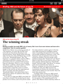
And the app doesn’t have any of the downsides of other magazine apps. The typography and layout and illustrations look beautiful and they exactly match the print magazine. It feels 100% like the real Economist, not a digital imitation. The app is lightning fast and just the tiniest amount of chrome frames the page for navigating.

I don’t get to say this often: it’s a perfect execution.


Tap an issue to read it.

The world this week.

Layouts just like the magazine.

Beautiful features stories.

Link: The Economist on the App Store.