You don’t really know if your templates and CSS are well factored until you try to make changes.
About Ryan
Ryan's been getting to the bottom of things at Basecamp since 2003.
Aren’t you oversimplifying this?
Yes. That’s the whole point.
—
From the Steve Krug’s new book, Rocket Surgery Made Easy
From the Steve Krug’s new book, Rocket Surgery Made Easy
Important: if something is important, say why and to whom. Use sparingly.
What's the suckage to usage ratio?
The price of shipping is imperfection. If you wait for your product to be perfect, you’ll never finish it. Fortunately you can decide which features should be closer to perfect and which can slack off a little. The Kindle DX is a good case in point. Reading and flipping pages on the Kindle is a wonderful experience. On the other hand, using the keyboard is painful. The keys are hard to press. The modifier keys are confusing. Mistakes are easy to make, slow to spot and hard to correct. Yet despite all these problems, I still love the device.
A good way to square the great overall experience with a bad feature is the “suckage to usage” ratio. You can take any feature and say “it sucks,” but that doesn’t tell you anything about the whole product until you factor in how often you use the feature. Have a look at this unscientific chart.
| Feature | Suckage (1-5) | Usage | Contribution (1-5) |
|---|---|---|---|
| Reading | 0 | 90% | 0 |
| Typing | 5 | 3% | 0.15 |
| Switching books | 1 | 7% | 0.07 |
| Total suckage | 0.22 | ||
Suppose reading on the Kindle doesn’t suck at all (0 out of 5), typing sucks maximally (5 out of 5), and switching between books sucks a little (1 out of 5). Considering I spend 90% of my time just reading on the device, the contributions add up to a total suckage of only 0.22 out of 5. Inverted, that’s 4.78—basically a 5-star product.
It’s rational for the Kindle designers to skimp on the keyboard when every feature takes time and time is scarce. Maybe the third or fourth generation Kindle will change such that keyboard input becomes more important. Pressures do change over time. But for now, it’s a fair trade.
It’s easy to accept in theory that some parts of your own product won’t be up to standard. In practice, it’s hard to drop the sword. Nobody wants to release a feature that you know could be better. When this happens, try adding a factor of usage to the equation to see if perfection is really worth its price.
Next time you want to illustrate a flow or concept with a diagramming tool, throw away the source file as soon as you export the PNG or PDF. If you’re afraid to throw the source file away, you spent too much time on it.
Examples make the presentation
Over the last few years I’ve noticed that as I’m giving a talk or a workshop, everyones’ antennas perk up when I turn to an example. It’s been a personal goal of mine to cut out as much preamble as possible and get straight into examples because they change the mood so drastically. Walking through an example says “here comes some reality.” You can theorize all you want, but examples force you to show that your theory holds. They allow the audience to test if what you say is true or not. And best of all, they turn the focus from abstract concepts to the mess and color of the real world.
I couldn’t help but think of the power of examples when I ran into this whirlwind talk about Kant’s Critique of Aesthetic Judgement illustrated exclusively with comic book art.
Would you have thought Kant could be so entertaining?
(via Schmüdde)
Designs take a leap forward when you kill the things you didn’t know you were holding on to.
UI that looked sexy in Photoshop almost always looks overdesigned when we try it for real in the browser. Here’s a hypothesis. Simple and useful designs just don’t seem good enough when they are dead pixels. They need to be brought to life before they can be appreciated. Until that happens we overcompensate with garnish.
Leave a little to the reader
Jonny Trunk’s Recommendations tip you off to music you haven’t heard without just handing it to you. For example, here’s something Jonny recommends:
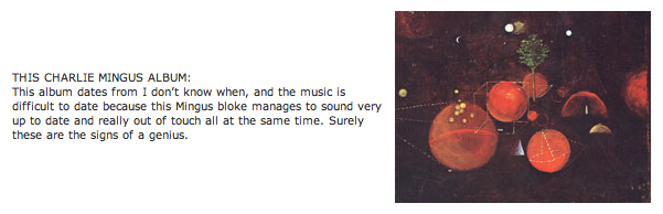
A quick scroll through Amazon will show you which Mingus album he’s talking about. But that small effort on the part of the listener changes everything. It’s fun to get new music, but it’s even better to discover new music yourself. By leaving the legwork to the reader, Jonny also leaves some of the joy of discovery. Besides, good music is always better when you earn it.
It goes beyond music too. The best moments are those Kathy Sierra ones where we think “Aha! Yes! I kick ass”—and those usually happen not by following instructions but by connecting the dots between the instructions.