Javascript for paging posts with 'j' and 'k'
Matthew Hutchinson cooked up some Javascript for paging through posts on your blog with the j and k keys ala ffffound.com. Here’s an example of the code in action.
You’re reading Signal v. Noise, a publication about the web by Basecamp since 1999. Happy !
Ryan's been getting to the bottom of things at Basecamp since 2003.
Matthew Hutchinson cooked up some Javascript for paging through posts on your blog with the j and k keys ala ffffound.com. Here’s an example of the code in action.
The main form of communication about buildings that have not yet been built is the artists’ conceptions of the imagined end state. Those sketches do, in fact, carry enormous weight around boardroom tables but, of course, they are an absolutely impossible way to deal with reality and so produce the same dead garbage.
“Because it sucks” is not a reason to redesign. “It sucks” leaves the scope wide open with no measure of success. It’s a sure way to scrap the good decisions you made along with the mistakes.
Instead, start the redesign with a question: “What is right about this design?” Use that perspective to identify specific problems and then target those exact problems.
Stacey is a refreshing new take on the portfolio back-end tool. There’s no admin, nothing to log into, no database and no CMS. Instead you edit flat text files and place your images in subdirectories. I like how Stacey opinionatedly focuses on making templates easy to customize and edit.
Good ideas turn into good designs fairly quickly. If you catch yourself fiddling too much with colors, borders and treatments to bring a design together, chances are the problem lies somewhere deeper.
Flows are just as important to good interfaces as individual screens are. Customers don’t land on screens from out of nowhere. Specific sequences of actions lead customers through your app as they try to accomplish their tasks.
But as important as they are, flows are hard to communicate during the design process. Drawing out every state of a flow is too time-consuming. And drawings become instantly outdated as screens change. On the other extreme, flows written down into stories or paragraphs are hard to reference and they don’t easily decompose into checklists for design and review.
Working on 37signals Accounts has recently raised this issue of communicating flows for me. We have whole sets of flows that need to be properly designed, implemented, tested and retested. So I’ve scratched the itch with a simple shorthand.
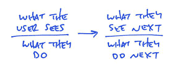
Flows are made out of individual interactions. A screen offers some possibilities and the user chooses one. Then something happens, and the screen changes. It’s an ongoing conversation. Each moment in a flow is like a coin with two sides. The screen is showing something on one side, and the user is reacting on the other side. My flow diagrams illustrate this two-sided nature with a bar. Above the bar is what the user sees. Below the bar is what they do. An arrow connects the user’s action to a new screen with yet another action.
Continued…Short notice, but come out to see me talk about “UI Fundamentals for Programmers” at WindyCityRails in Chicago this Saturday.
Desktop littered with tiny icons? Bump your icon size up to say, 80×80 and start deleting and re-filing. Making the icons bigger means they have to compete for space. Unimportant things are easier to keep around when they are small.
How many of these supposedly important blog posts and industry articles actually make me better at what I do?