I’ve been a fan of interface and software designer Bret Victor’s work since Craig (one of our designers) tipped me off about him. Bret made a splash a while back with his Magic Ink paper. Now Fast Company has profiled him and his Kill Math series. “Kill Math” is all about using smartly designed interfaces to make math tangible and playful, something you can experience instead of just think about.
Have you ever tried multiplying roman numerals? It’s incredibly, ridiculously difficult. That’s why, before the 14th century, everyone thought that multiplication was an incredibly difficult concept, and only for the mathematical elite. Then arabic numerals came along, with their nice place values, and we discovered that even seven-year-olds can handle multiplication just fine. There was nothing difficult about the concept of multiplication—the problem was that numbers, at the time, had a bad user interface.
It’s a nice piece (I only wish it was longer) and Bret surely deserves your attention if you are a fan of innovative UI design.
The Changelog posted a podcast interview with our very own Sam Stephenson. He talks about CoffeeScript, the Rails 3.1 asset pipeline, open source projects Pow and Sprockets, and the development of Basecamp Mobile.
The key difference to me is that when I look at a piece of Javascript code, I see parentheses and braces and semicolons and line noise. And when I look at CoffeeScript, I can see the code that I’ve written.
When I’m writing CoffeeScript I’m still thinking in Javascript—I just have to type less.
One of my favorite things is the ending: the interviewers ask “Who do you look up to?” That’s a great question to ask anyone who is doing good work.
I’ve long argued that UI design, programming, and product strategy should be learned apprentice-style with your hands and through experience, not through school and pedagogy. That can sound anti-academic, but it’s not. I recently got around to reading The Design of Everyday Things, the classic by Donald Norman (himself an academic) and he has this to say:
People function through their use of two kinds of knowledge: knowledge of and knowledge how.
...
Knowledge how [is] what psychologists call procedural knowledge.
...
Procedural knowledge is difficult or impossible to write down and difficult to teach. It is best taught by demonstration and best learned through practice. Even the best teachers cannot usually describe what they are doing. Procedural knowledge is largely subconscious.
I couldn’t have asked for a better statement of the problem. It’s really darn hard to take all the physical and mental processes going on when you do something like design an interface and boil them down to declarative statements like “do this or that.”
When I learned design, I was partly self-taught and partly mentored by Jason. When I learned programming—as much as I’ve learned—I didn’t make progress until I got personal explanations from David and Marcel.
When I go to conferences about design I see a lot of declarative knowledge. Knowledge of. The latest CSS rules. The new JavaScript syntax. Ten ways to make users happy (supposedly) or whatever else. What I don’t see are procedures—somebody standing up there with a pen or a text editor and making things happen and showing how it’s done. That’s what I want to see and that’s what I think our industry needs more of.
––
Addendum: Some examples of showing ‘how’:
- A Tour of the Design Process at 37signals, my presentation from FOWA London 2010, demos the mechanics at each stage of a design: modeling, sketching, coding, Photoshopping and implementing in Rails.
- Tom Preston-Werner sits down with a laptop and teaches the fundamentals of Git by actually typing commands in Mastering Git Basics.
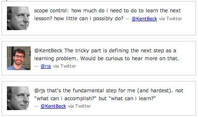
- Kent Beck’s screencasts on TDD show how test-driven development is done by a master with real code.
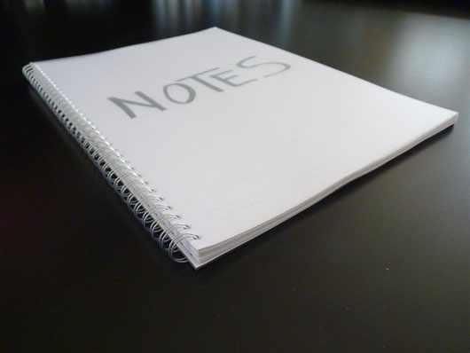
Batist Leman knew exactly what he wanted from a notebook:
- No lines: I get distracted by all those lines in most notebooks. I literally can’t read words on them. Or rather: there is no instant focus on the important stuff
- Pages should be fixed: For a while I used map full of regular printing paper, I liked it, but after a while it gets messy, the pages get scrambled up, etc.
- Every page must be the front page for a certain time. When I take the notebook out of my bag I don’t want to search for the page I’m focused on, it needs to be just there.
- Often I put my notebook in front of my laptop, the notebook needs to fit between the laptop and my belly. A horizontal A4 fits.
- A notebook should not be tiny. I need to make sketches, note miniature drawings. An A4 fits.
He couldn’t find anything on the market that fit the bill, so he decided to make his own at the local copy center. Here’s what he did:
- Buy a pack of paper, and take 50-60 pages from it (Max €/$ 1)
- Go to the local copy center
- Ask for 2 transparent covers. (Always use protection!) (Max €/$ 1)
- Ask to ring the bundle (Max €/$ 1)
A great idea. Check out his post for more details.
I gave a talk at Refresh Chicago last week and afterwards a fellow came up to me with a question. He does UI on a team of mostly engineers, and the engineers are big fans of the “Minimum Viable Product” concept. MVP, if you aren’t familiar, is an idea from the Lean Startup scene. In a nutshell, it means to do as little as possible so you can learn if you did the right thing or not. The fellow who approached me after the talk was having a problem with MVP. It seemed like their product suffered from bad experience holes. Their team was trying to do the minimum possible to ship, but their definition of minimum didn’t include things like a smooth way to reset your password. Things like password-reset were “never important enough”, so they languished as swamps of bad experience among the dry hills of minimally viable features.
Does the minimum-viable approach lead to gaps in the user experience? It doesn’t have to. There’s a distinction to make: The set of features you choose to build is one thing. The level you choose to execute at is another. You can decide whether or not to include a feature like ‘reset password’. But if you decide to do it, you should live up to a basic standard of execution on the experience side.
Features can be different sizes with more or less complexity, but quality of experience should be constant across all features. That constant quality of experience is what gives your customers trust. It demonstrates to them that whatever you build, you build well.
I like to visualize software. Here’s an intuition that works for me. Feature complexity is like surface area and quality of execution is like height.
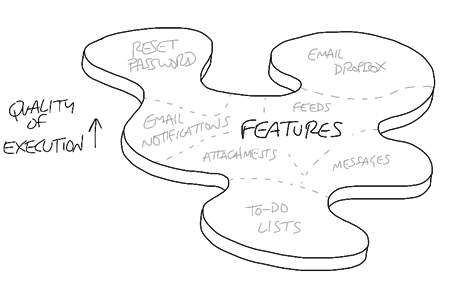
I want a base level of quality execution across all features. Whenever I commit to building or expanding a feature, I’m committing to a baseline of effort on the user experience. That way feature complexity — scope — is always the cost multiplier, not user experience. There aren’t debates about experience or how far to take it. The user experience simply has to be up to base standard in order to ship, no matter how trimmed down the feature is.
Minimum viable products are about learning what you need to build. They are matters of surface area. Whatever minimal feature set you decide to build, you can decide to build it properly. That commitment to quality at every step is the way to keep customers with you as you work upward from minimally viable to featureful and beyond.
Here’s a great little copy bit from the SecondConf website. The headline on the home page says:
“Three-day, Chicago-style, single-track conference”
I can easily imagine a more mundane version:
“Three-day, single-track conference in Chicago”
I don’t know what “Chicago-style” means, but it sure beats the mundane version. It’s more interesting and unique than merely stating that the conference happens in Chicago.
I like stuff like this because I personally struggle with making my writing interesting. It’s hard enough to be clear and get your point across. Being clear and interesting—that’s a goal to shoot for.
There’s a phase we go through in our maturity as designers. At first we don’t have a lot of confidence in our process, so we hide while we work. We take feedback from directors, programmers, customers, and say “Ok let me go away and work on that and I’ll get back to you.” Then we go away for a few days or a week and monkey around with our mysterious process until we feel good enough to show something again. We don’t like to show things that are still in progress. If somebody checks in we say “I’m still experimenting with a few things.” We design in secret.
When we get more confident a new phase opens up. We believe more in our process and we know that things are never perfect. So we start showing work earlier and start talking about our rationale at a given step. We’re excited for feedback on a clumsy design because we know feedback will steer us to a better one. We might even be unafraid to open our tools and do some real work in real time in front of people. This is designing in the open.
Is there anything we can do to speed the transition from designing in secret to designing in the open? My experience is yes, it can happen with a little help from the outside. Whoever is managing the project or directing it can ask for smaller, more frequent steps.
Instead of asking for 10 changes and waiting a week, you can ask for 1 change and wait 15 minutes. Evaluate the change, praise it or identify weaknesses, and suggest the next change. By asking for small changes, you take the pressure off the designer because you aren’t asking for miracles. You also take the pressure off the review process because the set of constraints and motivating concerns is smaller. The design is easier to talk about because there are a fewer factors involved.
By working hand in hand, reviewing small changes as they are made, designers gain confidence and learn to expose their process. And this technique is no training wheel. The better a designer is, the more open they are to discussing small changes and getting feedback. It’s a virtuous cycle leading out of secrecy and into productive openness.
Update: Pixar President Ed Catmull makes the same point in this quote on getting over embarrassment:
In the process of making the film [Toy Story], we reviewed the material every day. Now this is counter-intuitive for a lot of people. Most people—imagine this: you can’t draw very well, but even if you can draw very well, suppose you come in and you’ve got to put together animation or drawings and show it to a world-class, famous animator. Well, you don’t want to show something that is weak, or poor, so you want to hold off until you get it right. And the trick is to actually stop that behavior. We show it every day, when it’s incomplete. If everybody does it, every day, then you get over the embarrassment. And when you get over the embarrassment, you’re more creative.
As I say, that’s not obvious to people, but starting down that path helped everything we did. Show it in its incomplete form. There’s another advantage and that is, when you’re done, you’re done. That might seem silly, except a lot of people work on something and they want to hold it and want to show it, say two weeks later, to get done. Only it’s never right. So they’re not done. So you need to go through this iterative process, and the trick was to do it more frequently to change the dynamics.
Thank to Ben for pointing me to the Catmull quote.
Andrew Wicklander interviewed me for his Project Idealism podcast and our 45-minute chat is now online. Andrew’s background in software project management led to a lot of questions about how we work at 37signals. I was glad to dig into a number of topics including:
- How we emulate our “cowboy days” with teams of three
- How a growing company is like a cocktail party
- Picking and choosing from XP and Agile, and why basic values are more important than methodologies
- Why methodologies lose their meaning over time
- Why features become bloated when they are made for cases you don’t understand
- The overlap between UI design and product design
- How programmers and designers should negotiate on cost
- Who should manage projects: a designer or a programmer?
- How to not get lost in a project and the central challenge of doing just one thing at a time
- The costs of unfinished work
- The power of working in small steps and being in a “known state” between steps
- How doing less is still the hardest standard to keep
- and Why 37signals won’t be competing with Cisco anytime soon
Thanks a lot to Andrew for interviewing me and asking such thoughtful questions. The podcast is on his website and also available as episode #11 on iTunes.
From our Campfire chat room:
| Ryan S. |
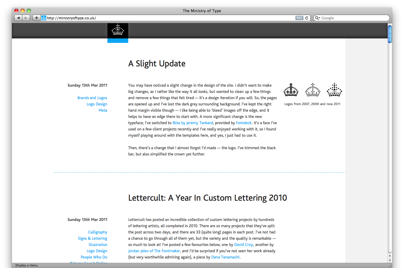
i love how Ministry Of Type keeps gently evolving his design
|
|
|
|
even the logo evolves in a steady path:
|
|
|
|
(2007, 2009, 2011)
|
|
i really like how the new layout is centered,
|
|
but with white to the browser edges on the left and grey on the right
|
|
he kept the grey margin on the right to give his images an edge to bleed off of
|
|
|
|
very sophisticated
|
|
it kinda feels left-aligned and bookish even though the layout is actually center aligned
|
|
|