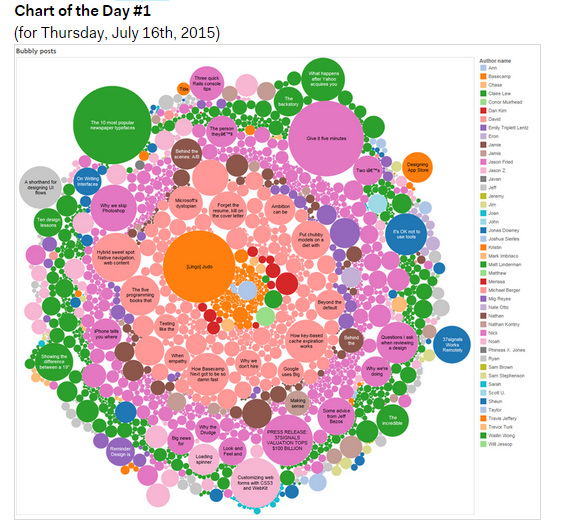
Every working day for the last month or so I’ve posted a single “chart of the day” to our Basecamp account. They’re posted internally without much commentary—just enough to explain what the chart is about. The topics are wide ranging: in the last month, we’ve covered browser uptake, search terms, The Distance, database performance, phone support, Nagios alert trends, demographics, classes, timezones, and even home energy usage and BMW torque curves.
The charts don’t fit into a big picture narrative, and there’s no agenda behind them: I simply take one chart from something I’m currently working on, have worked on recently, or someone has been curious about. Most are literally pulled from an open workbook or browser tab, so it’s not a big time investment. The chart of the day takes about a minute to post when it’s pulled from something I’m already working on, or up to fifteen minutes on the rare occasions that I create something completely from scratch for one. Sometimes they’re great visualizations; sometimes they’re not the most stunning displays of data. The key thing is that there’s a new one every day.
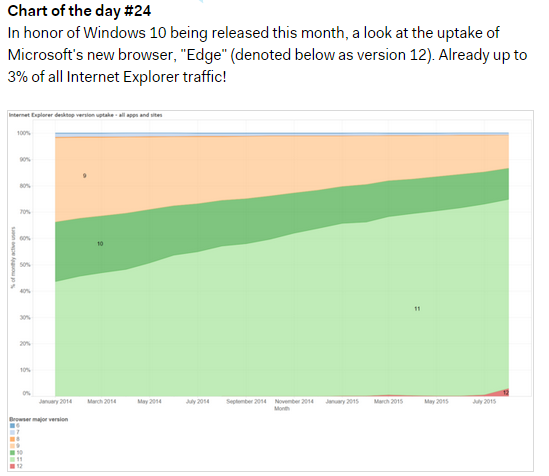
Why am I doing this? In part for fun and as a personal challenge: it takes a certain amount of thought and a different approach to making a chart that can tell a story on its own.
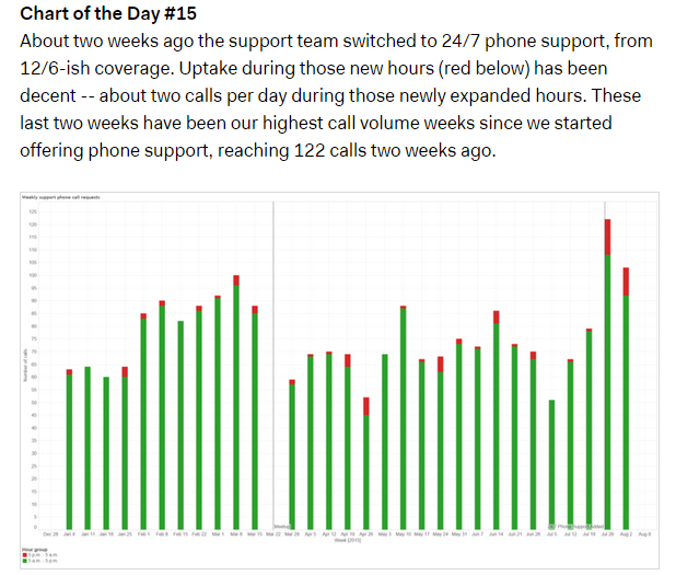
The bigger and more strategic reason for posting a chart a day is that I want to make data easier for people to digest and make a part of their daily work. I’m guilty of occasionally dropping 5,000 word reports with a couple dozen figures included into a Basecamp project when writing up a topic. I’ve gradually moved more and more content into appendices, methodological supplements, or self-service Tableau workbooks, but a full in-depth analysis of a topic is still long. I understand that it’s a real commitment of time and attention to read something of that length and digest it fully.
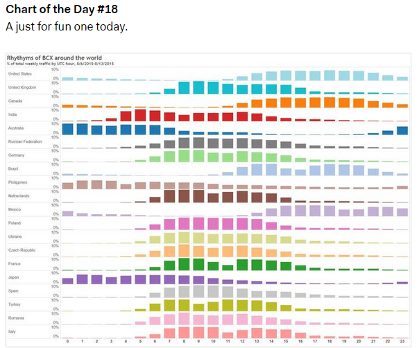
One chart a day, on the other hand, is easy — it’s not a big commitment to look at one chart and a couple sentences of context on a different topic each day. I don’t track readership of either longer reports or charts-of-the-day religiously, but based on general feedback, I think it’s fair to say more people are reading – and benefiting from – the daily charts.
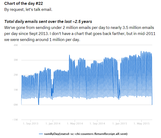
I’ve talked to people in other organizations who do similar things, whether it’s a weekly internal blog post or data show-and-tell at a meeting, and the reaction has been uniformly positive: more people engaging with more data and having a bigger impact on organizations. If you do something like this, I’d love to hear about what you do and the impact that it has. If you don’t, maybe it’s time to give it a try.

Jamis
on 26 Aug 15I love the relationship this has with Nathan’s recent post, “Less than Perfect”. It’s a theme that’s been recurring lately for me, and I think the repeated bludgeoning is finally starting to get through to me.
Also, “Random Chart of the Day” would be a great idea for a tumblr.
This discussion is closed.