You’re reading Signal v. Noise, a publication about the web by Basecamp since 1999. Happy !

Descriptive words and phrases found on a $6 bottle of hand soap

Jason Fried
Jason Fried wrote this on 17 comments
  • Extremely mild
  • Richly foaming
  • Naturally gentle
  • Deeply cleanses
  • Nourishes
  • Pure and soothing
  • Synergistically
  • Refresh and restore
  • Skin radiance
  • Cool soothing
  • Protects and restores balance
  • Harmonize and replenish
  • Additional moisturizing benefit

What doesn’t this stuff do? Lather up and this naturally gentle, richly foaming, pure and soothing nourishing cleanser will synergistically refresh, harmonize, replenish, protect and restore balance with cool soothing botanicals.

Kinda ridiculous, isn’t it? Reading this should remind you to read your own site, your own marketing copy, your own definitions.

What claims are you making? Do you really believe them? What are you saying? Does it make any sense? How are you describing your product? Is it accurate or just a sea of adjectives that look good and sound good together? What story are you telling or selling? Whatever it turns out to be, are you really OK with it? Deep down inside, is it something you’re proud of?

When debating UI, a picture is better than a description. And a functional mockup is better than both. But debating UI without being able to look at something is a waste of time.

Jason Fried on Feb 8 2010 10 comments

Big Think interview with Jason (filmed with the Interrotron)

Basecamp
Basecamp wrote this on 14 comments

Big Think Interview With Jason Fried

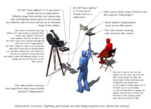
Was filmed using Errol Morris’ Interrotron (or a similar device). That’s how you get the direct eye contact. Jason’s take: “Was weird for 5 seconds then it was totally natural.”

The story of the Interrotron is also a neat example of scratching your own itch. Morris explains:

Q: Is it true that you interview people using a machine?

A: Yes, the (patent pending) Interrotron. It’s a machine that uses existing technology in a new and novel way. When I made my first film, Gates of Heaven, I interviewed people by putting my head right up against the lens of the camera. It seemed as though they were looking directly into the lens of the camera, but not really. Almost, but not quite. Of course, they were looking a little bit off to the side.

Q: What’s wrong with that? What were you trying to achieve?

A: The first person. When someone watches my films, it is as though the characters are talking to directly to them… There is no third party. On television we’re used to seeing people interviewed sixty-minutes-style. There is Mike Wallace or Larry King, and the camera is off to the side. Hence, we, the audience, are also off to the side. We’re the fly-on-the-wall, so to speak, watching two people talking. But we’ve lost something.

Q: What?

A: Direct eye contact.

Q: Eye contact?

A: Yup. We all know when someone makes eye contact with us. It is a moment of drama. Perhaps it’s a serial killer telling us that he’s about to kill us; or a loved one acknowledging a moment of affection. Regardless, it’s a moment with dramatic value. We know when people make eye contact with us, look away and then make eye contact again. It’s an essential part of communication. And yet, it is lost in standard interviews on film. That is, until the Interrotron.

Here’s a diagram of how it works and a photo of the device.

interrotron

Basecamp turns 6

Jason Fried
Jason Fried wrote this on 126 comments

Today Basecamp turns 6. We launched Basecamp in February 2004 – here’s the original post on SvN that launched it all.

Stats

Birthday stats are always fun. Here are some of our favorites:

  • 55,700,000 comments
  • 53,000,000 megabytes of uploaded files (that’s 53 terabytes)
  • 38,000,000 to-dos
  • 24,600,000 messages
  • 8,600,000 completed milestones
  • 3,600,000 users
  • 3,600,000 projects
  • And for the technically minded: At peak we’re doing 220 requests a second with an average response time of 160ms.

These numbers are based on open accounts. We’re not counting cancelled accounts or deleted messages/comments/to-dos/files etc.

We’re thrilled with the growth over the last year. Thanks to everyone who uses Basecamp or any one of our products. We’ve got some great stuff in store for you this year so stay tuned!

Computers shouldn't make people feel like idiots

Matt Linderman
Matt Linderman wrote this on 57 comments

Predictably, some argue the iPad doesn’t do enough. It needs a keyboard or a removable battery or multitasking ability or whatever.

But there’s an interesting backlash to that backlash. (Meta-backlash!) The discussion has people openly discussing an ugly truth that doesn’t typically get a lot of play among tech geeks: People don’t know how to use computers. And not just stupid people. Millions of people. People who are adults. And that’s pretty damn lame.

(Bold emphasis in the following excerpts is mine.)

Fraser Speirs writes this in “Future Shock”:

I’m often saddened by the infantilising effect of high technology on adults. From being in control of their world, they’re thrust back to a childish, mediaeval world in which gremlins appear to torment them and disappear at will and against which magic, spells, and the local witch doctor are their only refuges…

The Real Work is not formatting the margins, installing the printer driver, uploading the document, finishing the PowerPoint slides, running the software update or reinstalling the OS.

The Real Work is teaching the child, healing the patient, selling the house, logging the road defects, fixing the car at the roadside, capturing the table’s order, designing the house and organising the party.

Steven Frank says:

Since the days of the Apple ][, C64, and Atari 400, all we’ve done is add, add, add. Add more features to sell more computers. We’ve never stopped to take anything away.

I’m weary of this notion (even when presented as satire) that anyone who can’t master a computer must clearly be mentally retarded.

So while we trump up our skills at designing “easy to use” interfaces for our applications, millions of people are still trying to figure out how to get our beautifully designed application out of its zip file or disk image. Or where in fact the Downloads folder is. Or what, exactly, a folder is. If we hadn’t been there for every step of the personal computer evolution since the days of DOS and AppleSoft, I wager we’d find it pretty bloody confusing as well.

Rob Foster “On iPads, Grandmas and Game-changing”:

My mother-in-law walked in the door the day of the keynote and the first thing out of her mouth was “Did you see that new Apple iPad? That looks like it would work for me. Would that work for me?”

I was utterly flabbergasted. She NEVER talks about computers or technology. She tolerates them at best. Her attitude is typical of most baby boomers I’ve talked to regarding computers. She wants to benefit from them but is frustrated by the wall she must climb in order to do so. She’s learned how to use email and a couple of other things on the Internet and that’s about it…

I’ve long felt that computers were too hard to use, that the filesystem should NEVER be seen by the user. That human-computer interaction should favor the “human” side.

That these conversations are even going on is a good sign. For those of us surrounded by the minutiae of computers all day, it’s easy to forget there’s a world of people out there who just don’t get it. And it’s not their fault. It’s ours.

Apple has decided it’s worth throwing out advanced features in order to get these people onboard. Anyone who builds apps would be wise to consider taking a similar path. (Note: It’s not just about making a computer or an app more accessible for people who don’t get it. It’s also for people who do get it because this way is better.)

You can spend so much effort tweaking code or a specific part of the UI or adding a new pet feature that you forget the most important thing of all: People need to be able to START using your product. If they can’t do that, who cares about the rest?

You can crank up the snow machine. You can set up the slalom course perfectly. You can shape all the moguls so they’re just right. But if people can’t ever get on the ski lift, there ain’t gonna be any race.

It's not a promise, it's a guess

David
David wrote this on 38 comments

“When is it going to be done?” is a reasonable question and we as software developers should try to come up with the best answer we can based on our experience and analysis. What we should not do, however, is treat our answer as solemn oath.

When you treat estimates as promises instead of guesses, you bind your worth as a worker to it. If you do not meet your own deadline, you are a failure. And since nobody likes to be a failure, they’ll indulge in risky behavior to avoid it, like burning the midnight oil and checking in bad code with scanty or no tests.

Rushing to meet your estimate promise once or twice might be bearable, but it’s ultimately unsustainable. Software development is inherently unpredictable. There are just too many moving parts and ice tips that turn out to be icebergs.

If you treat the estimate as a “best guess based on the limited information available to me before I start the work”, though, you’ll change the frame and break the cycle of deadline anguish. Now the task becomes collaborative and you can share new discoveries with the stakeholders.

Found out that doing the feature as originally designed requires changing some fundamental infrastructure that’ll add another two days to your one day estimate? Maybe it’s not worth it any more. Ask the stakeholder if he’s still interested in the feature when it costs three days instead of one. Or if there’s a way to simplify it such that the infrastructure change is not necessary.

That’s the true value of estimates. That it sets up conversational constraints that can be used as boundaries for trading concessions. Not that they’re nails for your own self-erected cross.

[Podcast] Episode #7: Ryan Singer on the 37signals design process

Matt Linderman
Matt Linderman wrote this on 8 comments

Time: 19:24 | Download MP3


Like this episode? Please share it with your friends:

Tweet this podcast  Post to Facebook

Life as a 37signals Project Manager
Ryan Singer, who manages 37signals’ products and designs interfaces, talks about the company’s design process. He discusses how the design team works with each other and collaborates with programmers. He gives advice to other design/development teams on how to work together smoothly. He talks about how studying Rails has made him a better designer. He explains why Christopher Alexander and Edward Tufte have been big influences. And information architecture even gets some love!

See related links for this episode. Previous episodes available at 37signals.com/podcast. Subscribe to the podcast via iTunes or RSS.

Launchpad deep links for Highrise, Backpack, and now Basecamp

Jason Fried
Jason Fried wrote this on 7 comments

We’re really having fun digging into all the useful things we can do now that our customers have 37signals IDs. The Launchpad is one of those playgrounds.

Last night we added deep links to Basecamp accounts. Deep links let you jump into an account without having to first log into the account and then choose where you want to go.

For example, deep links for Highrise let you jump right to your deals, cases, tags, tasks, or contacts. Deep links for Backpack let you jump right to your calendar, pages, reminders, or journal. And now deep links for Basecamp let you jump right to one of your five most recently accessed projects.

Here’s a video to show you how it all works: