You’re reading Signal v. Noise, a publication about the web by Basecamp since 1999. Happy !

Survival and profit are fine, but if you don’t have values or “higher purpose” at the heart of your business, you may be losing out in the battle for the hearts and minds of customers, suppliers and employees…

[Jason Fried] recently broadcast a 100-character challenge to his 24,000 Twitter followers: “What’s missing most from business today? Not sales. Not service. Not technology. Answer: A point of view.”

That’s more telling than the speeches last month from Nicolas Sarkozy, the French President, and Lawrence Summers, economic advisor to Barack Obama who told the World Economic Forum at Davos we must all build a better capitalism that “reflects shared values” and a “common morality.” A manifesto bubbling up from successful young entrepreneurs on the front lines of global marketing and collaboration is worth two dozen top-down political rants…

A company known for having a point of view and commitment to community generates a payback worth more than money: Trust.


Rick Spence in What do you stand for? [Financial Post]
Matt Linderman on Feb 12 2010 12 comments

Product Blog update: New features in Basecamp, Highrise, and Campfire

Basecamp
Basecamp wrote this on Discuss

Basecamp
New in Basecamp: Redesigned messages section
We just launched a redesigned message section in Basecamp. The redesign brings current discussions to the top of the screen for easy discoverability and quick access. We also cleaned up the message design and added avatars to each message in the list.

Screen shot 2010-02-09 at 9.42.31 PM

New in Basecamp: Reply to assignment emails
When you assign a to-do or milestone to someone in Basecamp you have the option of notifying them via email. If you check the box, the person will receive an email listing the to-do or milestone, along with a link back to that to-do or milestone…Now people can reply to the initial notification email for to-dos or milestones and the reply will be automatically posted to the project as a comment. No more potential for lost communications.

Centripetal Software offers comprehensive backup solution for business users of Basecamp
“It will perform a backup of all of your data, files and writeboards from Basecamp and have it delivered directly to you by Dropbox or FTP. You can access your data at anytime because it’s stored in formats you already use, not proprietary formats that requires special software to open. The automated scheduling of the product allows you to setup your backup and then not think about it again. Centripetal Software offers a 30 day free trial on every backup job with prices starting at free forever to $55/month.”

Campfire
New in Campfire: Chat highlights and improved transcripts
The first improvement are chat highlights. Highlights let you mark any line in the chat room with a star. Those starred chats then appear in a special “highlights” section of the transcript letting anyone in your group see what you and others thought was interesting or important on that day. Highlights are a great way to save a chat you’d like to refer to later or emphasize in your group.

Starring

New in Campfire: Formatted Tweets
Now you can actually read the tweet in the chat – you don’t have to click over to Twitter to read it anymore. And there’s a bonus: Any tweet you paste into Campfire is now searchable in your transcripts.

Campfire-twitter

Highrise
New in Highrise: A redesigned “stream”
The date is black and bold like before, but the other data is treated more like a traditional email header in an email application. Each main point gets its own line. It’s smaller and a different size/color than the content below. You know where the data ends and the content begins. There’s only one key link on the left side above the content.

Newhrstream

New in Highrise: Search for cases and deals in the sidebar
We’ve always had a search field in the sidebar that let you jump straight to a contact. Start typing a name, see a list, hit return to go to the first one or use your mouse or keyboard arrow keys to jump around in the list. Today we added cases and deals to the search. Here’s what it looks like:

Highrise-sidebar-search

Continued…

Use real content to judge a design

Matt Linderman
Matt Linderman wrote this on 27 comments

Yesterday’s post “Design Decisions: Campfire transcript headings” explained how we arrived at this new header for each transcript day:

New transcript design

Several commenters disliked the black border:

Wow. I like the update but it is almost impossible to read “Today, February 9 in…” since the black border takes all the attention.

+1, the huge, repeated back border takes all the attention and makes my eyes cry.

I also find the thick black borders more distracting than useful in this situation. Maybe you should make them a little less thick or give them a less harder black color (gray)?

Viewing the header in isolation, I understand their concerns. But I also see what our prez would call a “teachable moment.”

See, this is where using real content to judge a design becomes so crucial. When you fake it or use lorem ipsum or just view a design in isolation, it’s easy to draw the wrong conclusions. That black bar does look very heavy in this context.

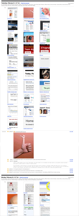
But check it out once you start using real info:

cf_bars_long

Totally different story now. Now the black bar doesn’t seem that heavy at all. In fact, it’s a great way to break up the data so you can see a new day has arrived in the transcript.

Real designs come from real content. Anything else is an abstraction. And abstractions can be real tough to judge accurately.

Related: Use Real Words: Insert actual text instead of lorem ipsum [Getting Real]

Design Decisions: Campfire transcript headings

Jason Z.
Jason Z. wrote this on 12 comments

Yesterday, we pushed an update to Campfire that added some new functionality to the transcripts screen. You can read the details in this post on our product blog, but I wanted to share the thought process on a small change we made as part of the update.

While working on the “Files, Transcripts and Search” tab in Campfire we noticed that the heading for each transcript day was kind of a mess. Here’s what it looked like before the update (the image has been reduced, click to see it full size):

Original transcript design

The design has essentially four elements using 3 font sizes, 4 colors, and 2 font weights. It certainly gets the job done, but it adds a lot of noise to the screen and can only make scanning the page slower than it needs to be. Contrast is essential to differentiating elements of a design, but here everything is unnecessarily different from everything else.

As we looked more critically we also felt like the link to read the transcript could be more obvious and that the link to delete a transcript was far too prominent for a feature that is rarely needed.

Here is what it looks like today:

New transcript design

The redesigned header reduces the contrast between the date and room name to just the weight of the font — a good example of least effective difference. The link to read the transcript is now explicit, reducing confusion, and the delete transcript link it subdued. Aligning it to the right keeps it out of the way where it is less likely to be accidentally clicked. Finally, a heavy black rule decidedly separates each day while giving each entry some visual weight.

The new design retains the same four elements as the original but by reducing unnecessary contrast, and refining the arrangement makes it feel like fewer to the eye. This results in less clutter and better scanability. It’s a small change that we think makes the whole page better.

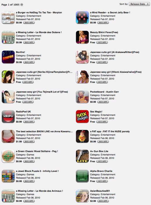
app-store-quality-control.png

There’s quality control for you. This is the latest entries in the Entertainment category on iTunes.

The App Store: Quality control without the quality

David
David wrote this on 59 comments

I love my iPhone and I love Apple (cue images of flag pins and “I love muh countray!”), but I believe they’re blowing it with the App Store gate keeping. That’s of course not a new opinion. Developers left and right have been decrying the broken process. But there’s nothing like feeling it on your own bones to make the point.

We have a couple of new features in the wing for Campfire. They’ve been done for more than 10 days now. Why haven’t we released them yet? Because the iPhone app Ember needed to have a simple regular expression updated to support the features. We really like Ember, so we decided that holding back the features until this pro forma update went through was prudent. We’re still waiting.

This has made me think about all the ways the app store process sucks and how little we get back in return. The argument I keep hearing for why this terrible process is worth it is quality control. Here’s a breakdown of each argument:

  • Applications will be more stable: No they won’t. Echophone still crashes on me all the time. It’s not like the iPhone is immune to crash bugs. And why would it be? You’re writing native Objective-C here. Shit is going to crash every now and then. No 10 minute look-over by a App Store clerk is going to help that.
  • The App Store will be free of malware: That’s certainly no given. If you really wanted to be evil, you could very well hide your malice underneath a cute game and have a time bomb or a remote trigger installed. Do you think the App Store clerks are combing through source code to look for security issues? Ha!
  • Only good stuff in the App Store: Ha! The App Store has some 140K+ applications. I can guarantee you that the bulk of that is less than average. There are some 100 fart apps for christ sake!

We’re paying for the inconvenience of quality control without the quality part. In fact, lots of software has lower quality because of the App Store process. Developers can’t easily get bug fixes out and they certainly don’t release new versions as often as they otherwise would. This harks back to the era where software was really cumbersome to release on CDs, so you did it much less frequently.

Contrast this with OS X and the web. Both platforms are much more open and on a mac you have very little trouble with stability or malware or even quality. In general, the market is pretty good at sorting this stuff out. If you make a crappy application, people don’t buy or recommend it. And OS X seems to be holding up well as a secure platform compared to, say, Windows, so malware isn’t much of a concern either.

What I think Apple should do instead is to reserve the power to nuke apps that prove troublesome. Have a “if you fuck it up, we’ll yank it” policy rather than a “we’ll review everything poorly and slowly and still not catch it all” policy. They’d be able to get by with a much smaller App Store clerk staff, developers would be thrilled to escape the needless gate keeping, and consumers would enjoy more applications updated more frequently.

What’s there to lose except for the feeling of powah?

Scope a variable to a block in your template code

Ryan
Ryan wrote this on 19 comments

Sometimes you are coding a template and you need to refer to the same method chain over and over. For example, you’re coding a template that summarizes activity on recent messages. You iterate through a block of messages, and for each message you want to display some information pertaining to the last comment. You could do it like this:

<div class="active_messages">
  <% @active_messages.each do |message| %>
    <h1><%= message.title %></h1>
    <div class="latest_comment">
      <div class="avatar">
        <%= avatar_for(message.comments.last.creator) %>
      </div>
      Latest comment <%= time_ago_in_words(message.comments.last.created_at) %> ago by <%= message.comments.last.creator.full_name %>
    </div>
  <% end %>
</div>

Everything inside of div.latest_comment deals with the exact same comment, but we have to use a method chain to get the comment each time (message.comments.last).

One solution is to set a local variable inside the iterating block with the knowledge that the variable will be reset after each iteration:

<div class="active_messages">
  <% @active_messages.each do |message| %>
    <h1><%= message.title %></h1>
    <% comment = message.comments.last %>
    <div class="latest_comment">
      <div class="avatar">
        <%= avatar_for(comment.creator) %>
      </div>
      Latest comment <%= time_ago_in_words(comment.created_at) %> ago by <%= comment.creator.full_name %>
    </div>
  <% end %>
</div>

One on hand, this is better because the methods called on `comment` are easier to scan. The whole div.latest_comment is more readable without the repeated method chain. On the other hand, setting a local variable is bad style. The local variable assignment creates state without explicitly showing where that state applies. It feels a little too PHP for my taste.

A better approach is to use the `tap` method to scope a variable to a block:

<div class="active_messages">
  <% @active_messages.each do |message| %>
    <h1><%= message.title %></h1>
    <div class="latest_comment">
      <% message.comments.last.tap do |comment| %>
        <div class="avatar">
          <%= avatar_for(comment.creator) %>
        </div>
        Latest comment <%= time_ago_in_words(comment.created_at) %> ago by <%= comment.creator.full_name %>
      <% end %>
    </div>
  <% end %>
</div>

The `tap` block shows exactly where the scope of the assignment starts and ends. I like how the template explicitly says “now we are going to deal with a comment in the following section, and this is the comment we are working with.”

I just hit on this pattern today while working on a feature and I think it’ll come in handy in the future.