You’re reading Signal v. Noise, a publication about the web by Basecamp since 1999. Happy !

The Design Roulette

Ryan
Ryan wrote this on 7 comments

There are sites, books, feeds, magazines, and movies about “design.” Thousands of people call themselves “designers.”
But have you noticed … “design” never means the same thing?
When I click on some “design” link, I feel like I’m spinning a roulette wheel. Will it be about:

  • Grids and Helvetica?
  • Typography?
  • How to balance trade-offs?
  • Applying engineering capability to a non-engineering problem?
  • Gradients?
  • Producing emotions?
  • Solving a business problem?
  • Posters?
  • Products?

I just saw a cool link on Hacker News. http://color.hailpixel.com/

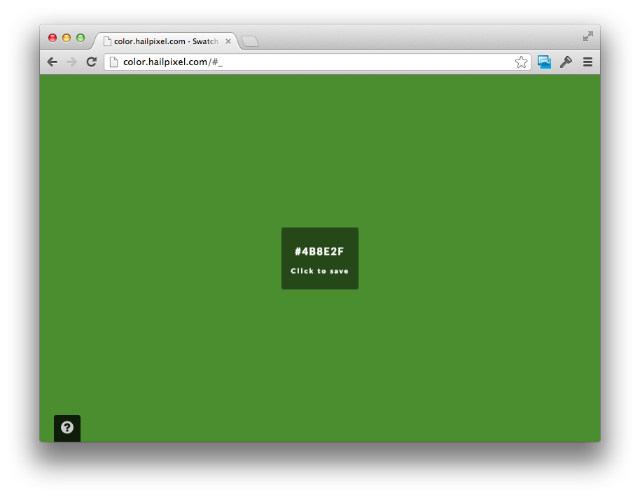
Screenshot of the color picker

What is it?

  • An interesting implementation because it’s made in HTML5, not Flash.
  • A cool style because it doesn’t look like other pickers.
  • A novel solution to a problem because the large scale gives access to values you can’t reach in a traditional picker.
  • An emotional experience because the immersive colorfield evokes purple twilights and blue-yellow sunrises.
Continued…

Drawing the native/web line in Basecamp for iPhone

Nick
Nick wrote this on 10 comments

Some of my favorite feedback on Basecamp for iPhone has been that the app feels wicked fast, and all native. The app actually is a mix of web and native UI, but it’s difficult to see where the line is drawn. The majority of the content shown in the app is web: From the login screen, to posting a message, and even uploading photos on a comment, that’s all done using UIWebView.

Chrome inspired us that web views could be pushed to the next level, and we wanted to make use of our existing fast, mobile HTML5 views. Going web wasn’t always solid: Some views started as web, went native, and ended up back in a web view. In the end, the app evolved into a simple web content browser with a native feel on top. It’s certainly a compromise, but we’ve been really happy with the hybrid architecture so far.

Continued…

Design decisions: Projects on Basecamp for iPhone

Jason Z.
Jason Z. wrote this on 6 comments

Designing the mobile version of an existing app is about so much more than screen size.

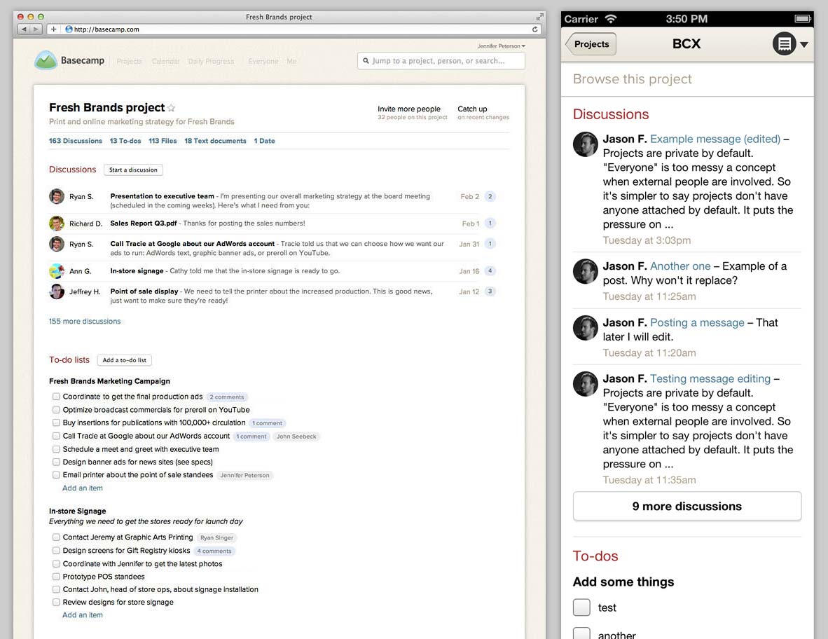
The fundamental concept of the new Basecamp is this: a project on a single page. Projects resemble a nicely organized paper document with wide margins, familiar proportions and plenty of white-space. In a glance you can see what’s happened in the project, what’s left to be done, and any relevant files. You can almost imagine peeling the sheet off the screen and handing it to a co-worker to get them up to speed. It’s an iconic design.

We knew that this design would be instrumental in making Basecamp for iPhone feel like Basecamp so it’s no surprise that we attempted a very literal reproduction in an early version of the app.

It’s all here: the clean, white sheet topped with the project’s name followed by sections with snapshots of the latest Discussions, To-dos, Files, etc. A virtual clone in smaller package. We were pretty happy with this mini-me design for awhile, but the story doesn’t start here.

Continued…

Being an Android user is a lot like being a Mac user in the 90's.

Jamie
Jamie wrote this on 43 comments

These are just a few observations. We all know how Apple turned out in the 2000’s. I wonder what’s next for Android…
Note: I’ve switched to Android from iPhone for the time being to learn about “that other platform”. I know: We just released Basecamp on iOS. I love the app. You should download it now!!!

Why I loved building Basecamp for iPhone in RubyMotion

Nick
Nick wrote this on 23 comments

It’s been over 8 months since our workplace experiment last July, when I got an entire month to buckle down and make an iPhone app. Last Friday, Basecamp landed in the App store. It’s been a long journey of simulator runs, device testing, and app crashes, but I’m convinced that I wouldn’t have been able to ship an iPhone app at all without RubyMotion.

I’ve tried to jump into mobile development a few times over the past few years, and I got stuck every time. I made a Android app in Eclipse, wrapped my head around Lua and Corona SDK, and tried to deal with Objective-C, Xcode, and Interface Builder. Not only did I have to throw out my existing toolset and workflow to break into this world, I had to ramp up with new APIs, frameworks, and more.

RubyMotion came at the perfect time: I wanted to make mobile apps, I didn’t have to throw out my existing workflow, and I could still write Ruby! Here’s what I learned about my experience with RubyMotion from the past few months.

Continued…

REMOTE: Office Not Required. The new book by 37signals. Coming fall 2013.

Jason Fried
Jason Fried wrote this on 20 comments

We’re working on a new book called REMOTE: Office Not Required. Get on the book mailing list and we’ll send you exclusive excerpts from the book before it’s released. There may be a few other bonuses, too.

As an employer, restricting your hiring to a small geographic region means you’re not getting the best people you can. As an employee, restricting your job search to companies within a reasonable commute means you’re not working for the best company you can. REMOTE shows employers and employees how they can work together, remotely, from any desk, in any space, in any place, anytime, anywhere.

Like REWORK before it, it’ll be a collection of short essays. It’s a quick read. Something you can finish in just a few hours. To the point, clear, no jargon, and no filler.

REMOTE will be published by Crown (Random House). Expect to see it on store shelves and eBook form fall 2013.

A loose rant on maximization

Jason Fried
Jason Fried wrote this on 40 comments

I can’t imagine anything less interesting in business than maximizing shareholder value. Yet this is what public companies are pressured – if not legally required – to do. A lot of non-public companies follow the same path towards performance and results.

To take it further, maximization as a concept just isn’t interesting to me. I don’t care about maximization. Not maximization of profit, revenue, people, reach, productivity, etc. Not interesting.

I feel like this makes me an outcast in the business world. Part of the minority, the ones who simply “don’t get how it works”.

I get how it works. I just don’t care. I’m not interested in squeezing something so tight that I get every last drop. I don’t want, need, or care about every last drop. Those last drops usually don’t taste as good anyway. My thirst is usually well quenched far before that final drop.

Am I interested in increasing profits? Yes. Revenues? Yes? Being more productive? Yes. Making our products easier, faster, and more useful? Yes. Making our customers and employees happier? Yes, absolutely. Do I love iterating and improving? Yes sir.

Do I want to make things better? All the time. But do I want to maximize “betterness”? No thanks.

I don’t mind leaving some water in the cloth, some drips in the glass, some money on the table. I like knowing there’s headroom. And once in a while it’s a fun challenge to chip away at that headroom. But that’s not for maximization’s sake – it’s for curiosity’s sake. “Can we do it?” is a lot more interesting to me than “we must do it because that’s what you’re supposed to do.”

Having fun, exploring ideas, creating, solving, building great things for you and your customers, being proud of your work, challenging yourself, learning, growing, building a self-sustaining company on your own schedule, adding something useful to the world, and working with great people – that’s what this is all about. Not maximization of a metric.

Launch: The official Basecamp iPhone app

Ryan
Ryan wrote this on 28 comments

We are proud to announce the first iOS app developed completely in-house at 37signals: the official Basecamp app for iPhone.

Get it now for free on the App Store.

Basecamp on mobile devices

Here’s what you can do with it:

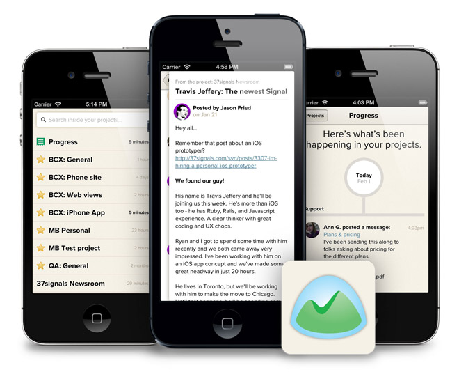
  • Check in on your projects from anywhere. Basecamp for iPhone shows you the latest news on each project.
  • Jump in on a discussion and post your thoughts.
  • View progress as team members complete to-dos and upload files.
  • Look up anything in a project. Refer to a document or make a decision no matter where you are.

We discovered it’s very important on the phone to make sharp priorities early in the design.

Our top priority was fast access to news. You’ll find the app makes it addictive to check in and feel the pulse of your projects throughout the day. You can quickly bounce in and out of projects. Project screens on the phone show the latest news first rather than static project contents.

Our second priority was to offer the full depth of Basecamp. After you dip into a project, you can go deeper and browse its contents. A menu offers all the project sections like Discussions, To-dos, Files, and Documents.

Iterating on iOS is tricky. The medium isn’t as flexible as HTML and CSS. To cut this down we used a hybrid approach. The page stacking behavior and navigation menus are native, while the rest of the screens are web views. Prototyping on Paper came in handy for evaluating native design ideas before committing to code.

We also used some shiny new tech. The app is built in RubyMotion. We barely touched Xcode. Look forward to some posts from Nick for details on that.

We’ve been using the app constantly since we first had a prototype in our hands. I’m thrilled to share it with you today. It’s available now for free in the App Store.

Download on the App Store
  • NOTE: Basecamp for iPhone requires an account on the new Basecamp (released March 2012). Basecamp Classic is not supported.