 My wife and I are planning a redesign of our bedroom. We usually go for paint on the walls. This time, however, we are planning to use wallpaper. We found a company called Graham & Brown, and we decided to order some wallpaper samples before deciding on a final pattern.
My wife took a few hours to browse and add items to her shopping cart to review with me later. The next day we had time to look over her selections. Unfortunately all of the items in her cart had disappeared. She even created an account to make sure that the items in her cart would be saved.
She called Graham & Brown customer service to tell them about the problem. They quickly apologized and explained that the site had just launched. Their web team was working out some bugs, and they were glad to hear our feedback. Customer service also offered to send us the wallpaper samples that we chose free of charge. As we make our final wallpaper selection I’ll be happy to give Graham & Brown my business because of this great experience.
A friend of mine sent me a text message this past weekend: “Did you know that they make spray paint specifically for graffiti?” He is a police officer (and former teenage graffiti writer). I thought he was joking and replied, “That’s capitalism for you. I wish I had thought of that idea.”
Today I saw that he was actually serious. There is a company from Barcelona Spain called MTN (Montana) that makes specific markers and spray paint for graffiti. There’s even an online store called Art Primo where you can get spray caps. FYI, you need to throw away the stock caps and get specific caps for smooth or fat spray lines.
Graffiti is illegal in most (if not all) cities, so this is a bit surprising to me. In many ways it actually takes the fun out of graffiti. Part of the fun is using something that was designed for a pedestrian purpose (like painting a bike or chair) and using it to paint a mural. I guess I wouldn’t be surprised to see a graffiti store at your local mall in a few years right next to Hot Topic.
Can you think of any other niche businesses that surprise you?
Over the past few months I’ve developed some icons for use on our marketing sites and newsletters. A few of these icons have made it into production. Some are simple and some are detailed. Most haven’t seen the light of day just because they weren’t a right fit for what we were trying to communicate at the time.
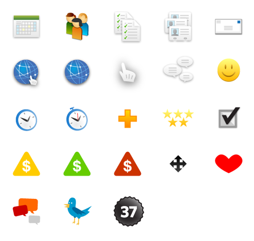
I want to release the artwork for these icons as open source. They’re free for you to use and (hopefully) improve upon. I hope that you’ll find these useful for any web or print design projects that you’re working on. All you need to get started is a vector illustration program that can open up an EPS file.
Updated: This artwork is released under the CC0 1.0 Universal license and the WTFPL. Can’t believe it’s this hard to give stuff away!
Download the 37signals Icons ZIP (2.65 MB)
I want to share with you the process that we used to develop the Flash animation that appears on Backpack homepage. The Flash animation itself isn’t a technical or design feat. There are many more examples of that online. It is how we got there that I find pretty cool.
First steps
We had previously launched 3 successful redesigns for the Basecamp, Highrise, and Campfire marketing sites. It made sense for us to approach Backpack in a similar way. Following that system: the main feature is comprised of a headline stating the big idea and to the right an image of a page within the app.
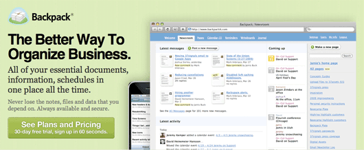
The page view I initially chose to feature was the Backpack Newsroom (above). The Newsroom shows all sorts of activity within Backpack. One glance shows that Backpack can be used by a group of people to share information throughout the company. The Newsroom is also a beautifully designed screen.
Jason, Ryan, and I discussed the design. What would the Newsroom screen communicate to someone who has never heard of Backpack before? It turns out not a whole lot. Is Backpack the Newsroom? How is this going to help a business organize clutter? The Newsroom screen is pretty, but ultimately we all agreed that Backpack was about Pages.
Continued…
Last year Jason Fried made a rather bold statement declaring the Drudge Report as one of the best designed sites on the web. I had recently been hired as a Designer, and I didn’t quite know what to think of this post. My boss explained to me (and 85,000+ people) that he thought the Drudge Report was one of the best designed sites on the web, and I disagreed with the statement.
It was only after launching the design for the 37signals site that I started to reflect back on the original sentiments of that Drudge Report post. Jason explained that the Drudge Report stands apart from the “news” pack. It is unique in its design—albeit plain—compared to the CSS mastery of other news sites. This simple and plain uniqueness actually makes it memorable.
It looks good, but what did it say?
We went through hundreds of designs for the Highrise, Basecamp, and 37signals marketing sites. I thought many of these designs were visually successful. Ultimately most were rejected on the basis of clarity. Each time Jason and I would have a design review he would inevitably ask, “What is this trying to say? Why is this important?” Then he would follow-up with the statement “Clarity above all else!” This would often result in making the font bigger, removing an illustration I spent hours on, or Jason rewriting complete pages of text.
It was during this time that I’d think about the sites that I appreciated from a design standpoint. Many of them are personal blogs or cool brochure sites. I began to realize that these sites displayed information well, but I could not exactly remember what they were about. They sure were pretty with fantastic CSS, but I can’t really remember what what the site said. Did it say anything?
I started to recall those amazing Flash Sites of the Day. You know those sites that get passed around via IM in your office on a slow day? Simply amazing design and programming. Problem is: I can’t for the life of me remember what those URLs were–much less the company/product that was being featured! Isn’t that the point with those sites? That the impact should be profound so that you remember Product or Company X?
And so it was in revisiting Jason’s Drudge-Report-Loving-Post that I finally began to understand: It doesn’t matter how awesome or slick the CSS or ActionScript on your site is. You have to make your site memorable. Your site has to speak clearly. Otherwise it may just end up as a web monument awaiting for another beautiful site to take its place.
Now that we’re almost done redesigning our product sites it’s time to turn our attention to the mothership: the 37signals site. A large portion of traffic to our product sites originates from the 37signals site. It’s important that we direct potential customers to the right products that meet their needs.
There is currently a page—37signals.com/which—that does a decent job of informing the customer which product to choose. However we are all in agreement that this is a temporary solution and it can be done better.
Yesterday I was experimenting with a different approach that would help these customers choose the right 37signals product. Right now it’s just a concept that might not even see the light of day (except on this here post). The copy is also not final. The overall shape, arrangement, and wording will ultimately determine if this concept will fail or succeed. Nonetheless, it’s an early iteration. Here’s a sample slice of the illustration:

The idea here is that software feature charts are boring. Maybe there’s a better and more interesting way to help people see what each app can do. The customer would click on the “word bubble” that is closest to addressing their need. This would link them to the relevant site: Basecamp, Highrise, Backpack, or Campfire.
What do you think? Trying to be too clever or am I onto something here?
I was looking at the Pinnochio Blu-ray page on Amazon last night and read “Expand Your Viewing Experience Beyond The Original Aspect Ratio Of The Film” in the product description. What does “Original Aspect Ratio” mean? We all used to have (or still do have) 4:3 CRT television sets. I know that Pinnochio was released in the ‘40s before Hollywood was shooting and presenting in CinemaScope or Panavision. So I went to the web and discovered the TCM Movie Database site.
The TCM Movie Database has an illustration for each film that shows how it would have looked in the theatre, on your 4:3 CRT TV, and on your 16:9 Widescreen TV. These illustrations clearly communicate exactly how the picture will be presented on the screen.
If numbers like 1.33:1 or 2.35:1 confuse you, or if your Dad asks, “Why is Wall-E letterboxed on your widescreen TV?” you can now reference these great illustrations. You can also learn more about theatrical aspect ratios by reading the article entitled Widescreen-O-Rama! at the always excellent Digital Bits site.
I’ve only known one method for approaching a Design project. There are many variations out there, but it can essentially be broken down into 4 steps: Discover, Plan, Design/Develop, and Deploy. It didn’t matter where I worked—agency or internal design department—these were the steps, and I didn’t question them.
Then 37signals published Getting Real, and I wondered if this might be a better way of approaching a project. I’d like to share with you a few stories from past Design projects while reflecting on how Getting Real would have helped. I’ll also share some insight into how the process here at 37signals works.
Continued…
 I have the usual gripes with cable/satellite/telecom company customer service like most people. However, I recently had an experience with DirecTV that left me feeling good about doing business with them.
Upon checking my latest bill, I was greeted with a message on my Account page: 3 months of Showtime for free. Score! OK, what’s there not to like about free premium programming right? But it wasn’t the free Showtime that made the experience great. Above that there was a line that read: Loyal viewer since 2004. I didn’t realize I had been a customer for so long. I appreciated that DirecTV was keeping track of that stat.
There was a feedback form next to the free Showtime graphic. I decided to send a “Thank you” note for the free Showtime, that I was enjoying my HD DVR, and a plea to not increase the monthly programming fees. I thought that this would just disappear into the Customer Service inbox ether. Needless to say, I started looking up Showtime programs that I could record. A few hours later I received this reply from DirecTV Customer Service:
Thanks for writing. I see that you have been part of the DIRECTV family since 2004. I’m happy to hear that you appreciate the free SHOWTIME UNLIMITED for 3 months that we’ve added to your account as a free gift. I would like to personally assure you that your suggestion about not increasing the monthly fee is very important to us. We value your opinions about our service, so I have forwarded your request to DIRECTV management, who review every suggestion, inquiry and complaint for trends from our most important customers to determine what changes should be considered.
Sincerely, Jhaney S. Employee ID# 100102919 DIRECTV Customer Service
I love how they not only responded to my note, but that they also reiterated that I have been “part of the DIRECTV family since 2004”. There is something “mom and pop shop” about that. That recognition of how long I’ve been a customer made me feel important. It’s such a simple little thing to do.