I’d like to share the design process that went on behind the scenes for the recent Basecamp email redesign. In this case we started at one point and wound up with a very different design in the end.
All of the conversations happened with me, Jason Fried, and Ryan Singer in our Campfire chat room. I would upload a design to the room and Jason and Ryan would give feedback. This process lasted for 1 day — start to finish.
I created many different iterations during this process. Here I’m showing the main shifts, so you’ll see “Version 2” followed by “Version 6”. You’re not missing anything.
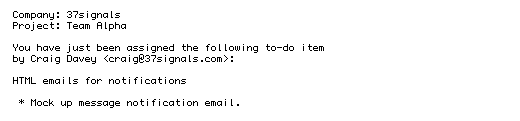
Original plain text
We still send this out if you don’t want to get HTML.
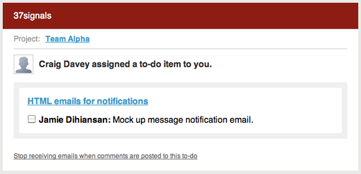
Version 1
Here I tried to emulate the actual to-do page in Basecamp.
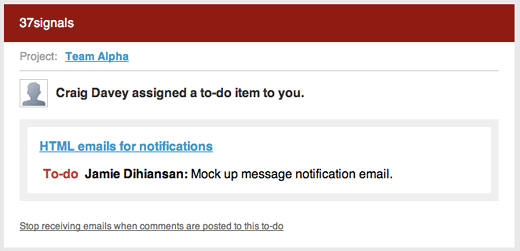
Version 2
Jason thought the checkbox in the email was confusing. If you finished the to-do would you click this checkbox? The checkbox wasn’t actually functioning too. It was fake. Let’s get rid of it.
Continued…
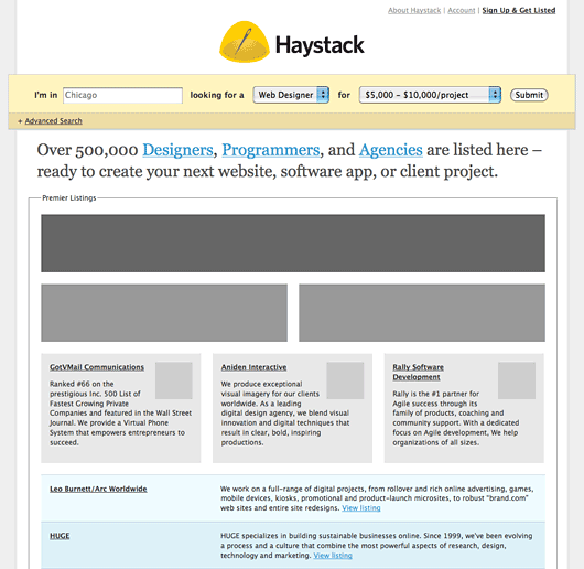
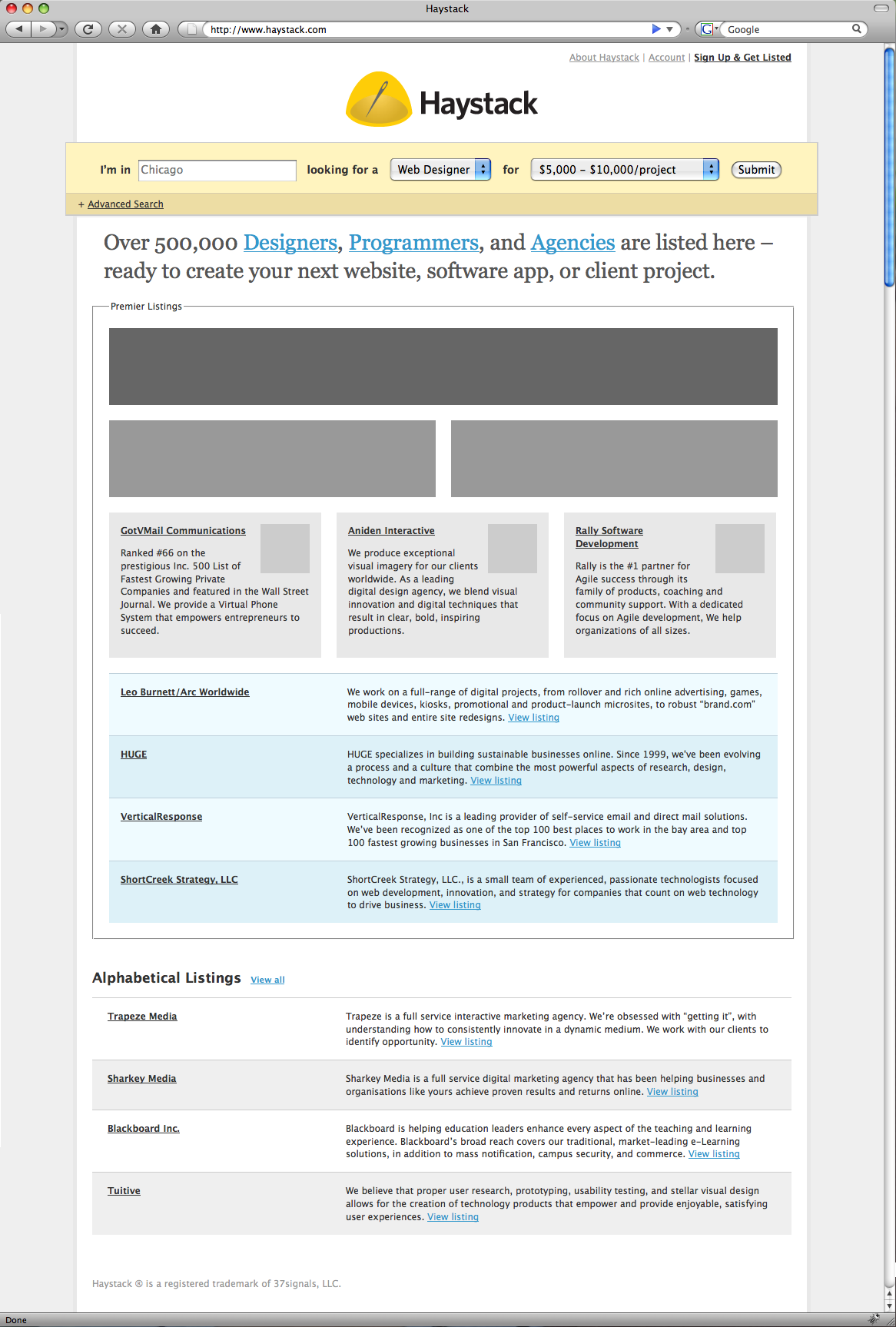
Last week we launched Haystack, a new way for clients and web designers to find each other. We designed early concepts for Haystack this past spring/summer. I thought you’d be interested to see some of the designs that we didn’t use, but helped get us to the final launch.
The Webdev Pages
Initially the idea was to base Haystack on the Yellow Pages. Designers, Programmers, and Agencies could create a free text-only listing. There would be multiple tiers of ad space that would sit prominently above those free listings. The consensus: Too broad: let’s focus on Web Designers. Not visual enough.
See a full-sized version
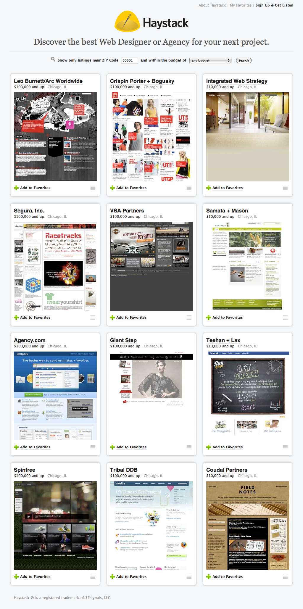
Company Cards
The design started to gel once we decided to focus on Web Designers. We created the company card. A quick glance gives you an idea about the designer’s work, location, and typical budget range. The company cards in a grid looked great, but all the cards were the same. We needed a way to differentiate Pro accounts from Free accounts.
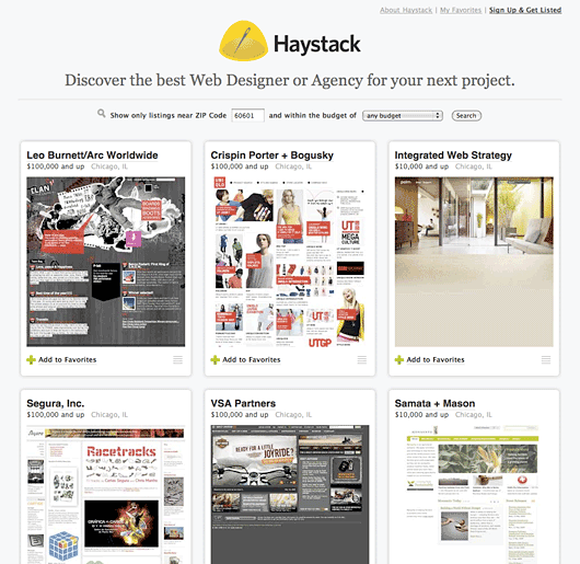
See a full-sized version
Continued…

