You’re reading Signal v. Noise, a publication about the web by Basecamp since 1999. Happy !

Jamie

About Jamie

He is Filipino.

Behind the scenes: Basecamp illustration

Jamie
Jamie wrote this on 19 comments

I needed to make illustrations for all of our apps for the new 37signals Suite page. The goal was to give a general idea of what the particular app does for customers that may be unfamiliar with our products. The illustration didn’t need to carry all of the weight since there would be a text description alongside it. However, it had to be attractive and detailed enough for people just scanning the page with their eyes.

Here are the variations I came up with for Basecamp. This particular project (illustrations for all the apps) took about 8 hours. Jason and Ryan both gave feedback which helped me arrive at the final version. There was a similar process for each of the other app illustrations too. I hope this gives you a sense of how we work.


Marketing tie-in
Trying to bring in elements — hand drawn arrows and icons — from the Basecamp marketing site.

Feedback: Good first step. The 2 icons, however, make Basecamp look weak. “What!? Basecamp can only do 2 things?”


Collage background
What if there was a collage of icons that would hint at everything Basecamp could do? It’ll be abstract, but maybe that’s OK. I can picture how the other apps would look like too. The icons can act almost like a pixellated abstract background.

Feedback: The idea is strong enough that I make similar illustrations for Highrise, Backpack, and Campfire to prove the concept. The page with the finished illustrations looks great. Unfortunately they are too abstract and also messy looking. “I thought these products were supposed to help me get organized, etc. It looks a bit chaotic.”


Literally: Project management
Jason starts throwing out ideas in our Campfire chat room: “How about a top down shot of people around a table meeting about a project?” To be honest I am not sure how it will turn out, but it is worth a try. Here’s a quick sketch of this exploration. I don’t spend much time giving the figures detail. I just want to prove the concept.

Feedback: This is way too hard to get right. I have to select the right ratio of men to women. I have to take into account skin color, clothing, etc. Do they wear suits or black turtlenecks? It also doesn’t look like they’re managing a project. They could be playing poker.


Literally: Project management part 2
Let’s try a folder. Most project managers I have worked with use a folder or a binder to keep relevant documents in one place.

Feedback: The folder is dull. It looks messy too.


Warmer folder
Ryan is concerned that the folder isn’t interesting. Maybe it’s the shape and color. Let me try a warmer color and softer shape. I’ll put “Projects” on the tab.

Feedback: Closer, but it is still dull. This is one of our best products and it is not exciting at all.


Add some flair
Jason and I have a quick 5 minute meeting to talk about the folder. We’ll bring back the icons. I’ll get them jumping out of the folder. I can also add some type of seal or sticker the open side to give a little more interest.

Feedback: Still way too messy.


Final illustration
I call Jason over to my computer as he is headed to the kitchen to make tea. I tell him I’m concerned about the messiness. Jason sketches a cross on a piece of paper. It’s like a coat of arms for project management. I like that idea and start working with that.

Feedback: Great! Let’s go with it.

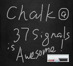
Introducing Chalk: A fun little browser-based app for iPad inspired by our new office

Jamie
Jamie wrote this on 87 comments

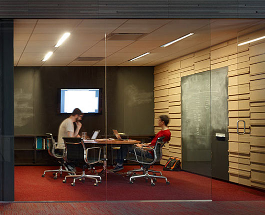
My favorite thing about the 37signals office are the 4 team rooms. Team rooms are where people can work together uninterrupted without disturbing anyone else. These team rooms are equipped with big chalkboards. You can sketch something quickly, erase it, and draw in more detail. Sketching on a chalkboard isn’t just a solo effort either. It’s collaborative. Anyone can add to your sketch to enhance your idea.

37signals Team Room

We love the interior design details of chalkboard and cork in our team rooms. Could we simulate the team room experience on the iPad? Luckily Sam Stephenson and I had some spare time between projects — an hour here, a few hours there — 3 days later we came up with Chalk. We’re really pleased with the results, and we want to share it with you.

Chalk

One of the coolest things about Chalk is it’s a website. There’s no app store approval process we had to endure. We used technologies we’re already familiar with. To use Chalk just go to chalk.37signals.com on your iPad.

Share

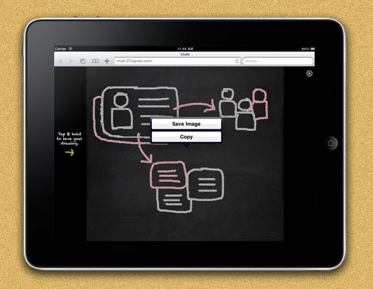
Instead of making a full-fledged sharing feature for Chalk, we decided to just use the iPad’s Photos app. You can save or copy your drawing by using the “tap and hold” gesture. This puts the drawing into the Photos app where you can attach it to an email.

Add to Home

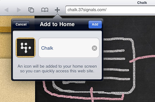
The Chalk web-app feels even more like a native app when you add it to your Home screen. Sam got Chalk to work even if you don’t have internet access. As long as it has been bookmarked already or on the Home screen it’ll work anywhere. Here’s a quick 1-minute demo movie if you want to see it in action.

It’s cool to work for a company that doesn’t frown on experiments like this. I had fun making the team room in Photoshop (yes we do use it on occasion). Sam had fun making it all work. We hope you have fun using it!

chalk.37signals.com

We’d love to see what you make with Chalk. Please send us your drawings: [email protected]. We might even publish a few of them here on SvN.

You may be wondering how this relates to Draft, our native iPad app for quick sketches. It doesn’t, really. Draft is a different product for different needs. Chalk was a fun experiment that lets you draw something quick in a browser.

We are in the people business. It doesn’t matter if you’re in the banking business, your customers, you’re in the people business, and it’s how you treat people. I grew up with the thought that I wanted to treat people the way I’d like to be treated, and I think if you do that, it’s pretty hard to go wrong.


Nolan Ryan on comparing his cattle ranch business with working with ballplayers.

Behind the scenes: Customer Wall

Jamie
Jamie wrote this on 21 comments

The idea
Jason Fried sent me a text Saturday morning a few weeks ago: “Pumped about an idea for a ‘meet our customers’ page. In on Monday??”

The idea, I learned Monday, was pretty cool. First we’d ask customers (on our blog and on Twitter) to send in photos of themselves. These photos would be printed out and pinned to a Customer Wall in our new office — an entire wall covered with the smiling faces of our customers. Then we’d create a page on our website that would simulate this office Customer Wall for everyone to see. Within 5 minutes of our discussion, Jason asked customers on the blog to send their photos and bios to me. The photos and bios started arriving immediately. I started designing.

Design and production
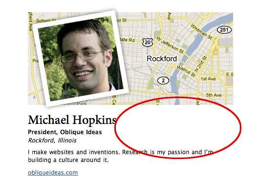
The design of the Customer Wall page is pretty simple. There are only 3 real elements: a photo, a map, and a block of copy.

Making sure that the balance and proportions were right was the tricky part. I used real customer photos and bios for my designs as the emails started coming in. Here are all of my iterations of the customer bio design. Some of the changes from iteration to iteration are seemingly minor, but extremely important for arriving at a tight page layout.

#1 and #2

The first challenge was determining the size of the photo in relation to the size of the map. Some customers submitted long copy and others short copy. Clearly #1’s photo and map were too small based on the copy that was submitted. Here experimented with making the map do a little more work by not spelling out the city and state within the copy. #2’s photo was much too large and the map seemed arbitrarily placed. There was also a huge gap between the imagery and the copy. It all feels too disconnected.

#3 and #4

I thought that I could just set the map at a constant height and the copy could be edited to fit. I attempted this in #3. The photo and the copy seemed to align perfectly. However the map felt like an afterthought. #4’s balance started to feel better. The copy was close to the map. The image size felt right in proportion to the map size.

The problem

Jason’s feedback, however, was that there was still too much whitespace (illustrated by the red oval above). It is true that some people have longer names, so some of that whitespace was necessary. However there must be a way to tighten up that area.

The solution

To shrink the whitespace I reduced the width of the customer bio block by about 100 pixels. I also faded the map background slightly into the customer’s name so that the whitespace felt shorter. Jason also had the great idea of treating the “city, state, country” like a newspaper article. That saved another line. For the final design we even cut out the website link and made the customer’s company name clickable.

Great results
Seeing the Customer Wall come to life has been a blast. It is a great reminder that people all over the world — from our hometown Chicago to Beijing, China to Manchester, UK to Commerce Township, Michigan — depend on our products.

I’ll be adding new customers each week. We’d love to have you on our customer wall! Send us your name, title, company, location, a brief description about what you do, and a list of 37signals products you use — along with a photo — to [email protected] with the subject “Customer Wall.”

©2010 Google, Map data ©2010 Google, Tele Atlas

Grant Achatz and Craig Schoettler experiment with the idea of bubble tea. Gin and tonic made with junipero, yellow chartreuse and cucumber alginate encapsulation. (via Chicagoist)

Laver's Law of Fashion

Jamie
Jamie wrote this on 11 comments

James Laver was a museum curator for the Victoria and Albert Museum in London from the ‘30s through the ‘50s. He was also a fashion theorist and historian who conceived Laver’s Law — an attempt to make sense of the fashion trend lifecycle.

Here is Laver’s Law:

Indecent 10 years before its time
Shameless 5 years before its time
Outré (Daring) 1 year before its time
Smart Current Fashion
Dowdy 1 year after its time
Hideous 10 years after its time
Ridiculous 20 years after its time
Amusing 30 years after its time
Quaint 50 years after its time
Charming 70 years after its time
Romantic 100 years after its time
Beautiful 150 years after its time


Stanley Marcus, the former president of Neiman Marcus, recounts in his memoir Minding the Store how Laver’s Law was used by Neiman Marcus clothes buyers in the late 60’s. There was a heated internal debate on whether the trend for that next year would still be the mini skirt (which was the current fashion) or the longer midi skirt. Marcus asked Laver point blank if the mini skirt was dead. Laver told him that the mini skirt had at least another 2 years to go — against expert opinion at the time.

His forecast was right, the midi was a complete flop, many women continued to wear the miniskirt, and those who couldn’t or wouldn’t make up their minds went into the pants suit. Pants were bound to come, but the skirt-length controversy made pants acceptable at an accelerated rate.

The brilliance of this timeline is that it can be applied to nearly all creative mediums — not just fashion but also art, design, architecture, and even music. Smart, or Current Fashion, doesn’t have a particular time frame attached to it. Something can be smart for 1 year or a even few years.

Think back to some of the trendy things of the past and you’ll see how it applies: candy colored iMacs, Victorian wallpaper, Emigre fonts, Disco, Sears homes of the 1920’s, Preppy clothes, Atari video game box covers, and Braun products of the late-50’s early 60’s.

Hitting that sweet spot around Daring and Smart when you’re trying to design, create or sell something is crucial. There’s even a market for Dowdy too, right? Just look around at your local mall or shopping center. Just remember that in a few years it’ll start to look bad. In 10 years it’ll look REALLY bad. Then, after some time, it will be appreciated — or even revered — again. I take comfort that something like Comic Sans (theoretically) will have a shot at being beautiful in 100 years time.

I have seen many people become good at copying, but then never think to apply what they learned to their own drawings. Applying something from what you study tests you to see if you actually understood what you copied.

It’s important that nobody gets mad at you for screwing up. We know screwups are an essential part of making something good. That’s why our goal is to screw up as fast as possible.


Lee Unkrich, director of Toy Story 3, Wired magazine

AT&T Pricing Legend

Jamie
Jamie wrote this on 22 comments

Your Price “Your Price” is the optimal price after factoring in contractual (i.e. equipment discount), business and consumer pricing based on a one or two-year service agreement. This price is independent of eligibility requirements.

With Discount “With Discount” is the discounted amount given should you meet eligibility requirements.

Promotional Discount ($ displayed) This is the discounted price available for the device should you meet eligibility requirements.

No-Commitment Price The no-commitment price is the price you will pay for a phone/device without a service commitment. No contract extensions are required for existing customers, and buying a device at the no-commitment price does not affect your future upgrade eligibility. When you purchase a device at the no-commitment price, you are not eligible for any phone/device discounts or rebates; however, you will continue to receive any service discount for which you qualify.

Riddle me this: Why can’t phones just have a simple price?